With the XEC variant on the way to dominance in most places, and XEC waves starting to show, it is time to ponder which variant will drive the next wave after XEC.
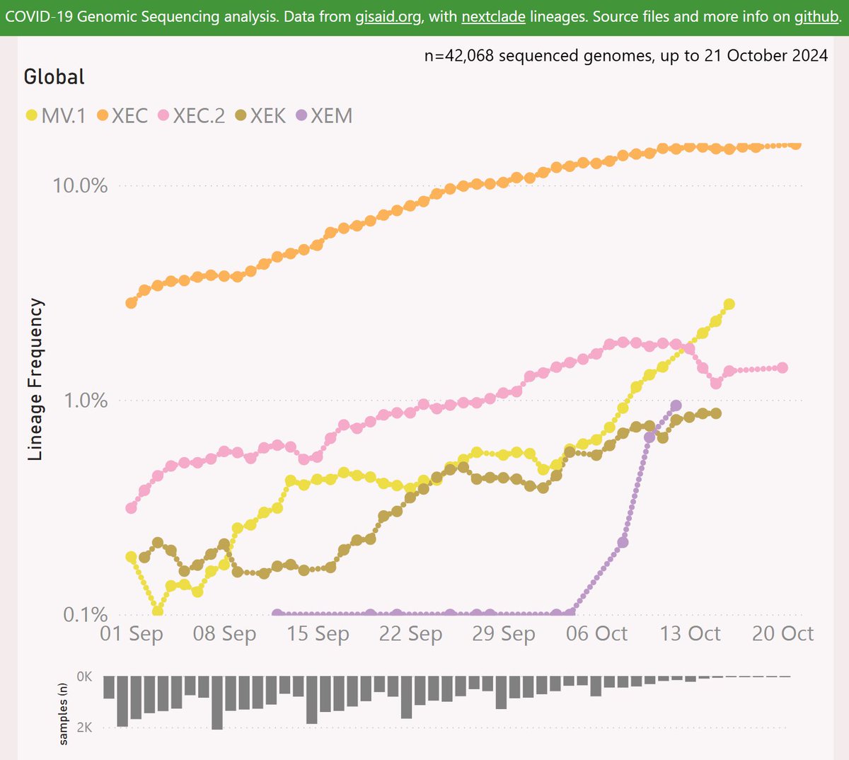
Here are the leading contenders: MV.1, XEC.2, XEM and XEK. They are shown here using a log scale, vs OG XEC.
🧵
Here are the leading contenders: MV.1, XEC.2, XEM and XEK. They are shown here using a log scale, vs OG XEC.
🧵
MV.1 is descended from JN.1.49.1 via MB.1.1.1. MV.1 adds the Spike:K478T mutation.
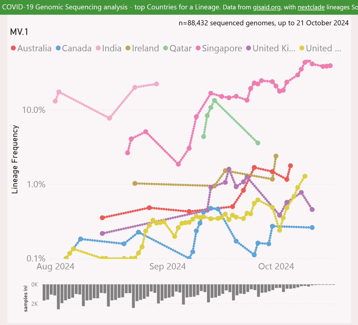
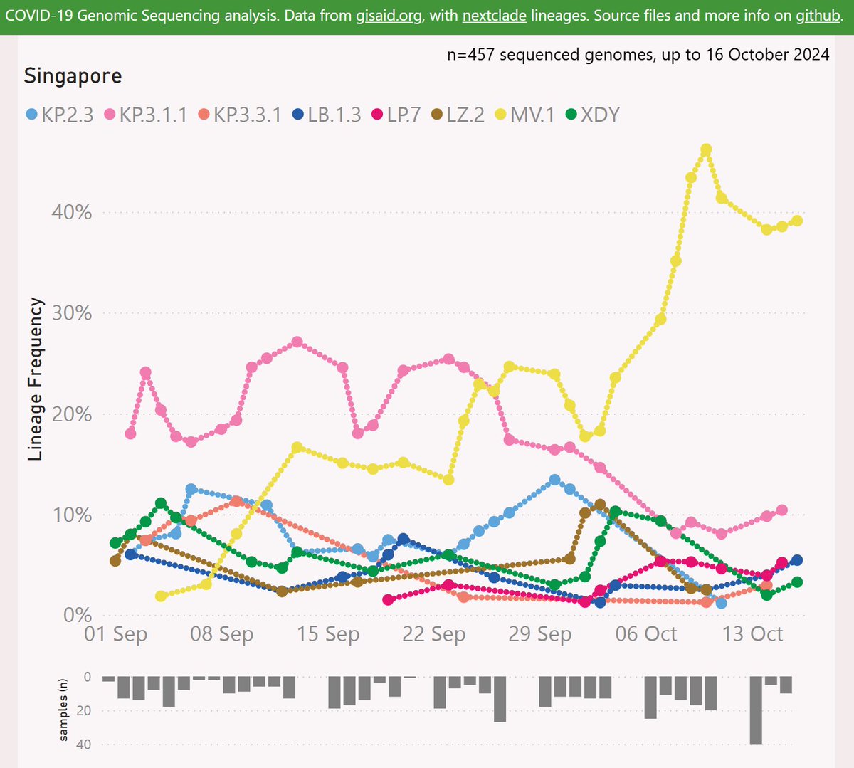
MV.1 showed some early success in India, reaching 22% frequency. Data from India has been sparse and lagging. The more recent data from Singapore shows it at an impressive 39% frequency.
🧵
MV.1 showed some early success in India, reaching 22% frequency. Data from India has been sparse and lagging. The more recent data from Singapore shows it at an impressive 39% frequency.
🧵
Here's an animated map showing the spread of MV.1. It was first reported in Maharashtra (India), in late June. It eventually spread to New York (USA) and then to all points of the compass.
🧵
🧵
MV.1 has reached some impressively far-flung places including Mauritius, Hawkes Bay (New Zealand), Saskatchewan (Canada) and Wielkopolskie (Poland).
🧵
🧵
Audio credit:
Swarm_Bees_outdoor_stereo by leonseptavaux -- -- License: Attribution 4.0
🧵freesound.org/s/573839/
Swarm_Bees_outdoor_stereo by leonseptavaux -- -- License: Attribution 4.0
🧵freesound.org/s/573839/
Here's the latest variant picture for Singapore, showing the dominance of MV.1 over DeFLuQE KP.3.1.1. Note XEC does not even make the cut (top 8 lineages).
🧵
🧵
Globally, MV.1 is showing a growth advantage of 2.4% per day (17% per week) vs XEC, so any crossover looks distant. Note the "global" variant data is dominated by North America and Europe.
🧵
🧵

XEC.2 adds the ORF1a:I1367L mutation, and lacks ORF1a:A599T.
XEC.2 has been most successful in Australia, reaching 12% frequency. There are also some signs of growth in the UK, France and Sweden.
🧵
XEC.2 has been most successful in Australia, reaching 12% frequency. There are also some signs of growth in the UK, France and Sweden.
🧵
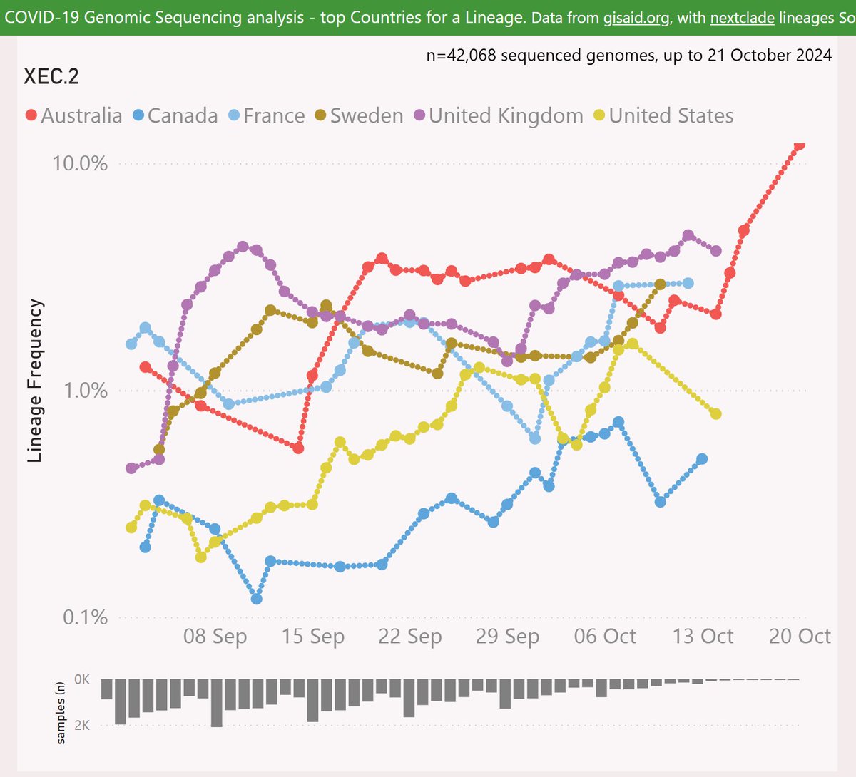
Globally, XEC.2 is showing a growth dis-advantage of 0.2% per day vs XEC, so a crossover looks unlikely.
🧵
🧵

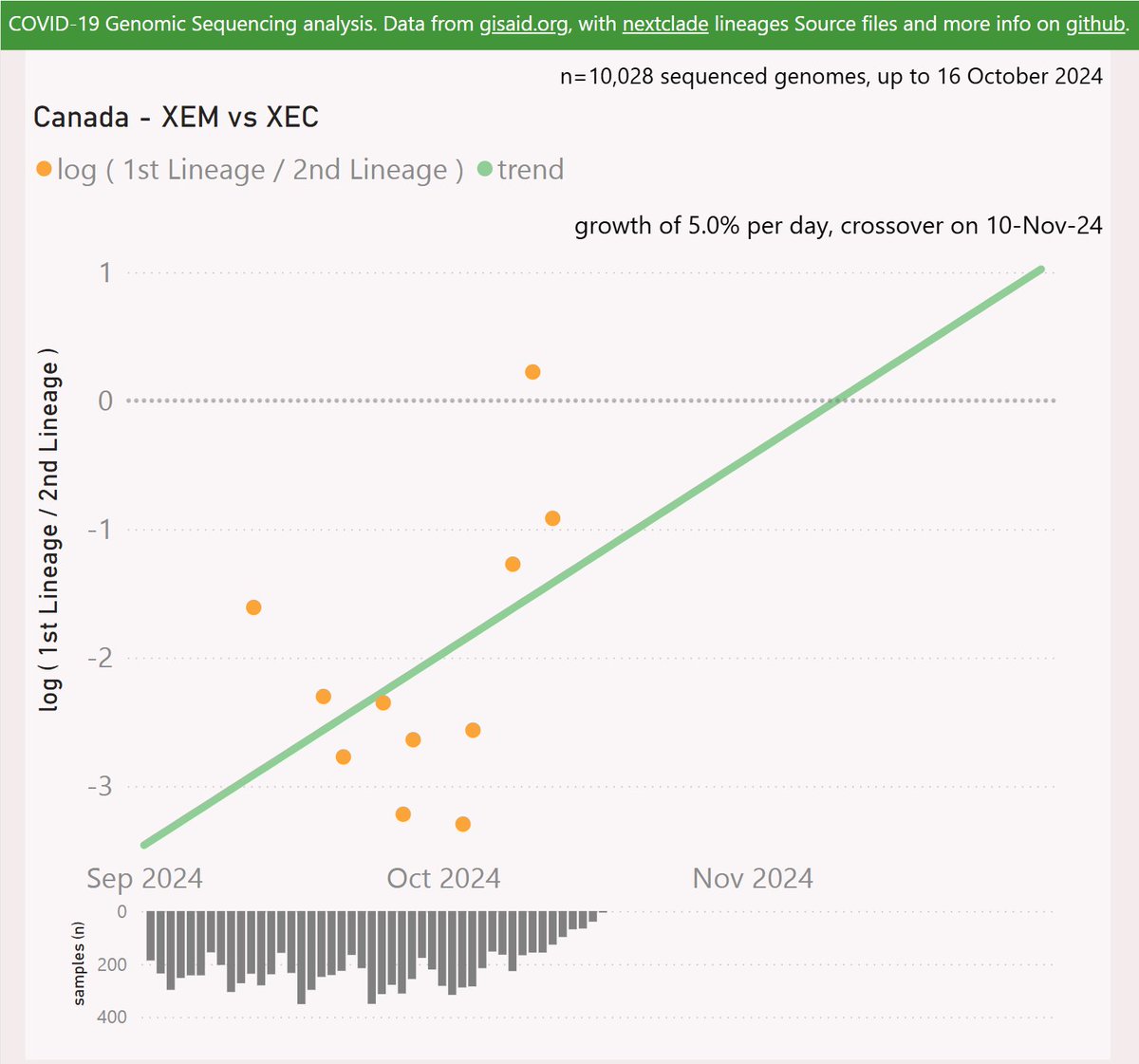
XEM is a newly classified recombinant of KS.1 and KP.3.3.1. XEM has gained the Spike F59S and R346T mutations.
XEM has only been reported in Canada (Ontario and BC) so far, with 37 samples in under a month. It is showing impressive growth, but these could be related clusters.
🧵
XEM has only been reported in Canada (Ontario and BC) so far, with 37 samples in under a month. It is showing impressive growth, but these could be related clusters.
🧵

For Canada, XEM is showing a growth advantage of 5% per day (35% per week) vs XEC, which predicts a crossover in early November.
🧵
🧵
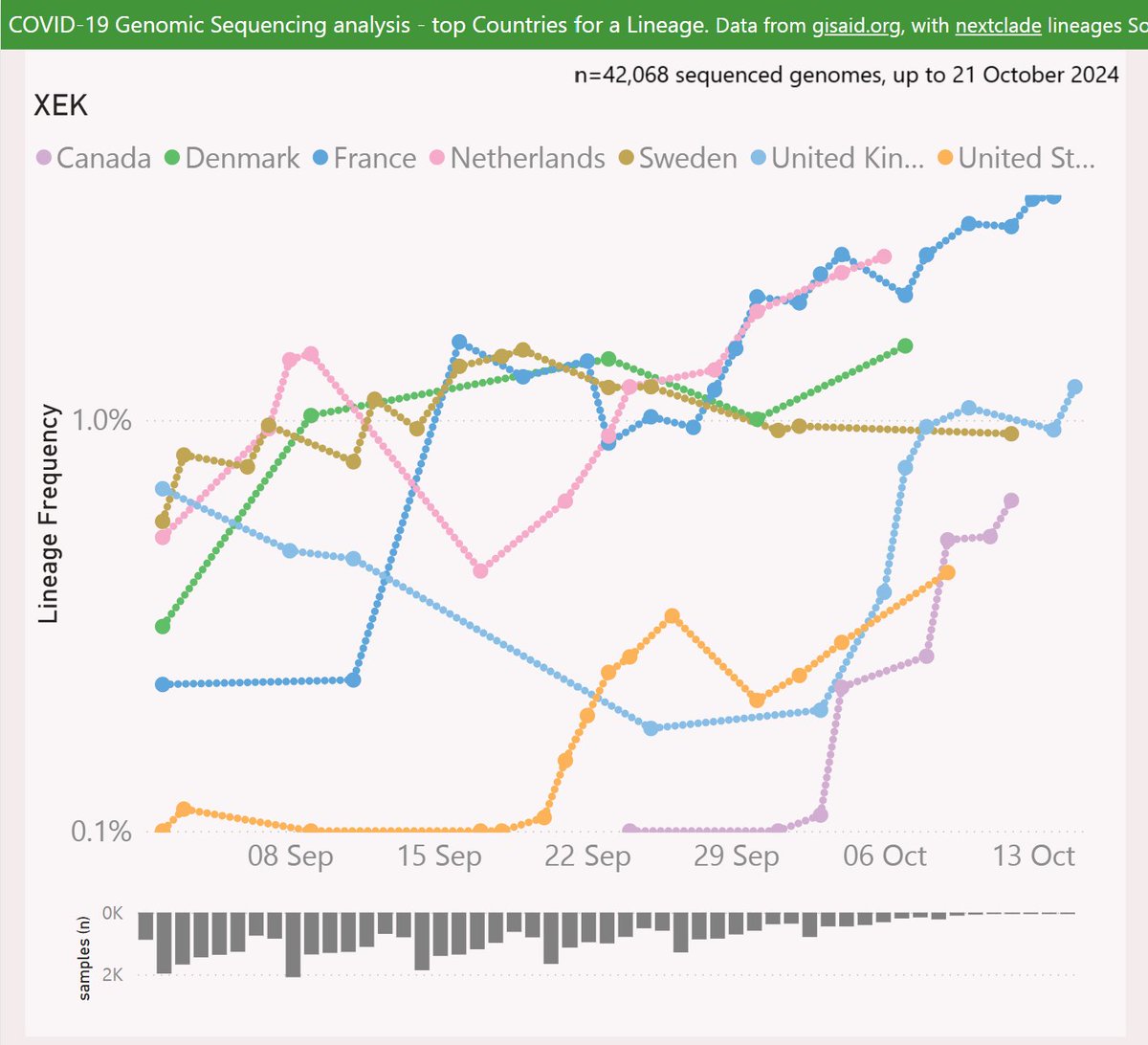
XEK is a recombinant of KP.2.3 and XEC, with a very similar set of Spike mutations to XEC.
XEK has been most successful in France, reaching 3.5% frequency. There are also some signs of growth in the UK and around Europe.
🧵
XEK has been most successful in France, reaching 3.5% frequency. There are also some signs of growth in the UK and around Europe.
🧵
Globally, XEK is showing a growth advantage of 1.1% per day vs XEC, so a crossover looks very distant.
🧵
🧵

So in summary, the most obvious contenders to challenge XEC at this point are MV.1 and XEC.2. I will back MV.1 at this point, with it's higher growth rate and it's success in undersampled regions.
🧵
🧵

XEM is a "dark horse" which could sweep the field if it's early growth indications from Ontario are sustained on the global stage.
🧵
🧵
The usual caveats apply - recent sample sizes are smaller which might skew these results.
🧵
🧵
Of course, variant evolution continues unfettered, with billions of infected hosts and millions of chronic infections in a historically unprecedented global "flywheel" of momentum. Surprises could appear at any time, and might be well established before they are detected.
🧵
🧵
Here's an outstanding thread on the evolutionary trajectory by Arijit Chakravarty and collaborators:
🧵
🧵
https://x.com/arijitchakrav/status/1847457263511798012
I am relying on the latest pango lineage designations, which currently go up to NL.1 and XEN. As always, there are many proposed lineages under consideration for designation. That important work is slowed and made more difficult by the uncertainty of limited data.
🧵
🧵

Interactive genomic sequencing dataviz, code, acknowledgements and more info here:
🧵 endsgithub.com/Mike-Honey/cov…
🧵 endsgithub.com/Mike-Honey/cov…
• • •
Missing some Tweet in this thread? You can try to
force a refresh