Minimisers:
"If Covid dysregulated the immune system, why aren't we seeing an increase in opportunistic infections, eh?!"
The opportunistic infections:
"If Covid dysregulated the immune system, why aren't we seeing an increase in opportunistic infections, eh?!"
The opportunistic infections:

The UKHSA have the gall to say that some of these outbreaks only seem large due to improved testing, when testing rates for them actually *decreased*.
Don't listen to their spin. Look at the big picture.
And all the little pictures.
Don't listen to their spin. Look at the big picture.
And all the little pictures.
Data from here:
gov.uk/government/pub…
gov.uk/government/pub…
And here:
gov.uk/government/pub…
gov.uk/government/pub…
While we're here, there's no immunity debt to crypto parvum or hominis.
You know what there is though?
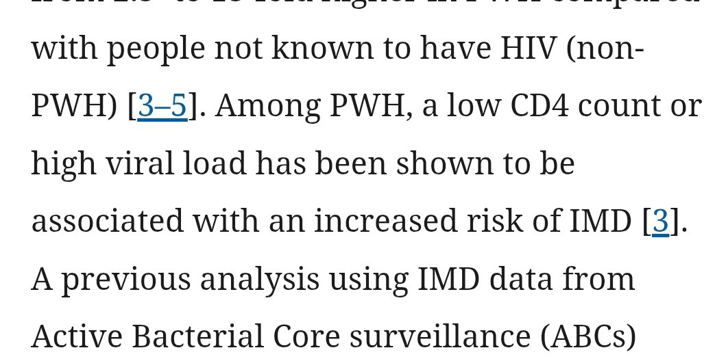
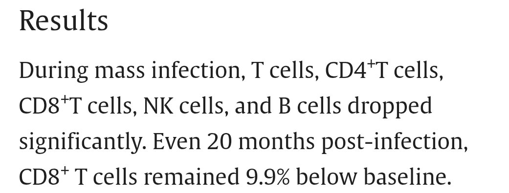
There's immunity damage that allows them in.
You know what there is though?
There's immunity damage that allows them in.
Also worth noting:
Some of these trends were in operation before Covid, but have increased further since.
Some of these trends were in operation before Covid, but have increased further since.
And yes, some of these infections are in perfect sync with Covid waves, and some... follow in perfect sync *afterwards*.
Here they are with labels highlighting the years for which there is data available:

https://x.com/vnaylon/status/1852758695127707995

• • •
Missing some Tweet in this thread? You can try to
force a refresh


