PMC COVID-19 Forecasting Model, Nov 4, 2024
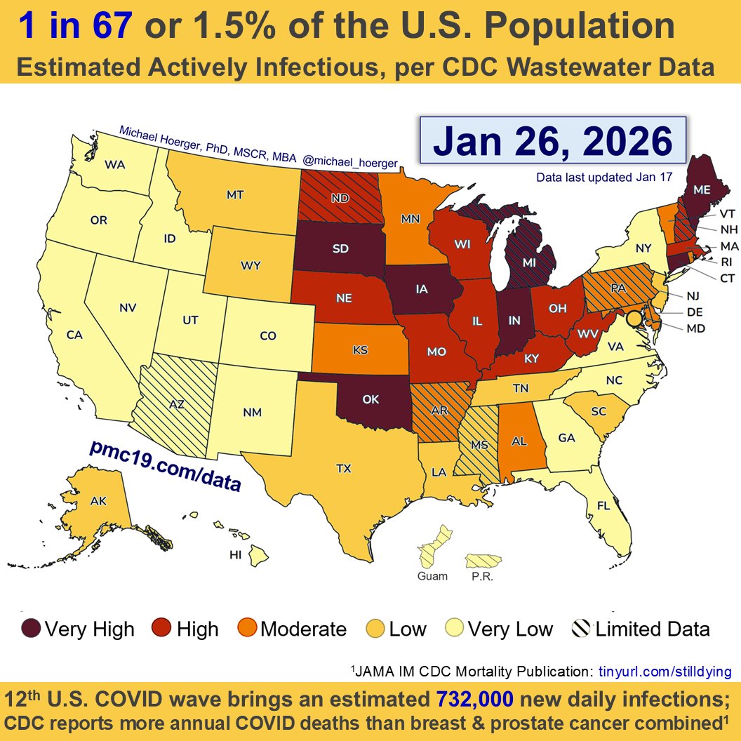
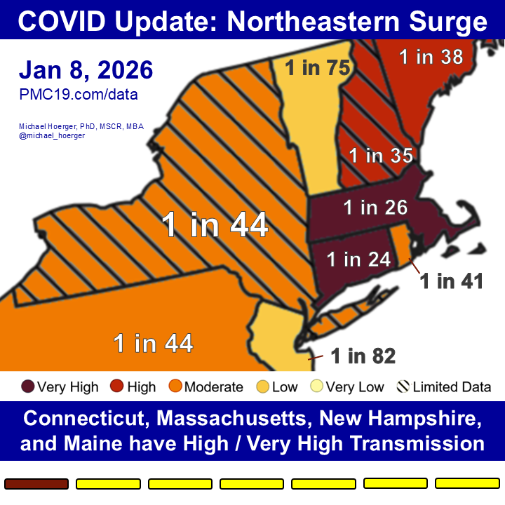
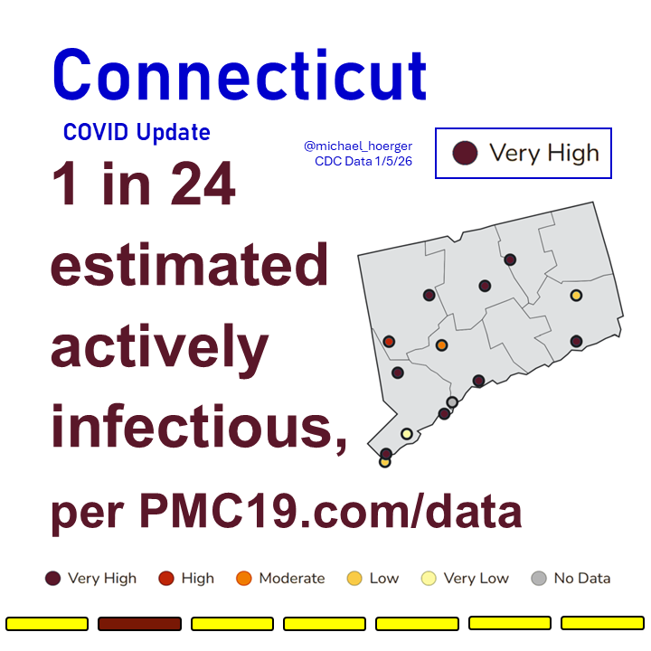
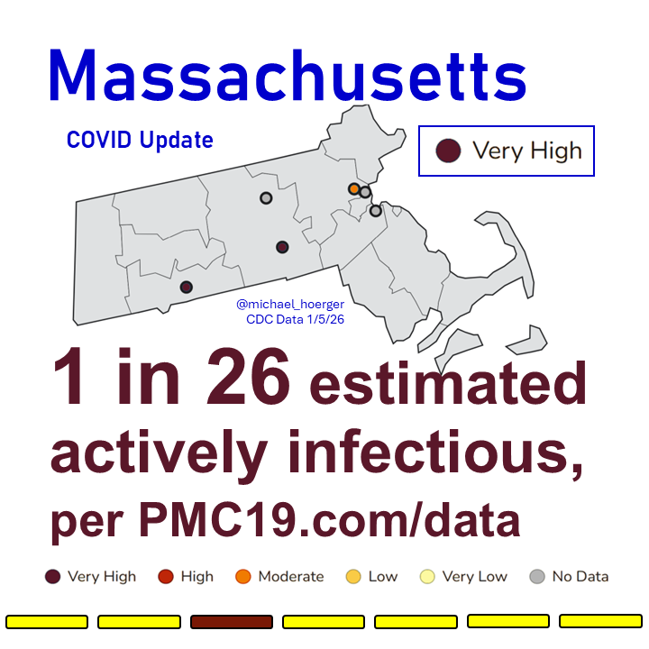
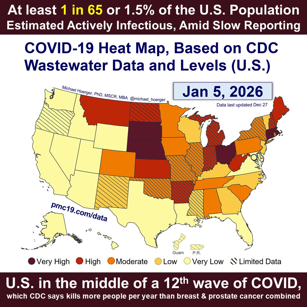
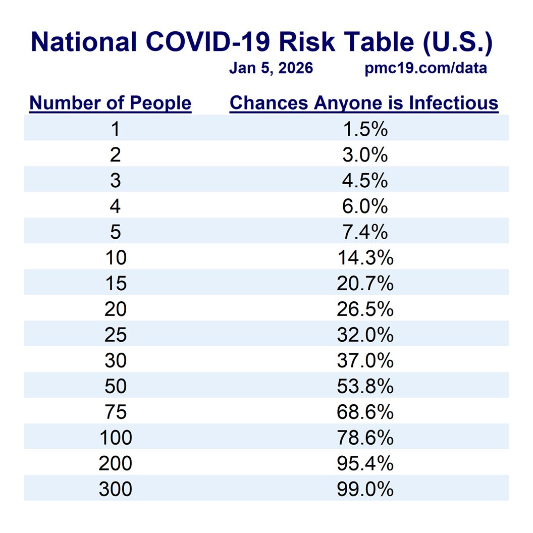
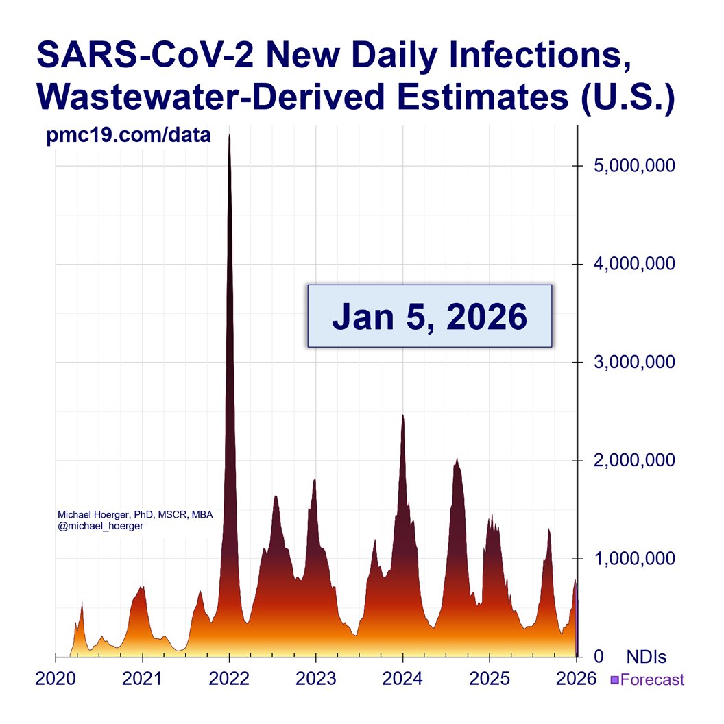
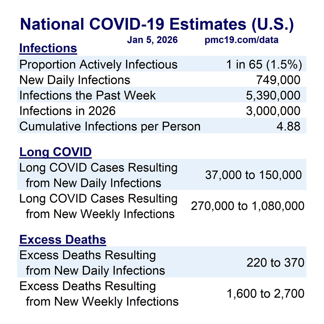
We're seeing an uptick in U.S. Covid transmission with 1 in 115 actively infectious.
The percentage of the population actively infectious has increased from 0.7% last week (based on updated data) to 0.9% this week.
The uptick is barring retroactive downward corrections.
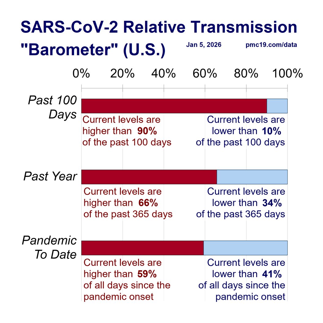
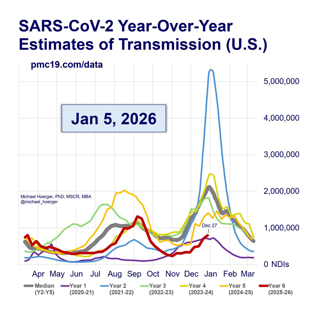
We place the "lull point" as likely around Oct 20, but it could be +/- 2 weeks around that. Looking back at the late-summer wave, you'll see the date of the high point was quite arbitrary, and the same is true for the "lull."
There is presently considerable variation by region and even when examining the same region across different data sources. Some areas are still cooling off, while others are increasing markedly, as one would expect in the peri-lull area. There's also a lot of volatility across other data sources not included in our model (e.g., WastewaterSCAN up 43% nationally from Oct 18-25, but back down on the most recent data point on the 26th).
You'll note two updates in the current PMC forecasting model starting this week. These are described in detail in the technical appendix.
1) Biobot's sun rises again. 🌅 Our composite indicator of Covid transmission had been weighted 40% Biobot and 60% CDC. When Biobot abruptly stopped reporting for several weeks in a row during the summer wave, we were forced to downgrade them to 0% with no data coming in. After weeks of consistent reporting and a near-perfect correlation with recent CDC data (r=.95), we have re-included them in our current case-estimation model at 20% Biobot and 80% weight for CDC. Note, some of our pandemic "running total" estimates are marginally adjusted downward, as Biobot reported a slightly narrower (leptokurtic) late-summer wave. Having two high-quality data sources for estimating current transmission increases precision in real-time estimates and prepares for the eventuality that one source by experience a gap in reporting near the winter peak.
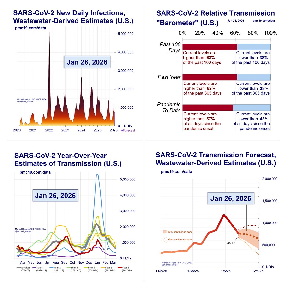
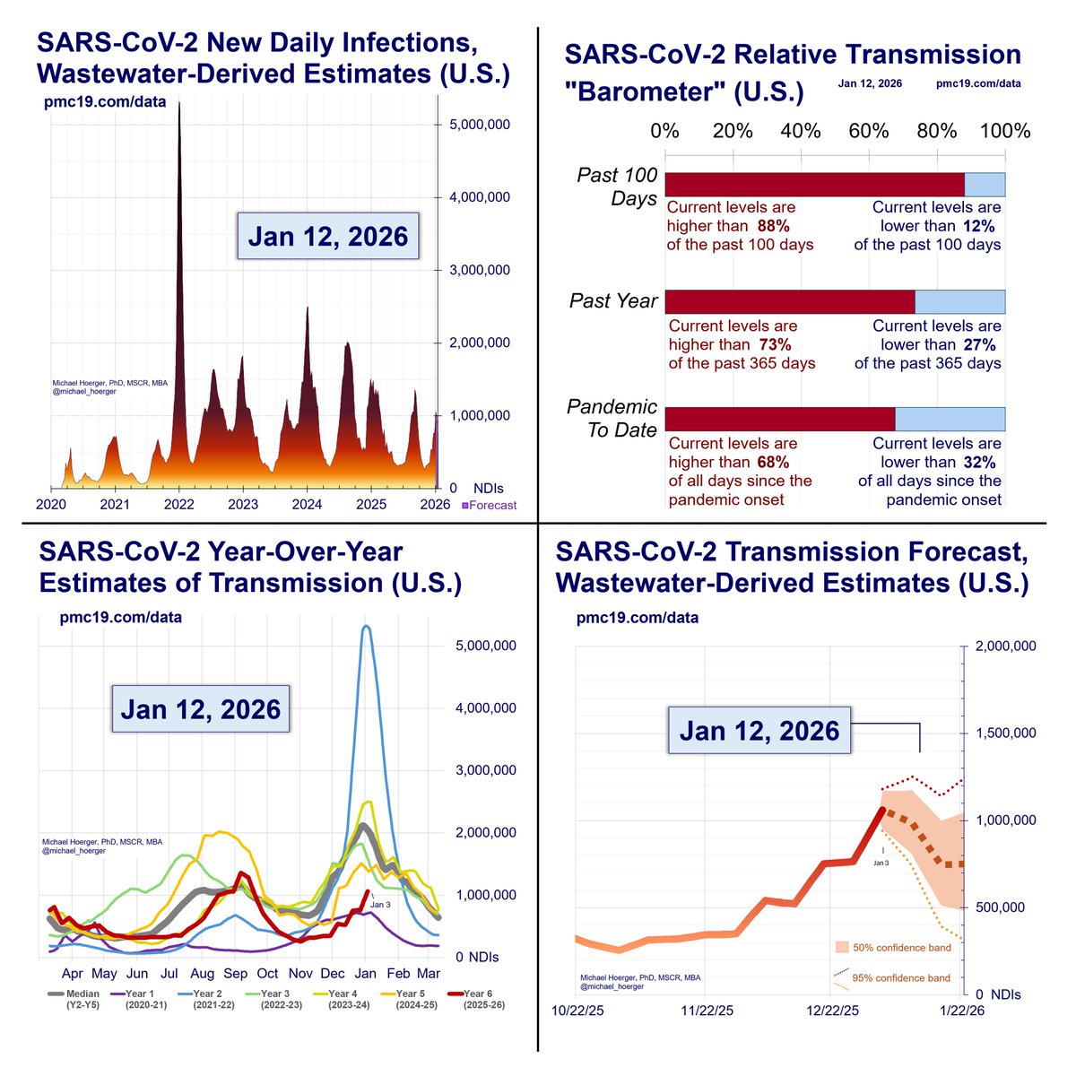
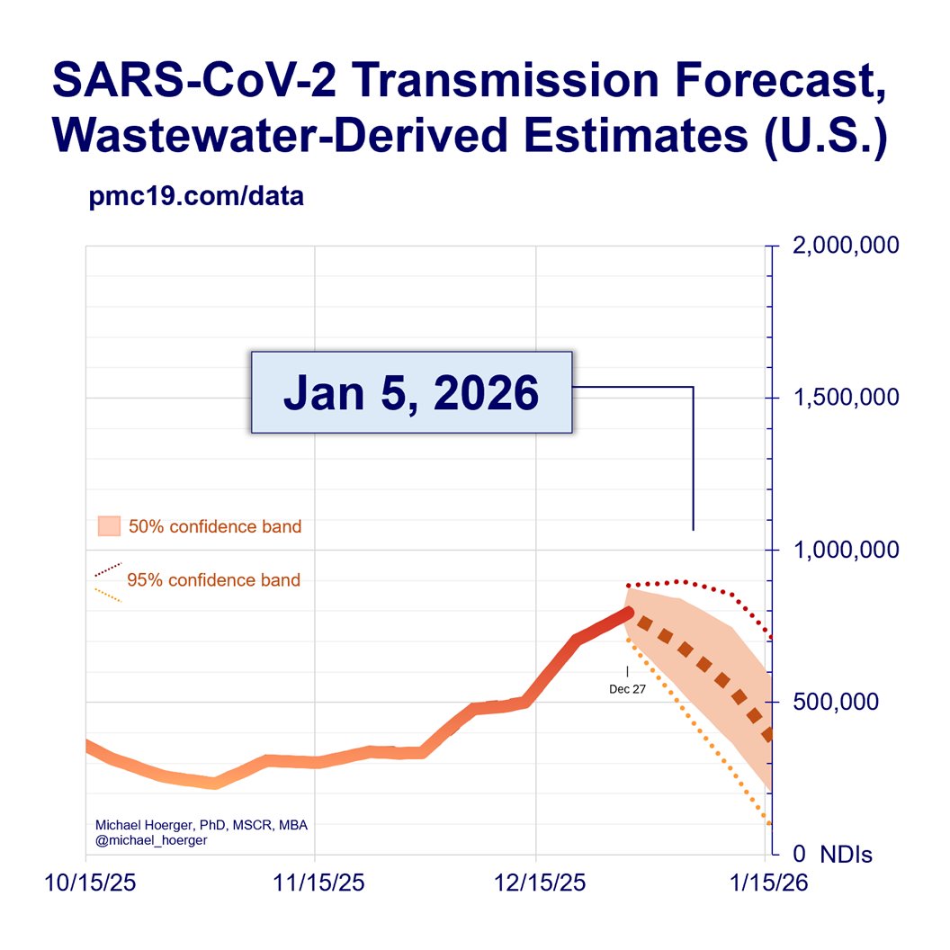
2) Best-Case and Worst-Case Scenarios. In figure 3 (upper right of dashboard), we have added 50% and 95% confidence bands. See the Technical Appendix for estimation details. Essentially, consider the 50% band (shaded area) the normal variation, and the boundaries of the 95% band (light dashed lines) the worst- and best-case scenarios, barring something nearly unforeseen (approximately 2.5% chance of a worse or better scenario). We encourage non-scientists to provide feedback on that figure, as it is challenging to present more detailed data in ways that are easily digestible. In Version 1 of the forecast (Aug 2023-Aug 2024), we reported several forecasting models and a compositive. It's unclear how helpful this was to readers, as we got surprisingly little feedback on it. With 15 months of forecasting, we now have the data to provide meaningful confidence bands. If helpful, we will keep it. If not, we will change the graphical depiction or replace them.
Info for new readers:
For those unfamiliar with the PMC model, find full weekly reports for the past 14+ months at pmc19.com/data
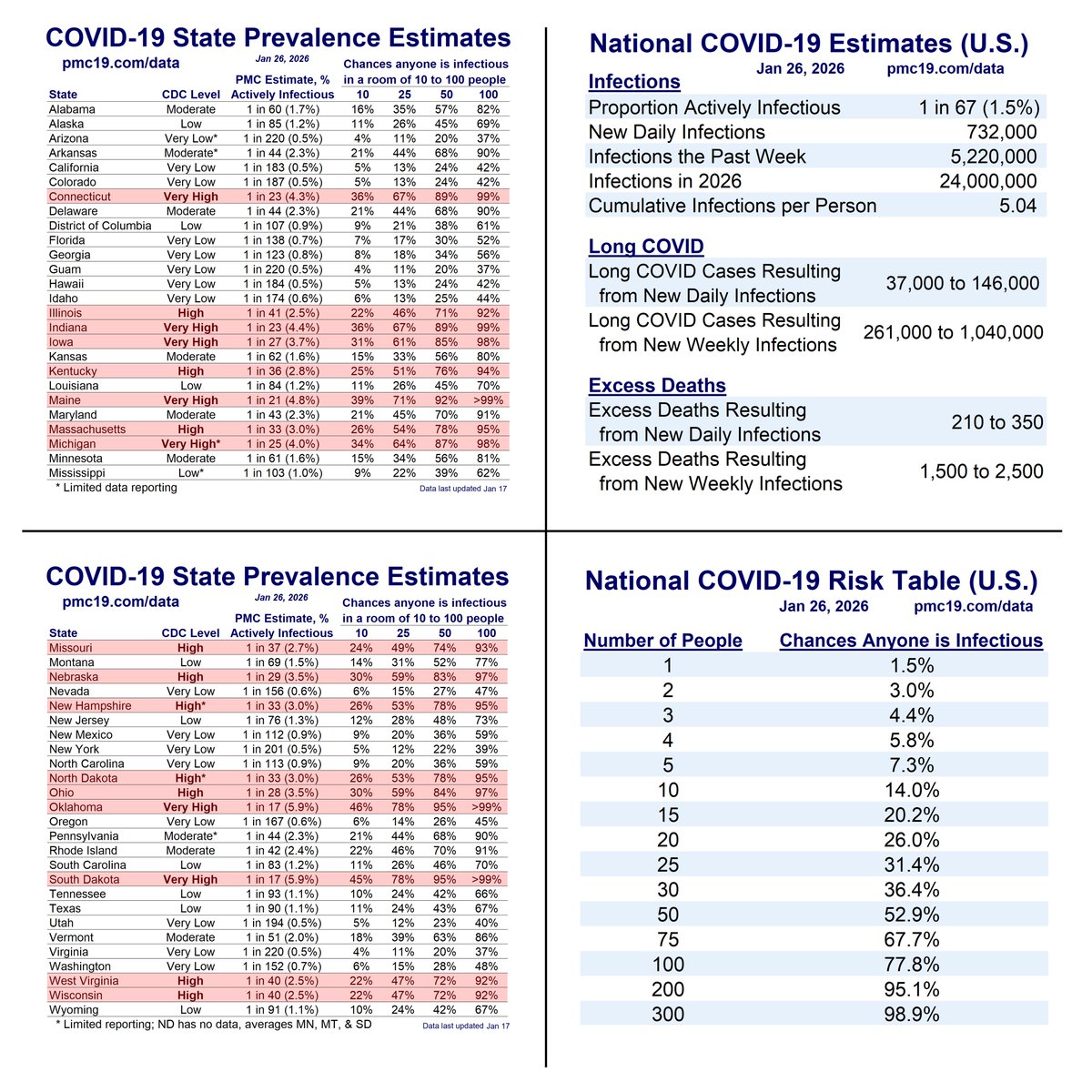
The models combine data from IHME, Biobot, and CDC to use wastewater to estimate case levels (r = .93 to .96) and forecast levels the next month based on typical (median) levels for that date and recent patterns of changes in transmission the past 4 weeks.
Our work has been cited in top scientific journals and media outlets, which are fully sourced in a detailed technical appendix at pmc19.com/data/PMC_COVID…
Examples include JAMA Onc, JAMA-NO, BMC Public Health, Time, People, TODAY, the Washington Post, the Institute for New Economic Thinking, Salon, Forbes, the New Republic, Fox, CBS, and NBC. See pgs 10-11 at the above link.
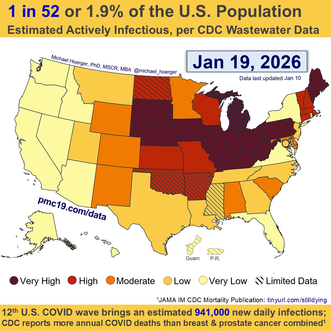
We're seeing an uptick in U.S. Covid transmission with 1 in 115 actively infectious.
The percentage of the population actively infectious has increased from 0.7% last week (based on updated data) to 0.9% this week.
The uptick is barring retroactive downward corrections.
We place the "lull point" as likely around Oct 20, but it could be +/- 2 weeks around that. Looking back at the late-summer wave, you'll see the date of the high point was quite arbitrary, and the same is true for the "lull."
There is presently considerable variation by region and even when examining the same region across different data sources. Some areas are still cooling off, while others are increasing markedly, as one would expect in the peri-lull area. There's also a lot of volatility across other data sources not included in our model (e.g., WastewaterSCAN up 43% nationally from Oct 18-25, but back down on the most recent data point on the 26th).
You'll note two updates in the current PMC forecasting model starting this week. These are described in detail in the technical appendix.
1) Biobot's sun rises again. 🌅 Our composite indicator of Covid transmission had been weighted 40% Biobot and 60% CDC. When Biobot abruptly stopped reporting for several weeks in a row during the summer wave, we were forced to downgrade them to 0% with no data coming in. After weeks of consistent reporting and a near-perfect correlation with recent CDC data (r=.95), we have re-included them in our current case-estimation model at 20% Biobot and 80% weight for CDC. Note, some of our pandemic "running total" estimates are marginally adjusted downward, as Biobot reported a slightly narrower (leptokurtic) late-summer wave. Having two high-quality data sources for estimating current transmission increases precision in real-time estimates and prepares for the eventuality that one source by experience a gap in reporting near the winter peak.
2) Best-Case and Worst-Case Scenarios. In figure 3 (upper right of dashboard), we have added 50% and 95% confidence bands. See the Technical Appendix for estimation details. Essentially, consider the 50% band (shaded area) the normal variation, and the boundaries of the 95% band (light dashed lines) the worst- and best-case scenarios, barring something nearly unforeseen (approximately 2.5% chance of a worse or better scenario). We encourage non-scientists to provide feedback on that figure, as it is challenging to present more detailed data in ways that are easily digestible. In Version 1 of the forecast (Aug 2023-Aug 2024), we reported several forecasting models and a compositive. It's unclear how helpful this was to readers, as we got surprisingly little feedback on it. With 15 months of forecasting, we now have the data to provide meaningful confidence bands. If helpful, we will keep it. If not, we will change the graphical depiction or replace them.
Info for new readers:
For those unfamiliar with the PMC model, find full weekly reports for the past 14+ months at pmc19.com/data
The models combine data from IHME, Biobot, and CDC to use wastewater to estimate case levels (r = .93 to .96) and forecast levels the next month based on typical (median) levels for that date and recent patterns of changes in transmission the past 4 weeks.
Our work has been cited in top scientific journals and media outlets, which are fully sourced in a detailed technical appendix at pmc19.com/data/PMC_COVID…
Examples include JAMA Onc, JAMA-NO, BMC Public Health, Time, People, TODAY, the Washington Post, the Institute for New Economic Thinking, Salon, Forbes, the New Republic, Fox, CBS, and NBC. See pgs 10-11 at the above link.

• • •
Missing some Tweet in this thread? You can try to
force a refresh