Mike Hoerger, PhD MSCR MBA Profile picture
Dec 3, 2024 1 tweets 2 min read Read on X
PMC COVID-19 Forecasting Model, Dec 2, 2024

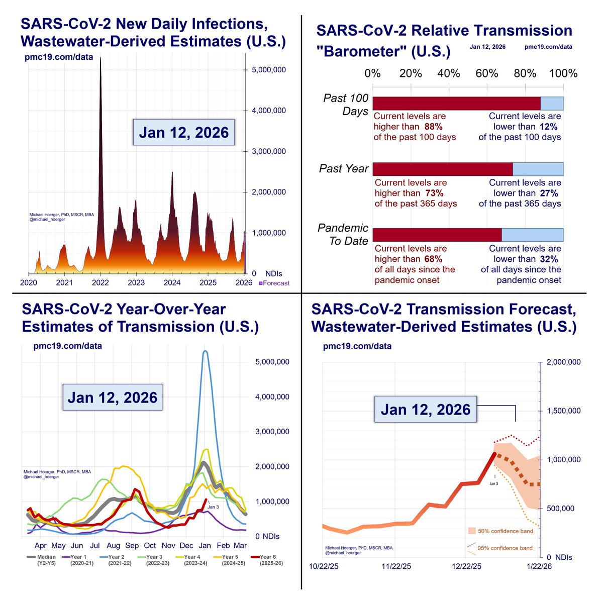
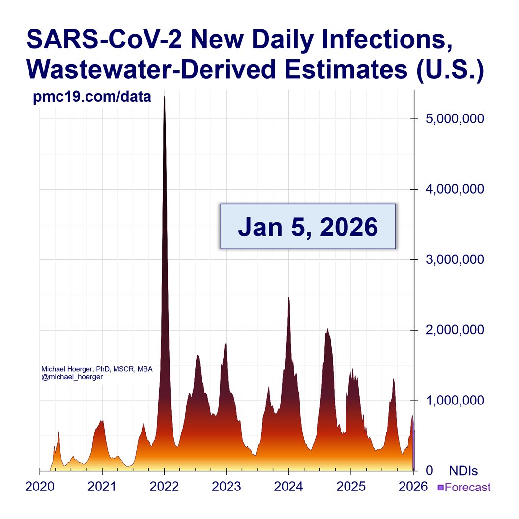
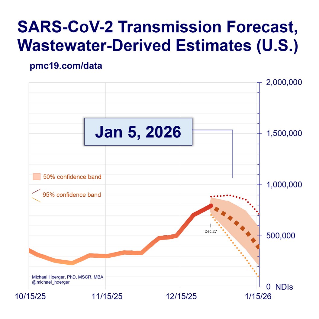
In a best-case scenario, we could see 700,000 daily infections/day near the peak. Worst-case, probably 1.4 million. These are all very bad levels of transmission, but nowhere near last winter, where we peaked near 2 million daily infections.

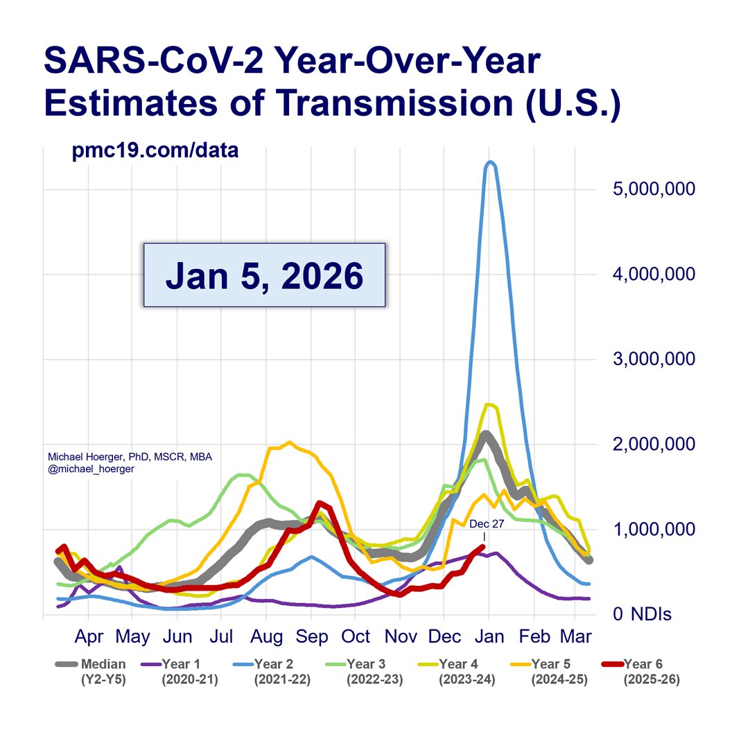
There's a reasonable chance the winter peak will be smaller than the summer wave. That's good news in terms of lower anticipated transmission, but bad news in that our lulls are bad and peaks are still terrible.

If the forecast holds, this will further challenge received public health wisdom that winter is necessarily "respiratory virus season," and suggest a need for closer monitoring of transmission and mitigation year round. We need to expand wastewater and testing-based surveillance programs, generate better consensus methodologic standards, and better link transmission levels to actionable public health guidance.

It remains to be seen how much this winter is an aberration. It could be a consequence of public health guidance switching to a 1-day isolation period that helped create such a large summer wave. Subvariant evolution has also been "lucky" the past several months.

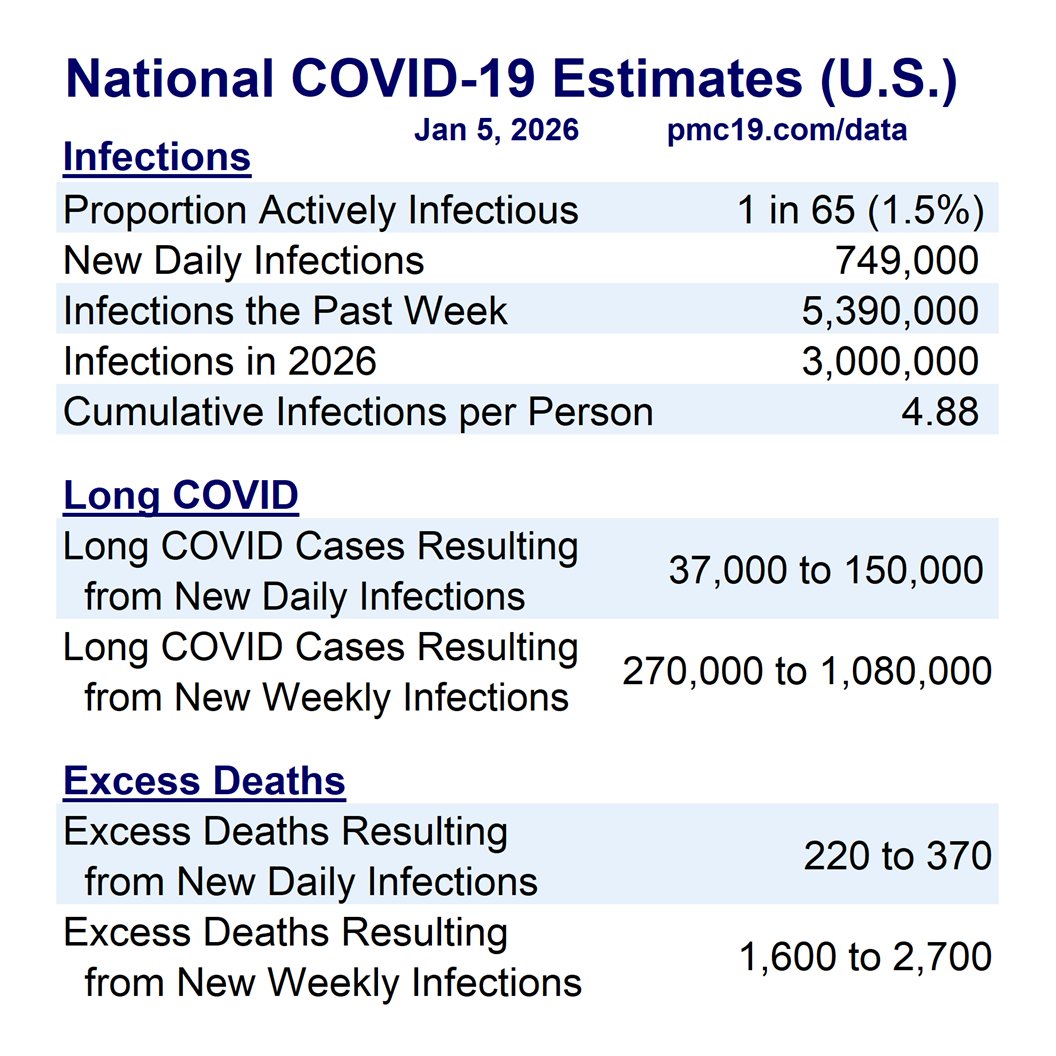
In terms of the raw numbers, transmission was up marginally for the week ending on Nov 23, leading into busy holiday travel and gatherings. The regional patterns are not clear, given variation across data sets.

There is no formal report on the website this week.

Info for new readers:

For those unfamiliar with the PMC model, find full weekly reports for the past 14+ months at pmc19.com/data

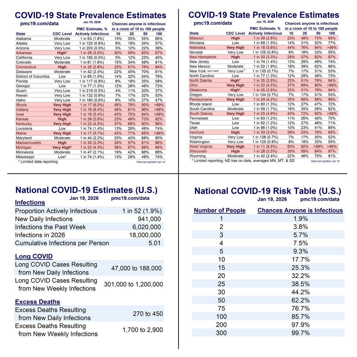
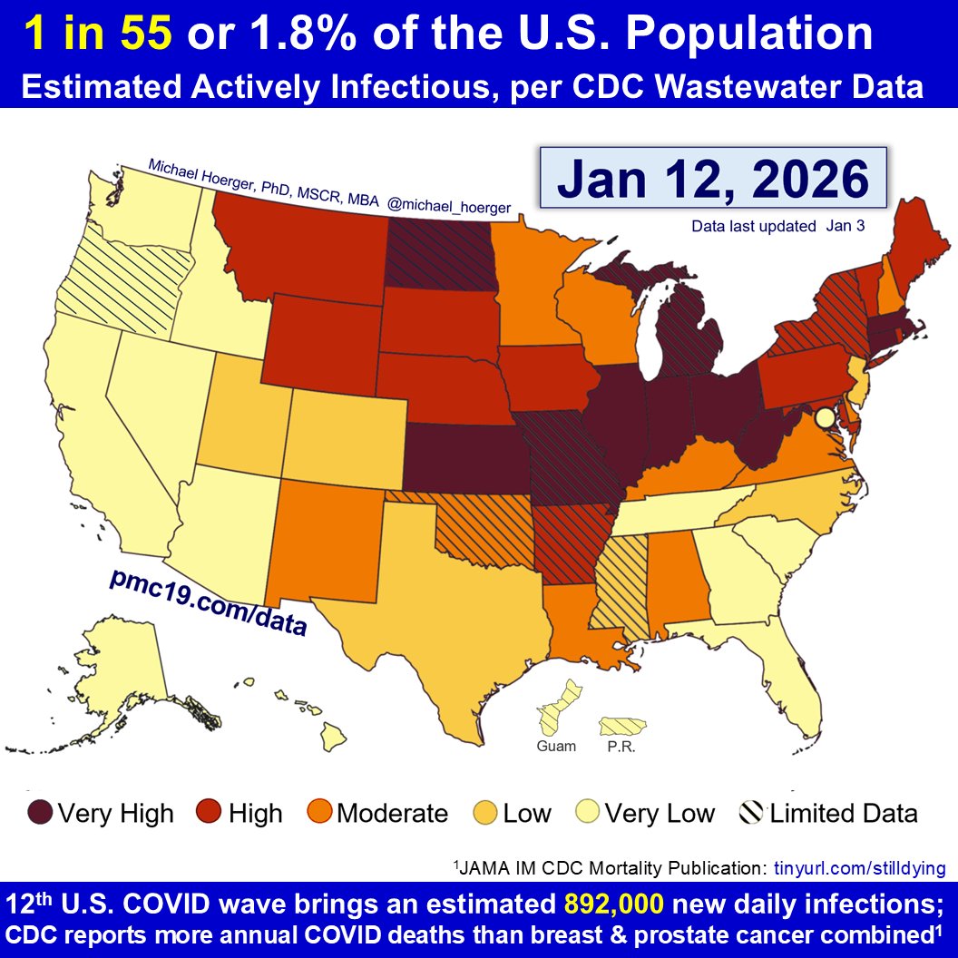
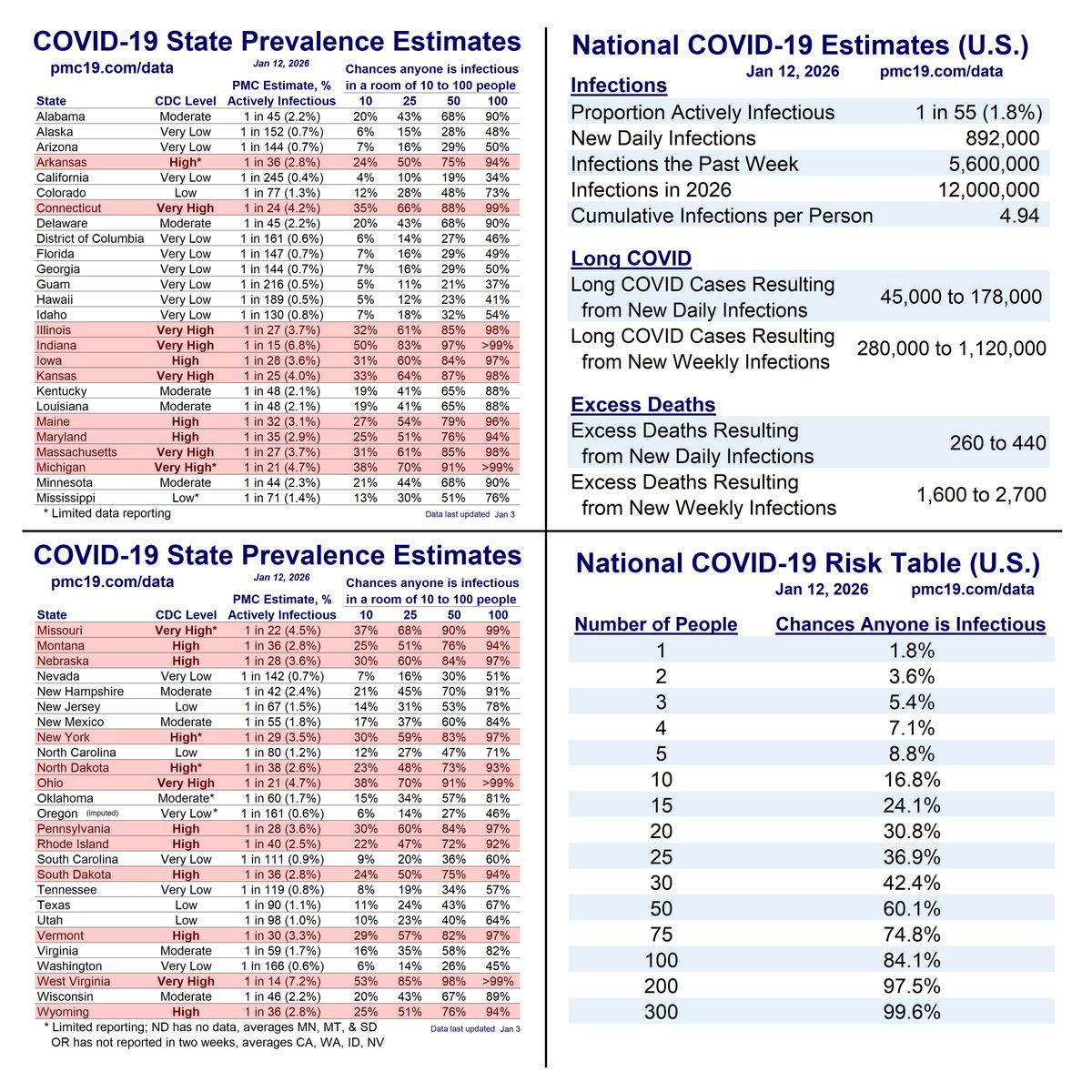
The models combine data from IHME, Biobot, and CDC to use wastewater to estimate case levels (r = .93 to .96) and forecast levels the next month based on typical levels for that date and recent patterns of changes in transmission the past 4 weeks.

Our work has been cited in top scientific journals and media outlets, which are fully sourced in a detailed technical appendix at pmc19.com/data/PMC_COVID…

Examples include JAMA Onc, JAMA-NO, BMC Public Health, Time, People, TODAY, the Washington Post, the Institute for New Economic Thinking, Salon, Forbes, the New Republic, Fox, CBS, and NBC. See pgs 11-13 at the above link.

We will have a pre-print out in the next month or two documenting very compelling evidence for the validity of using wastewater to estimate case rates.Year-over-year graph of Covid transmission in the U.S.  The estimates for the winter peak are summarized in Tweet.

• • •

Missing some Tweet in this thread? You can try to force a refresh
 

Keep Current with Mike Hoerger, PhD MSCR MBA

Mike Hoerger, PhD MSCR MBA Profile picture

Stay in touch and get notified when new unrolls are available from this author!

Read all threads

This Thread may be Removed Anytime!

PDF

Twitter may remove this content at anytime! Save it as PDF for later use!

Try unrolling a thread yourself!

how to unroll video
  1. Follow @ThreadReaderApp to mention us!

  2. From a Twitter thread mention us with a keyword "unroll"
@threadreaderapp unroll

Practice here first or read more on our help page!

More from @michael_hoerger

Jun 17
1) PMC COVlD Dashboard, June 16, 2025 (U.S.)

Current transmission (red line) closely tracks that of summer 2023 (yellow line).

We expect to break 500k daily infections between July 9 and the end of July. Our current forecast...Year over year graph of tranmission
2) PMC COVlD Dashboard, June 16, 2025 (U.S.)

Our current forecast is a bit more aggressive, predicting breaking 500k daily infections by July 9. The 2023 trend suggests end of July.

The 95% confidence interval shows large variation. Note that...Past 12 months of transmission (U.S.) and forecast
3) PMC COVlD Dashboard, June 16, 2025 (U.S.)

Note that CDC and Biobot both had retroactive corrections to last week's data, meaning the relative "lull" will last a little longer than the uncorrected data suggested. No big news on NB.1.8.1.

All good news, but...10 pandemic waves. Soon 11
Read 7 tweets
Jun 16
1) Here's a quick example of how the federal government is censoring the best scientific research. It's not just cuts to ongoing research.

It's new grant submissions too... "No forbidden words found"
2) In January, I re-submitted a promising Covid/cancer grant to a non-federal funder. Hundreds of pages. Hundreds of hours of work. The best proposal I've submitted as a scientist.

Out of curiosity, I used Sean Mullen's Scan Assist tool to see how many banned words it had...
3) The proposal had 1,750 banned words. No big deal -- they're non-federal.

BUT I had planned to submit a smaller version to NIH this month as a "back up." Impossible!

It's not a matter of using a thesaurus or the find/replace command. The grant is on *Covid*... 1,750 banned words found
Read 13 tweets
Jun 9
1) PMC COVlD Dashboard, June 9, 2025

CDC wastewater surveillance data show transmission rising. This is our forecast if transmission growth follows typical patterns.

The high & low estimates could be thought of as optimistic & pessimistic scenarios for NB.1.8.1.Forecast graph: Rising transmission the next month
2) PMC COVlD Dashboard, June 9, 2025

Notice that current transmission (red line, lower left) tracks closely with two years ago (yellow), slightly below the median (gray), and not far below last year (orange).

Consider each of these trajectories realistic scenarios.Image
3) PMC COVlD Dashboard, June 9, 2025

All indications are that we are headed into the start of an 11th national wave in the U.S.

We could percolate near the lull point another couple weeks (fingers crossed), but that scenario is becoming less likely.Graph of 10 C19 waves
Read 7 tweets
Jun 3
1/ PMC COVlD Dashboard, June 2, 2025 (U.S.)

National COVlD transmission recently fell to its lowest levels since the pre-Delta era.

It's go-time for many who have delayed medical appointments. The situation will likely get much worse in Jul/Aug.
2/ PMC COVlD Dashboard, June 2, 2025 (U.S.)

An estimated 1 in 211 are actively infectious. Most states are "low" or "very low" per CDC.

The situation remains serious even in a relative "lull." >1.5 million weekly estimated infections to result in 600-900 excess deaths.C19 heat map
year over year graph, tracking closely with the median and past 2 years
Current Levels for Jun 2, 2025	 % of the Population Infectious	 0.5% (1 in 211)	 New Daily Infections	 227000	 New Weekly Infections	 1589000	 Resulting Weekly Long COVID Cases	 79,000 to 318,000	 Resulting Weekly Excess Deaths	 600 to 900	 	 Monthly Forecast	 Average % of the Population Infectious	 0.7% (1 in 139)	 Average New Daily Infections	 344566.6667	 New Infections During the Next Month	 10337000	 Resulting Monthly Long COVID Cases	 517,000 to 2,067,000	 Resulting Monthly Excess Deaths	 3,700 to 6,200	 	 Running Totals	 Infections Nationwide in 2025	 70132000	 Average Number of Infe...
Graph of the whole pandemic, 11th wave forthcoming
3/ PMC COVlD Dashboard, June 2, 2025 (U.S.)

By the end of the month, we forecast an increase to 450k daily infections. If NB.1.8.1 takes off, closer to 600k. If overhyped, percolating only slightly higher.Past 12 months and forecast
Read 5 tweets
May 26
1) PMC Dashboard, May 26, 2025 (U.S.)

The lull exit is coming. Despite being in a lull:

🔥1 in 180 actively infectious
🔥1.9 million weekly infections
🔥>93,000 new #LongCOVID cases from the week's infections
🔥1,100 excess deaths from the week's infections

This is a "lull."
2) PMC Dashboard, May 26, 2025 (U.S.)

The forecast calls for a near-doubling in transmission the next month to 450k daily infections.

The 95% confidence interval includes flat transmission (percolating), or escalating to 650k (if NB.1.8.1 takes off). Forecasting graph, summarized in post
3) PMC Dashboard, May 26, 2025 (U.S.)

Looking at year-over-year transmission, 2025 (red) is closely tracking the median (gray).

It transmission accelerates, it could look more like last year (orange). If it slows, more like two years ago (yellow). Year-over-year graph summarized in post
Read 7 tweets
May 25
1) CDC & Biobot wastewater surveillance both show the West region in an apparent uptick in C19 transmission.

Here's the graph of regional transmission from CDC data with the West in green: Estimated Percentage Actively Infectious*						 		PMC Model		Raw CDC Data		 	National	0.6% (1 in 180)		0.5% (1 in 196)		 	Northeast	0.4% (1 in 236)		0.4% (1 in 257)		 	Midwest	0.5% (1 in 209)		0.4% (1 in 227)		 	South	0.6% (1 in 160)		0.6% (1 in 175)		 	West	0.8% (1 in 129)		0.7% (1 in 140)
2) This image zooms in on the West (green line) so you can see the apparent departure from the C19 lull more easily. Zoomed in graph from prior post. More stats in the ALT text there.
3) Biobot still provides national & regional C19 updates. They usually post sometime between Thursday morning & Saturday evening. IMO, their most recent data point can be viewed as the Wednesday of the prior week.

Like the CDC, they have an apparent uptick in the West (green). Biobot graph. What's striking is that the peak (for any region) is almost identical the past 3 waves, though the West apparently runs cooler on average. The West is presently highest and increasing, whereas the other regions are lower and still trending down at the time of these data.
Read 6 tweets

Did Thread Reader help you today?

Support us! We are indie developers!


This site is made by just two indie developers on a laptop doing marketing, support and development! Read more about the story.

Become a Premium Member ($3/month or $30/year) and get exclusive features!

Become Premium

Don't want to be a Premium member but still want to support us?

Make a small donation by buying us coffee ($5) or help with server cost ($10)

Donate via Paypal

Or Donate anonymously using crypto!

Ethereum

0xfe58350B80634f60Fa6Dc149a72b4DFbc17D341E copy

Bitcoin

3ATGMxNzCUFzxpMCHL5sWSt4DVtS8UqXpi copy

Thank you for your support!

Follow Us!

:(