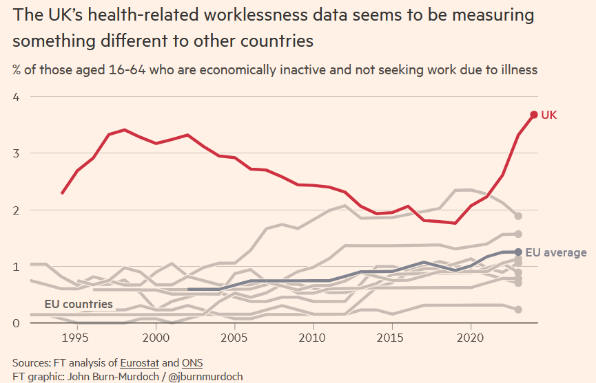
There was an article in the FT this weekend, purporting to discover that there has been no increase in illness in Britain - merely an increase in people claiming more generous health benefits.
1/16
1/16
https://x.com/FT/status/1864965532614602982
I was surprised to see it's by the normally reality-based @jburnmurdoch.
In some ways, the 'mirage' he's arguing against is one of his own making. He candidly admits over-estimating his 2022 view that Britain's ill health made it an outlier in Europe.
2/16
In some ways, the 'mirage' he's arguing against is one of his own making. He candidly admits over-estimating his 2022 view that Britain's ill health made it an outlier in Europe.
2/16

@jburnmurdoch His 2022 view was the same sort of view that @RoryStewartUK expresses here: the idea that we're now post-pandemic, and that Europe recovered but Britain didn't.
3/16
3/16
https://x.com/implausibleblog/status/1862283967879422202
@jburnmurdoch @RoryStewartUK I'll set aside the 'post-pandemic' illusion, even though acknowledging the reality that the pandemic continues is critical to understanding the present.
What seems to be a mirage is the assumption of Europe's recovery.
4/16
What seems to be a mirage is the assumption of Europe's recovery.
4/16
@jburnmurdoch @RoryStewartUK Europe continues to see severe illness-related problems that mirror the UK's, whether they show up on Eurostat on not.
Here for example is one of Germany's health insurance companies noting that sickness is still rocketing upwards in Oct 2024.
5/16tk.de/presse/themen/…
Here for example is one of Germany's health insurance companies noting that sickness is still rocketing upwards in Oct 2024.
5/16tk.de/presse/themen/…
@jburnmurdoch @RoryStewartUK Back to the FT article.
What @jburnmurdoch concludes is that rates of illness in the UK reflect numbers claiming sickness benefits (rather than the other way round).
6/16
What @jburnmurdoch concludes is that rates of illness in the UK reflect numbers claiming sickness benefits (rather than the other way round).
6/16
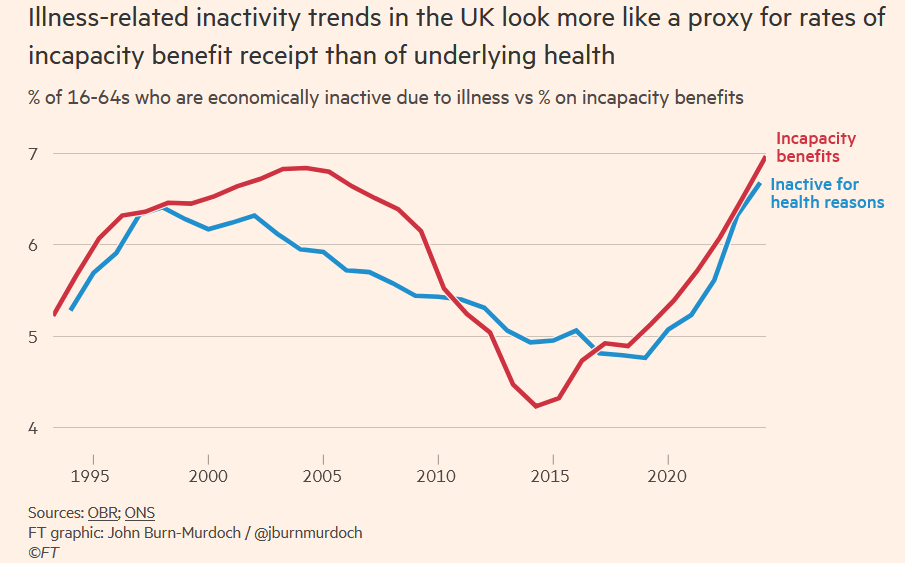
@jburnmurdoch @RoryStewartUK Therefore the rise in disability is not a rise in actual ill health, but in benefits-seeking.
This is the point at which my jaw dropped.
7/16
This is the point at which my jaw dropped.
7/16
@jburnmurdoch @RoryStewartUK There's a vagueness here that betrays a complete lack of understanding of how current benefits work.
I can see the theory, but it doesn't match reality. Where on earth is he getting the idea that health-based benefits are anything but incredibly difficult to get?
8/16
I can see the theory, but it doesn't match reality. Where on earth is he getting the idea that health-based benefits are anything but incredibly difficult to get?
8/16
@jburnmurdoch @RoryStewartUK It turns out that his source for real-life experience with disability benefits is, er, the recently-resigned editor of The Spectator, Fraser Nelson.
He would have done better to read the IFS report he links to more closely.
9/16
He would have done better to read the IFS report he links to more closely.
9/16
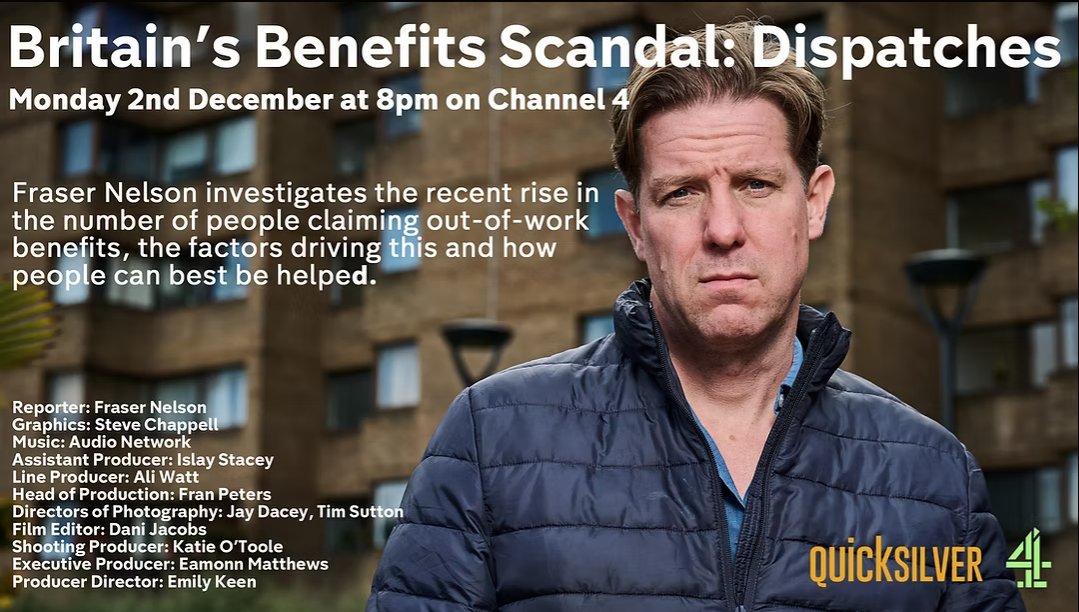
@jburnmurdoch @RoryStewartUK Can anyone think of any reasons that Fraser Nelson might not be the most reliable source of information on disability and benefits?
(There are many reasons, but this one's probably the most pungent.)
10/16
(There are many reasons, but this one's probably the most pungent.)
10/16

@jburnmurdoch @RoryStewartUK Back to the headline claim: long-term illness is unchanged. Is this true?
The article relies on the Health Survey for England data, which only covers up to 2022, and surveyed 9000 people.
11/16files.digital.nhs.uk/6C/753EC3/Heal…
The article relies on the Health Survey for England data, which only covers up to 2022, and surveyed 9000 people.
11/16files.digital.nhs.uk/6C/753EC3/Heal…
@jburnmurdoch @RoryStewartUK John says, let's "simply ask people if they have a long-term illness".
The HSE doesn't do that, not quite; but there is a very good survey that does exactly that - the NHS GP-Patient Survey.
And that survey is actually up to date.
12/16
The HSE doesn't do that, not quite; but there is a very good survey that does exactly that - the NHS GP-Patient Survey.
And that survey is actually up to date.
12/16
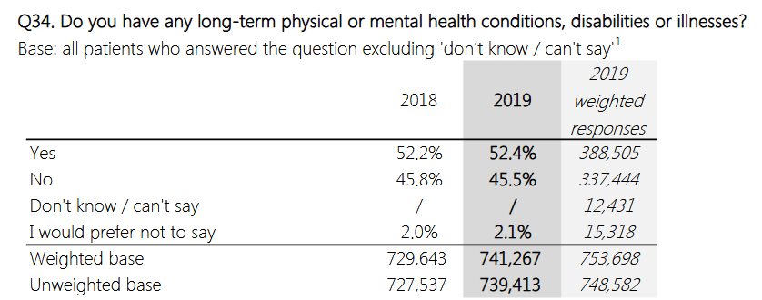
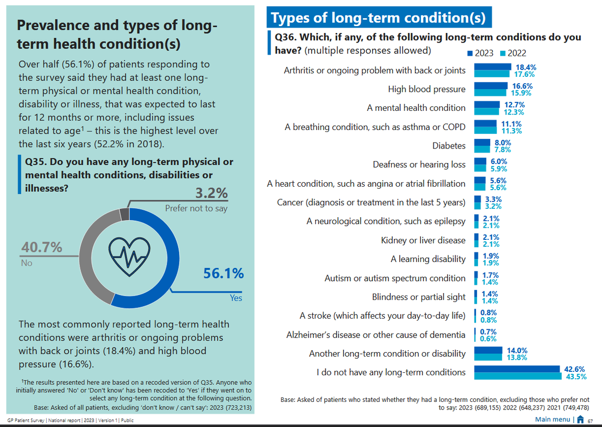
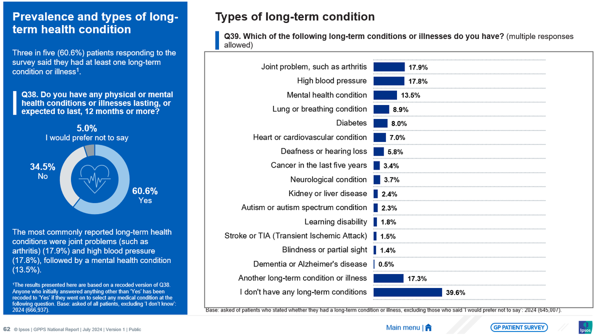
@jburnmurdoch @RoryStewartUK The GPPS for 2024 shows something very different from the HSE. The sample size is over 700,000.
In the GPPS, we see long-term conditions climbing from 52.4% in 2019, to 56.1% in 2023 and then 60.6% in 2024
13/16
In the GPPS, we see long-term conditions climbing from 52.4% in 2019, to 56.1% in 2023 and then 60.6% in 2024
13/16
@jburnmurdoch @RoryStewartUK John might reasonably reply that the NHS GPPS covers everyone, not just working-age people. Maybe it's all older people getting sicker?
After all, he's specifically concerned with worklessness.
14/16
After all, he's specifically concerned with worklessness.
14/16
@jburnmurdoch @RoryStewartUK Fortunately, the NHS GPPS breaks its data down to cover this too.
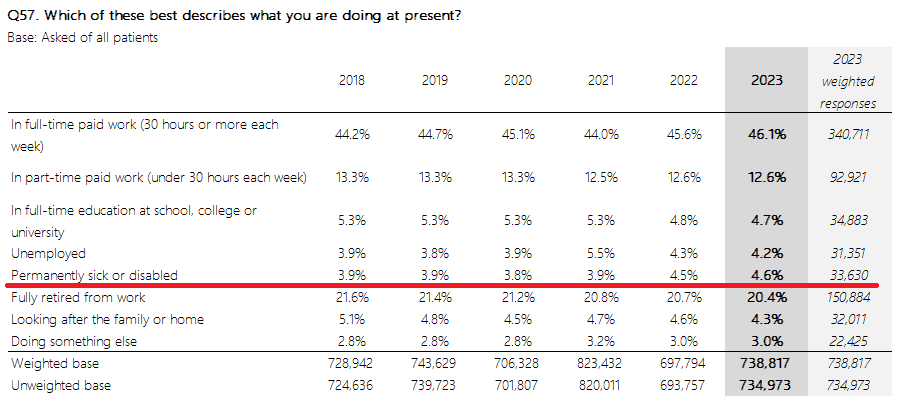
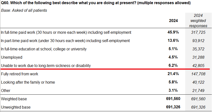
From 2018 to 2021 those who were too sick to work were fairly stable at 3.9%.
Then, a series of jumps to 4.5%, 4.6%, and this year, 6.2%.
15/16
From 2018 to 2021 those who were too sick to work were fairly stable at 3.9%.
Then, a series of jumps to 4.5%, 4.6%, and this year, 6.2%.
15/16
@jburnmurdoch @RoryStewartUK I like the FT's data-driven reporting. And I know this article is an opinion article.
But in my opinion, too much theorizing in advance of (or the absence of) the relevant data has led it to some wild and harmful conclusions.
16/ends
But in my opinion, too much theorizing in advance of (or the absence of) the relevant data has led it to some wild and harmful conclusions.
16/ends
• • •
Missing some Tweet in this thread? You can try to
force a refresh