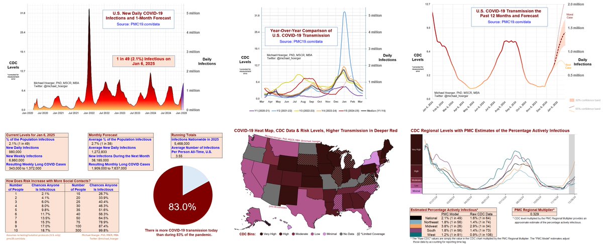
📈1 in 49 people actively infectious
🔥Nearly 1 million daily infections
🎲About a 50-50 chance someone has COVID in a large class if typical risk and no testing/isolating
🏥300,000+ new Long Covid conditions per week
The infections are likely minor underestimates. AZ and OR did not report this week. They were surging, so the lack of data brings down the average. As well, the model gives 80% weight to CDC wastewater data and 20% weight to Biobot, but Biobot took the week off, so this is dependent on observed changes in the CDC data.
It would be wise to add multiple imputation into the model to account for all the non-random missingness during surges, but I won't likely get to that anytime soon.
The peak is looking more and more like 1.4 million daily infections, but I wouldn't be surprised if it's earlier than shown and more like 1.3 million, based on the pattern of retroactive data corrections last winter. If the real-time data really stink, it could come in closer to 1.0-1.1 million. To top 1.6 million, we would probably need some serious immune escape that at present I just don't see happening. However, in past winters, transmission was declining nationally in early/mid January, and back-to-school is a wild card.
Info for new readers:
For those unfamiliar with the PMC model, find full weekly reports for the past 1.5 years at pmc19.com/data
The models combine data from IHME, Biobot, and CDC to use wastewater to estimate case levels (r = .93 to .96) and forecast levels the next month based on typical levels for that date and recent patterns of changes in transmission the past 4 weeks. Our work has been cited in top scientific journals and media outlets, which are fully sourced in a detailed technical appendix at pmc19.com/data/PMC_COVID…
Examples include JAMA Onc, JAMA-NO, BMC Public Health, Time, People, TODAY, the Washington Post, the Institute for New Economic Thinking, Salon, Forbes, the New Republic, Fox, CBS, NBC, and CNN. See pgs 11-13 at the above link.
We will have a pre-print out in the next week or so documenting very compelling evidence for the validity of using wastewater to estimate case rates. Forecasting is challenging in the context of the current viral evolution, but the real-time estimates of cases are impressively accurate to the best we can evaluate it.
#MaskUp #VaxUp #CleanTheAir #RapidTest
2) PMC COVID-19 Dashboard, Jan 6, 2025 (U.S.)
We're in the 10th wave of the pandemic (1st graph), and transmission this year has picked up atypically late, while coming on strong (2nd graph).
3) PMC COVID-19 Dashboard, Jan 6, 2025 (U.S.)
Note that sputtering in the West's rise is likely an aberration, as surging OR and AZ did not provide data this week.
I recently learned of a new strategy to get more clean indoor air to people's homes. I don't believe I've heard anyone mention this on here, but please add if you have made inroads.
1/
Last August, I was surprised to learn that Entergy, our regional energy company, was giving away free HEPA filters to customers.
This was surprising to me. Why would an energy company do this?
2/
Apparently, most jurisdictions in the U.S. have regulations that require a portion of consumers' energy payments to go toward an energy efficiency fund.
These are often used for discounts on thermostats but occasionally for Energy Star appliances.
3/
2) This is one of the better scenarios I noted, with national levels coming in at about 3.33. Unfortunately, the rise was a little lower than anticipated only because transmission slowed in the west. Not uniform, so lots of uncertainty.
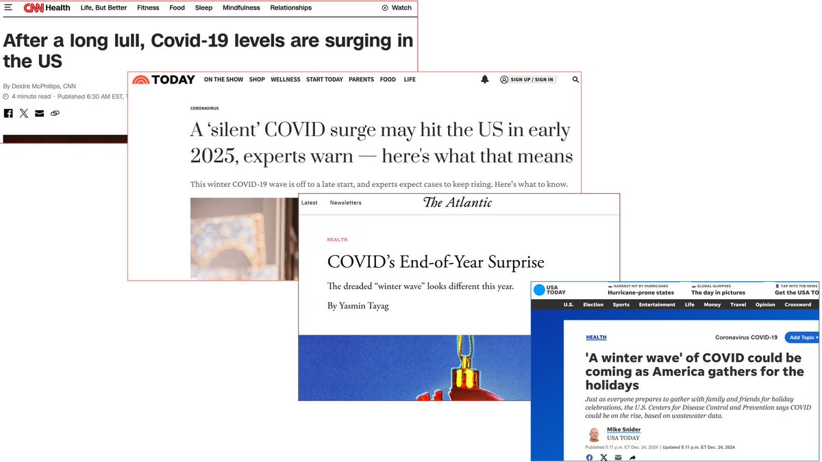
3) Transmission remains much higher than people realize. Many will get caught off guard by a seemingly #SilentSurge. This is in part because the CDC spent the past month downplaying numbers in misleading graphs.
🔹1 in 64 (1.6%) actively infectious in the U.S.
🔹750,000 new daily infections and rising
🔹Highest % increase in transmission in nearly 3 years
🔹10th wave is the "silent surge," coming on late out of nowhere
The video will walk you through each of the graphs on the dashboard and covered in this thread.
Info for new readers:
For those unfamiliar with the PMC model, find full weekly reports for the past 14+ months at pmc19.com/data
The models combine data from IHME, Biobot, and CDC to use wastewater to estimate case levels (r = .93 to .96) and forecast levels the next month based on typical levels for that date and recent patterns of changes in transmission the past 4 weeks.
Our work has been cited in top scientific journals and media outlets, which are fully sourced in a detailed technical appendix at pmc19.com/data/PMC_COVID…
Examples include JAMA Onc, JAMA-NO, BMC Public Health, Time, People, TODAY, the Washington Post, the Institute for New Economic Thinking, Salon, Forbes, the New Republic, Fox, CBS, and NBC. See pgs 11-13 at the above link.
We will have a pre-print out in the next month documenting very compelling evidence for the validity of using wastewater to estimate case rates. Forecasting is challenging in the context of the current viral evolution, but the real-time estimates of cases are impressively accurate to the best we can evaluate it.
PMC COVID-19 Dashboard, Dec 16, 2024
🧵2 of 8
🔹10th wave taking off (U.S.)
🔹5 million infections expected this week
🔹>250,000 post-infection conditions (#LongCovid) expected to develop from this week's infections
🔹Higher transmission than 73% of the pandemic
Info for new readers (as noted in Tweet 1):
For those unfamiliar with the PMC model, find full weekly reports for the past 14+ months at pmc19.com/data
The models combine data from IHME, Biobot, and CDC to use wastewater to estimate case levels (r = .93 to .96) and forecast levels the next month based on typical levels for that date and recent patterns of changes in transmission the past 4 weeks.
Our work has been cited in top scientific journals and media outlets, which are fully sourced in a detailed technical appendix at pmc19.com/data/PMC_COVID…
Examples include JAMA Onc, JAMA-NO, BMC Public Health, Time, People, TODAY, the Washington Post, the Institute for New Economic Thinking, Salon, Forbes, the New Republic, Fox, CBS, and NBC. See pgs 11-13 at the above link.
We will have a pre-print out in the next month documenting very compelling evidence for the validity of using wastewater to estimate case rates. Forecasting is challenging in the context of the current viral evolution, but the real-time estimates of cases are impressively accurate to the best we can evaluate it.
PMC COVID-19 Dashboard, Dec 16, 2024
🧵3 of 8
Areas of the U.S. depicted in darker red have higher transmission, as of 9 days ago. The map uses CDC data and is simply the CDC "cool blue" map recolored in more traditional red, which is best practices.
The line graph shows transmission increasing by region.
For those unfamiliar with the PMC model, find full weekly reports for the past 14+ months at pmc19.com/data
The models combine data from IHME, Biobot, and CDC to use wastewater to estimate case levels (r = .93 to .96) and forecast levels the next month based on typical levels for that date and recent patterns of changes in transmission the past 4 weeks.
Our work has been cited in top scientific journals and media outlets, which are fully sourced in a detailed technical appendix at pmc19.com/data/PMC_COVID…
Examples include JAMA Onc, JAMA-NO, BMC Public Health, Time, People, TODAY, the Washington Post, the Institute for New Economic Thinking, Salon, Forbes, the New Republic, Fox, CBS, and NBC. See pgs 11-13 at the above link.
We will have a pre-print out in the next month documenting very compelling evidence for the validity of using wastewater to estimate case rates. Forecasting is challenging in the context of the current viral evolution, but the real-time estimates of cases are impressively accurate to the best we can evaluate it.
PMC COVID-19 Forecasting Model, Oct 21, 2024
🧵1 of 4
Every indication is that the 10th U.S. Covid wave is on the way. Within 2 weeks, expect transmission to be meaningfully higher.
Current estimates from PMC:
🔹1 in 115 actively infectious
🔹Higher transmission than during 43% of the pandemic
🔹Nearly 3 million weekly infections
These estimates are high in the absolute sense, but low relative to the recent summer wave and likely winter surge.
The CDC data show transmission increasing in the Northeast, and a slowing of the decline in transmission elsewhere. Biobot data also show flattening transmission. The raw CDC and Biobot wastewater data are delayed >1 week. Walgreens shows positive cases, testing, and positivity ratios flattening and is delayed only 1 day.
For those unfamiliar with the model, find full weekly reports for the past 14+ months at pmc19.com/data
The models combine data from IHME, Biobot, and CDC to use wastewater to estimate case levels (r = .93 to .96) and forecast levels the next month based on typical (median) levels for that date and recent patterns of changes in transmission the past 4 weeks.
Our work has been cited in top scientific journals and media outlets, which are fully sourced in a detailed technical appendix at pmc19.com/data/PMC_COVID…
Examples include JAMA Onc, JAMA-NO, BMC Public Health, Time, People, TODAY, the Washington Post, the Institute for New Economic Thinking, Salon, Forbes, the New Republic, Fox, CBS, and NBC. See pgs 10-11 at the above link.
PMC COVID-19 Forecasting Model, Oct 21, 2024
🧵2 of 4
These graphs show the forecast for changes in transmission over the next month.
The first graph shows year-over-year transmission. The 2nd focuses on the most recent year. Within a month, expect to see 0.7 to 1.0 million daily infections, if the assumptions of the model hold.
If lucky, we could get a slightly longer "lull" than what the model shows. The model likely underestimates the true value for the recent summer peak because many children were infected while going back to school, in fact, the highest peak at that time period all-time. Wastewater underestimates child infections ("contributions" correlate highly with body weight, so it takes four ill 50 lb kids to show up as one ill 200 lb adult). In underestimating the peak, transmission also fell more rapidly than anticipated post-peak. To the extent we underestimated the magnitude of the peak, there may be fewer than anticipated infections the next two weeks and a longer lull.
If you look at the first graph, however, you will see a clear patterns of escalating transmission in November, so it's more a matter of how quickly the situation will worsen than whether it will worsen.
During this relative "lull," it's an excellent time to stock up on high-quality masks, get vaccinated, upgrade the quality and quantity of air cleaners, re-stock on rapid tests, and encourage others to do the same.
PMC COVID-19 Forecasting Model, Oct 21, 2024
🧵3 of 4
Regional differences suggest that the NE may already be rebounding in transmission. Transmission declines are slowing elsewhere.
We compare the PMC map in standard red against the CDC map using the same data in cool blue.
COVID transmission remains extremely high, but we're entering a "lull" in the U.S. sooner than anticipated.
Among all summer/fall waves, the 22% 1-week drop in transmission is steepest all-time.
Details:
In Friday's data release, the CDC retroactively corrected the prior week's numbers downward 6% (for Sep 14). This is a big correction, bigger than average, but nothing nefarious. The most recent week's numbers show an additional 1-week decline in transmission of 22% (from Sep 14 to Sep 21) on top of that 6% correction (for Sep 14), so the transmission estimates have fallen quickly.
Looking back, we estimate that the 1-week drop of 22% is the largest decline on the back end of any summer/fall wave in the U.S.
*If* these numbers hold against future retroactive corrections, it means people have about 5 weeks of similar transmission from today through Nov 7.
Why might we have seen a record decline in post-peak transmission?
Several hypotheses:
1) Reporting Error: The 22% decline could be driven in part by errors in real-time reporting. These average is 5%, based on our analyses of Biobot wastewater data. We do not have long-term data on the accuracy of Verily/CDC real-time reports versus retrospectively corrected values. In the updated graphic, we have added 95% confidence intervals for the real-time values based on Biobot data, which show that 95% of real-time errors fall within 8.33%. Note that the dotted lines do not show 95% confidence intervals for the forecast, merely how the best estimates would change if a large error in the real-time reports of +/- 8.33%. It’s possible that next week the data will get corrected upward, and the forecast will more resemble the top dashed line. In the next Tweet, we show the forecast for our old (Biobot-based model); it’s still showing a slower decline, but they update their data about 5 days slower than the CDC, so it is unclear whether it’s a big real-time reporting error at the CDC or just that the CDC is ahead of the game.
2) Unprecedented School Transmission: This is the largest wave during the August back-to-school period. It’s possible transmission disproportionately affected school children and their families, and in being more targeted than typical transmission, the wave went down faster that what is normative thus far in the pandemic.
3) Laissez Faire Public Health: Public health guidance has weakened (e.g., 1-day isolation policy, not strongly pushing additional mitigation), which likely pushed the peak of the 9th wave higher, which could have led to a faster-than-usual resolution. The model accounts for these changing dynamics reasonably well, but with the school issue noted in hypothesis #2, it is possible the weakened public health guidance disproportionately hit a subset of the population, which altered the back side of the wave.
4) Missing Data: There are no widespread state-level instances of missing data, as is often the case. It is possible that specific areas did not report this week, and if there is a bias toward higher transmission in those places, the numbers will get retroactively corrected upward. This is one example of the issues that contribute to #1.
5) Politics: There is no evidence to suggest the CDC is modifying transmission data for political reasons. We put deep trust in the fundamental scientists doing the critical work translating wastewater into meaningful downloadable data. The inferences, agency graphs, and guidance can be influenced by politics, but the data are sound, given the limitations noted under #1.
Overall, if the data hold or anything reasonable within the ballpark, which is likely, this means a more prolonged and slightly lower lull than previously anticipated. Those putting off medical appointments and other risky activities may see this as a slightly broader window (today through Nov 7) to get things done. Note that even under the most optimistic forecasting scenarios, transmission remains very high in absolute terms, even if low in relative terms.
Note that while the CDC data show an unprecedentedly steep decline, Biobot data suggest more gradual changes, along the lines we have been forecasting the past several weeks.
This graph shows a resurrected version of our discontinued model 1 (Biobot-only) forecast.
I would not be surprised if the CDC data get retroactively corrected upward a little bit (this is common, not nefarious), AND the Biobot data go down a bit faster (they lag the CDC data by about 5 extra days). There is regional variation between the data sets, which means that BOTH models could actually be accurate without corrections.
Nonetheless, anything in the ballpark of these two forecasts suggests a "lull" from about now through Nov 7. It's a very high lull, but people find these dates useful for risk-based planning.
The United States is coming down from a 9th Covid wave and will soon transition into a 10th.
We are still #DuringCOVID.
The peak will likely be around New Year's Eve, though some models suggest slightly later.
A 3-month forecast is extremely volatile. I mention it now because people are already making travel plans.
Hospitals should formalize their plans for requiring universal masking if they have not already done so. Many have missed the mark during the ongoing summer/fall wave due to reliance an outdated zeitgeist of "respiratory virus season" that treats cold, flu, and Covid at interchangeably equal. Covid peaks twice annually and is more disabling long-term. Nonetheless, even hospitals relying on outdated models will be more likely to take the forthcoming wave more seriously.
As we have published, universal masking during Covid waves is a key indicator of healthcare quality. Yes, this is true based on 2024 data. Unfortunately, it's mostly only the very best-of-the-best health centers. Consider printing and mailing this article to places where you receive care. jamanetwork.com/journals/jaman…