
Right you lovely people.
It's time to talk about the Third Bump again.
Strap in, this isn't good news.
It's time to talk about the Third Bump again.
Strap in, this isn't good news.
Just to give you a quick recap:
Before the pandemic started, annual rates of sickness, new onset disability, and death were pretty constant here.
You can see one of those strands of data in the 'NHS England Sickness Absence Rates'.
Here's a graph of the annual rate of sickness absence of NHS staff.
It starts in 2010, and covers up to 2019.
I'll fill the rest in gradually...
Here's a graph of the annual rate of sickness absence of NHS staff.
It starts in 2010, and covers up to 2019.
I'll fill the rest in gradually...
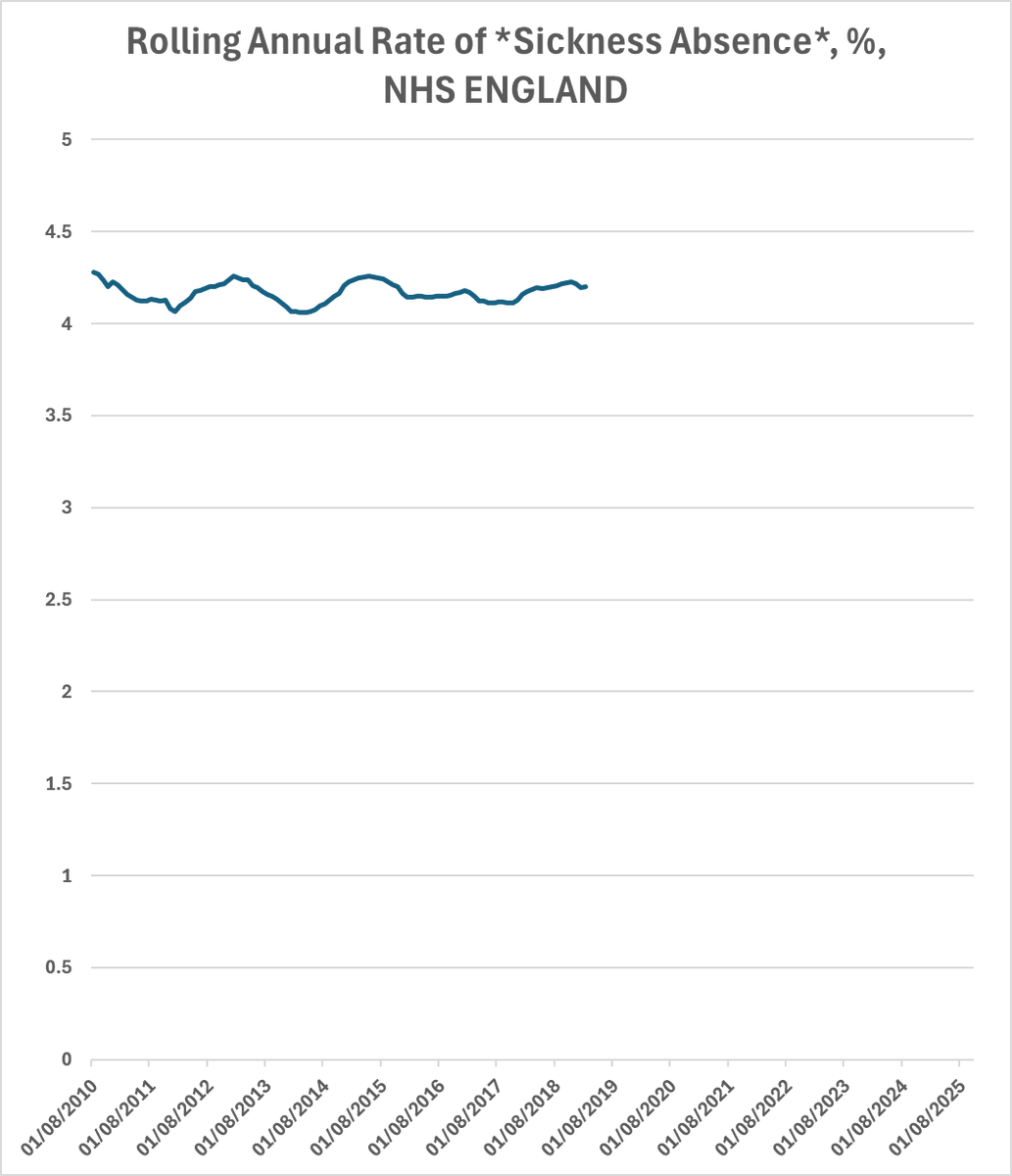
It's pretty constant.
There's the most minute fluctuation between 4.05% and 4.27% at its lowest and highest.
That's an annual variation of 0.11% from the pre-pandemic average.
There's the most minute fluctuation between 4.05% and 4.27% at its lowest and highest.
That's an annual variation of 0.11% from the pre-pandemic average.

But then.... at the end of 2019, along came a spider.
Covid.
And it started to hit *hard*.
So... if you've got a disease spreading that increases the risk of someone being sick and absent from work, what do you think would happen to that graph?
You'd get a bump.
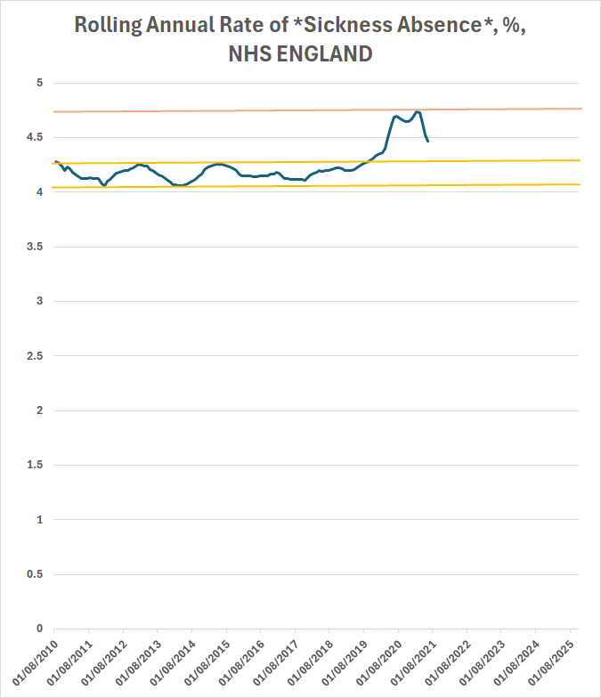
And there it is.
The first bump.
The first bump.

Why did that line drop?
Because we put into place really clumsy and badly organised restrictions on movement.
Because we put into place really clumsy and badly organised restrictions on movement.
We didn't tackle the actual problem: that Covid is spread by aerosols.
We just screwed up how our society works for a couple of months.
Seriously, those lockdowns were not much better than medieval lords trying to deal with the plague.
But meanwhile, some of us were trying to raise an alarm.
Not just the alarm about the first bump...
Not just the alarm about the first bump...
The alarm about the *Third Bump*.
https://x.com/1goodtern/status/1260892784611012608
The problem that some infections have *long term consequences*.
I know that's a scary concept.
We all want to think that medicine and science can solve everything or that our bodies are cleverer than viruses or that unicorn rainbows will make us well, but actually, none of that is true.
Actually, the truth is that there are *loads* of pathogens that start off seemingly mild and then cause *huge* problems.
Fricking anthrax, man.
Fricking anthrax, man.
https://x.com/1goodtern/status/1260892782979420160
I posted that tweet after working supporting a handful of people who had very obviously developed nasty *secondary infections* as a result of their covid infections.
And then I buried two of them.
It was clear that Covid infection was making people *vulnerable*.
So I started to worry about what I now call the Third Bump.
But let's not get ahead of ourselves.
We've just got over the first bump.
We've just got over the first bump.
At its worst, in terms of sickness leave in the NHS, the annual rate was 16% worse.

In the worst month in 2020, the absence rate peaked at 50% higher than the pre-pandemic average.
And let's not forget.
While the 'alarmists' like me were warning about the long term effects, loads of people were trying to tell you it was over.
That things were going back to normal.
While the 'alarmists' like me were warning about the long term effects, loads of people were trying to tell you it was over.
That things were going back to normal.
Those people were lying out of their faces.
Yeah.

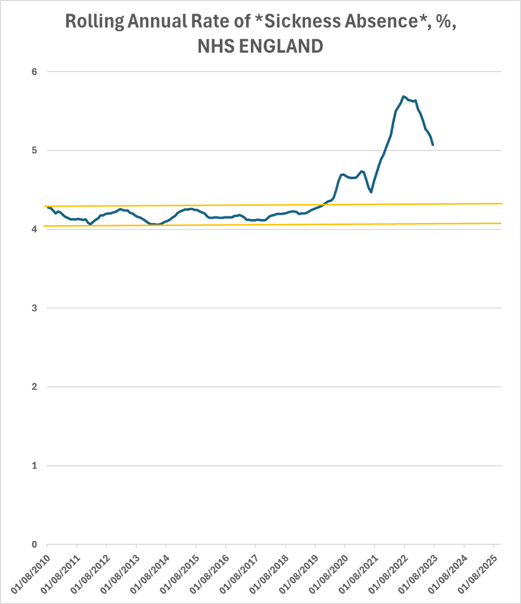
We're going to need a bigger graph.
This was the Second Bump.

Because even though people had been vaccinated which reduced some of the risk of illness and disability and death, the vaccines didn't eliminate *all* the illness, disability, and death.
And while the government told everyone to catch as much covid as they could to build up their immunity, it actually made people really sick, and caused a load of illness.
And death.
And disability.
This time, the increased sickness peaked at 70% above the pre-pandemic average.
But as it fell, people again started to pretend harder that it was all over.
Look! It's dropping! It's all over!
But while that was happening, some of us, the alarmists were warning again.
https://x.com/1goodtern/status/1598962260369559552
I was still seeing it weekly, people catching Covid and then developing other problems. Infections, medical conditions, long term health problems, cardio, neuro, developmental, respiratory, everything.
So I was primarily looking it from the point of view of seeing people in our community developing problems off the back of Covid.
But other people way cleverer than me were actually warning about the mechanisms by which Covid was causing the problems.
https://x.com/fitterhappierAJ/status/1482648398373306375
And what were we warning about?
**The Third Bump**
We were warning that Covid infections were making people vulnerable to all these other conditions and infections.
Because it was starting to look like absences or deaths or new onset disability were returning all the way back to normal.

And lo and behold.
The Third Bump started.

And then that third bump isn't just caused by *covid infections*, it's also caused by the fact that covid infections make you more vulnerable to other infections...
And covid infections make those other infections *more serious*.
🫤

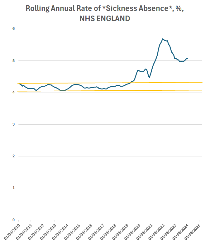
So... we're in The Third Bump.
How big will it be?
I don't know.
When will it end?
I don't know.
But here's the monthly rate of absence in NHS England.
(this is the data that the rolling annual rate is based on)
(this is the data that the rolling annual rate is based on)

The peak of absence comes a few months after October. (I know we're in March now, but the latest complete data available for the NHS is October)

So expect the Third Bump to keep growing for at least a little while.
And, sadly, I expect the effects of this to keep rising as long as people keep infecting each other with Covid.
Oh yeah... numbers... you like numbers...
Currently the rolling annual rate of sickness sits at TWENTY FOUR PERCENT above the pre-pandemic average.
So for every 4 people sick before the pandemic, there's one extra now.
@threadreaderapp, would you kindly unroll?
And let's not forget:
There's also still a massive number of nhs staff *dying* on the job too right now.
There's also still a massive number of nhs staff *dying* on the job too right now.
https://x.com/1goodtern/status/1892298240181104812?t=s5Cp-X4wpqX8RiknDnfy0Q&s=19
• • •
Missing some Tweet in this thread? You can try to
force a refresh


