Introducing the registry mcp. One command to make any component registry mcp-compatible.
Your Design System. Now with AI. Zero config.
We've got a lot to cover. Let's get started. ⬇️
Your Design System. Now with AI. Zero config.
We've got a lot to cover. Let's get started. ⬇️

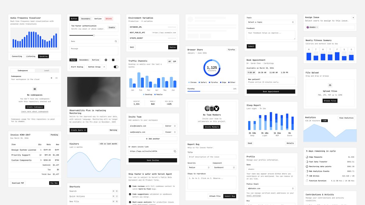
1/10 - Here’s a custom registry I built for testing. It has custom components, color tokens, fonts, everything you'd expect in a design system.
2/10 - The registry also has a registry:style. This is where we’ve list the custom tokens & css vars to be set up when you init a project.
We’ve also added a @cursor_ai rule. The rules instruct the llm how to setup providers, fonts and even next.config.ts.
We’ve also added a @cursor_ai rule. The rules instruct the llm how to setup providers, fonts and even next.config.ts.
3/10 - shadcn now ships with a registry:mcp command. One command to make any registry mcp-compatible.
Let’s start a new next project and setup shadcn mcp with @cursor_ai
Let’s start a new next project and setup shadcn mcp with @cursor_ai
4/10 - This project is a vanilla Next.js project. No shadcn no registry configured.
We’ll now use the registry mcp to setup our project. It will connect to the registry, figure out the style to use, init shadcn, install the custom tokens…everything.
We’ll now use the registry mcp to setup our project. It will connect to the registry, figure out the style to use, init shadcn, install the custom tokens…everything.
5/10 - Our custom Alpine Design System comes with a set of rules. One of them is how to install the custom DM_Sans font. Let’s ask it to do this.
6/10 - The project is now ready. We can start using components from the registry right away.
7/10 - Let’s keep going. More components, more design primitives.
8/10 - So far we’ve only used components from the Alpine registry.
Since all shadcn registries share one schema, we can go even further and pull components from anywhere. Here's one from Tailark.
The cli will take care of adapting the code to fit our style.
Since all shadcn registries share one schema, we can go even further and pull components from anywhere. Here's one from Tailark.
The cli will take care of adapting the code to fit our style.
9/10 - Pretty cool right? But there’s more.
If a component is updated on the remote registry, say a dev pushes a fix or a style update...just ask the llm and it will take care of pulling, merging and applying the changes.
If a component is updated on the remote registry, say a dev pushes a fix or a style update...just ask the llm and it will take care of pulling, merging and applying the changes.
• • •
Missing some Tweet in this thread? You can try to
force a refresh