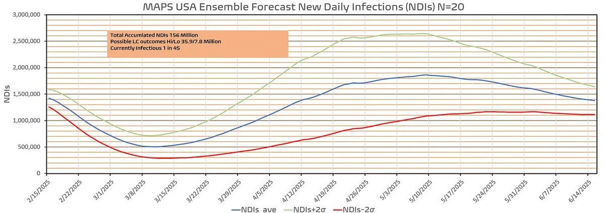
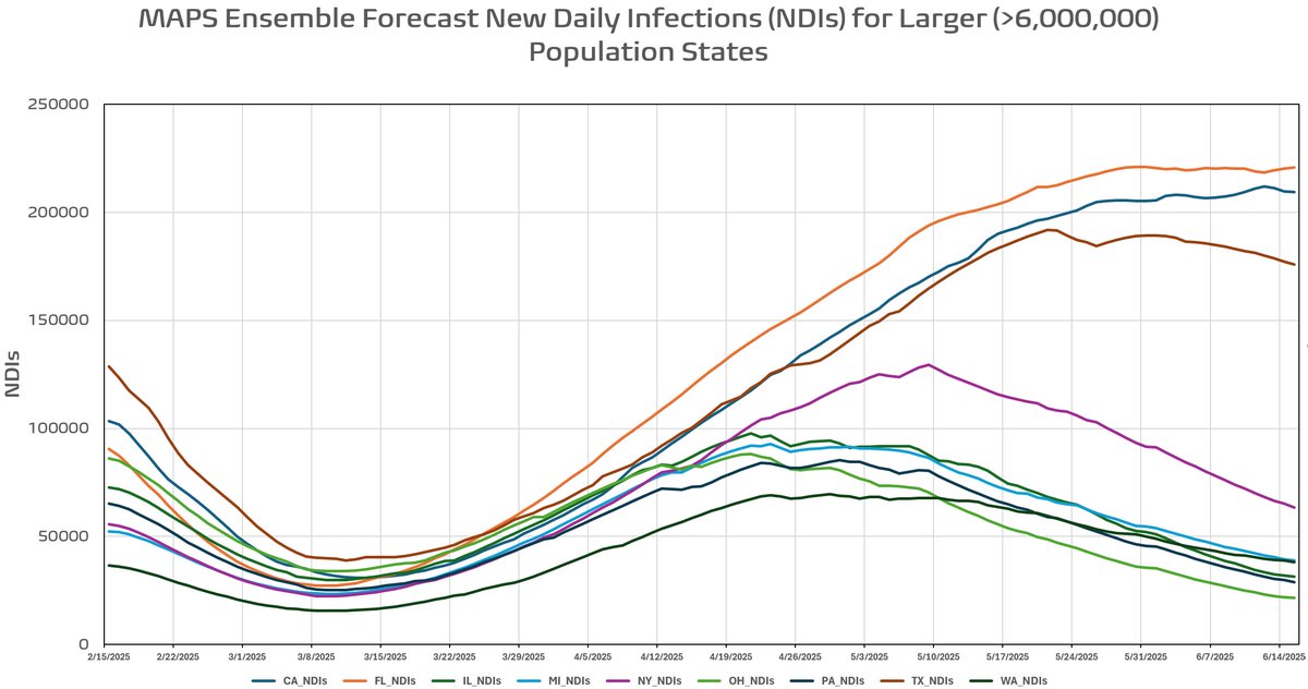
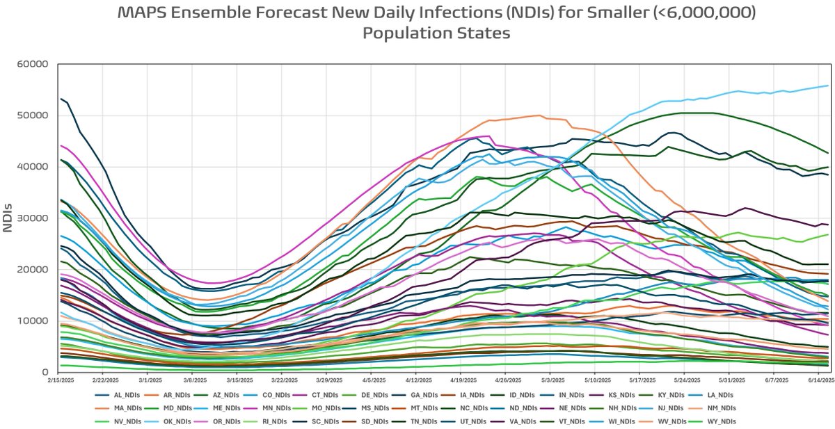
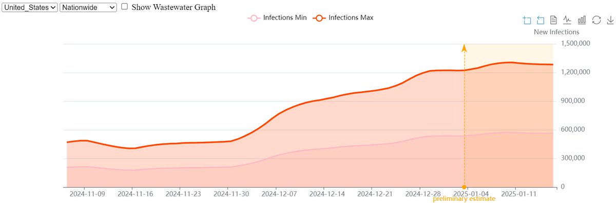
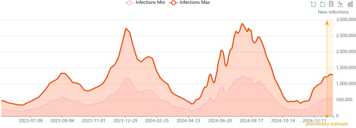
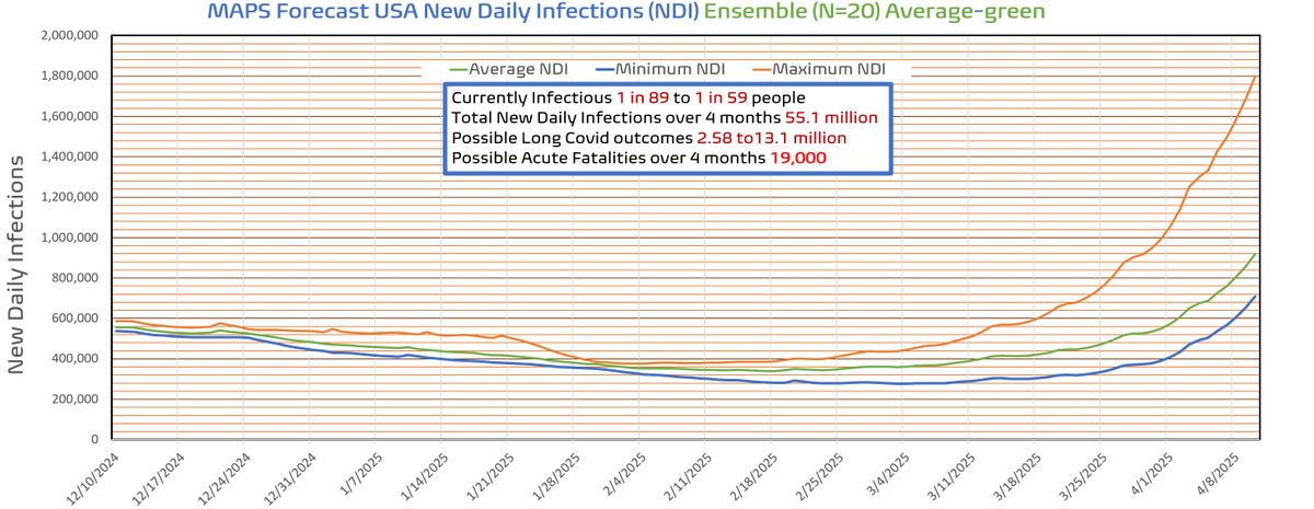
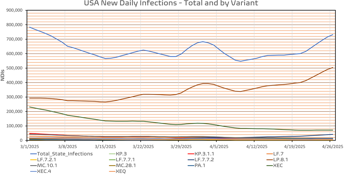
The latest US New Daily Infections LF.7.7* and PA.1 show up. LF.7.7.2 is on the move. As I indicated previously, without any big competitors, LP.8.1 is rising. The model indicates another peak in late May to early June. Measles is also continuing its rise. We are also approaching
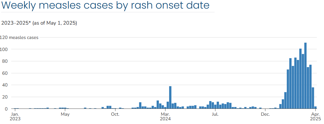
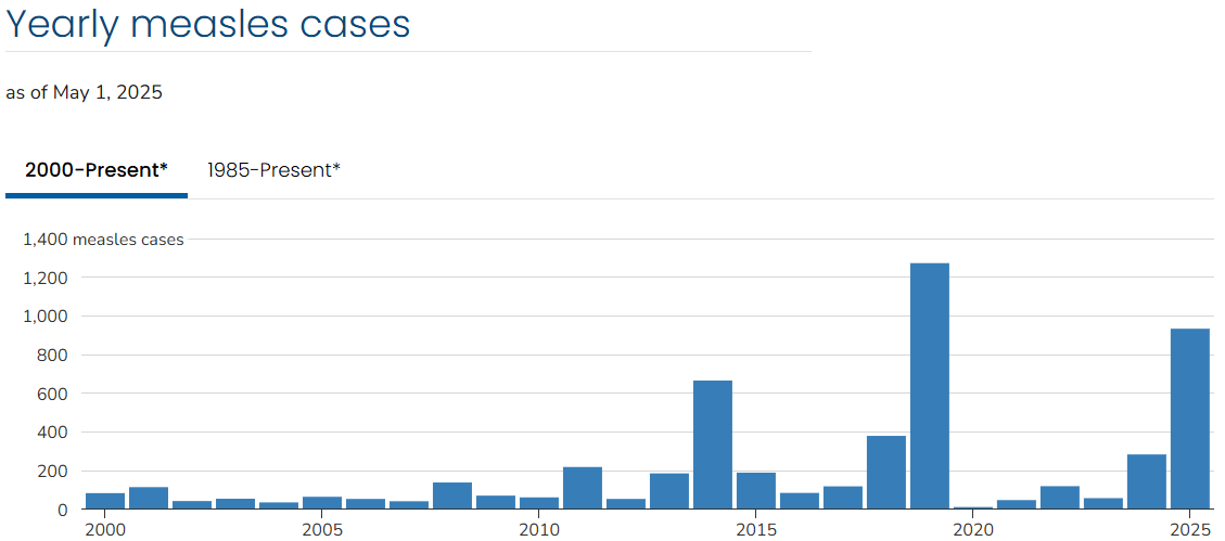
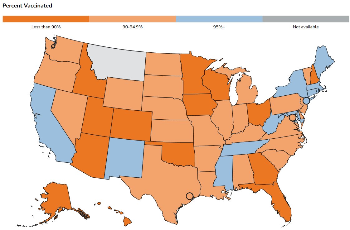
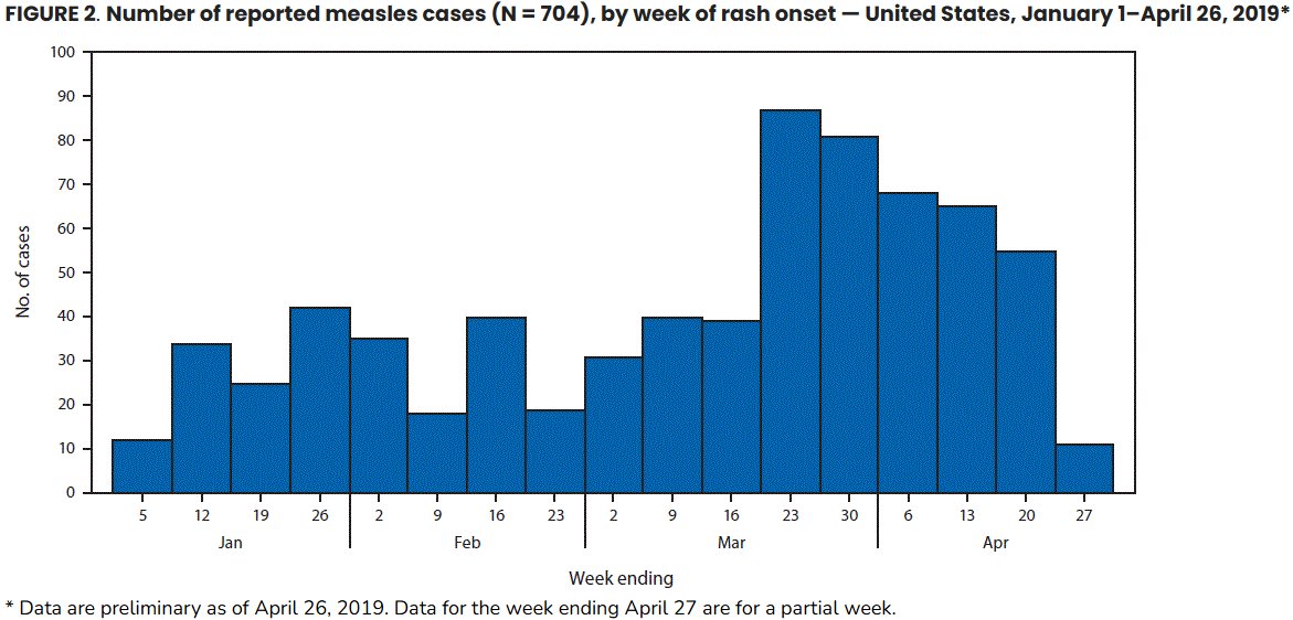
2019 numbers and it is only May. The latest US percent vaccinated for measles should be a concern. Most states are below 95%. I will update my percent vaccinated for the under 18 age group later. For reference, 2019 through a similar time period is shown. 2025 is at 935.
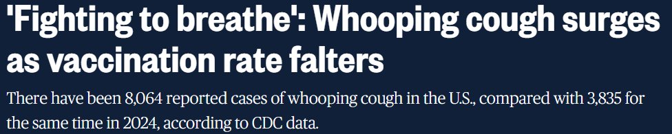
We mustn't forget about Pertussis either.There was a 1800% increase last year in Michigan and they are on a pace to exceed that this year. As we all know these can be prevented with a high vaccination percentage. Other pathogens are on the rise, like tuberculosis. Buckle up folks
• • •
Missing some Tweet in this thread? You can try to
force a refresh
When you look at graphs of new daily infections on the national level, what you see is not the entire picture. For instance, here is the most recent MAPS forecast for the next four months. It appears to be a fairly smooth curve. However that is not the entire picture. Let's look
a little closer at the state level. I seperate them by population size. Those >6 million and those less than 5 million. On the left is the larger states. What should be clear is that they all have different temporal distributions in terms of onset and peak. Now let's look at the
smaller states, 39 in total. The graphs indicate even more temporal variability and the peaks are seperated even more than in the larger states. It is also apparent that the curves are much noisier. There are several reasons for this that I will go into in my next substack. This
MAPS USA Ensemble (N=20) Forecast 1-6-2025 to 5-6-2025 with Masking Results
This is the first forecast done with a newly added compartment that is used for immunity profiles from natural immunity with/without prior vaccination. We will see how it works out, but historical runs
indicate better agreement that the prior version of the model. The figure below shows the +/- 95% CIs (thick black lines), the ensemble mean (thick red line) and other ensemble members within the bounds. If this verifies it would be an unprecedented early spring wave. This is a
slow building wave that is just reaching the peak at the end of the integration. I will have a detailed analysis of the in my substack tomorrow.
At the WHN the last day with data reporting was on 1-16-2025, the last estimate we trust was 1-3-2025 (below) JosephEastman.substack.com
We have patched the WHN wastewater-derived infections for the USA, and things look much better. There were six wastewater stations in one county of NY that were a couple of orders of magnitude too large. It appears we peaked on January 10th, 2025 at ~1.31 million new daily
infections. I can now run the model using the last good date before preliminary estimates are employed (1.15.2025). In addition I will be able to include the latest variant proportions update. Will this be the last time I am able to do a forecast after yesterdays bad news?
Technically I have ways around this. But I will have to return to a national initialization instead of state-by-state. The proxy numbers will also degrade the forecast accuracy. In addition of the variant proportions are no longer updated I will have to move to another source
Here is the first of many MAPS forecasts over the coming weeks. I am working on some things to improve the model. If this is verified over the next 4 months, it will be unprecedented. The forecast beyond Mid-February is subject to considerable change depending on emerging
and is characterized by the increased spread in the forecast. The two emerging variants employed by MAPS are XEC.4 and LP.8.* based on sparse data. I attempt to account for the estimates by varying their traits through the integrations as well as their temporal appearance.
The following graph contrasts this year with the previous 3 during this period. You can see no significant thanksgiving bump for 2024. If my natural immunity waning assumptions are correct we will see a similar outcome over the Christmas break. We could also see an earlier
Here is the most up-to-date wastewater data we "trust" (). We are inclined to believe it lies closer to the maximum calculation (see webpage). The right-hand panel shows what MAPS had forecast three weeks ago. I am working on a new forecast with today's whn.global/estimation-of-…
new variant proportions data. Should be completed this weekend. I remember about 2 months ago surmising that due to the massive summer wave we would see a well below normal holiday wave. Still when MAPS indicated minimal Thanksgiving bump I was concerned something was wrong
with MAPS. Turns out nothing was wrong. You will likely see a minimal bump at the end of the year to. Finally, XEC has replaced KP.3.1.1 as the top dog. Nothing startling on the horizon. Now would be a great time to mask up. As the model has demonstrated getting 15-20% compliance
@threadreaderapp unroll Sshh, snuck away from my ICU vigil. Justin, this study home with my PhD in atmospheric science and ecology😊 some thought I was silly putting weather in my pandemic model. I’ve done several studies with no met, 50km resolution monthly climatology, ~12km
Daily forcing and compared 2.5 years of simulation from 3-1-2020 to 9-1-2022. Ensembles (n=20) integrated on a 1km grid covering North America. The 12km met forcing was clearly superior, followed by no met, and last was the climatology ( yes it makes sense). Pandemics are global
their evolution/trajectory is local/regional. I’d write it up but I’m a retired scientist and I am way too freaking busy. Thank you @ejustin46 !