
married to Sara 36 years, father, retired scientist PhD, Covid modeler deadhead #NoRA #union #IChooseScience https://t.co/M6oCUBuxXa
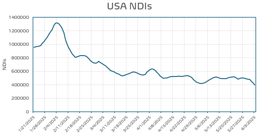
 I am trying to reconcile this.
 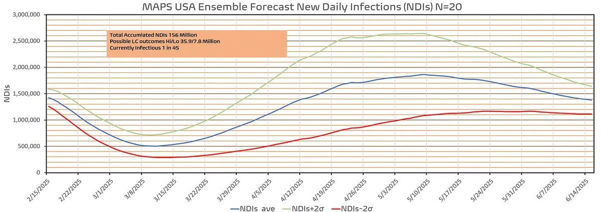 a little closer at the state level. I seperate them by population size. Those >6 million and those less than 5 million. On the left is the larger states. What should be clear is that they all have different temporal distributions in terms of onset and peak. Now let's look at the
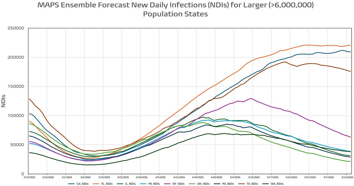
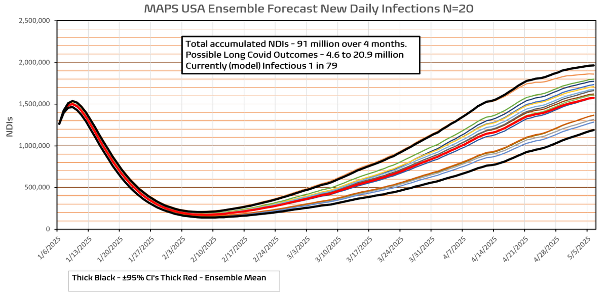
 infections. I can now run the model using the last good date before preliminary estimates are employed (1.15.2025). In addition I will be able to include the latest variant proportions update. Will this be the last time I am able to do a forecast after yesterdays bad news?
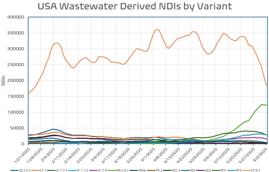
 and is characterized by the increased spread in the forecast. The two emerging variants employed by MAPS are XEC.4 and LP.8.* based on sparse data. I attempt to account for the estimates by varying their traits through the integrations as well as their temporal appearance.
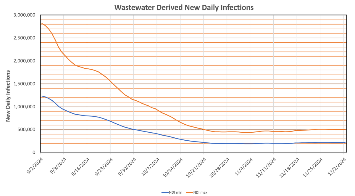
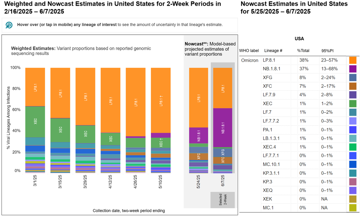
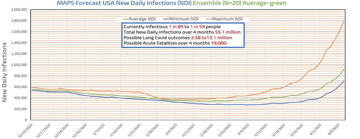
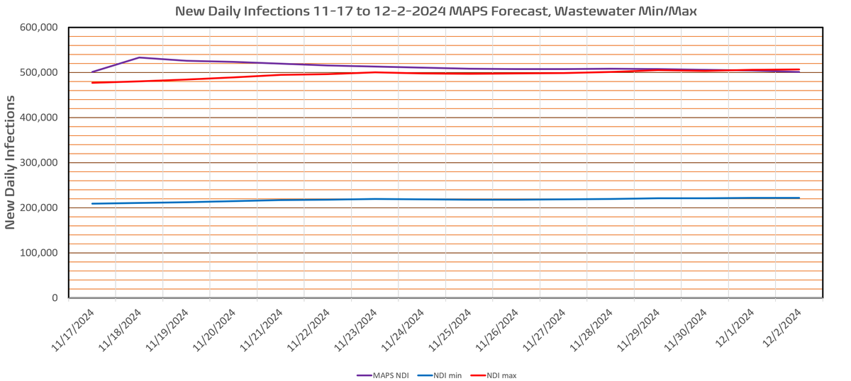 new variant proportions data. Should be completed this weekend. I remember about 2 months ago surmising that due to the massive summer wave we would see a well below normal holiday wave. Still when MAPS indicated minimal Thanksgiving bump I was concerned something was wrong