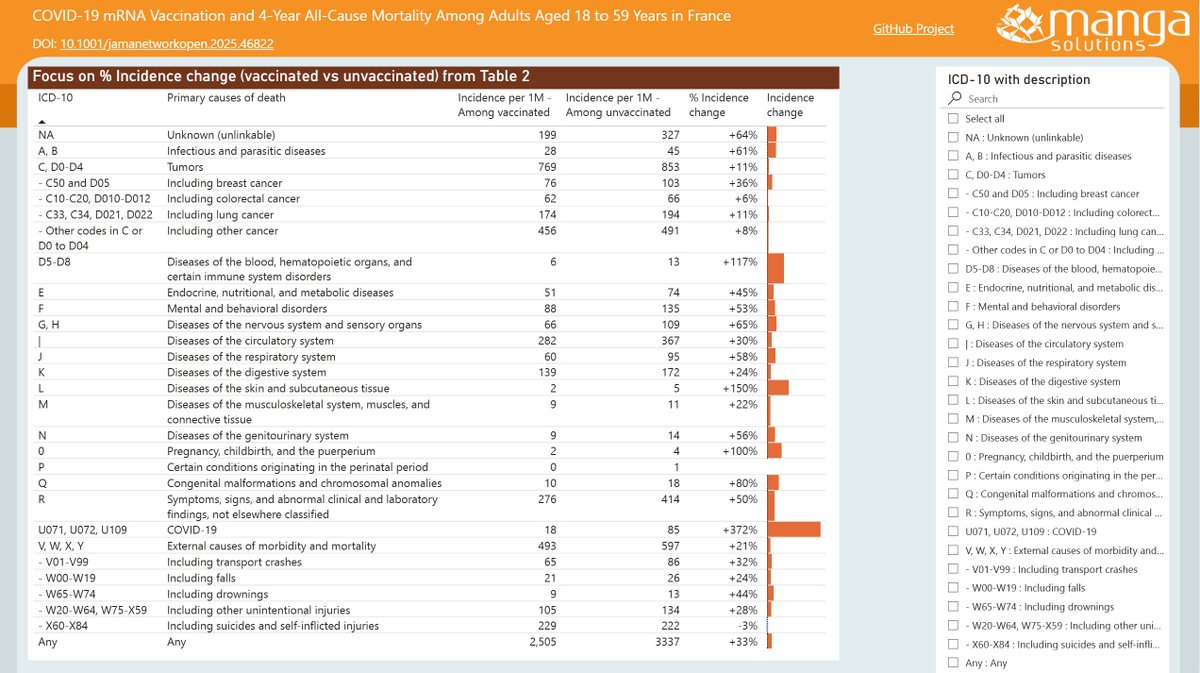
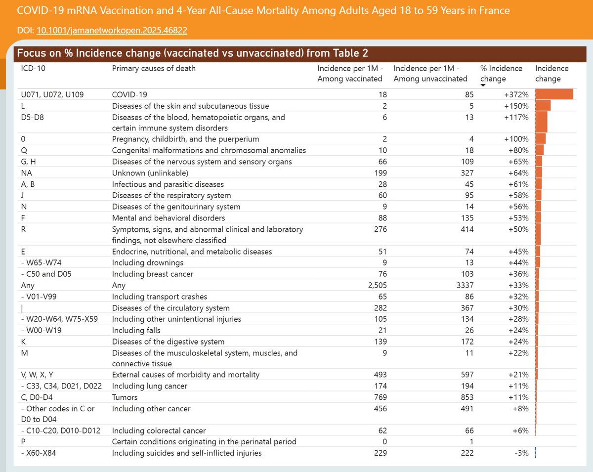
Here's the latest variant picture for the United States, to early May.
The LP.8.1.* variant has peaked and fell back to 52%.
The presumed next challengers are growing – XDV.* (led by NB.1.8.1) to 9% and XFG.* to 8%.
#COVID19 #USA #LP_8_1 #XFG #XDV #NB_1_8_1
🧵
For the US, the XFG.* variant shows a strong but slightly slowing growth advantage of 5.2% per day (36% per week) over LP.8.1.*, which now predicts a crossover in early June.
🧵
For the US, the XDV.* variant (led by NB.1.8.1) shows a healthy growth advantage of 4.8% per day (34% per week) over LP.8.1.*, with a possible crossover in June.
🧵
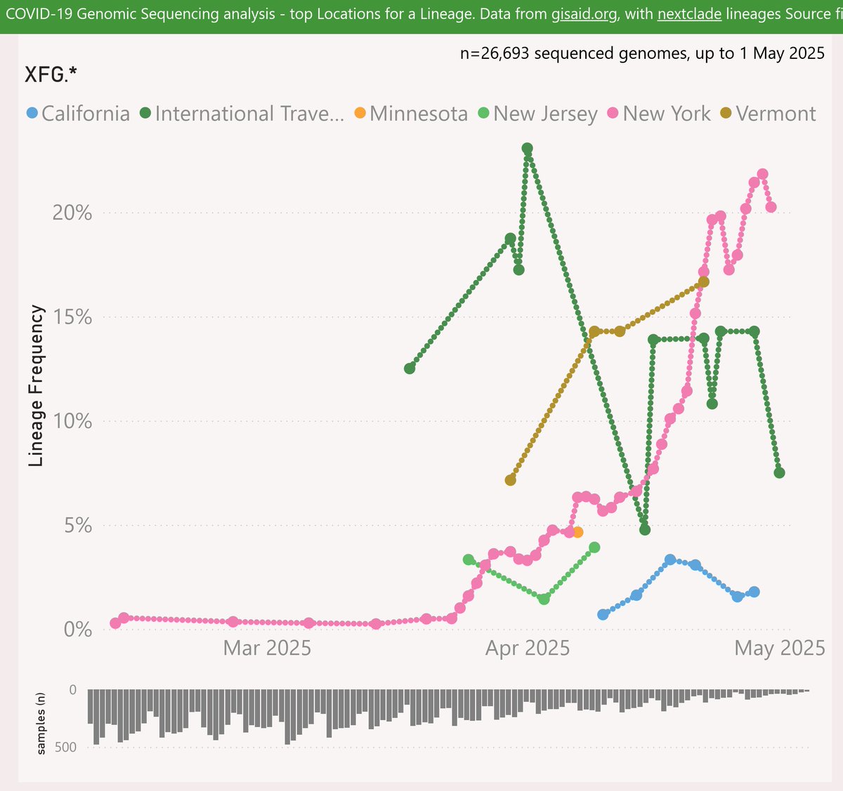
The XFG.* variant has mainly been reported from New York state, rising to 22% frequency. It was very common among the International Traveller samples in early April, but has been less common lately.
🧵
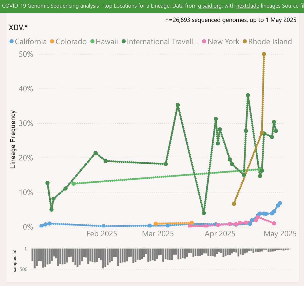
The XDV.* variant (led by NB.1.8.1) has mainly been reported among the International Traveller samples, at around 20-40% frequency. It rose to 50% in Rhode Island recently, but samples sizes from there are very thin.
🧵
International Traveller samples represent a significant population. Looking at the last 8 weeks, their volume ranks them 12th among the US states. As international arrivals are around 10-12M per month, that seems roughly proportionate.
🧵
Another factor is the profile of those people. The typical subject of a PCR test is now someone in a health care or aged care setting, so tending older. International travellers who submit a sample are more likely to be adults, so more representative of the overall population.
🧵
Recent travellers (who may be unaware they are infectious) are also seem more likely to be in superspreader scenarios eg onward domestic travel, restaurants, events etc.
So considering all of that I prefer to include the International Traveller samples in my US analysis.
🧵
A recent scientific paper compared long-term mortality by vaccination status.
I noticed that Table 2 drew a lot of attention, but was actually included in the paper as a static image. So I built a quick dataviz project to explore.
🧵
On the first page, I've added a % Incidence change (vaccinated vs unvaccinated) and emphasised that with data bars. This is quicker for general readers to grasp than hazard ratios.
🧵
You can click on any column header to sort the rows, e.g. as shown by % Incidence change. The starkest difference was deaths from COVID-19 at +372%.
Other causes with significant differences were diseases of the skin & blood, pregnancy and childbirth.
🧵
A recent scientific paper included an antigenic map, comparing the immune status of individuals vaccinated with a range of vaccines "… vaccinated sera", against a collection of significant variants "Virus …".
The map was very informative, so I built a quick dataviz project.
🧵
The map shows starkly that BA.3.2 "Cicada" is a wild outlier, way out on its own in the south-west corner. This suggests the current vaccines and/or disease-acquired immunity will not offer strong protection against infection.
🧵
Another point of note is how the XFG "Stratus" variant is the furthest away from BA.3.2, at the extreme south, compared to other recent variants.
This might help explain how BA.3.2 has been able to drive significant waves in Europe, following their recent waves of XFG
🧵
Here's the latest variant picture for Europe (excluding the UK), to late November.
BA.3.2.* "Cicada" is showing a very strong growth advantage of 7.9% per day (55% per week) over XFG.* "Stratus", which predicts a crossover in late December.
#COVID19 #EUR #BA_3_2 #Cicada #XFG
🧵
To include the latest BA.3.2.* samples, I have rolled my reporting window forward an extra week or so. So the most recent data is even less representative than usual. The picture for those dates might change as more data is shared.
🧵
Here are the leading European countries reporting BA.3.2.* .
The Netherlands leapfrogged Germany to report the highest frequency at 31%. Germany also grew sharply to 25%. Denmark grew to 16%.
🧵
Here's the latest variant picture for the United Kingdom, to late November.
For the UK, BA.3.2.* "Cicada" is showing a strong growth advantage of 5% per day (35% per week) over XFG.* "Stratus", which predicts an imminent crossover.
#COVID19 #SARSCoV2 #UK #BA_3_2 #Cicada
🧵
To include the latest BA.3.2.* samples, I have rolled my reporting window forward an extra week. So the most recent data is even less representative than usual. The picture for those dates might change as more data is shared.
🧵
BA.3.2.* accelerated sharply in Scotland to 16% of recent samples.
🧵
A recent scientific paper explored the impact of mass SARS-CoV-2 infections on Lymphocytes (crucial to the body’s immune system).
I noticed the authors had shared the data behind their charts in the Appendix Supplementary materials, so I built a quick dataviz project.
🧵
Above, I’ve re-cast the data behind their Figures 3 and 5 in terms of % change from the baseline. Hopefully this is useful to help compare the subsets, whose results vary in scale.
🧵
I added interactive filter controls and a trend line (dashed pink). You can use those to explore for example the trends in the last 12 months measured in the paper, for the CD3, 4 & 8 series.
🧵
It became clear during November that a unusual second wave is underway in Australia, driven by the new "clade K" (H3N2 clade 2a.3a.1, subclade K).
Tasmania, New South Wales and South Australia are currently the hardest-hit.
#Influenza #Australia
🧵
Western Australia had been spared the worst of this second wave until the last week or so. But now there’s a signal of a sharp change in case momentum there also.
🧵
The latest Australian Respiratory Surveillance Report confirms my earlier speculation that the new "clade K" (H3N2 clade 2a.3a.1, subclade K) is driving the "unusual" second wave of influenza in Australia.