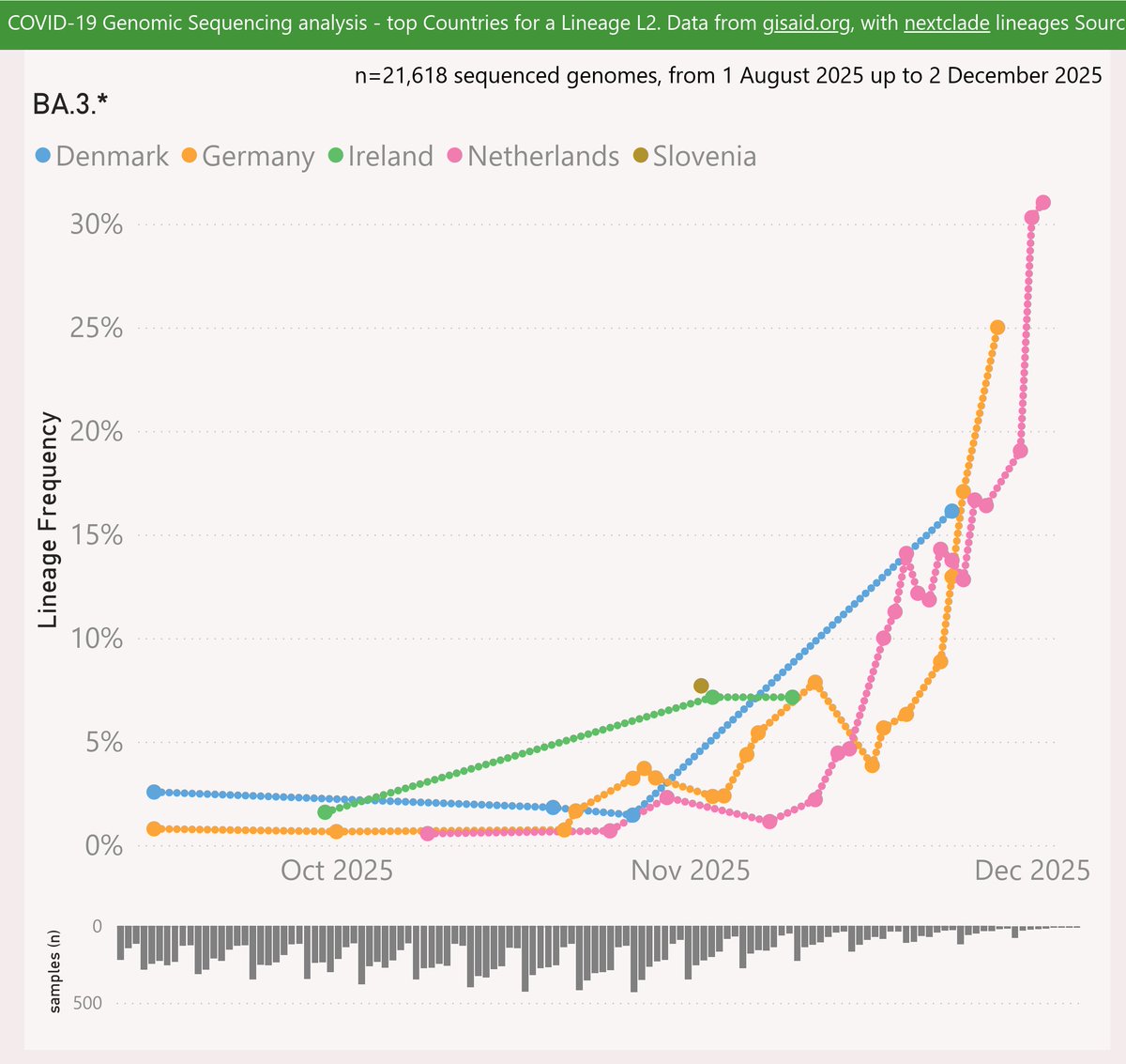
Here's the latest variant picture for the United States, to early May.
The LP.8.1.* variant continued to fall, down to 35%.
The next challenger is XFG.*, which grew strongly to 19%.
#COVID19 #USA #LP_8_1 #XFG #NB_1_8_1 #Nimbus
🧵
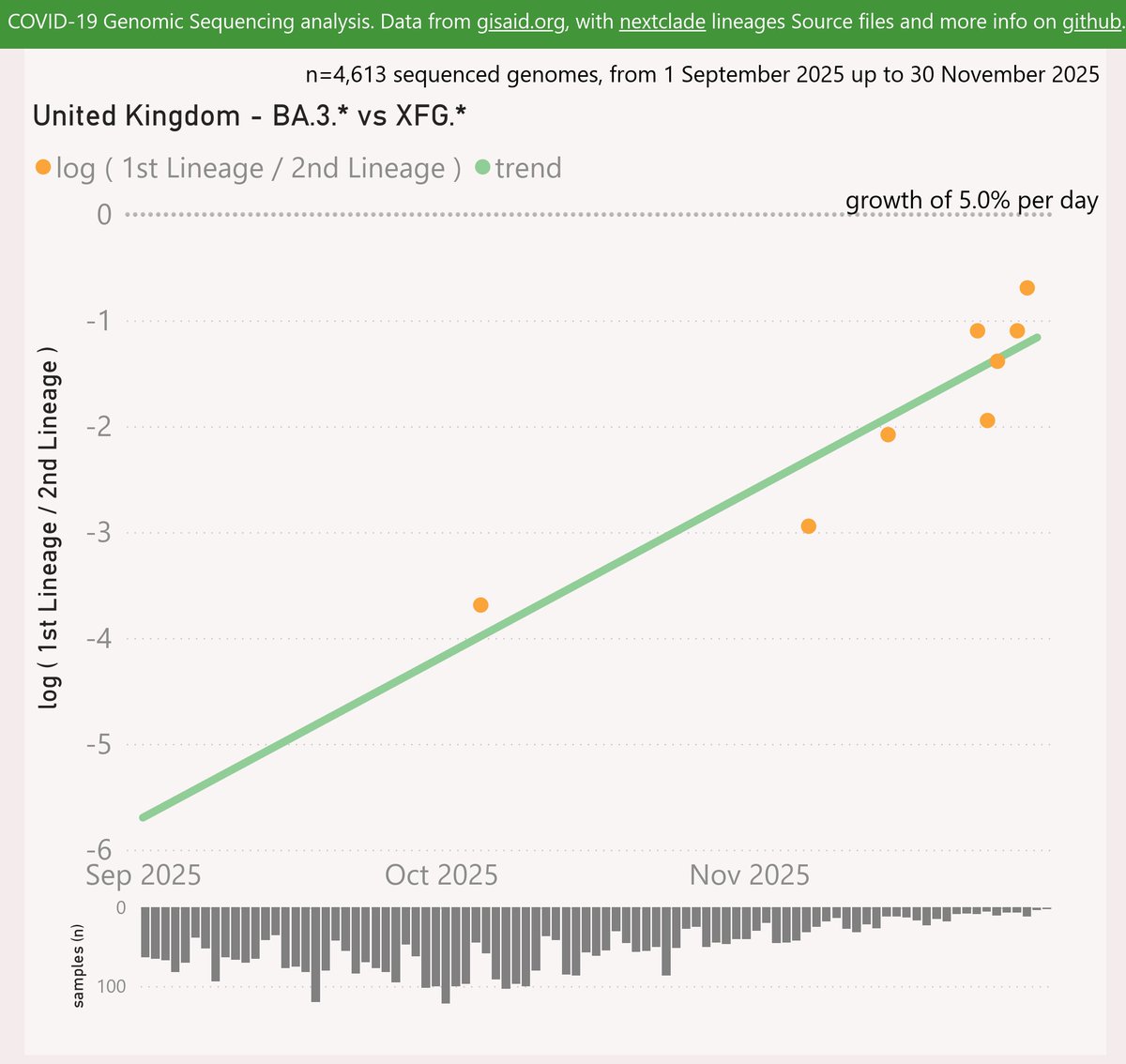
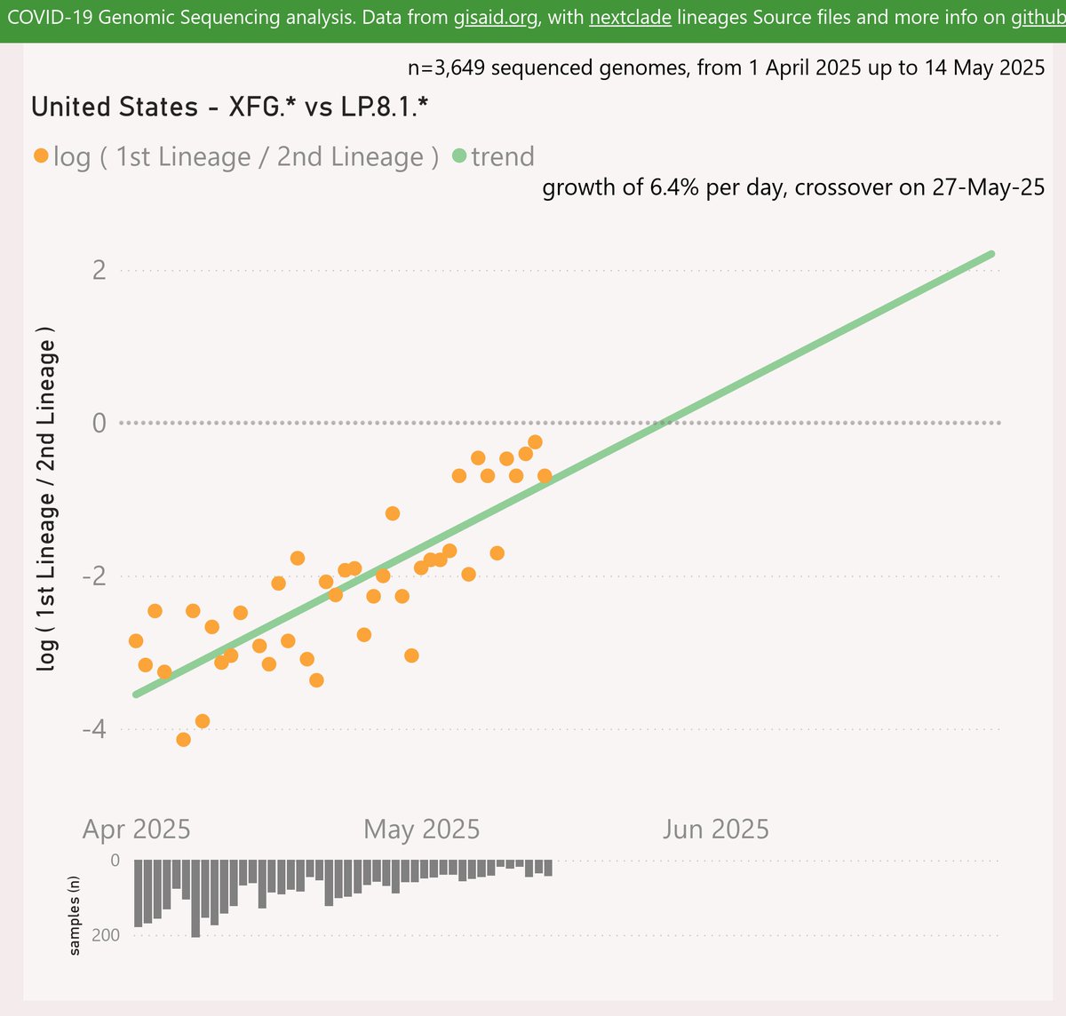
For the US, the XFG.* variant shows a strong and accelerating growth advantage of 6.4% per day (45% per week) over LP.8.1.*, which now predicts a crossover in late-May (the data routinely lags).
🧵
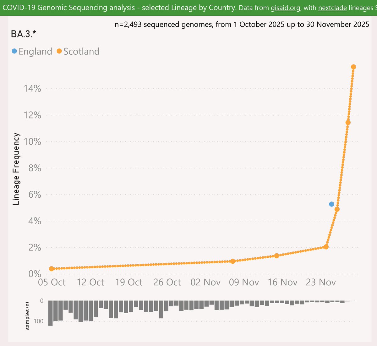
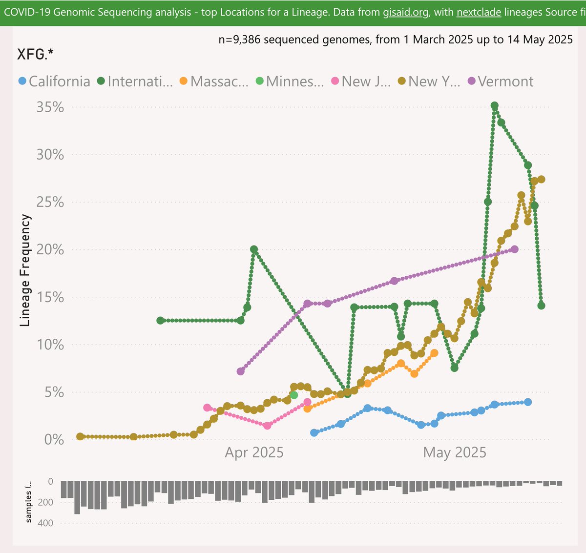
XFG.* had mainly been reported from New York state, rising to 27% frequency. It has also been very common among the International Traveller samples. It rose in Vermont to 20%.
🧵
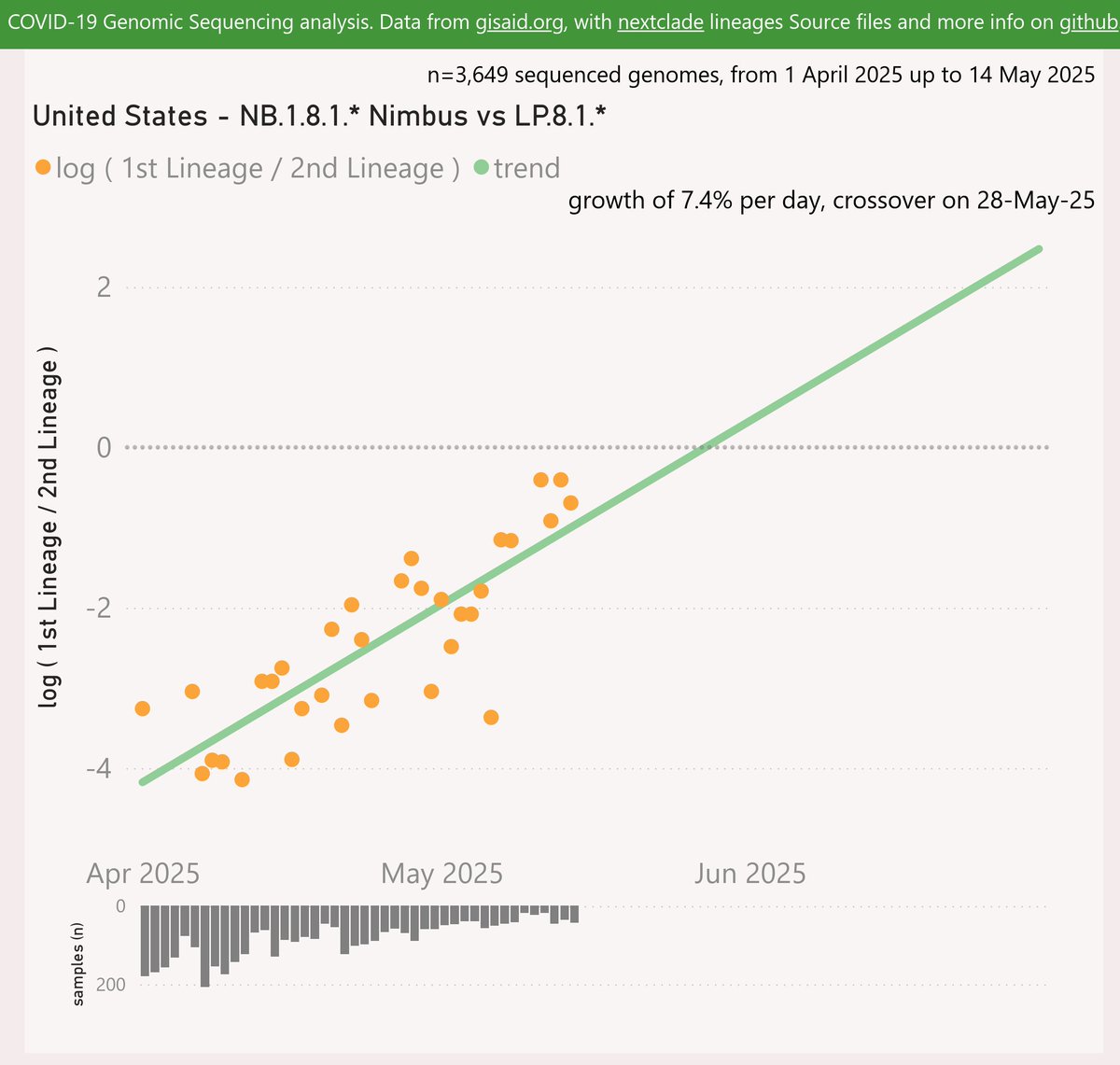
For the US, the NB.1.8.1 "Nimbus" variant shows a faster growth advantage of 7.4% per day (34% per week) over LP.8.1.*, which now predicts a crossover in late-May (the data routinely lags).
🧵
NB.1.8.1 "Nimbus" has mainly been reported among the International Traveller samples, at around 20-40% frequency.
It has also been reported up to 50% in Rhode Island and Arizona.
🧵
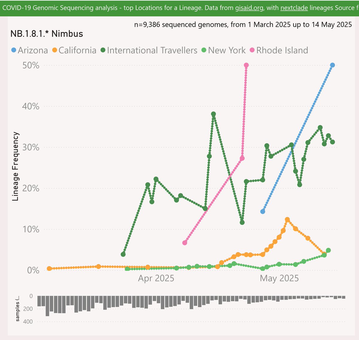
As International Travellers are not significantly over-represented, I think of them as an alternative slice of the US community – skewed towards business people and the wealthy.
🧵
A recent scientific paper compared long-term mortality by vaccination status.
I noticed that Table 2 drew a lot of attention, but was actually included in the paper as a static image. So I built a quick dataviz project to explore.
🧵
On the first page, I've added a % Incidence change (vaccinated vs unvaccinated) and emphasised that with data bars. This is quicker for general readers to grasp than hazard ratios.
🧵
You can click on any column header to sort the rows, e.g. as shown by % Incidence change. The starkest difference was deaths from COVID-19 at +372%.
Other causes with significant differences were diseases of the skin & blood, pregnancy and childbirth.
🧵
A recent scientific paper included an antigenic map, comparing the immune status of individuals vaccinated with a range of vaccines "… vaccinated sera", against a collection of significant variants "Virus …".
The map was very informative, so I built a quick dataviz project.
🧵
The map shows starkly that BA.3.2 "Cicada" is a wild outlier, way out on its own in the south-west corner. This suggests the current vaccines and/or disease-acquired immunity will not offer strong protection against infection.
🧵
Another point of note is how the XFG "Stratus" variant is the furthest away from BA.3.2, at the extreme south, compared to other recent variants.
This might help explain how BA.3.2 has been able to drive significant waves in Europe, following their recent waves of XFG
🧵
Here's the latest variant picture for Europe (excluding the UK), to late November.
BA.3.2.* "Cicada" is showing a very strong growth advantage of 7.9% per day (55% per week) over XFG.* "Stratus", which predicts a crossover in late December.
#COVID19 #EUR #BA_3_2 #Cicada #XFG
🧵
To include the latest BA.3.2.* samples, I have rolled my reporting window forward an extra week or so. So the most recent data is even less representative than usual. The picture for those dates might change as more data is shared.
🧵
Here are the leading European countries reporting BA.3.2.* .
The Netherlands leapfrogged Germany to report the highest frequency at 31%. Germany also grew sharply to 25%. Denmark grew to 16%.
🧵
Here's the latest variant picture for the United Kingdom, to late November.
For the UK, BA.3.2.* "Cicada" is showing a strong growth advantage of 5% per day (35% per week) over XFG.* "Stratus", which predicts an imminent crossover.
#COVID19 #SARSCoV2 #UK #BA_3_2 #Cicada
🧵
To include the latest BA.3.2.* samples, I have rolled my reporting window forward an extra week. So the most recent data is even less representative than usual. The picture for those dates might change as more data is shared.
🧵
BA.3.2.* accelerated sharply in Scotland to 16% of recent samples.
🧵
A recent scientific paper explored the impact of mass SARS-CoV-2 infections on Lymphocytes (crucial to the body’s immune system).
I noticed the authors had shared the data behind their charts in the Appendix Supplementary materials, so I built a quick dataviz project.
🧵
Above, I’ve re-cast the data behind their Figures 3 and 5 in terms of % change from the baseline. Hopefully this is useful to help compare the subsets, whose results vary in scale.
🧵
I added interactive filter controls and a trend line (dashed pink). You can use those to explore for example the trends in the last 12 months measured in the paper, for the CD3, 4 & 8 series.
🧵
It became clear during November that a unusual second wave is underway in Australia, driven by the new "clade K" (H3N2 clade 2a.3a.1, subclade K).
Tasmania, New South Wales and South Australia are currently the hardest-hit.
#Influenza #Australia
🧵
Western Australia had been spared the worst of this second wave until the last week or so. But now there’s a signal of a sharp change in case momentum there also.
🧵
The latest Australian Respiratory Surveillance Report confirms my earlier speculation that the new "clade K" (H3N2 clade 2a.3a.1, subclade K) is driving the "unusual" second wave of influenza in Australia.