I’m thrilled to announce the update of our water surveillance dashboard.
Many improvements, and our first substantial move into ‘OneHealth’.
Read to the end to find the Easter Egg.
1/
dholab.github.io/public_viz/001…
Many improvements, and our first substantial move into ‘OneHealth’.
Read to the end to find the Easter Egg.
1/
dholab.github.io/public_viz/001…
The first big improvement is that the output is more precise, and interactive. For each data point we tell you the date, the reads mapped, the total reads in each sample, and the reads/billion for each pathogen.
The heat map color is dictated by reads/billion.
2/
The heat map color is dictated by reads/billion.
2/

As before, we have a dropdown menu (now divided into categories) where you can do a city-to-city comparison of the different pathogens.
We hope to show more locations soon.
3/
We hope to show more locations soon.
3/

If you are not a visual person, we also now have written and audio alternatives for learning the ‘weather report’.
4/
4/

The written discussion link leads to a weather forecast-styled readout on the various pathogens.
5/
5/

And the audio report…you just have to listen to it. It will immediately be obvious what the report is styled on.
6/
6/
My favorite addition is that we now have a dashboard for select animal viruses detected from wastewater. Some of these make sense, other do not (at least not yet).
7/
7/

You will notice that many of the most prevalent animal viruses in Columbia are pig viruses.
8/
8/
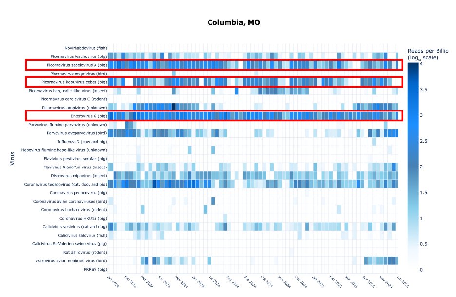
This is one of many virus types that are not equal across sewersheds. Columbia is the only city among these 5 that has a significant swine input. This is at least in part, if not entirely, from university research facilities that have pigs.
9/
9/

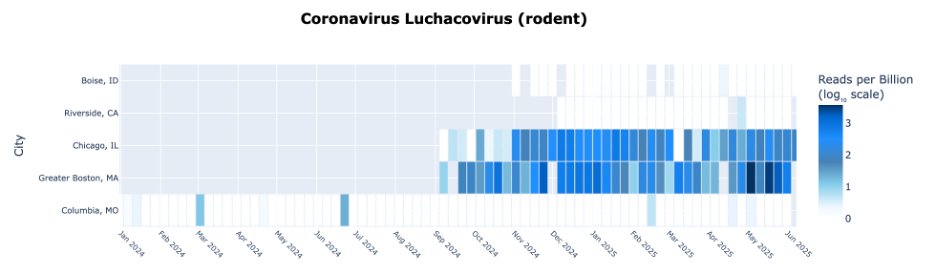
If you go to Chicago it’s different; you see a lot more viruses coming from birds and rodents. This is because Chicago has combined sewers.
Storm water mixes with wastewater so you get a sampling of the urban wildlife.
10/
Storm water mixes with wastewater so you get a sampling of the urban wildlife.
10/

The animal viruses in Chicago are fairly similar to those in Boston, which also has combined sewers.
11/
11/
However, we see more fish viruses from Boston.
We see a lot more fish contribution in Boston wastewater in general. In particular, it’s the only location of these 5 where we see a lot of cod and flounder species (lots of fish processing in Boston).
12/
We see a lot more fish contribution in Boston wastewater in general. In particular, it’s the only location of these 5 where we see a lot of cod and flounder species (lots of fish processing in Boston).
12/

There are also viruses that make no sense at all.
This calici-like virus surged in Columbia last Fall, but nowhere else. It most likely infects an insect or an arachnid. No idea where it is coming from but very curious to see if it returns this Fall.
13/
This calici-like virus surged in Columbia last Fall, but nowhere else. It most likely infects an insect or an arachnid. No idea where it is coming from but very curious to see if it returns this Fall.
13/

Another mystery mentioned before is an Ampivirus.
It’s only known to infect amphibians.
Its appearance is both seasonal (Spring) and sewershed-specific. Columbia is not a combined sewersystem, so it probably isn’t from the wild.
We don’t know where it’s coming from.
14/
It’s only known to infect amphibians.
Its appearance is both seasonal (Spring) and sewershed-specific. Columbia is not a combined sewersystem, so it probably isn’t from the wild.
We don’t know where it’s coming from.
14/

Remember that we are currently only scratching the surface of the thousands of types of viruses we detect every week. We intend to add many more in the future.
15/
15/
This project involved many collaborators and community partners. @Securebio in particular.
Thanks to our sponsors Inkfish and OpenPhilanthropy.
16/
Thanks to our sponsors Inkfish and OpenPhilanthropy.
16/

Finally, be sure to click the icon at the bottom.
I’m not going to tell you what it is, but here’s a hint: It’s what people that grew up in the 80s think of when they see a heat map.
17/17
I’m not going to tell you what it is, but here’s a hint: It’s what people that grew up in the 80s think of when they see a heat map.
17/17

• • •
Missing some Tweet in this thread? You can try to
force a refresh