🌍Want to track COVID transmission accurately worldwide?
This PMC thread walks you through leading dashboards with information more up to date than WHO & EU directories.
🧵 1/
This PMC thread walks you through leading dashboards with information more up to date than WHO & EU directories.
🧵 1/

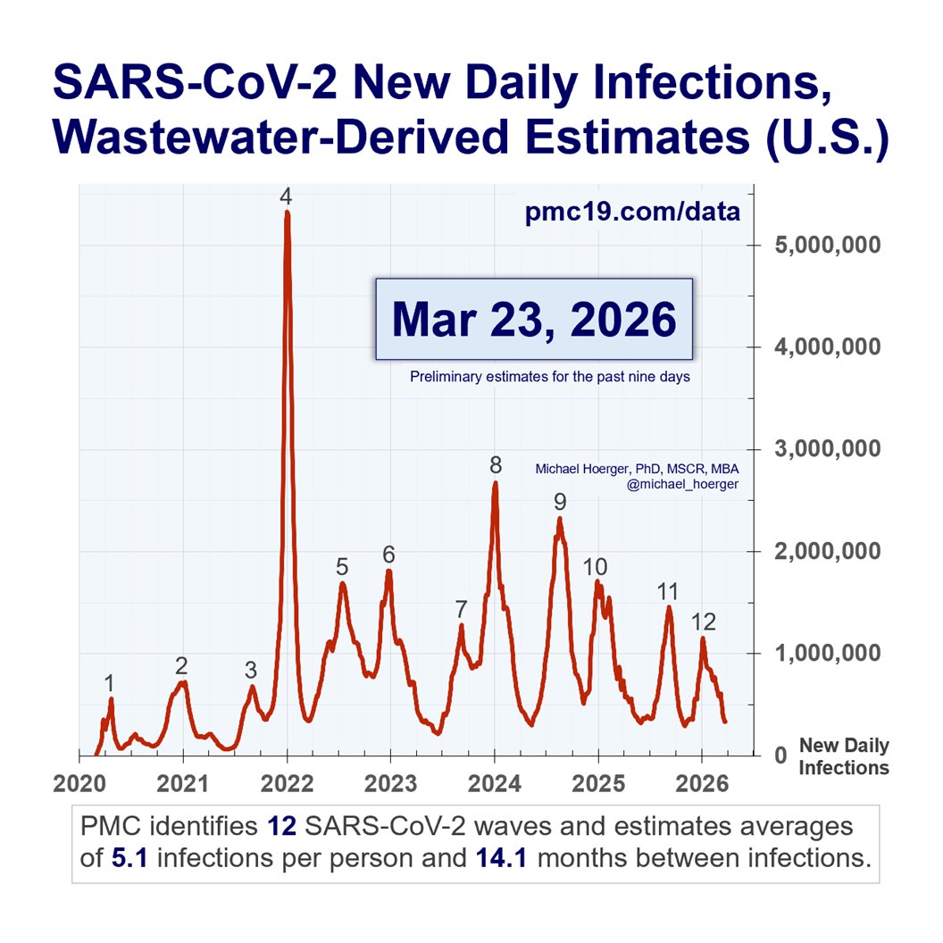
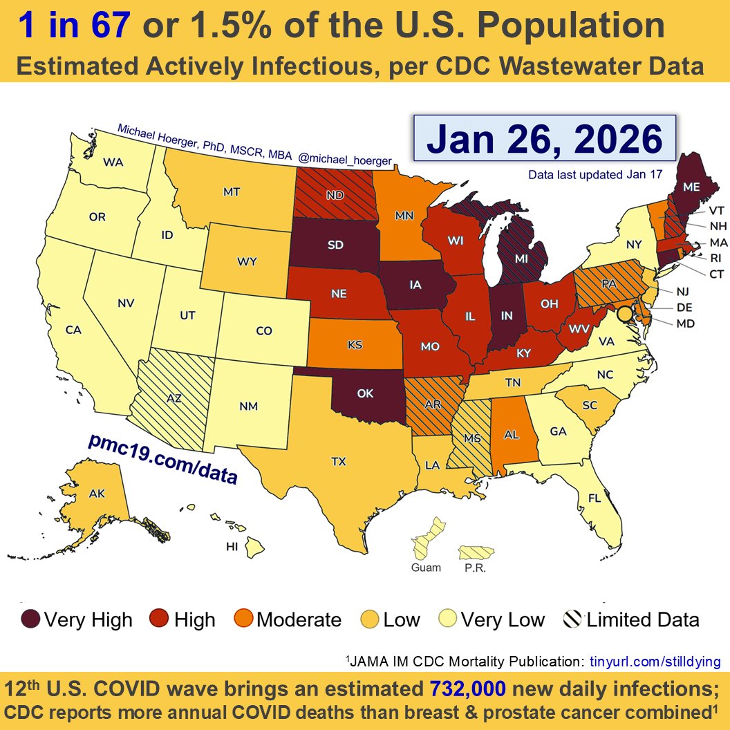
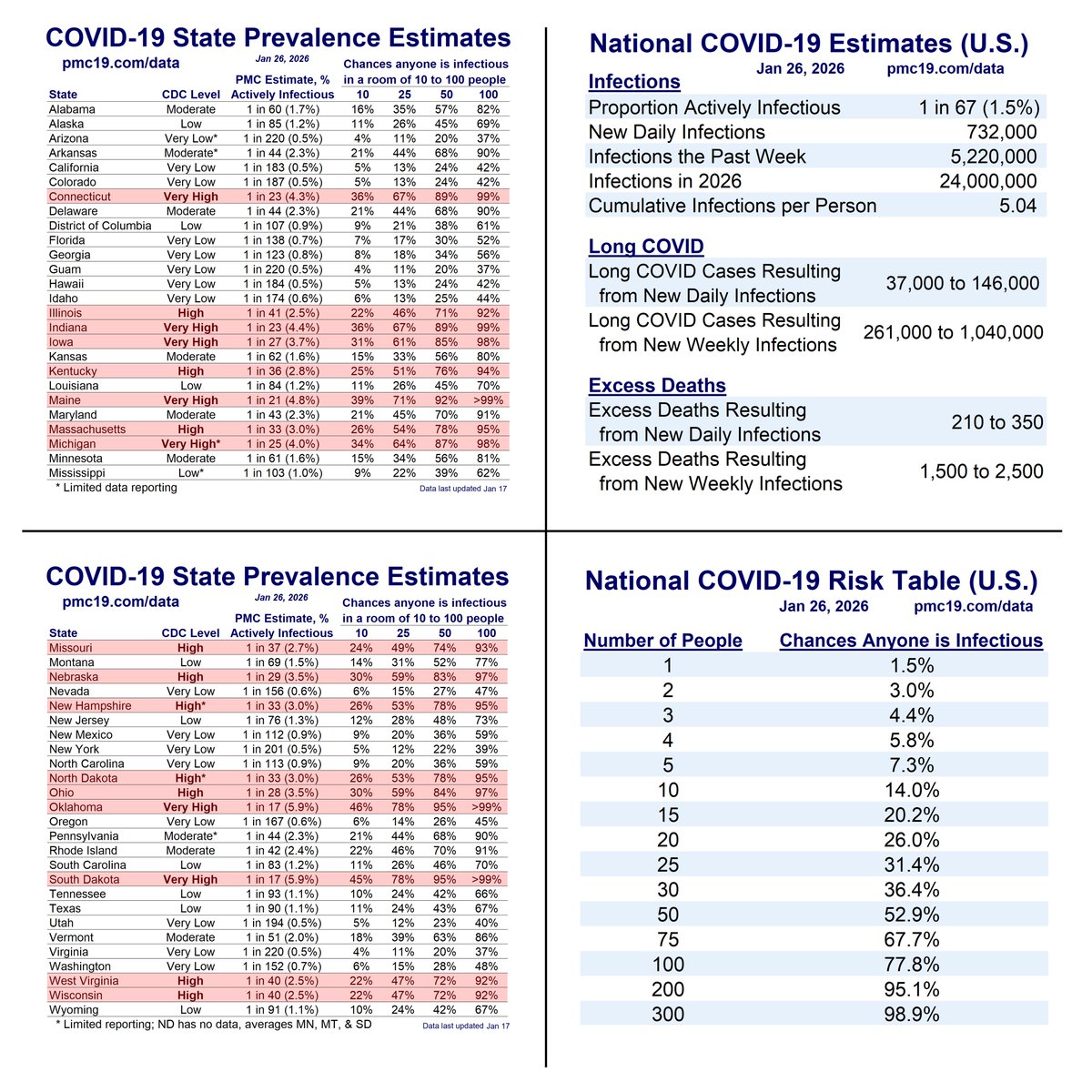
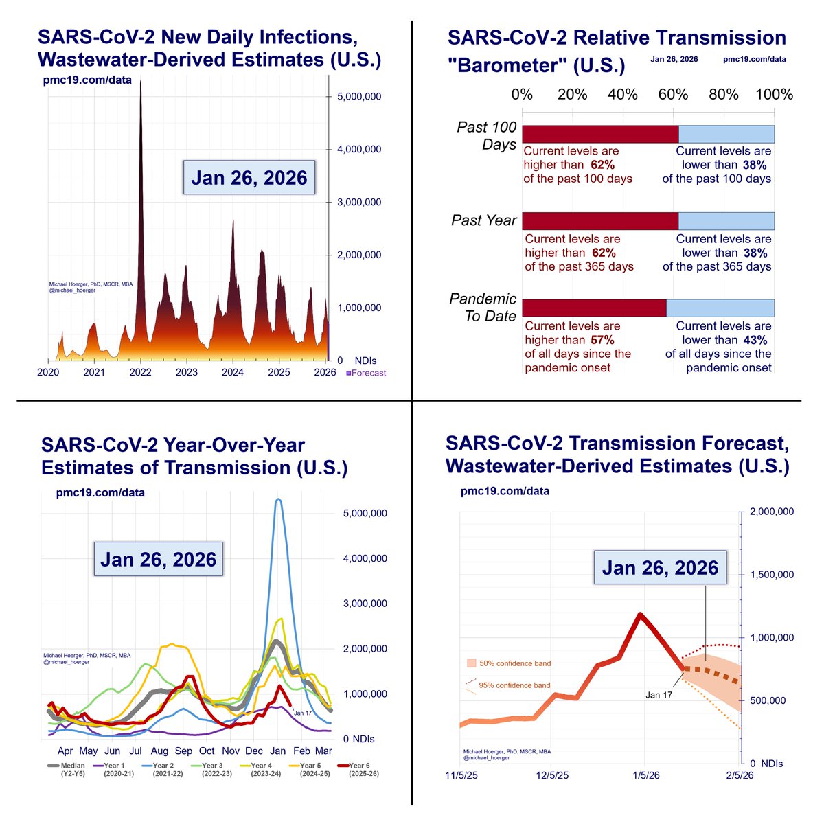
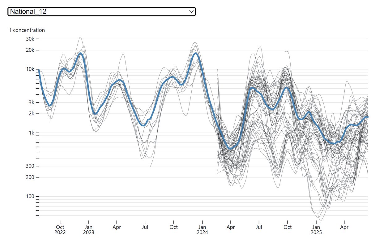
The Pandemic Mitigation Collaborative (PMC) Dashboard provides weekly COVID updates for the U.S., using wastewater surveillance derived case estimation models and analytic forecasting.
We have added a list of international dashboards:
🧵 2/
pmc19.com/data/index.php…
We have added a list of international dashboards:
🧵 2/
pmc19.com/data/index.php…


Our international directory includes official government dashboards & those developed by citizen scientists.
We exclude countries that have stopped reporting in the past 2-12 months even if on EU or WHO lists. We also exclude low-quality data from opt-in testing programs.
🧵 3/
We exclude countries that have stopped reporting in the past 2-12 months even if on EU or WHO lists. We also exclude low-quality data from opt-in testing programs.
🧵 3/
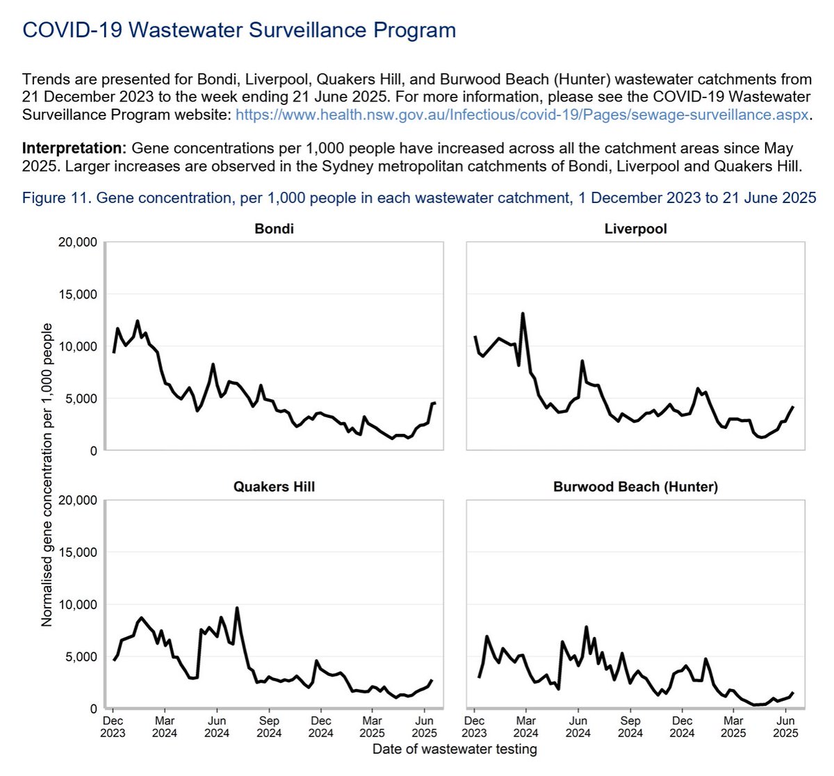
The Australia NSW Dashboard
Click on the most recent PDF report. Skip the outdated low-quality stats, and jump down to the pure gold around pg. 10.
Brown gold!
Wastewater data. Not looking good in Australia right now.
🧵 4/ health.nsw.gov.au/Infectious/cov…
Click on the most recent PDF report. Skip the outdated low-quality stats, and jump down to the pure gold around pg. 10.
Brown gold!
Wastewater data. Not looking good in Australia right now.
🧵 4/ health.nsw.gov.au/Infectious/cov…
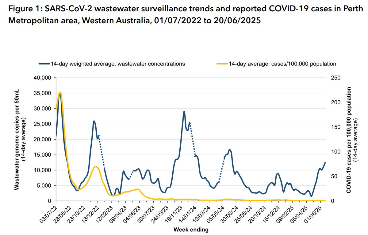
Western Australia
Ignore the yellow line. That's garbage case-count data from antiquated public health thinking. Testing is opt-in. No testy, no casey.
The blue line is wastewater. No individual testing required. 💩 don't lie. Big wave.
🧵 5/ health.wa.gov.au/articles/a_e/c…
Ignore the yellow line. That's garbage case-count data from antiquated public health thinking. Testing is opt-in. No testy, no casey.
The blue line is wastewater. No individual testing required. 💩 don't lie. Big wave.
🧵 5/ health.wa.gov.au/articles/a_e/c…
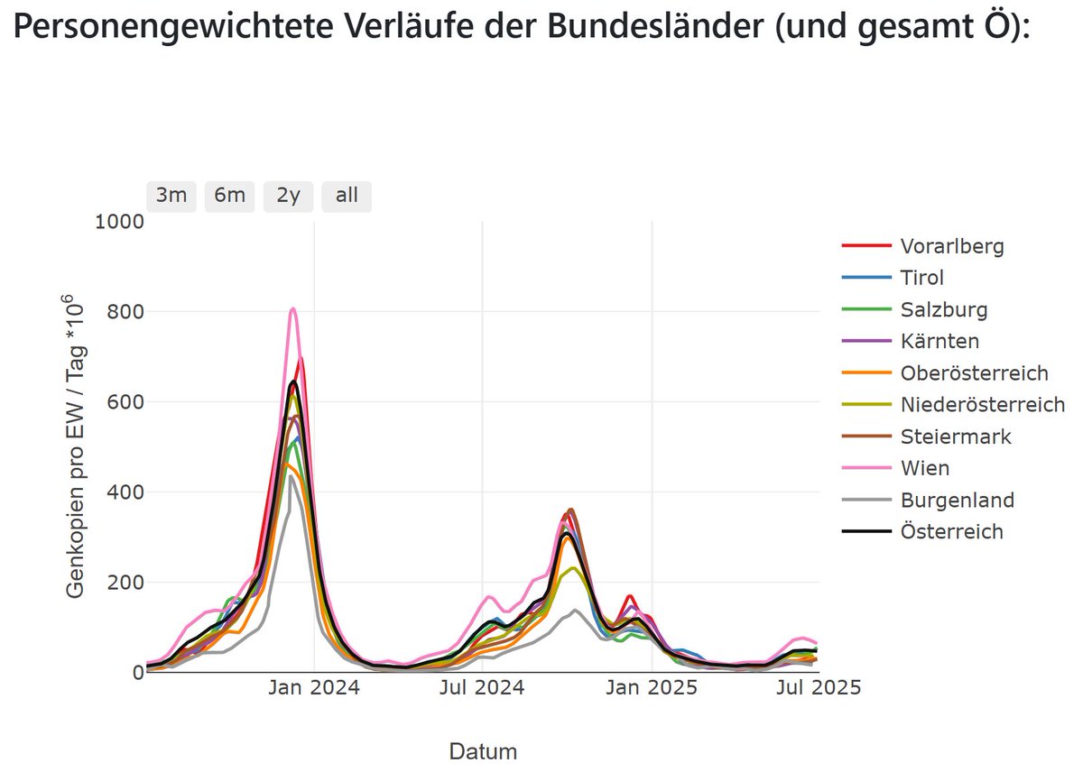
Austria
Transmission has been on an uptick the past 6 weeks.
Note: The 3rd link (Coron-A) has re-branded into the 1st link, but we've listed both in case useful.
abwassermonitoring.at/dashboard/
wien.gv.at/gesundheit/ein…
coron-a.at/dashboard/
🧵 5/
Transmission has been on an uptick the past 6 weeks.
Note: The 3rd link (Coron-A) has re-branded into the 1st link, but we've listed both in case useful.
abwassermonitoring.at/dashboard/
wien.gv.at/gesundheit/ein…
coron-a.at/dashboard/
🧵 5/

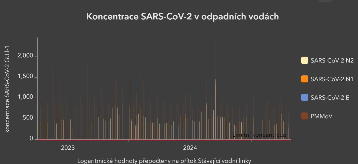
Czech Republic
The dashboard appears to have a reporting lag of 2 months, possibly due to recent flooding. Not the best quality data at the moment. Check back later.
🧵 6/ experience.arcgis.com/experience/edf…
The dashboard appears to have a reporting lag of 2 months, possibly due to recent flooding. Not the best quality data at the moment. Check back later.
🧵 6/ experience.arcgis.com/experience/edf…
Looks like CR snuck ahead of Belgium and Canada in the line during this real-time thread. Fixed. Let me know if you catch other typos or cultural mistakes on the website.
🧵 7/
🧵 7/
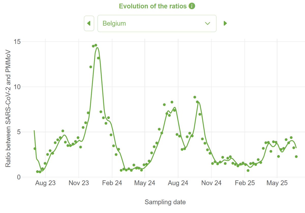
Belgium
Wastewater data show a recent uptick in transmission. Click on the dropdown menu for more specific locations.
🧵 8/ wastewater.sciensano.be/dashboard/covi…
Wastewater data show a recent uptick in transmission. Click on the dropdown menu for more specific locations.
🧵 8/ wastewater.sciensano.be/dashboard/covi…
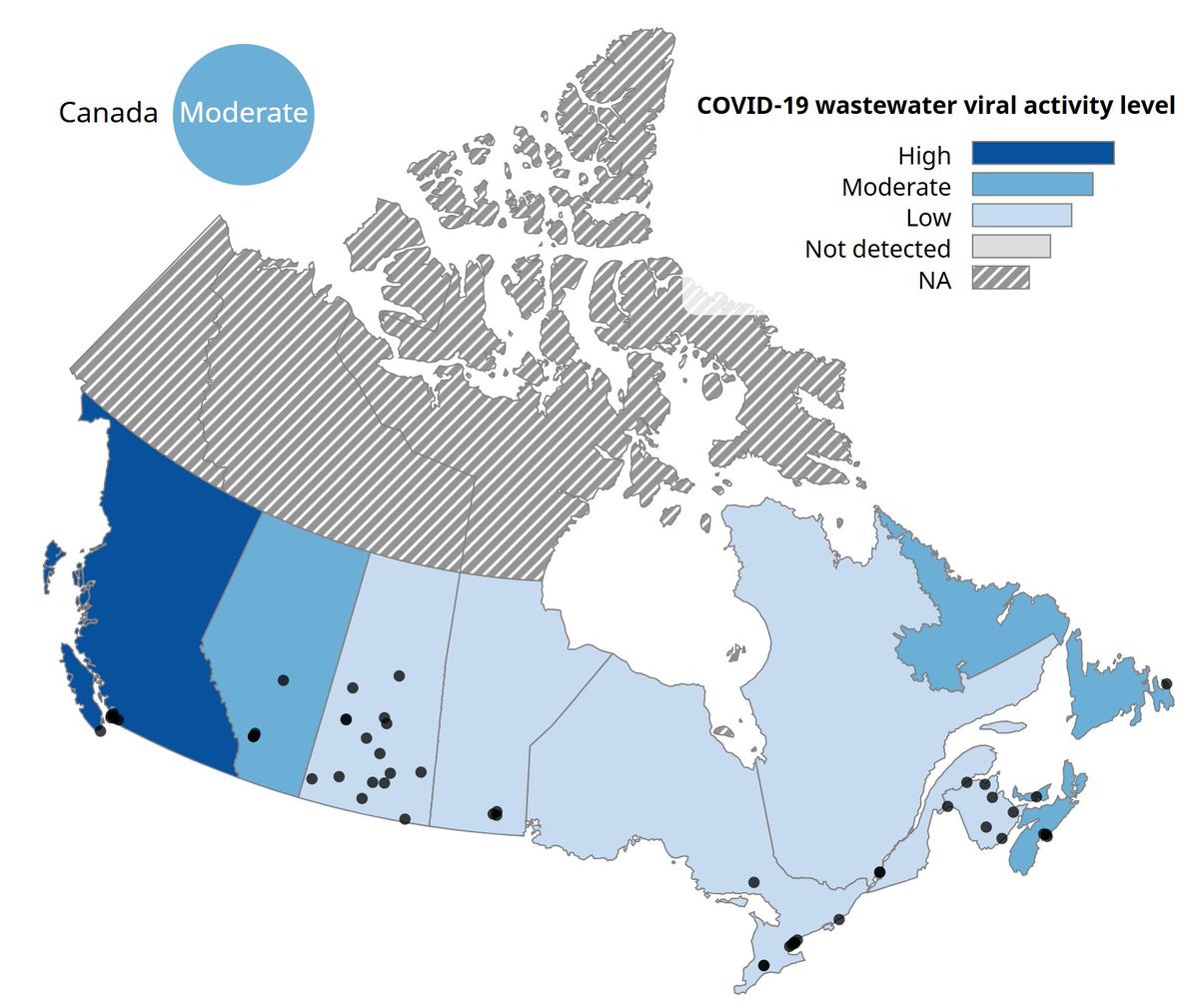
Canada - 1 of 4
The Government of Canada website his high transmission in the west. Scroll down for line graphs by region.
(High transmission is shown in "cool blue" like the U.S. CDC does. This counters geospatial ethical guidance.)
🧵 9/ health-infobase.canada.ca/wastewater/
The Government of Canada website his high transmission in the west. Scroll down for line graphs by region.
(High transmission is shown in "cool blue" like the U.S. CDC does. This counters geospatial ethical guidance.)
🧵 9/ health-infobase.canada.ca/wastewater/
Canada - 2 of 4
Andrew Young makes nice visualizations of COVID, Flu, and RSV data. Here you can see the high transmission in British Columbia.
🧵 10/ wwater.ca
Andrew Young makes nice visualizations of COVID, Flu, and RSV data. Here you can see the high transmission in British Columbia.
🧵 10/ wwater.ca

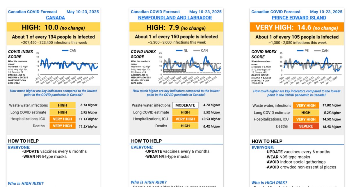
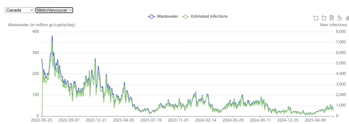
Canada - 3 of 4
Tara Moriarty runs C19 Resources Canada. They put transmission data into useful metrics and offer other resources. They normally update every 2 weeks.
Scroll down &click on the numbers 3-6 in the lower left.
🧵 11/ covid19resources.ca/covid-hazard-i…
Tara Moriarty runs C19 Resources Canada. They put transmission data into useful metrics and offer other resources. They normally update every 2 weeks.
Scroll down &click on the numbers 3-6 in the lower left.
🧵 11/ covid19resources.ca/covid-hazard-i…
Canada - 3 of 4
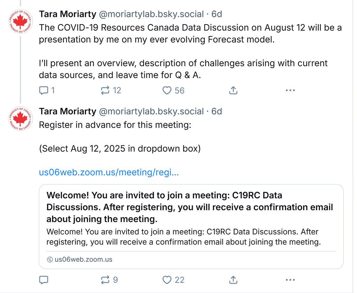
Dr. Moriarty is on Twitter and BSky for easily digestible updates. Posts more over there. They have a big meeting in August you can join.
🧵 12/ bsky.app/profile/moriar…
Dr. Moriarty is on Twitter and BSky for easily digestible updates. Posts more over there. They have a big meeting in August you can join.
🧵 12/ bsky.app/profile/moriar…
Canada - 4 of 4
The World Health Network (WHN) posts data for selected areas of Canada. They provide case estimates, using a methodology similar to PMC.
If Chrome doesn't work, try Edge or another browser.
🧵 13/ whn.global/estimation-of-…
The World Health Network (WHN) posts data for selected areas of Canada. They provide case estimates, using a methodology similar to PMC.
If Chrome doesn't work, try Edge or another browser.
🧵 13/ whn.global/estimation-of-…
Denmark
SSID Dashboard: Generally, 'very low' COVID transmission in most places currently.
🧵 14/ en.ssi.dk/surveillance-a…
SSID Dashboard: Generally, 'very low' COVID transmission in most places currently.
🧵 14/ en.ssi.dk/surveillance-a…

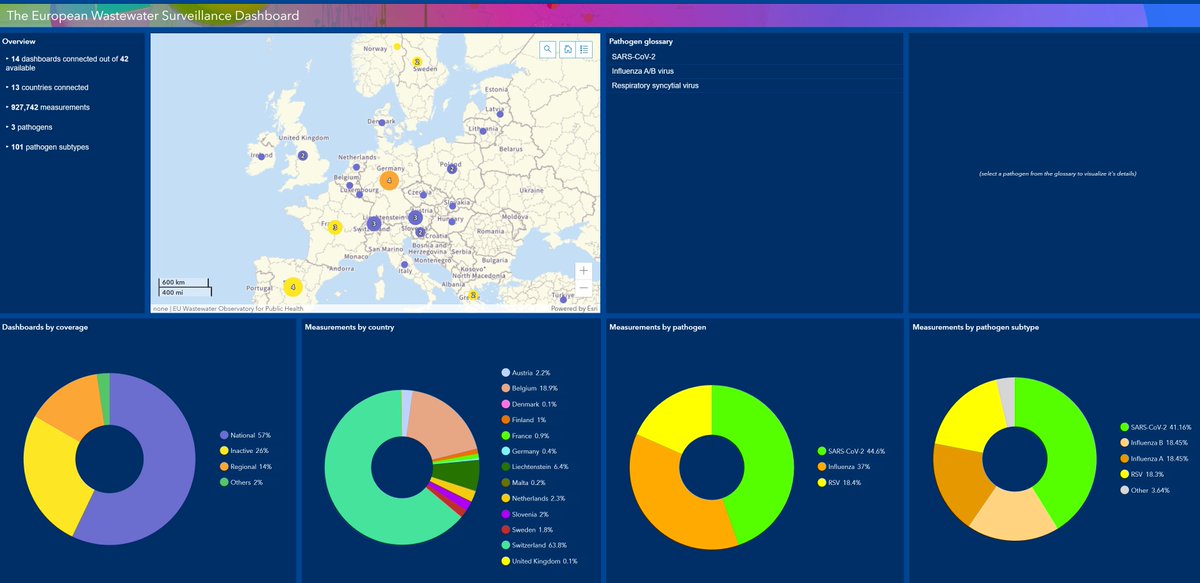
EU Multi-national Dashboard for Europe
It's slow & a little tricky to navigate but useful. You'll notice several countries have been delisted by PMC because they closed their surveillance programs very recently.
🧵 15/ …stewater-observatory.jrc.ec.europa.eu/#/content/the-…
It's slow & a little tricky to navigate but useful. You'll notice several countries have been delisted by PMC because they closed their surveillance programs very recently.
🧵 15/ …stewater-observatory.jrc.ec.europa.eu/#/content/the-…
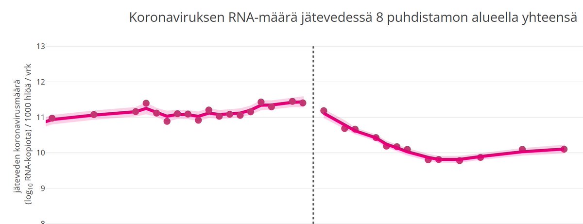
Finland
National Institute for Health and Welfare Finland - shows a slight uptick of late.
thl.fi/episeuranta/ja…
We've also linked to some old WHN data that may be useful with case estimation:
whn.global/estimation-of-…
🧵 16/
National Institute for Health and Welfare Finland - shows a slight uptick of late.
thl.fi/episeuranta/ja…
We've also linked to some old WHN data that may be useful with case estimation:
whn.global/estimation-of-…
🧵 16/
France - 1 of 5
The French government has great Covid wastewater surveillance data, but you'll likely want to use independent visualizations. Scroll down the page.
🧵 17/ data.gouv.fr/fr/datasets/65…
The French government has great Covid wastewater surveillance data, but you'll likely want to use independent visualizations. Scroll down the page.
🧵 17/ data.gouv.fr/fr/datasets/65…
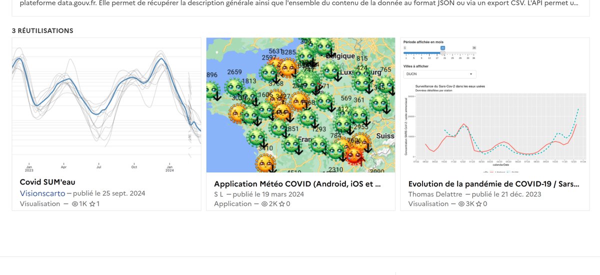
France - Dashboards 2, 3, 4, and 5
It's a mix of low versus spiking transmission across regions of France.
Check out these great Covid data visualizations for France.
associationarra.wordpress.com/suivi-regional…
observablehq.observablehq.cloud/pangea/varia/c…
sites.google.com/view/meteocovi…
tdelattre.shinyapps.io/SUMEau/
🧵 18/
It's a mix of low versus spiking transmission across regions of France.
Check out these great Covid data visualizations for France.
associationarra.wordpress.com/suivi-regional…
observablehq.observablehq.cloud/pangea/varia/c…
sites.google.com/view/meteocovi…
tdelattre.shinyapps.io/SUMEau/
🧵 18/


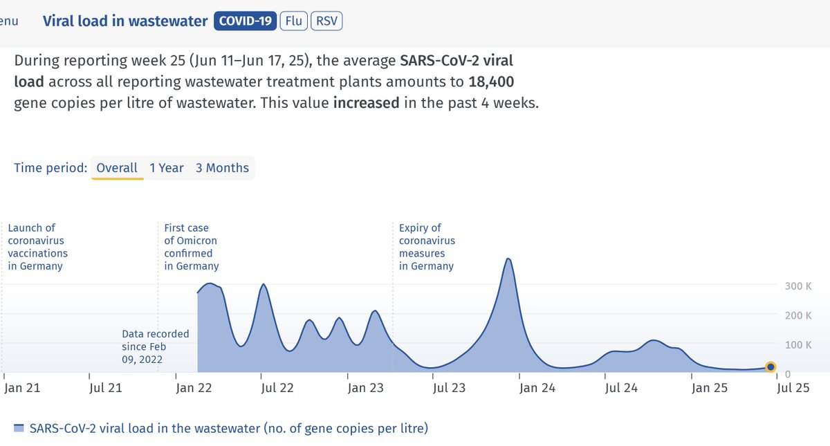
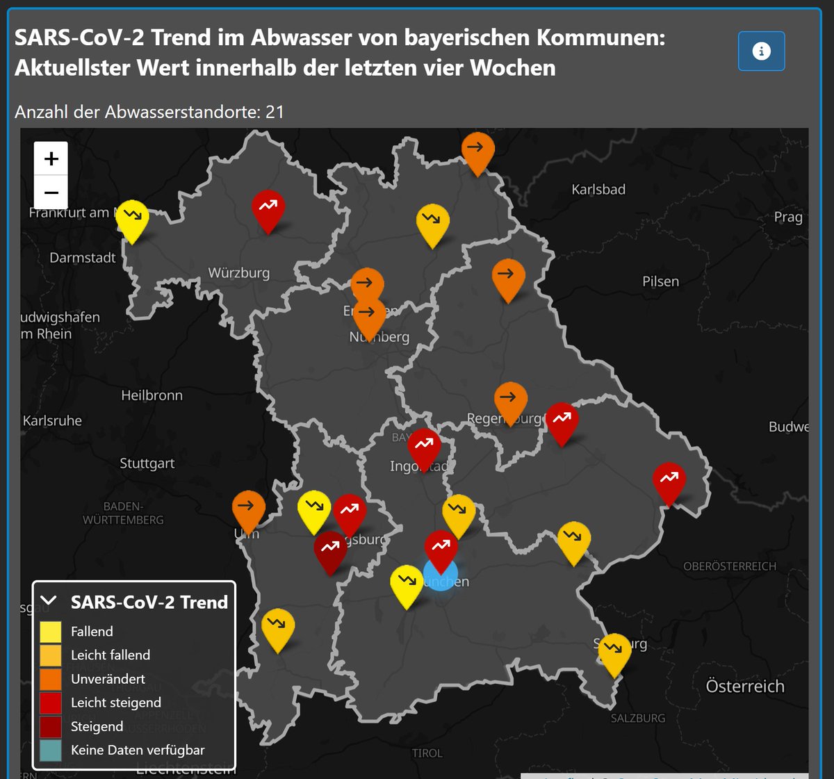
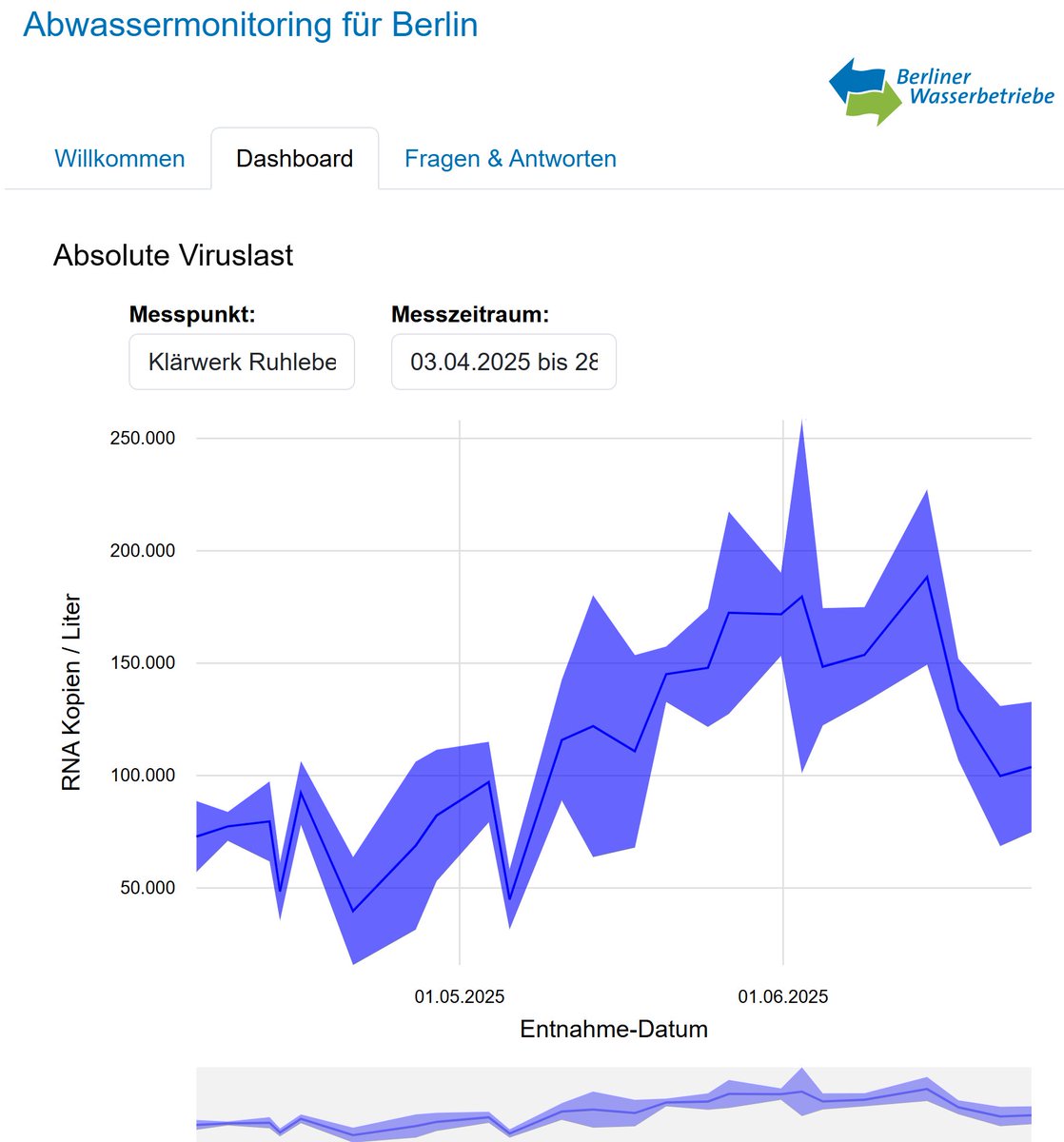
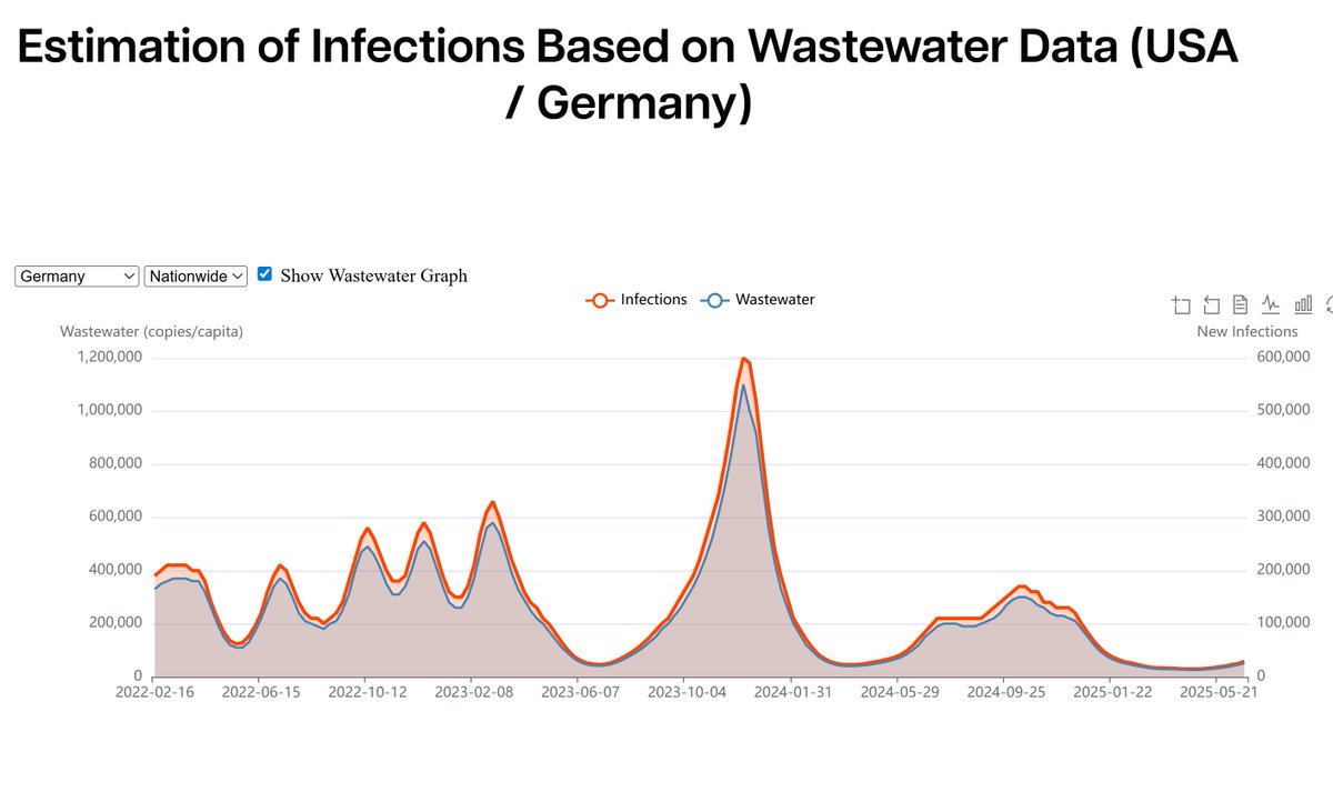
Germany - 4 COVID Dashboards
Transmission is generally 'low' & rising.
Here are the dashboards. The WHN dashboard (try in Edge) has case estimates.
infektionsradar.gesund.bund.de/en/covid/sewage
bay-voc.lmu.de/abwassermonito…
hygiene-monitor.de/dashboard/coro…
whn.global/estimation-of-…
🧵 19/
Transmission is generally 'low' & rising.
Here are the dashboards. The WHN dashboard (try in Edge) has case estimates.
infektionsradar.gesund.bund.de/en/covid/sewage
bay-voc.lmu.de/abwassermonito…
hygiene-monitor.de/dashboard/coro…
whn.global/estimation-of-…
🧵 19/
Hong Kong
CHP COVID Dashboard. Click on the most recent PDF. Skip all the legacy junk data from opt-in testing, and go down to around page 6 for wastewater.
Hong Kong is on the back end of a recent large wave.
🧵 20/ chp.gov.hk/en/resources/2…
CHP COVID Dashboard. Click on the most recent PDF. Skip all the legacy junk data from opt-in testing, and go down to around page 6 for wastewater.
Hong Kong is on the back end of a recent large wave.
🧵 20/ chp.gov.hk/en/resources/2…

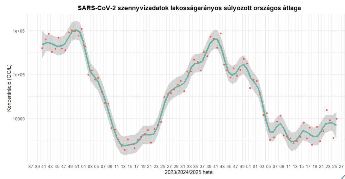
Hungary
Government COVID Dashboard. Click on the most recent report. Transmission is mostly 'low.' Scroll down for a lot more data.
🧵 21/ nngyk.gov.hu/hu/szennyviz.h…
Government COVID Dashboard. Click on the most recent report. Transmission is mostly 'low.' Scroll down for a lot more data.
🧵 21/ nngyk.gov.hu/hu/szennyviz.h…
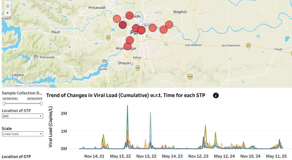
India
There are two main COVID Dashboards. The first in the Pune metro region seems more helpful due to more frequent sampling.
Pune has 'low' transmission after the recent wave.
pkc.org.in/pkc-focus-area…
lookerstudio.google.com/u/0/reporting/…
🧵 22/
There are two main COVID Dashboards. The first in the Pune metro region seems more helpful due to more frequent sampling.
Pune has 'low' transmission after the recent wave.
pkc.org.in/pkc-focus-area…
lookerstudio.google.com/u/0/reporting/…
🧵 22/
Ireland
HPSC COVID Dashboard. Click on the most recent report. You can find data by region and nationally.
Transmission was picking up after a lull. The most recent data are for May 28, and they're publishing with just over a month lag.
🧵 23/ hpsc.ie/a-z/nationalwa…
HPSC COVID Dashboard. Click on the most recent report. You can find data by region and nationally.
Transmission was picking up after a lull. The most recent data are for May 28, and they're publishing with just over a month lag.
🧵 23/ hpsc.ie/a-z/nationalwa…
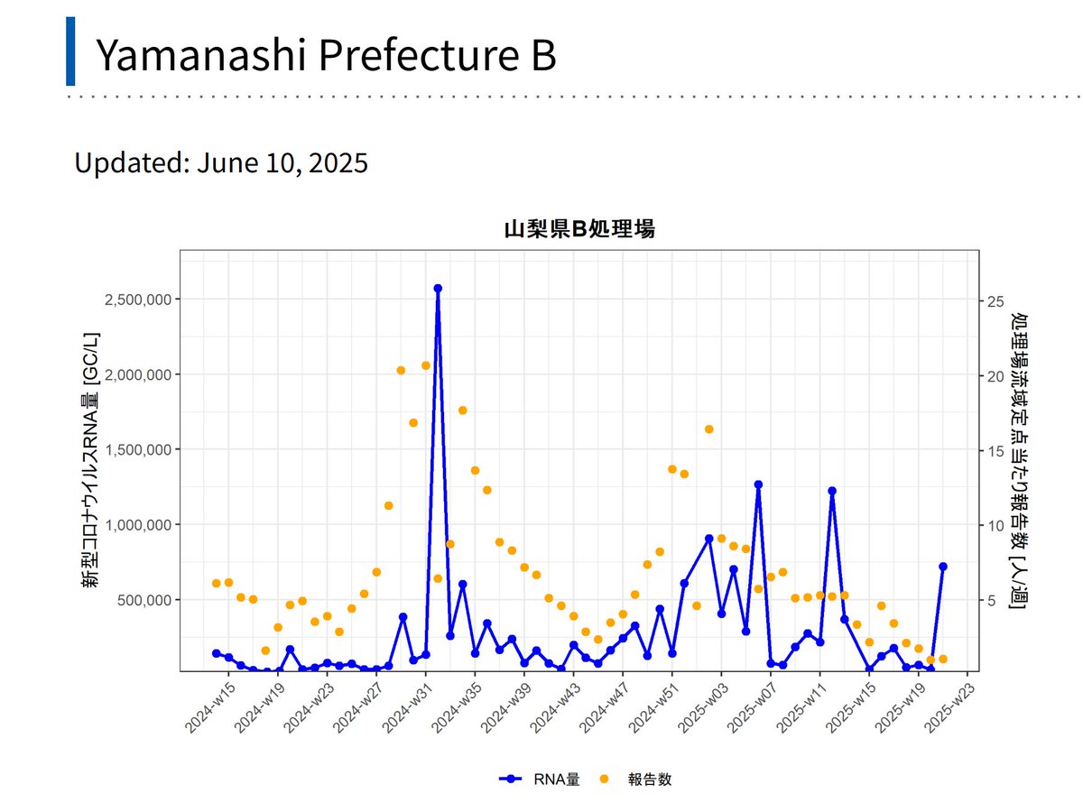
Japan
JIHS COVID Dashboard. It's all regional. Look at the blue lines (wastewater), not orange dots (reported cases, unhelpful).
Most places are 'low,' but there are some isolated spikes. Can someone aggregate the data nationally?
🧵 24/ id-info.jihs.go.jp/surveillance/n…
JIHS COVID Dashboard. It's all regional. Look at the blue lines (wastewater), not orange dots (reported cases, unhelpful).
Most places are 'low,' but there are some isolated spikes. Can someone aggregate the data nationally?
🧵 24/ id-info.jihs.go.jp/surveillance/n…
Latvia
Open the most recent PDF report. It has exquisite detail. Focus on the subtle dashed line (wastewater, useful), not the prominent bold line (reported cases, useless).
Transmission is 'low,' slightly increasing.
🧵 25/ bior.lv/lv/notekudenu-…
Open the most recent PDF report. It has exquisite detail. Focus on the subtle dashed line (wastewater, useful), not the prominent bold line (reported cases, useless).
Transmission is 'low,' slightly increasing.
🧵 25/ bior.lv/lv/notekudenu-…

Lithuania
NPHC COVID Dashboard for Vilnius, Kaunas, and Klaipėda. Focus on the orange line (wastewater), not blue bars (reported cases).
Shown, Klaipėda has the most pronounced uptick, Vilnius not far behind.
🧵 26/ nvsc.lrv.lt/en/information…
NPHC COVID Dashboard for Vilnius, Kaunas, and Klaipėda. Focus on the orange line (wastewater), not blue bars (reported cases).
Shown, Klaipėda has the most pronounced uptick, Vilnius not far behind.
🧵 26/ nvsc.lrv.lt/en/information…

Luxembourg
Microbs COVID Dashboard. The graph shows an ongoing COVID wave. Click on the pins in the nearby map for regional data.
🧵 27/ microbs.lu/dashboards/res…
Microbs COVID Dashboard. The graph shows an ongoing COVID wave. Click on the pins in the nearby map for regional data.
🧵 27/ microbs.lu/dashboards/res…

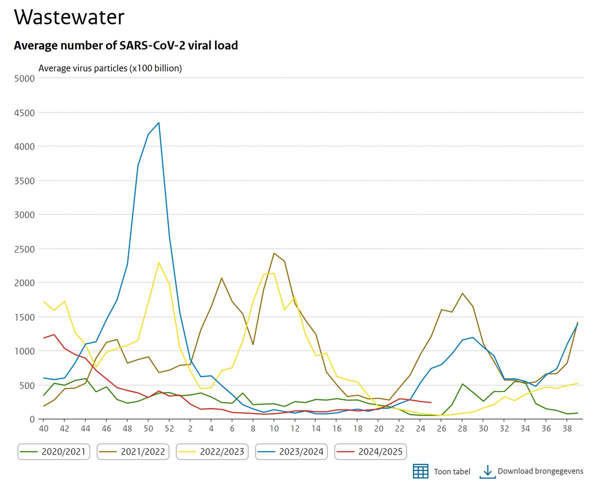
Netherlands
RIVM COVID Dashboard (graph shown). "Low" levels currently. Focus on the red line in this year-over-year graph.
rivm.nl/en/coronavirus…
WHN (open in Edge). Provides wastewater-derived case estimates for *many* locations.
whn.global/estimation-of-…
🧵 28/
RIVM COVID Dashboard (graph shown). "Low" levels currently. Focus on the red line in this year-over-year graph.
rivm.nl/en/coronavirus…
WHN (open in Edge). Provides wastewater-derived case estimates for *many* locations.
whn.global/estimation-of-…
🧵 28/
New Zealand
PHF Science's COVID Dashboard. The graph shows the national trend. Also, browse by region. A wave is ongoing (green), presently highest in the Canterbury region.
🧵 29/ esr-cri.shinyapps.io/wastewater/
PHF Science's COVID Dashboard. The graph shows the national trend. Also, browse by region. A wave is ongoing (green), presently highest in the Canterbury region.
🧵 29/ esr-cri.shinyapps.io/wastewater/

Poland
Warsaw Sewerage COVID Dashboard. Go to the bottom graph. It's 2025 but mislabeled 2024.
The graph suggests 'low,' but I question their year-over-year standardization process. Possible wave.
🧵 30/ mpwik.com.pl/view/monitorin…
Warsaw Sewerage COVID Dashboard. Go to the bottom graph. It's 2025 but mislabeled 2024.
The graph suggests 'low,' but I question their year-over-year standardization process. Possible wave.
🧵 30/ mpwik.com.pl/view/monitorin…

Slovenia
NIPH COVID Dashboard: They provide regional graphs. The blue line is wastewater-derived estimates of true cases (useful). Ignore the red (reported cases).
Cheers to Slovenia for translating wastewater to a true case estimate! ⭐️⭐️⭐️⭐️
🧵 31/ modeliranje.nijz.si/epivode/epivod…
NIPH COVID Dashboard: They provide regional graphs. The blue line is wastewater-derived estimates of true cases (useful). Ignore the red (reported cases).
Cheers to Slovenia for translating wastewater to a true case estimate! ⭐️⭐️⭐️⭐️
🧵 31/ modeliranje.nijz.si/epivode/epivod…

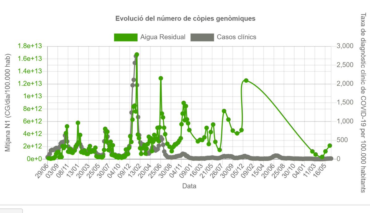
Spain
Catalonia COVID Dashboard: Transmission is currently in an uptick (moderate levels, green). They took a 1-year break from recording levels, which is why that wave near the right looks weird.
🧵 32/ sarsaigua.icra.cat
Catalonia COVID Dashboard: Transmission is currently in an uptick (moderate levels, green). They took a 1-year break from recording levels, which is why that wave near the right looks weird.
🧵 32/ sarsaigua.icra.cat
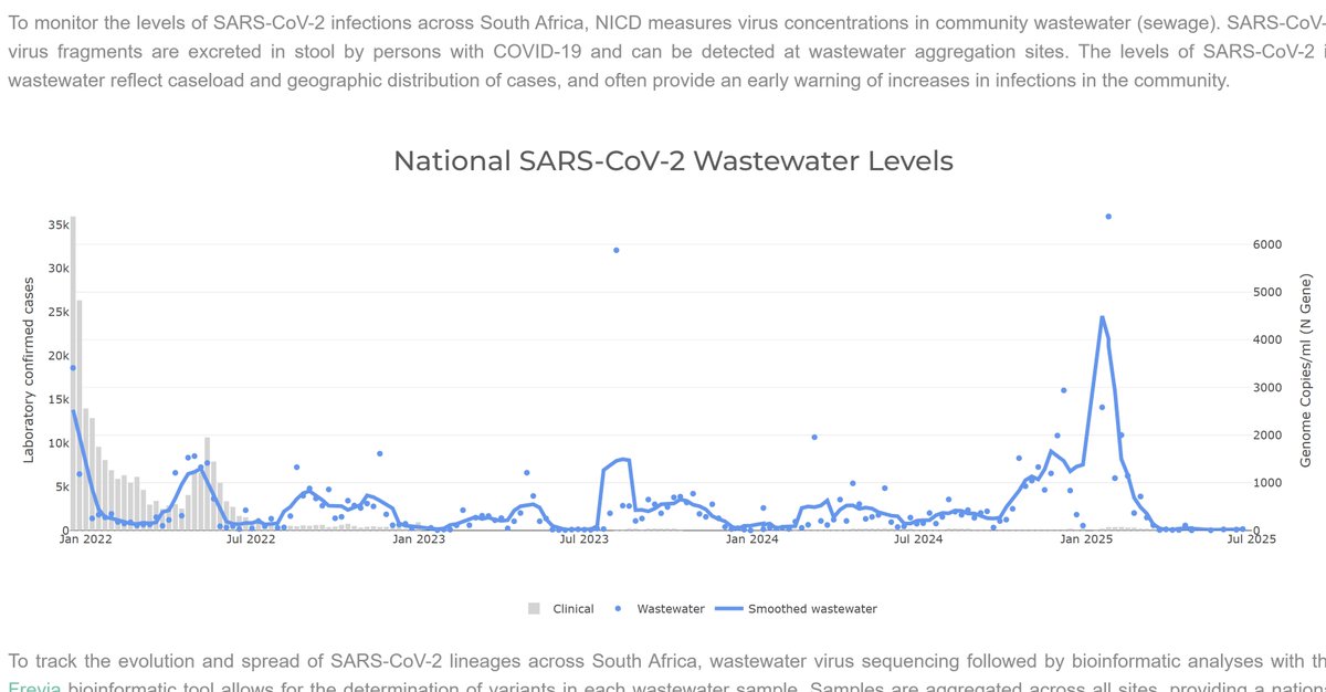
South Africa
NICD COVID Dashboard. Transmission levels are presently 'low.'
🧵 33/ wastewater.nicd.ac.za
NICD COVID Dashboard. Transmission levels are presently 'low.'
🧵 33/ wastewater.nicd.ac.za
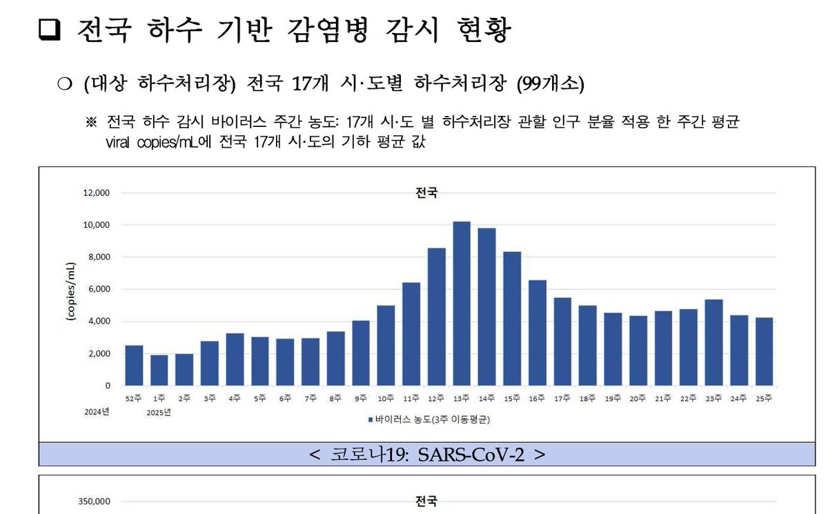
South Korea
Disease Control & Prevention Agency COVID Dashboard: Click on the most recent report, and download the PDF.
Transmission is presently moderate and sustained.
🧵 34/ dportal.kdca.go.kr/pot/bbs/BD_sel…
Disease Control & Prevention Agency COVID Dashboard: Click on the most recent report, and download the PDF.
Transmission is presently moderate and sustained.
🧵 34/ dportal.kdca.go.kr/pot/bbs/BD_sel…
Sweden
Pathogens COVID Dashboard: The graph is terrible. Try selecting specific regions, or hover over the graph and use tools in the upper left to set the max closer to 100.
In Stockholm, for example, see a recent uptick in transmission.
🧵 35/ pathogens.se/dashboards/cov…
Pathogens COVID Dashboard: The graph is terrible. Try selecting specific regions, or hover over the graph and use tools in the upper left to set the max closer to 100.
In Stockholm, for example, see a recent uptick in transmission.
🧵 35/ pathogens.se/dashboards/cov…

Switzerland - 2 Dashboards
FOPH: Very limited COVID wastewater data (map)
idd.bag.admin.ch/diseases/covid…
ETH WISE Dashboard: Shows longitudinal trends
wise.ethz.ch
Both show 'low' transmission currently.
🧵 36/
FOPH: Very limited COVID wastewater data (map)
idd.bag.admin.ch/diseases/covid…
ETH WISE Dashboard: Shows longitudinal trends
wise.ethz.ch
Both show 'low' transmission currently.
🧵 36/


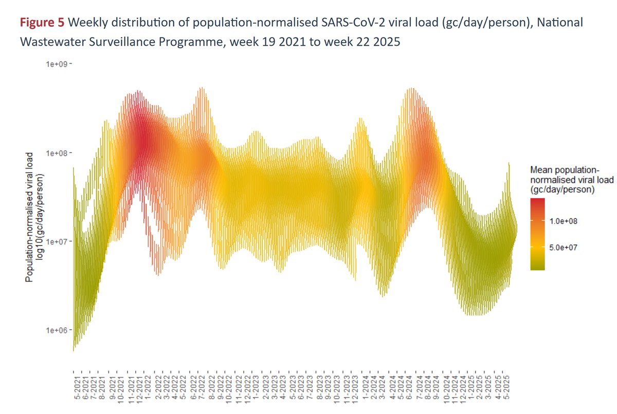
U.K. - 1 of 2
Public Health Scotland: Shows COVID transmission is rising.
Keep in mind, during the UKHSA testing based surveillance study, transmission in Scotland and England correlated near perfectly (r=.99). Assume similar across the UK.
🧵 37/ scotland.shinyapps.io/phs-respirator…
Public Health Scotland: Shows COVID transmission is rising.
Keep in mind, during the UKHSA testing based surveillance study, transmission in Scotland and England correlated near perfectly (r=.99). Assume similar across the UK.
🧵 37/ scotland.shinyapps.io/phs-respirator…

U.K. - 2 of 2
Keep in eye on @BuDs_UK. They estimate transmission levels for England, using the metric people care about most (1 in ___ estimated infectious).
The UKHSA study enabled reasonable estimates along these lines.
🧵 38/buds.org.uk/category/our-w…
Keep in eye on @BuDs_UK. They estimate transmission levels for England, using the metric people care about most (1 in ___ estimated infectious).
The UKHSA study enabled reasonable estimates along these lines.
🧵 38/buds.org.uk/category/our-w…
@BuDs_UK Highlights:
⭐️Many high-quality data sources around the world.
⭐️Some less-resources countries are still monitoring COVID well.
⭐️Slovenia makes true-case estimates!
⭐️Many good public health officials and citizen scientists making this happen. Keep fighting!!
🧵 39/
⭐️Many high-quality data sources around the world.
⭐️Some less-resources countries are still monitoring COVID well.
⭐️Slovenia makes true-case estimates!
⭐️Many good public health officials and citizen scientists making this happen. Keep fighting!!
🧵 39/
@BuDs_UK Concerns:
🔹Need to support low-resource countries to increase monitoring (South America, Africa, Asia).
🔹Gov't dashboards feature legacy low-quality data 1st (reported cases), have slow dashboards, or PDFs only.
🔹Stats provided rarely useful to general audiences.
🧵 40/
🔹Need to support low-resource countries to increase monitoring (South America, Africa, Asia).
🔹Gov't dashboards feature legacy low-quality data 1st (reported cases), have slow dashboards, or PDFs only.
🔹Stats provided rarely useful to general audiences.
🧵 40/
@BuDs_UK How can you help?
🔥Share, translate, and add commentary to what I have posted for your nearby dashboard.
🔥Provide your own updates weekly or monthly about your nearby dashboard.
🔥Let me know what dashboards I have missed, so I can review and add them.
🧵 41/
🔥Share, translate, and add commentary to what I have posted for your nearby dashboard.
🔥Provide your own updates weekly or monthly about your nearby dashboard.
🔥Let me know what dashboards I have missed, so I can review and add them.
🧵 41/
@BuDs_UK If you found this thread helpful, please re-share the first post too.
🧵 42/
🧵 42/
https://x.com/michael_hoerger/status/1940262075068301339
• • •
Missing some Tweet in this thread? You can try to
force a refresh