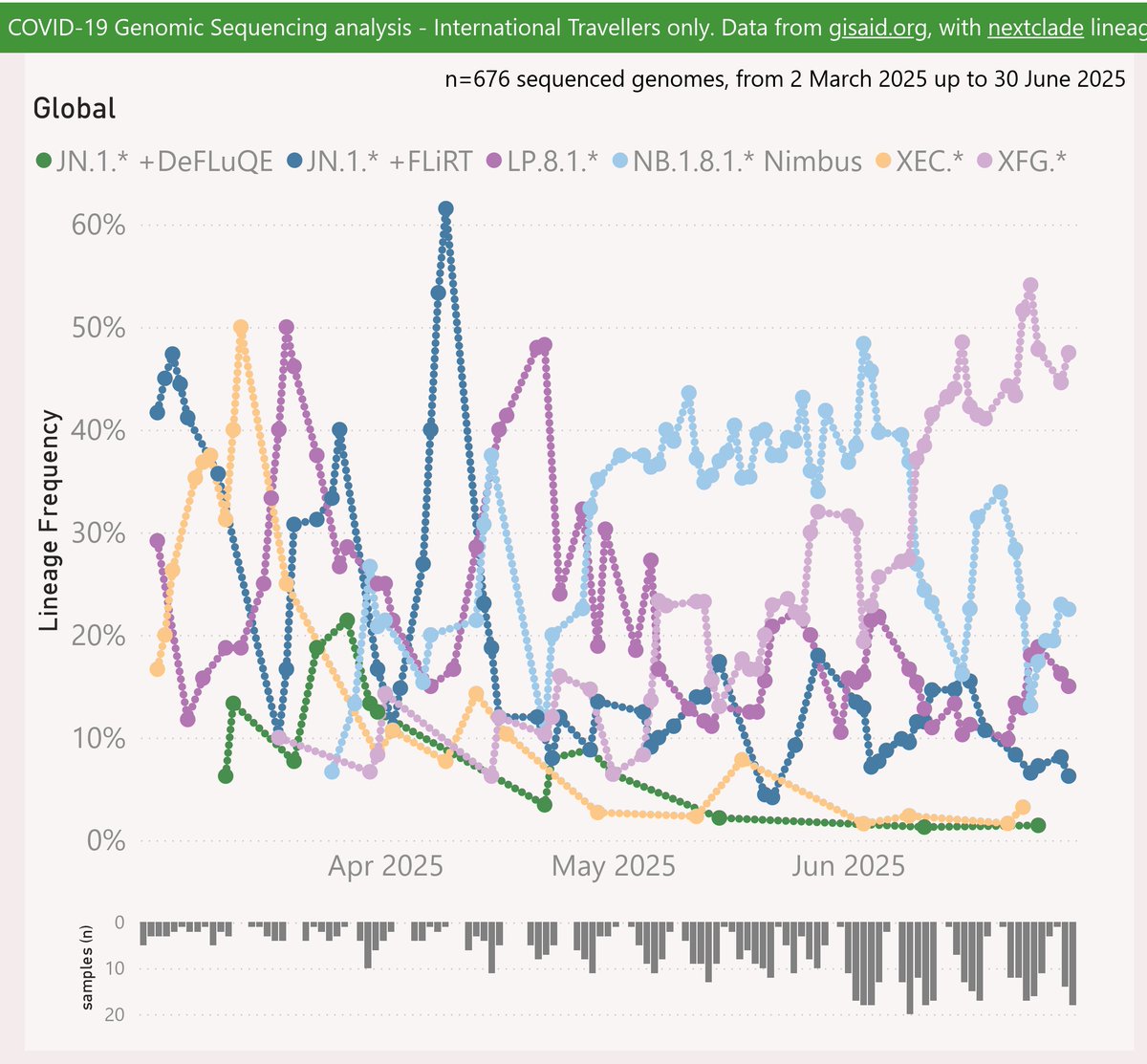
Here are the trends across all the International Traveller samples. From that perspective, XFG.* "Stratus" is dominant at 48%.
This dataset (mostly arrivals in the US and Japan) is arguably more random, as it is not skewed by sequencing volumes.
🧵
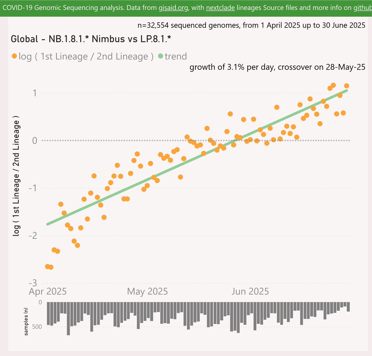
Globally, the NB.1.8.1 "Nimbus" variant is showing a steady growth advantage of 3.1% per day (22% per week) over the LP.8.1.* variant, with a crossover in late May.
🧵
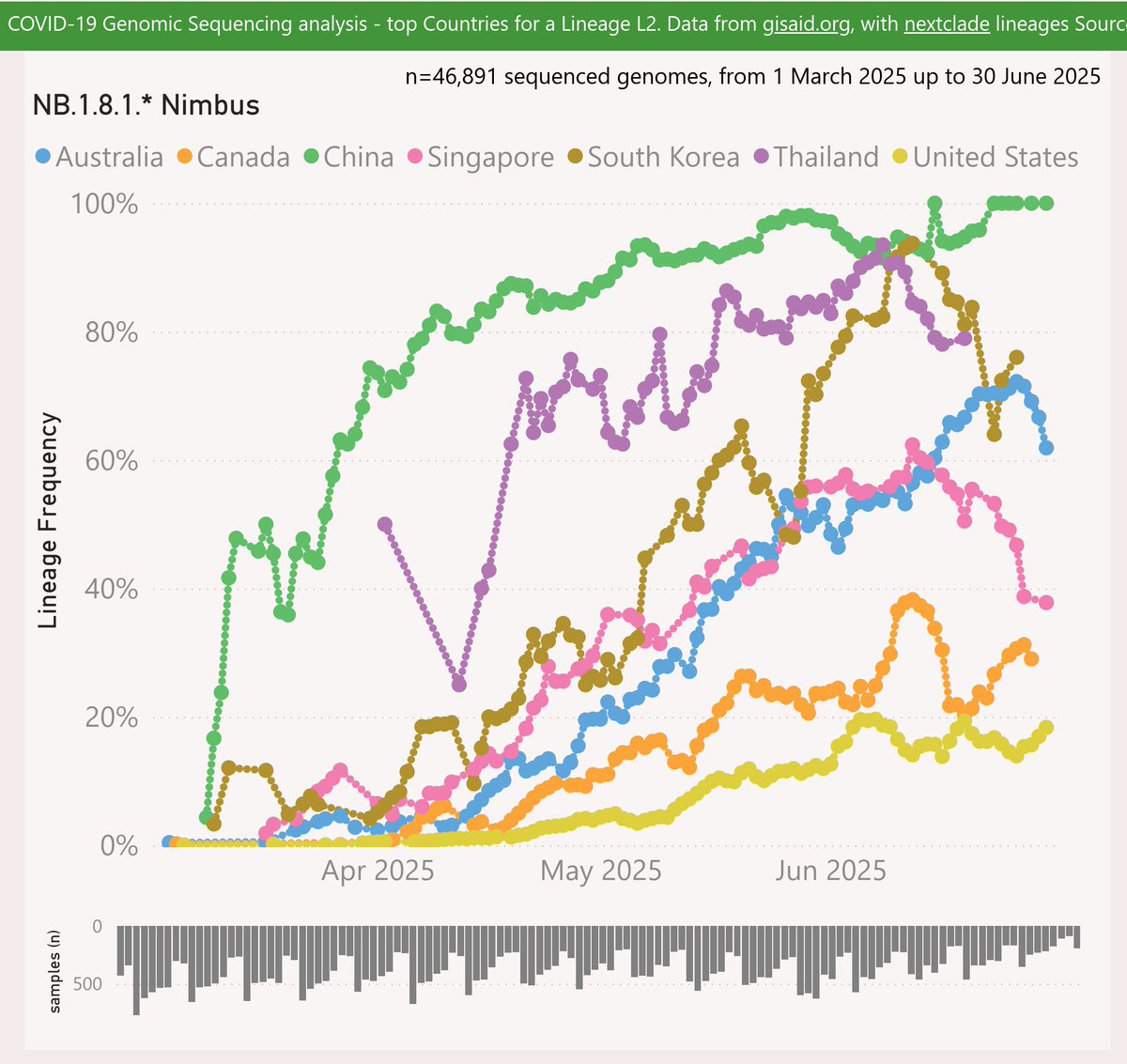
Here are the leading countries reporting NB.1.8.1 "Nimbus". There seem to be 3 tracks:
- China, Thailand and South Korea are reporting a clean sweep or close to it.
- Singapore and Australia in a mid-range
- growth in the US, UK and Canada has been lower at 20-30%.
🧵
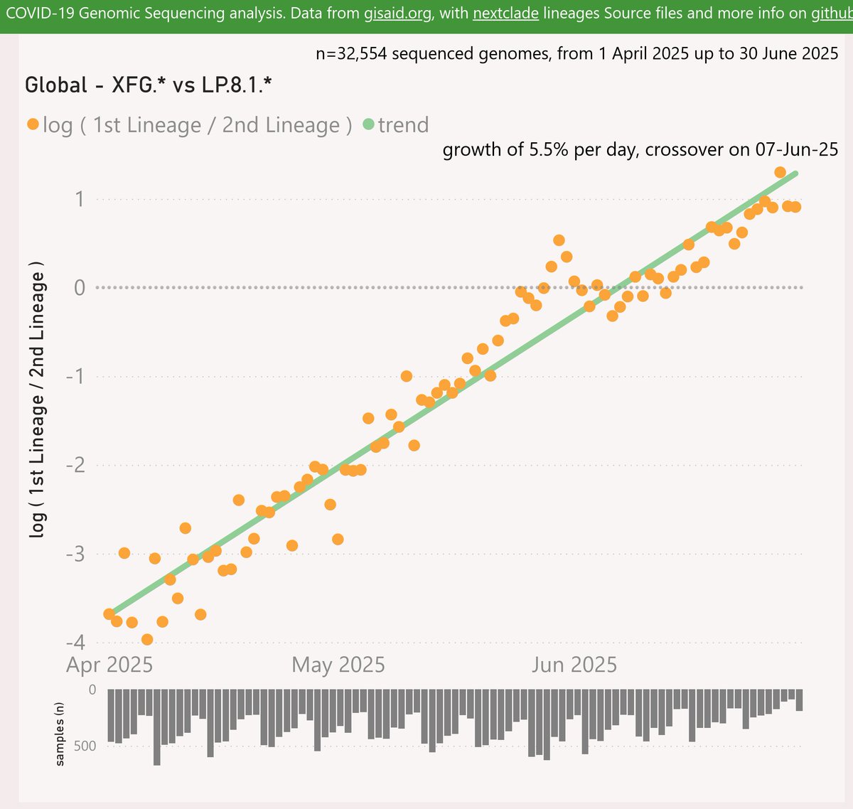
Globally, the XFG.* "Stratus" variant is showing a stronger growth advantage of 5.5% per day (39% per week) over the LP.8.1.* variant. That shows a crossover in early June.
🧵
Here are the leading countries reporting XFG.* "Stratus". It reached 77% in India, before falling to finish at 54%. It has also shown sustained growth to around 55% in the US, with the other leading countries on a very similar trajectory.
🧵
This adds further weight to the case for Stratus over Nimbus. It suggests a double-wave could be in store for those countries who have already had mid-level Nimbus waves e.g. Singapore and Australia.
🧵
A recent scientific paper compared long-term mortality by vaccination status.
I noticed that Table 2 drew a lot of attention, but was actually included in the paper as a static image. So I built a quick dataviz project to explore.
🧵
On the first page, I've added a % Incidence change (vaccinated vs unvaccinated) and emphasised that with data bars. This is quicker for general readers to grasp than hazard ratios.
🧵
You can click on any column header to sort the rows, e.g. as shown by % Incidence change. The starkest difference was deaths from COVID-19 at +372%.
Other causes with significant differences were diseases of the skin & blood, pregnancy and childbirth.
🧵
A recent scientific paper included an antigenic map, comparing the immune status of individuals vaccinated with a range of vaccines "… vaccinated sera", against a collection of significant variants "Virus …".
The map was very informative, so I built a quick dataviz project.
🧵
The map shows starkly that BA.3.2 "Cicada" is a wild outlier, way out on its own in the south-west corner. This suggests the current vaccines and/or disease-acquired immunity will not offer strong protection against infection.
🧵
Another point of note is how the XFG "Stratus" variant is the furthest away from BA.3.2, at the extreme south, compared to other recent variants.
This might help explain how BA.3.2 has been able to drive significant waves in Europe, following their recent waves of XFG
🧵
Here's the latest variant picture for Europe (excluding the UK), to late November.
BA.3.2.* "Cicada" is showing a very strong growth advantage of 7.9% per day (55% per week) over XFG.* "Stratus", which predicts a crossover in late December.
#COVID19 #EUR #BA_3_2 #Cicada #XFG
🧵
To include the latest BA.3.2.* samples, I have rolled my reporting window forward an extra week or so. So the most recent data is even less representative than usual. The picture for those dates might change as more data is shared.
🧵
Here are the leading European countries reporting BA.3.2.* .
The Netherlands leapfrogged Germany to report the highest frequency at 31%. Germany also grew sharply to 25%. Denmark grew to 16%.
🧵
Here's the latest variant picture for the United Kingdom, to late November.
For the UK, BA.3.2.* "Cicada" is showing a strong growth advantage of 5% per day (35% per week) over XFG.* "Stratus", which predicts an imminent crossover.
#COVID19 #SARSCoV2 #UK #BA_3_2 #Cicada
🧵
To include the latest BA.3.2.* samples, I have rolled my reporting window forward an extra week. So the most recent data is even less representative than usual. The picture for those dates might change as more data is shared.
🧵
BA.3.2.* accelerated sharply in Scotland to 16% of recent samples.
🧵
A recent scientific paper explored the impact of mass SARS-CoV-2 infections on Lymphocytes (crucial to the body’s immune system).
I noticed the authors had shared the data behind their charts in the Appendix Supplementary materials, so I built a quick dataviz project.
🧵
Above, I’ve re-cast the data behind their Figures 3 and 5 in terms of % change from the baseline. Hopefully this is useful to help compare the subsets, whose results vary in scale.
🧵
I added interactive filter controls and a trend line (dashed pink). You can use those to explore for example the trends in the last 12 months measured in the paper, for the CD3, 4 & 8 series.
🧵
It became clear during November that a unusual second wave is underway in Australia, driven by the new "clade K" (H3N2 clade 2a.3a.1, subclade K).
Tasmania, New South Wales and South Australia are currently the hardest-hit.
#Influenza #Australia
🧵
Western Australia had been spared the worst of this second wave until the last week or so. But now there’s a signal of a sharp change in case momentum there also.
🧵
The latest Australian Respiratory Surveillance Report confirms my earlier speculation that the new "clade K" (H3N2 clade 2a.3a.1, subclade K) is driving the "unusual" second wave of influenza in Australia.