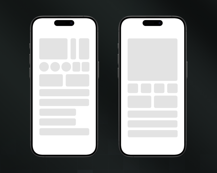
Look at these 2 UIs.
One of them will 100% outperform the other for one reason:
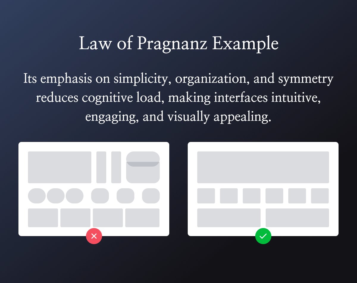
Law of Prägnanz.
Here's how this psychological principle works & how to use it in your products:
One of them will 100% outperform the other for one reason:
Law of Prägnanz.
Here's how this psychological principle works & how to use it in your products:
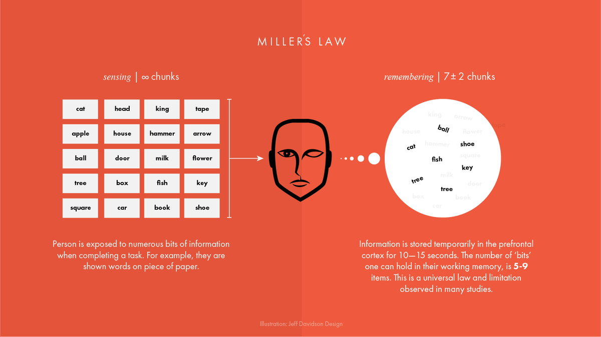
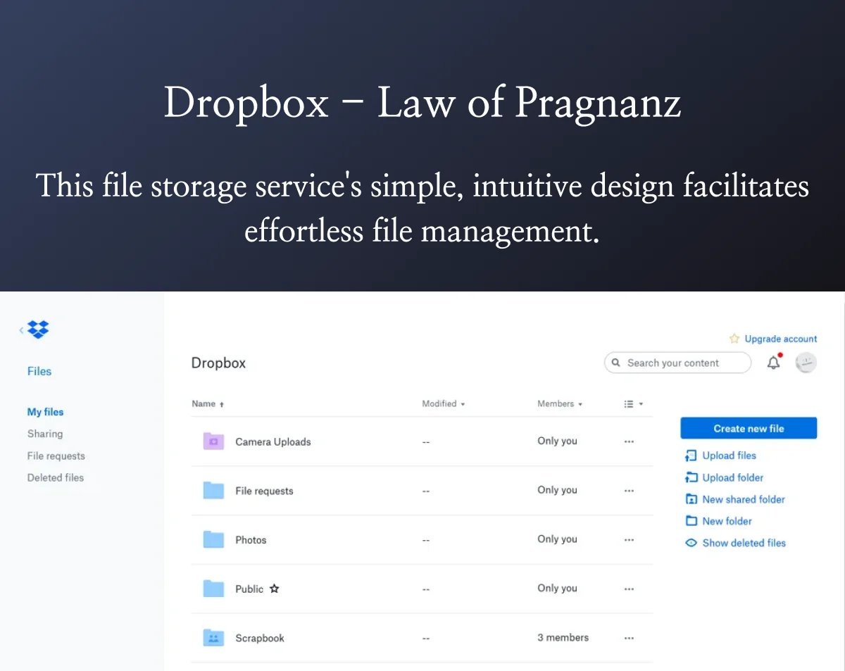
The Law of Prägnanz says our brains are lazy as f*ck.
We automatically simplify complex shapes into the most basic forms possible.
It's why you see faces in clouds. Your brain's just trying to make sense of chaos.
(Credits: plusnarrative)
We automatically simplify complex shapes into the most basic forms possible.
It's why you see faces in clouds. Your brain's just trying to make sense of chaos.
(Credits: plusnarrative)
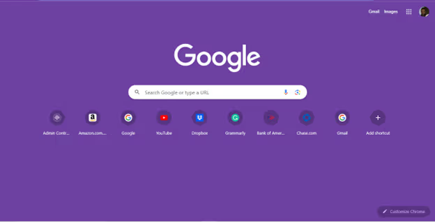
Most designers create UIs that fight against how our brains actually work.
They add gradients, shadows, & complex icons thinking it looks "premium."
Nah bro. You're just making users work harder. (Just learn from @google)
They add gradients, shadows, & complex icons thinking it looks "premium."
Nah bro. You're just making users work harder. (Just learn from @google)
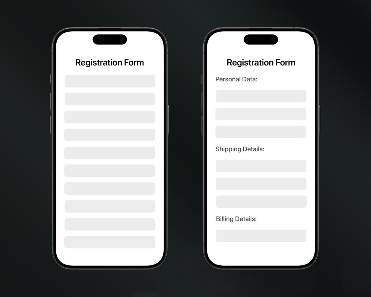
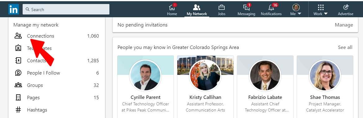
Here's a bad example:
This is @LinkedIn’s old “My Network” page. At first glance, it feels… messy:
• No clear hierarchy
• Unrelated sections crammed together
• Primary actions (like managing connections) buried under noise
Users get overwhelmed & drop off.
This is @LinkedIn’s old “My Network” page. At first glance, it feels… messy:
• No clear hierarchy
• Unrelated sections crammed together
• Primary actions (like managing connections) buried under noise
Users get overwhelmed & drop off.
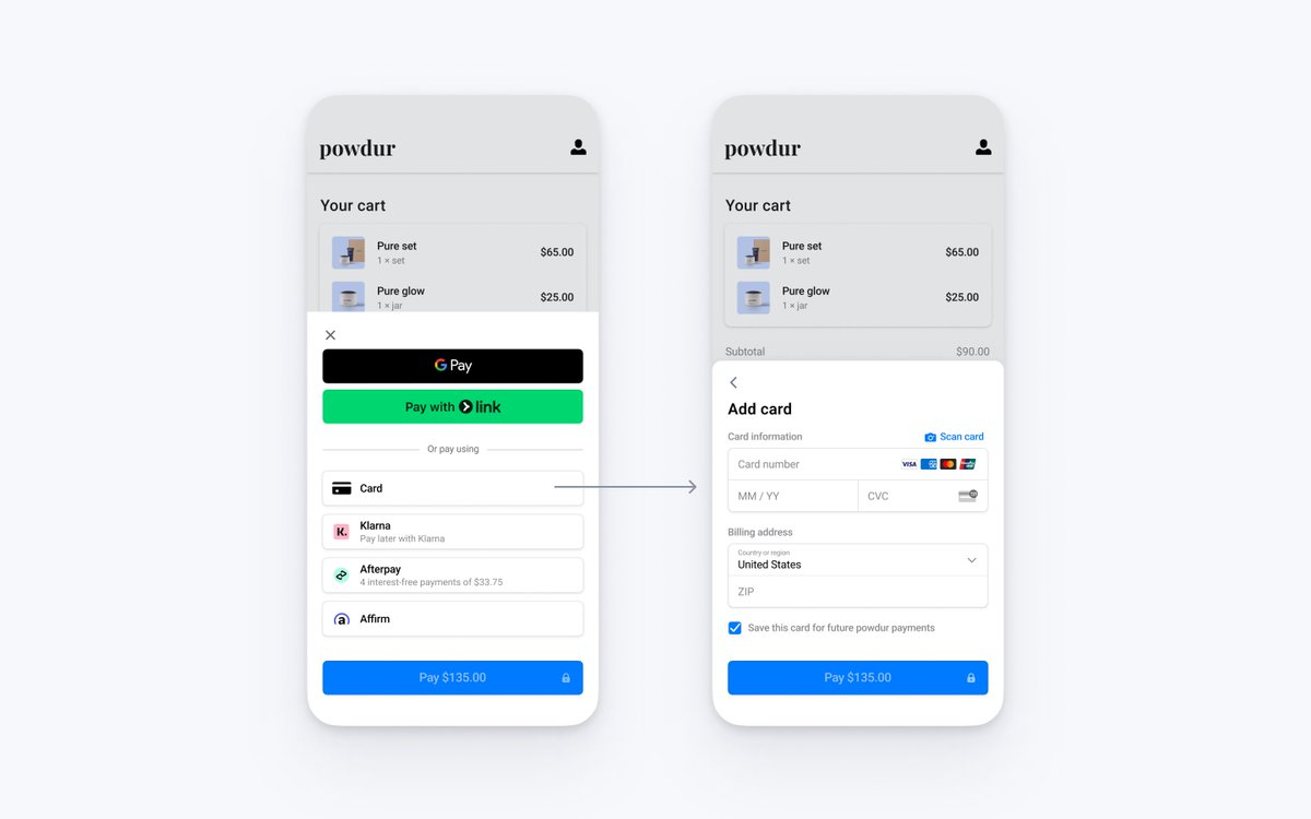
Now this is a Good example:
This checkout screen of @stripe gets it right.
• Primary actions stand out clearly (Pay button)
• Payment options grouped logically & visually clean
• Secondary details (like ZIP, save card) are tucked below
Feels effortless to use.
This checkout screen of @stripe gets it right.
• Primary actions stand out clearly (Pay button)
• Payment options grouped logically & visually clean
• Secondary details (like ZIP, save card) are tucked below
Feels effortless to use.
This is how to apply it in your work:
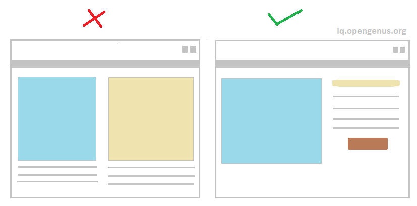
1. Group related stuff together
Your brain sees it as ONE thing instead of 20. Less mental load = happier users.
2. Use consistent shapes
Mixing circles, squares, and triangles? Stop. Pick one dominant shape and stick with it.
1. Group related stuff together
Your brain sees it as ONE thing instead of 20. Less mental load = happier users.
2. Use consistent shapes
Mixing circles, squares, and triangles? Stop. Pick one dominant shape and stick with it.
3. Create visual hierarchies
Big = important. Small = less important. Your brain gets this instantly without any thinking.
4. Embrace white space
It's not empty. It's giving your user's brain a break. Like punctuation in a sentence.
Big = important. Small = less important. Your brain gets this instantly without any thinking.
4. Embrace white space
It's not empty. It's giving your user's brain a break. Like punctuation in a sentence.
Spotify's interface is another Law of Prägnanz masterclass.
• Consistent rounded rectangles everywhere
• Clear grouping (playlists, albums, artists)
• Tons of breathing room
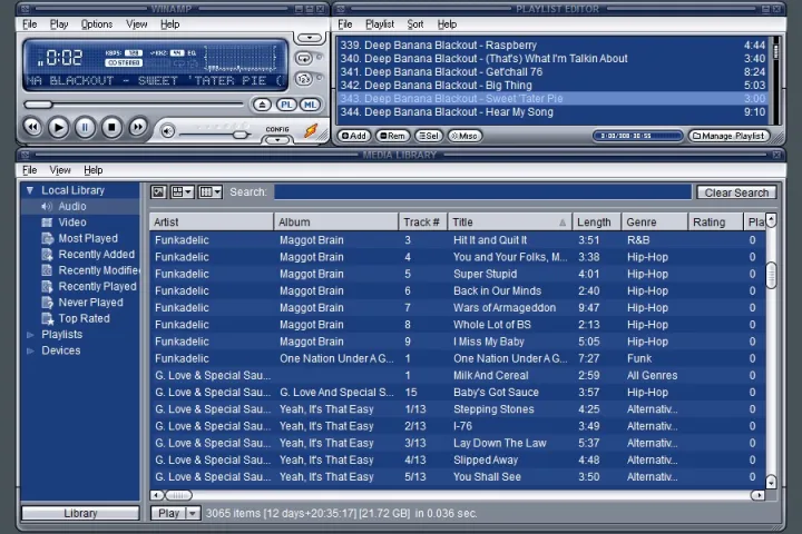
Compare that to early 2000s media players...
• Consistent rounded rectangles everywhere
• Clear grouping (playlists, albums, artists)
• Tons of breathing room
Compare that to early 2000s media players...
Remember Winamp lol?
Every button was different.
Literally 0 visual hierarchy.
Gradients everywhere.
Your brain had to WORK to understand it.
That's why simple apps win. The best interfaces feel invisible.
Every button was different.
Literally 0 visual hierarchy.
Gradients everywhere.
Your brain had to WORK to understand it.
That's why simple apps win. The best interfaces feel invisible.

Users don't think "wow this is beautiful design."
They think "wow this is easy to use."
That's the Law of Prägnanz in action.
Stop designing for other designers.
Design for lazy brains. Because that's what we all have.
They think "wow this is easy to use."
That's the Law of Prägnanz in action.
Stop designing for other designers.
Design for lazy brains. Because that's what we all have.
Founders:
We've helped 60+ startups ship beautiful products that actually convert.
So if you’re looking for a metrics-driven, world-class UX/UI for your app/product with no fluff...
Book a call and let’s see how we can help:
figura.digital
We've helped 60+ startups ship beautiful products that actually convert.
So if you’re looking for a metrics-driven, world-class UX/UI for your app/product with no fluff...
Book a call and let’s see how we can help:
figura.digital
Liked this thread?
Give your bro @DenisJeliazkov a follow for more cool design processes & breakdowns.
And like/repost to help a fellow designer:
Give your bro @DenisJeliazkov a follow for more cool design processes & breakdowns.
And like/repost to help a fellow designer:
https://twitter.com/711232574245498880/status/1947673036187906232
• • •
Missing some Tweet in this thread? You can try to
force a refresh