Denislav Jeliazkov Profile picture
Designer & maker ✦ I help founders build products people love ✦ Built 60+ products for high-growth startups. See work → https://t.co/TgoHSKsCPN | Book a call ↓
4 subscribers
Sep 12 17 tweets 7 min read
I'm obsessed with design.

Over the last 6 years, I've analysed every Travel App on the market.

Here are 11 of the best (and worst) Travel Apps & what you can learn from their UI/UX(& the market gaps everyone's missing):

1. @Airbnb Image THE BEST

These guys get it.

Real-time search that doesn't make you want to punch your screen. Map, pricing, availability - boom, all in one view.

No dead ends. No "sorry, not available" after 10 clicks.

The filters actually feel like filters, not a damn spreadsheet.
Image
Aug 14 12 tweets 4 min read
I'm a product designer.

I've definitely spent 1000+ hours analyzing tiny UI details.

My current obsession is @Apple's Glassmorphism.

Here's the insane technical breakdown nobody talks about (and how you can use this trend effectively in your products): Image The OG glassmorphism started as a trend.

Designers threw in 20px blur and 10% white, called it “frosted UI.”

Yes it was pretty, but it sure as hell wasn't the most functional.
Too much contrast, bad layering, zero depth logic.

Then @Apple said: “Let’s fix it.”
Aug 9 14 tweets 5 min read
Look at these 2 UIs.

One of them will 100% outperform the other for one reason:

Peak-End Rule.

Here's how this psychological principle works & how to use it in your products: Image As the name suggests, this rule states that your users don't remember everything about your app.

They only remember two things:

1. The most intense moment (peak)
2. How it Ends

That's it. The rest is forgotten by their brain.

(Credits: @UXChrisNguyen)
Aug 2 14 tweets 5 min read
I'm a design addict.

I've tested pretty much every music app on the market — and these 5 are worth studying.

Here's a UI/UX breakdown of the 5 most popular music apps (and which features product designers & founders can steal from them): Image 1. @SPOTIFY:

The Social Media of Music. They turned music into @Instagram.

Wrapped = yearly flex
Shared playlists = social currency
Algorithm = scary good at predicting vibes

But here's what they don't tell you:
Jul 31 12 tweets 5 min read
Look at these 2 UIs.

One of them will 100% outperform the other for one reason:

Fitts's Law.

Here's how this psychological principle works & how to use it in your products: Image Fitts’s Law in 3 seconds:

The closer & bigger the target, the faster & easier it is to hit.

You already know this in your bones. It’s why:

• You miss the “close” button & accidentally open an ad
• You try to tap “save” but hit “delete” instead

(credits: anirudhux)
Jul 26 10 tweets 4 min read
As a product designer, here are 8 of my favourite designers on X:

(with a breakdown of their best shots) 🧵

1. @raunofreiberg - show me a more interactive website, I'll wait 2. @msenyil

UI that feels alive - even when it’s a throwback.

His Atari on-chain project with @Coinbase.

A perfect mix of nostalgia and modern UX discipline, down to the tiniest button label. Image
Jul 24 13 tweets 4 min read
I LOVE design psychology.

After creating 60+ apps, I've discovered an interesting pattern:

Every brain processes your UI differently.

Here are 7 Gestalt Principles that control how people see your designs (and why @Apple uses ALL of them): Image Gestalt principles aren't some academic BS.

They're literally how our brains are wired to see the world.

Master these & your designs become intuitive AF.

Ignore them and watch your users bounce faster than you can say "conversion rate."

Let's dive in. (Credits: @barnarddotco)
Jul 22 12 tweets 5 min read
Look at these 2 UIs.

One of them will 100% outperform the other for one reason:

Law of Prägnanz.

Here's how this psychological principle works & how to use it in your products: Image The Law of Prägnanz says our brains are lazy as f*ck.

We automatically simplify complex shapes into the most basic forms possible.

It's why you see faces in clouds. Your brain's just trying to make sense of chaos.

(Credits: plusnarrative)
Jul 15 11 tweets 4 min read
Look at these 2 UIs.

One of them will 100% outperform the other for one reason.

Miller's Law.

Here's how this psychological principle works & how to use it in your products: Image 
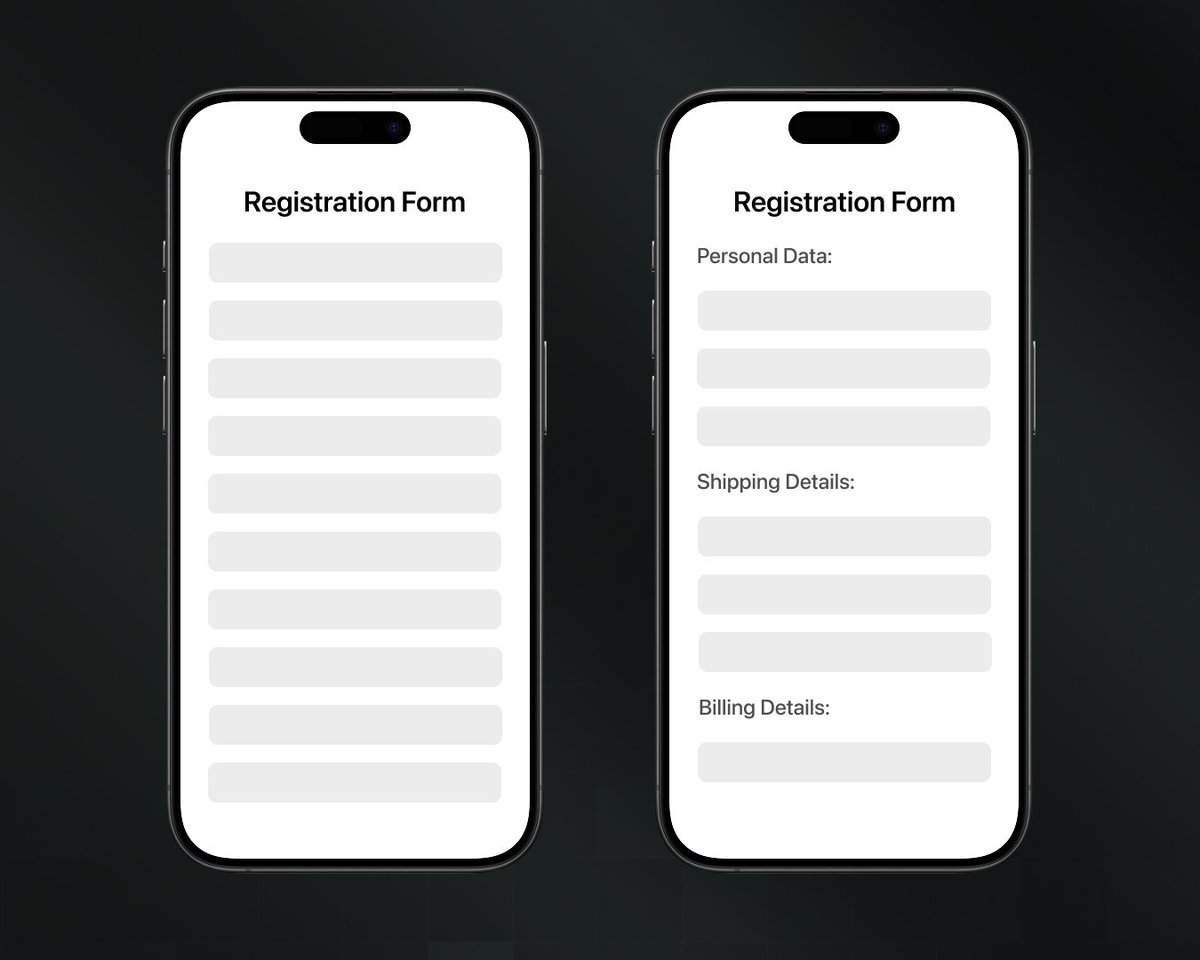
In 1956, psychologist George Miller ran a study that uncovered something obvious yet brutal:

People can only hold 7±2 pieces of information in short-term memory at a time.

Yet most product teams design as if users can juggle 20 decisions on one screen.
Jul 5 13 tweets 5 min read
I'm a product designer.

After 10 years of building apps, I've discovered the most difficult design principle to master:

Minimalism.

Here's why 90% of designers get it wrong (& how to use it properly): Image First off - minimal and simple are NOT the same thing.

I see designers throwing these words around like they're synonyms.

They're not. Let me break it down: Image
Jul 3 13 tweets 4 min read
Look at these 2 UIs.

One of them will 100% outperform the other for one reason:

The Doherty Threshold.

Here's how this psychological principle works & how to use it in your products: Image The Doherty Threshold says something stupidly simple:

Keep response times under 400ms (0.4 seconds).

That's it.

But 99% of products ignore this and wonder why users bounce. Your product either feels effortless… or like pulling teeth.

No in-between.
Jun 19 13 tweets 5 min read
Look at these 2 UIs.

One of them will 100% outperform the other for 1 key reason:

The Zeigarnik Effect.

Here's EVERYTHING you need to know about this psychological trick (& how to use it for your products to increase conversions): Image The Zeigarnik Effect says our brains HATE unfinished business.

Like that TV show cliffhanger that keeps you up at night.

Or that half-filled progress bar that makes you twitch.

Your brain literally can't let go of incomplete tasks.

And smart designers use this to their advantage.

Credits: @jimkwik
Jun 12 13 tweets 5 min read
Look at these 2 UIs.

One of them will 100% outperform the other for 1 key reason:

The Von Restorff Effect.

Here's EVERYTHING you need to know about this psychological trick (and how to use it for your own products to increase conversions): Image The Von Restorff Effect is basically a fancy way of saying "make it pop."

In design terms: make one thing visually different → people notice it more.

But here's the thing most designers get wrong:

Making something stand out is only valuable if it drives actual results.

Otherwise, it's just noise.Image
Jun 7 10 tweets 4 min read
I'm obsessed with design psychology.

After 10 years of building products, I've discovered a UI/UX secret:

Dark Mode makes apps harder to use.

Here's why we're all getting Dark Mode wrong, how to use it properly, and what @Apple knew all along: Image Here's an unexpected fact:

Studies show dark text on light backgrounds is 26% more readable.

The Nielsen Norman Group found reading speed decreases by nearly 10% with white text on black.

Yet every designer acts like dark mode is the holy grail of UX.
May 31 12 tweets 4 min read
Look at these UIs.

One of them will 100% outperform the other for 1 key reason:

Hick's Law.

Here's EVERYTHING you need to know about this psychological trick (and how to use it for your own products to increase conversions): Image
Image
Hick's Law states:

The more options you give users, the longer they take to make a decision.

Here's the fancy formula: T = b × log₂ (n + 1)

In plain English: More choices = exponentially more brain processing time.
May 25 12 tweets 5 min read
I LOVE design psychology.

Here are 9 sneaky psychological principles your favorite apps use to keep you hooked:

1. The IKEA Effect Image
Image
@NotionHQ is a master of the IKEA effect:

You fall in love with their product because you build it yourself.

When you create your own workspace from scratch, you value it more.

It's like IKEA furniture - you'll defend that wobbly shelf because you assembled it with your own hands...
May 16 13 tweets 5 min read
I LOVE design psychology.

@Apple, @NotionHQ, and @Family all exploit the same psychological loophole to dominate their competition.

It's called Jakob's Law.

Once you understand it, you'll never look at product design the same way again 🧵 Jakob's Law is simple:

Users bring expectations from EVERY other app they've used before yours.

This means people prefer your product to work the SAME WAY as products they already know.

Break this, and you're training users from scratch. Good luck with that.
May 15 16 tweets 6 min read
A hill I'm willing to die on:

Spotify's UI & UX will never be defeated.

With 678+ million users, there's a reason it dominates music apps.

Let me break down why its design is so good (and what you can steal from it): Image 1. The navigation is stupid simple:

• Home
• Search
• Your Library

That's it. NEVER more than 2 taps from anything.

While most apps keep adding useless features to their bottom navigator, @Spotify understood that less is more.
May 3 18 tweets 7 min read
I design apps for a living.

I've spent 6+ years using every FinTech app on the market.

Here are 9 of the best (and worst) FinTech apps & what you can learn from their UI/UX:

1. @RevolutApp @RevolutApp is becoming an "everything app" beyond just banking.

I literally booked a hotel last weekend for €6 for two nights (plus a free massage) using Revolut points.

It has a clean, consistent UI that doesn't try to do too much at once.
May 1 13 tweets 5 min read
I'm an Apple fanboy.

But I admit some of their apps suck.

Here's my brutally honest take on the 9 most popular @Apple apps (as a product designer):

1. Apple Maps Apple maps went from being the app everyone laughed at to a genuinely great experience - BUT only in the US.

It sucks in most other places.

It also still misses some of Google Maps' best features like Street View and business info details.
Apr 13 17 tweets 7 min read
I'm starting a design war.

Here are 10 times Apple's UI obliterated Android's:

1. Superior Notifications iOS Notifications have a beautiful bounce animation that feels weighted.

Notice how the notifications don't just appear - they settle in with a satisfying "plop" feeling.

Android is functional, sure. But not fluid and haptic. It lacks the "feel."