In this THREAD I will explain “Fibonacci”
1. Fibonacci Retracement
2. How to draw Fibonacci Levels?
3. Fibonacci Ratios
🧵(1/12)
1. Fibonacci Retracement
2. How to draw Fibonacci Levels?
3. Fibonacci Ratios
🧵(1/12)

1. Fibonacci Retracement
Fibonacci levels are used to identify potential Support and Resistance levels on price charts.
These levels are expressed as percentages (23.6%, 38.2%, 61.8%, and 78.6%)
Traders use these levels to identify potential entry and exit points
Fibonacci levels are used to identify potential Support and Resistance levels on price charts.
These levels are expressed as percentages (23.6%, 38.2%, 61.8%, and 78.6%)
Traders use these levels to identify potential entry and exit points

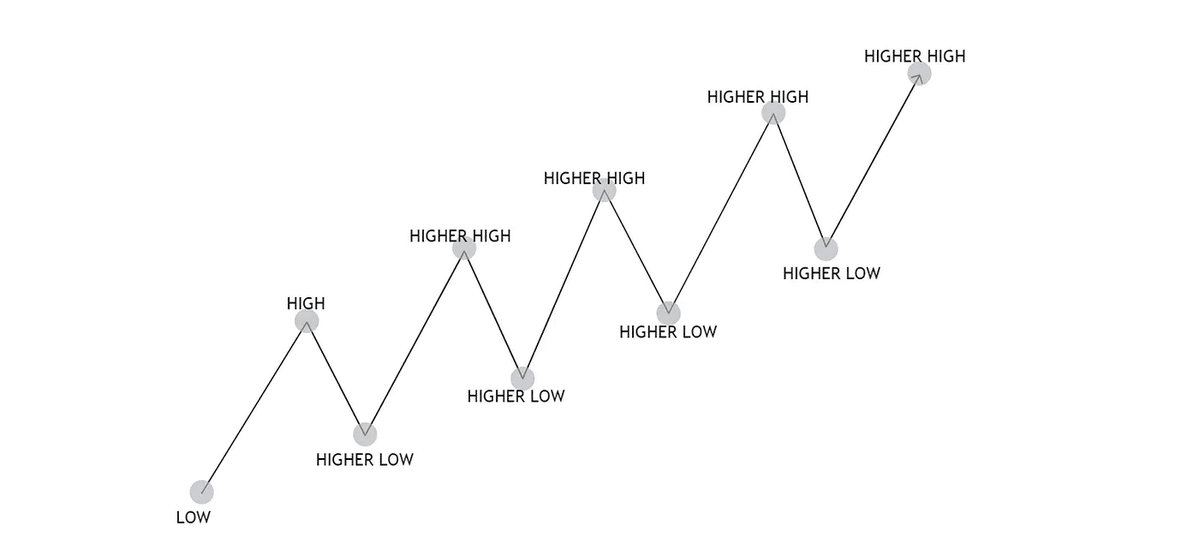
1.1 Fibonacci Retracement
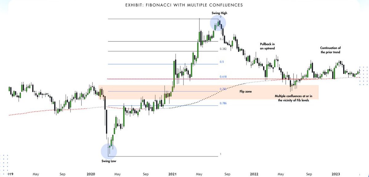
In a Fibonacci retracement uptrend, levels like 23.6%, 38.2%, 50%, 61.8%, and 78.6% act as potential support areas.
These levels are used to identify potential areas where the price might pause or reverse during a pullback within the uptrend.
In a Fibonacci retracement uptrend, levels like 23.6%, 38.2%, 50%, 61.8%, and 78.6% act as potential support areas.
These levels are used to identify potential areas where the price might pause or reverse during a pullback within the uptrend.
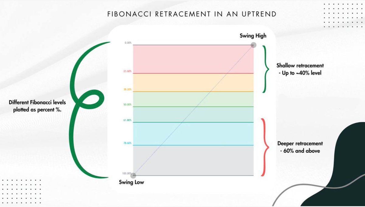
1.2 Fibonacci Retracement
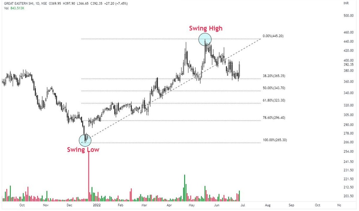
In an uptrend draw the Fibonacci tool from the lowest point (Swing Low) to the highest point (Swing High) of the uptrend.
Key Fibonacci levels like 38.2%, 50% and 61.8% are often watched for potential buying opportunities
In an uptrend draw the Fibonacci tool from the lowest point (Swing Low) to the highest point (Swing High) of the uptrend.
Key Fibonacci levels like 38.2%, 50% and 61.8% are often watched for potential buying opportunities


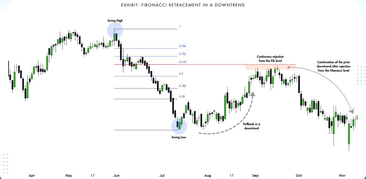
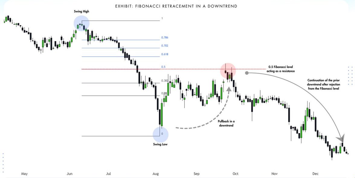
1.3 Fibonacci Retracement
In a Fibonacci retracement downtrend, the key levels to watch are 23.6%, 38.2%, 50%, 61.8%, and 78.6%
These levels represent areas of support.
With 61.8% being the most significant due to its connection with the Golden Ratio.
In a Fibonacci retracement downtrend, the key levels to watch are 23.6%, 38.2%, 50%, 61.8%, and 78.6%
These levels represent areas of support.
With 61.8% being the most significant due to its connection with the Golden Ratio.

1.4 Fibonacci Retracement
If you are in a downtrend, you would draw the Fibonacci retracement levels downwards.
This is because you are retracing from a high point to a low point during a downtrend.
Look for the price to potentially rebound off the Fibonacci levels.
If you are in a downtrend, you would draw the Fibonacci retracement levels downwards.
This is because you are retracing from a high point to a low point during a downtrend.
Look for the price to potentially rebound off the Fibonacci levels.
1.5 Fibonacci Retracement
Look for the following things at the point of interaction or in the proximity of the Fibonacci level
- Reversal candlestick patterns
- Volume
- Moving averages
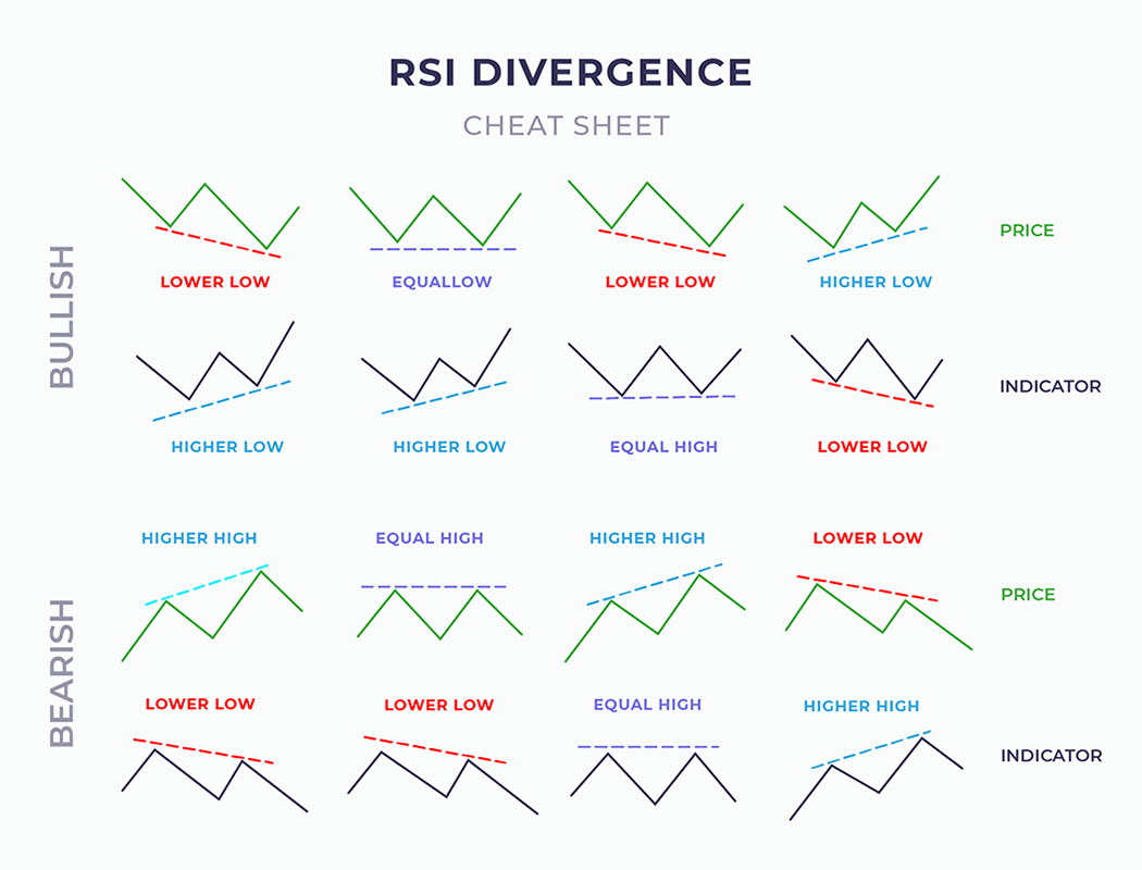
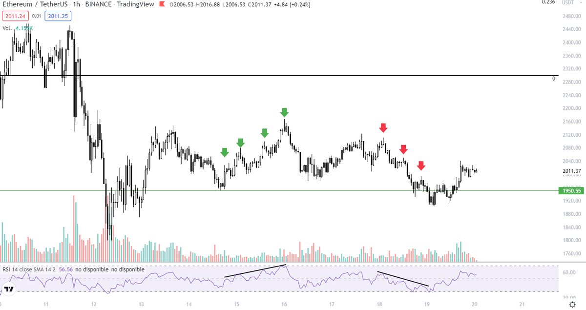
- RSI divergence
- Previous support/resistance level
Look for the following things at the point of interaction or in the proximity of the Fibonacci level
- Reversal candlestick patterns
- Volume
- Moving averages
- RSI divergence
- Previous support/resistance level
2. How to draw Fibonacci Levels?
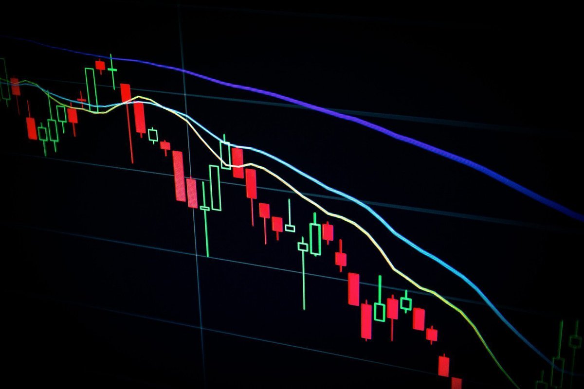
Fibonacci Levels works well in trending markets.
To locate these Fibonacci Retracement Levels, identify the most recent Swing Low and Swing High.
There are different types of Pullbacks in a uptrend.
Fibonacci Levels works well in trending markets.
To locate these Fibonacci Retracement Levels, identify the most recent Swing Low and Swing High.
There are different types of Pullbacks in a uptrend.

2.1 How to draw Fibonacci Levels?
The levels that were Support in a Uptrend, now they act as a Resistance in an Uptrend.
Take a SHORT position when this levels are hit, ideally at 50% and 61.8% Levels
The levels that were Support in a Uptrend, now they act as a Resistance in an Uptrend.
Take a SHORT position when this levels are hit, ideally at 50% and 61.8% Levels

2.2 How to draw Fibonacci Levels?
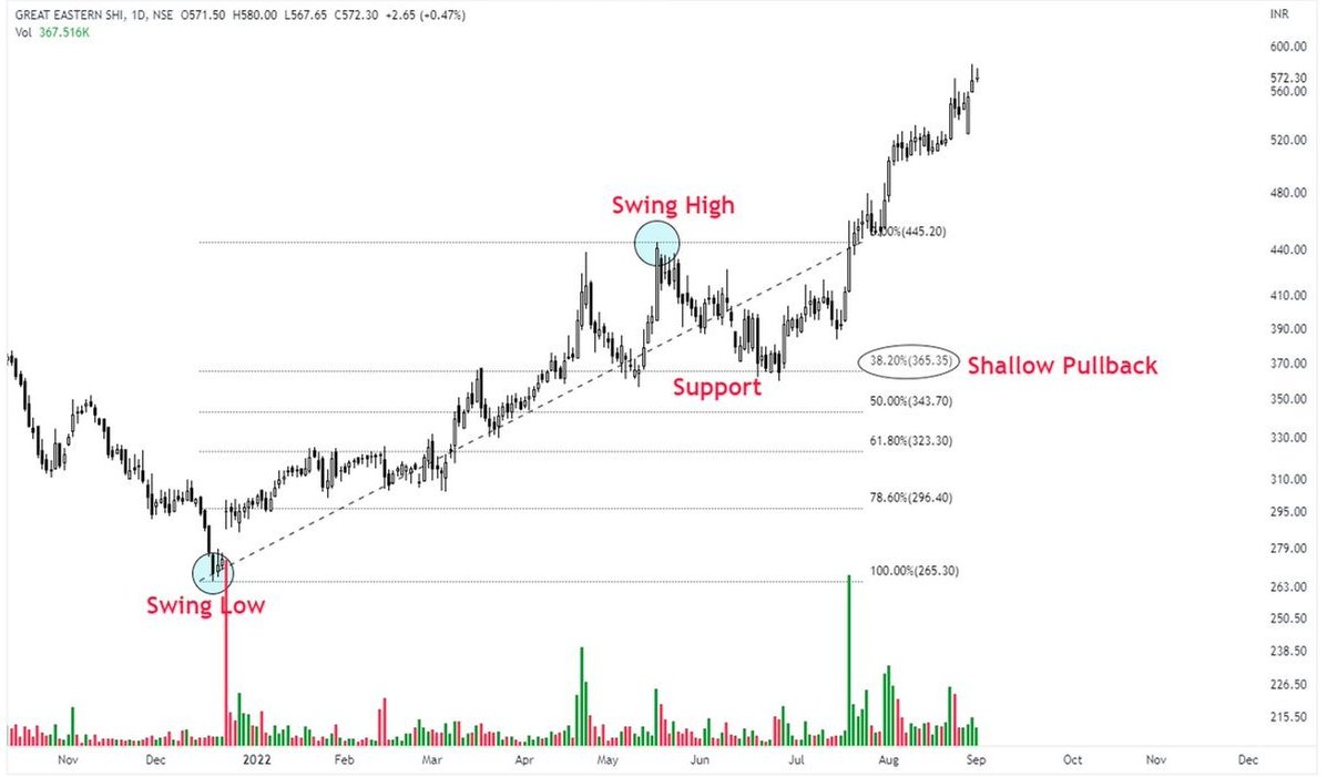
Fibonacci Levels were drawn from Swing Low to Swing High, since the Price Action is in an uptrend.
Price fell straight to the 38.2% Level and hold.
After taking that Level as Support, the price broke out the range.
Fibonacci Levels were drawn from Swing Low to Swing High, since the Price Action is in an uptrend.
Price fell straight to the 38.2% Level and hold.
After taking that Level as Support, the price broke out the range.
2.3 How to draw Fibonacci Levels?
After the Swing Low, price went straight to Resistance at 38.2%
In this example, we can see that price only hit this level, and didnt even touch 50% level.
In this case, if price doesnt make a deviation above 38.2% Level, I will short it.
After the Swing Low, price went straight to Resistance at 38.2%
In this example, we can see that price only hit this level, and didnt even touch 50% level.
In this case, if price doesnt make a deviation above 38.2% Level, I will short it.


3. Fibonacci Ratios
Key Fibonacci levels used in these patterns include:
0.382, 0.50, 0.618, 0.786, 0.886, 1.13, 1.27, 1.414, 1.618, 2.24, 2.618, and 3.618
Key Fibonacci levels used in these patterns include:
0.382, 0.50, 0.618, 0.786, 0.886, 1.13, 1.27, 1.414, 1.618, 2.24, 2.618, and 3.618

• • •
Missing some Tweet in this thread? You can try to
force a refresh