Not a pretty jobs report today...
I think this one chart sums up what's wrong with anyone pointing to unemployment as a sign the labor market is "solid."
If not for collapsing labor force participation since April, unemployment would've climbed to 4.9% today instead of 4.25%.
A lot to unpack in the 🧵
I think this one chart sums up what's wrong with anyone pointing to unemployment as a sign the labor market is "solid."
If not for collapsing labor force participation since April, unemployment would've climbed to 4.9% today instead of 4.25%.
A lot to unpack in the 🧵
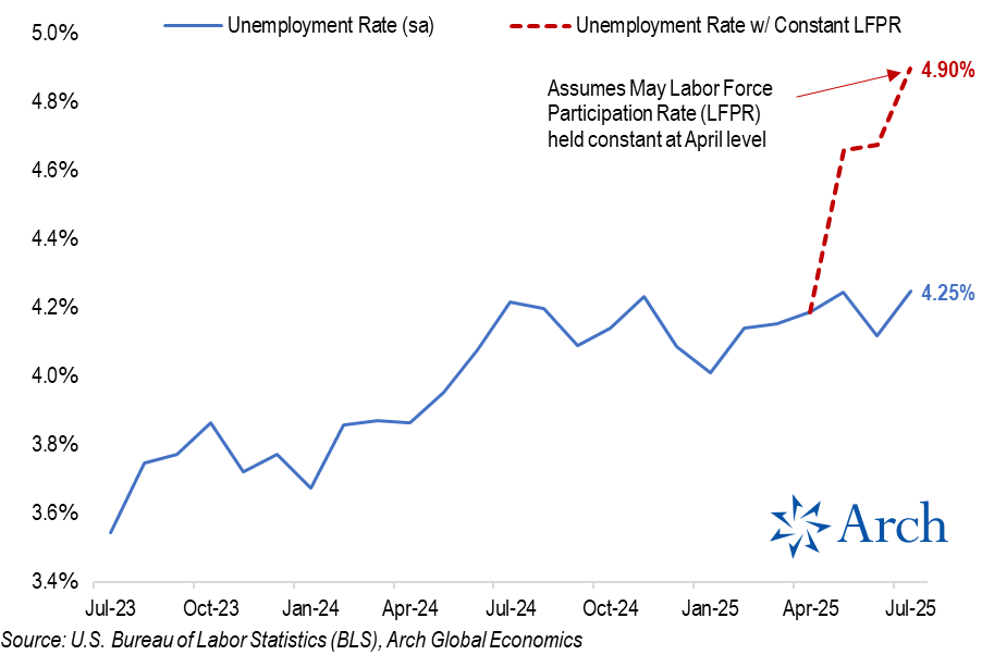
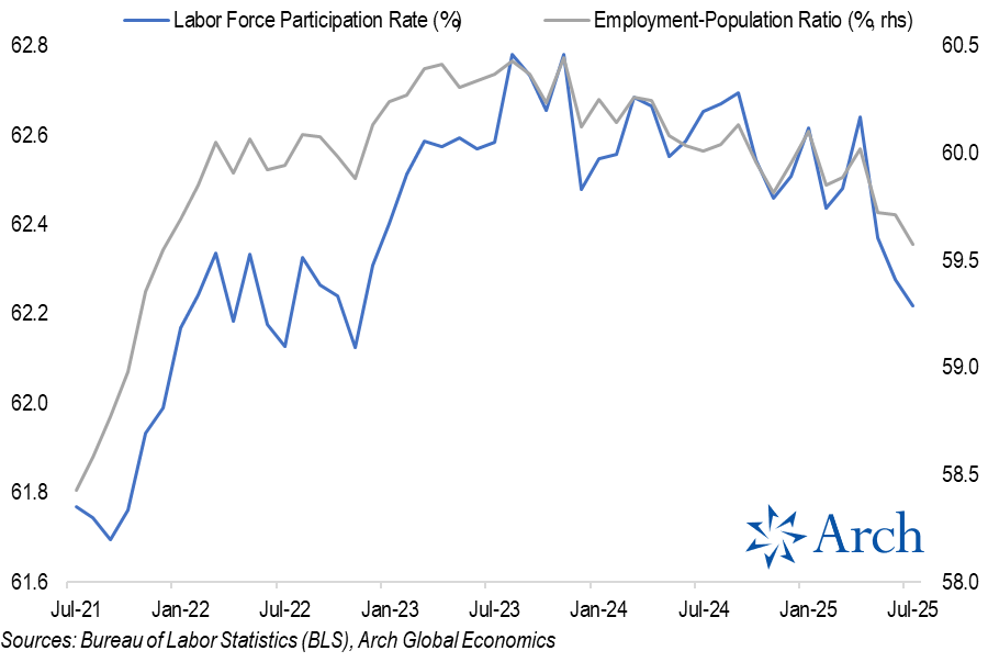
The labor force participation rate has dropped from a recent peak of 62.8% back in Nov '23 to 62.2% in July '25.
The pace of that decline accelerated sharply in May and has continued through July.
If not for the recent drop in the participation rate, unemployment would be meaningfully higher.
The pace of that decline accelerated sharply in May and has continued through July.
If not for the recent drop in the participation rate, unemployment would be meaningfully higher.
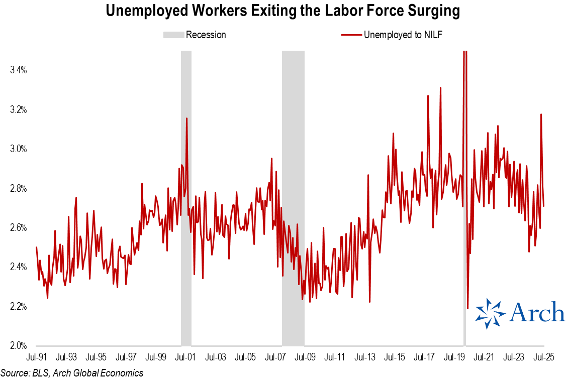
Back in May, it was a surge in workers exiting the workforce driving the decline in participation.
While that surge hasn't continued, flows out of the labor force remained elevated through July.
While that surge hasn't continued, flows out of the labor force remained elevated through July.
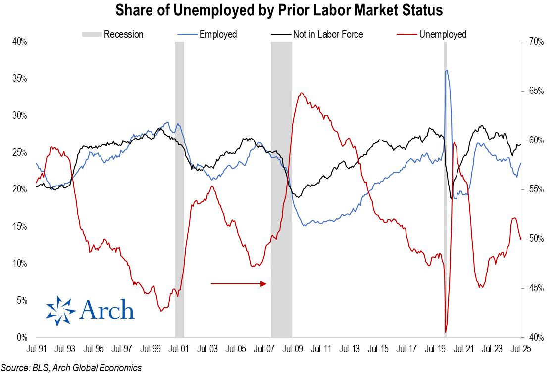
As for the unemployed population, a rising share have come from people previously employed and those who were not recently in the labor force.
That "not in the labor force" segment of the unemployed surged in July as new entrants not finding jobs put 15bps of upward pressure on the headline unemployment rate.
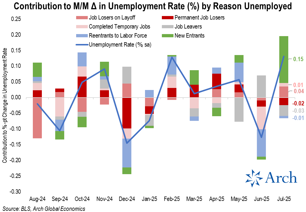
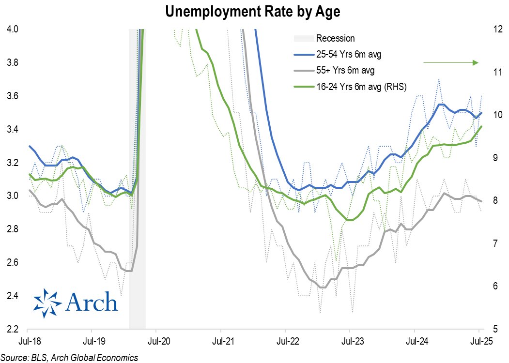
The new entrant / youth unemployment angle is not new, but it is clearly the segment of the labor market feeling the greatest softening in recent months.
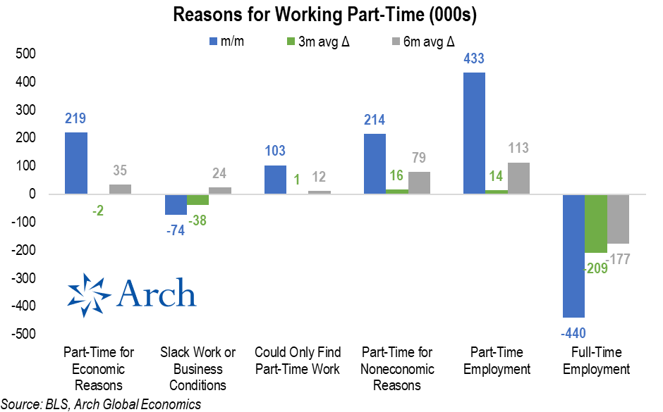
It's not just new entrants not being able to find jobs and ending up in the unemployed cohort, workers are increasingly resorting to part-time work as full-time employment has trended lower.
So, it's clear the labor market is not "solid" when looking under the hood of the household survey, it also doesn't exactly look rosy in the establishment survey either.
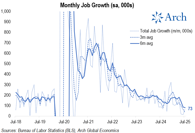
Job growth has cooled to an average of just 35k over the past 3 months from nearly 130k just back in April and ~230k at the beginning of the year.
Job growth has cooled to an average of just 35k over the past 3 months from nearly 130k just back in April and ~230k at the beginning of the year.
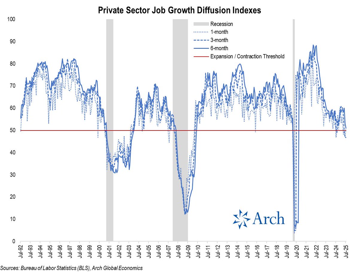
That brings me to my favorite metric from the establishment survey: the private job growth diffusion index, which reflects the breadth of job gains across industries.
The 3m index dropped below the 50 expansion / contraction threshold back in May and remained at 46.8 in July, down from 60.8 back in Jan '25.
The 3m index dropped below the 50 expansion / contraction threshold back in May and remained at 46.8 in July, down from 60.8 back in Jan '25.
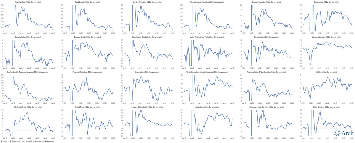
Within private sector employment, manufacturing has been even uglier...
The diffusion indexes for manufacturing have been in contraction territory since early 2023 despite a brief spike earlier this year that subsequently collapsed.
The diffusion indexes for manufacturing have been in contraction territory since early 2023 despite a brief spike earlier this year that subsequently collapsed.
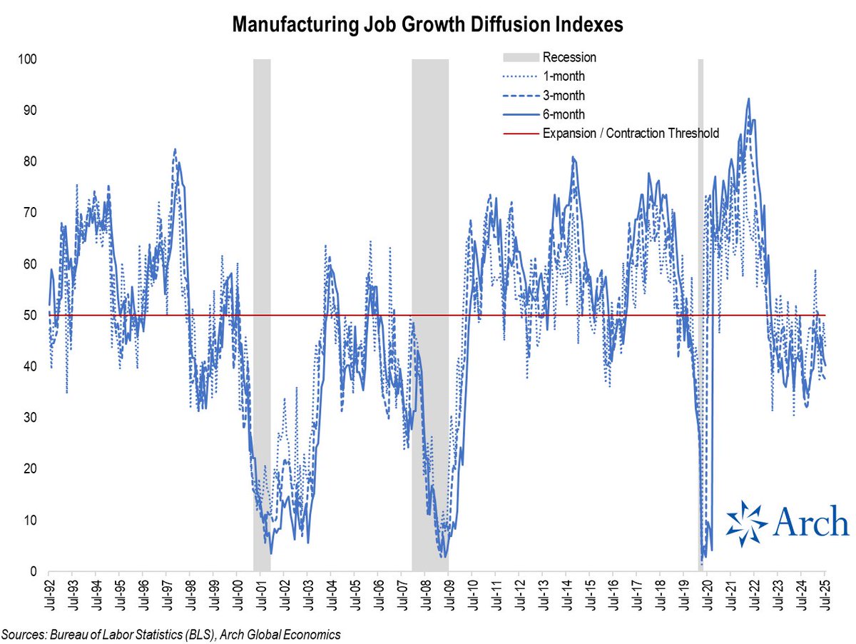
Looking at the sector level, you can see a similar high-level split, with roughly half of sectors contracting vs expanding.
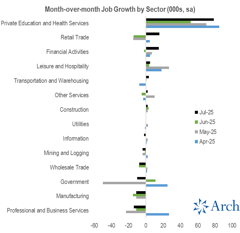
One sector stuck out prominently in the chart above and viewed another way, it is clear:
*All of the recent job growth is currently coming from Education and Health Services alone*
*All of the recent job growth is currently coming from Education and Health Services alone*
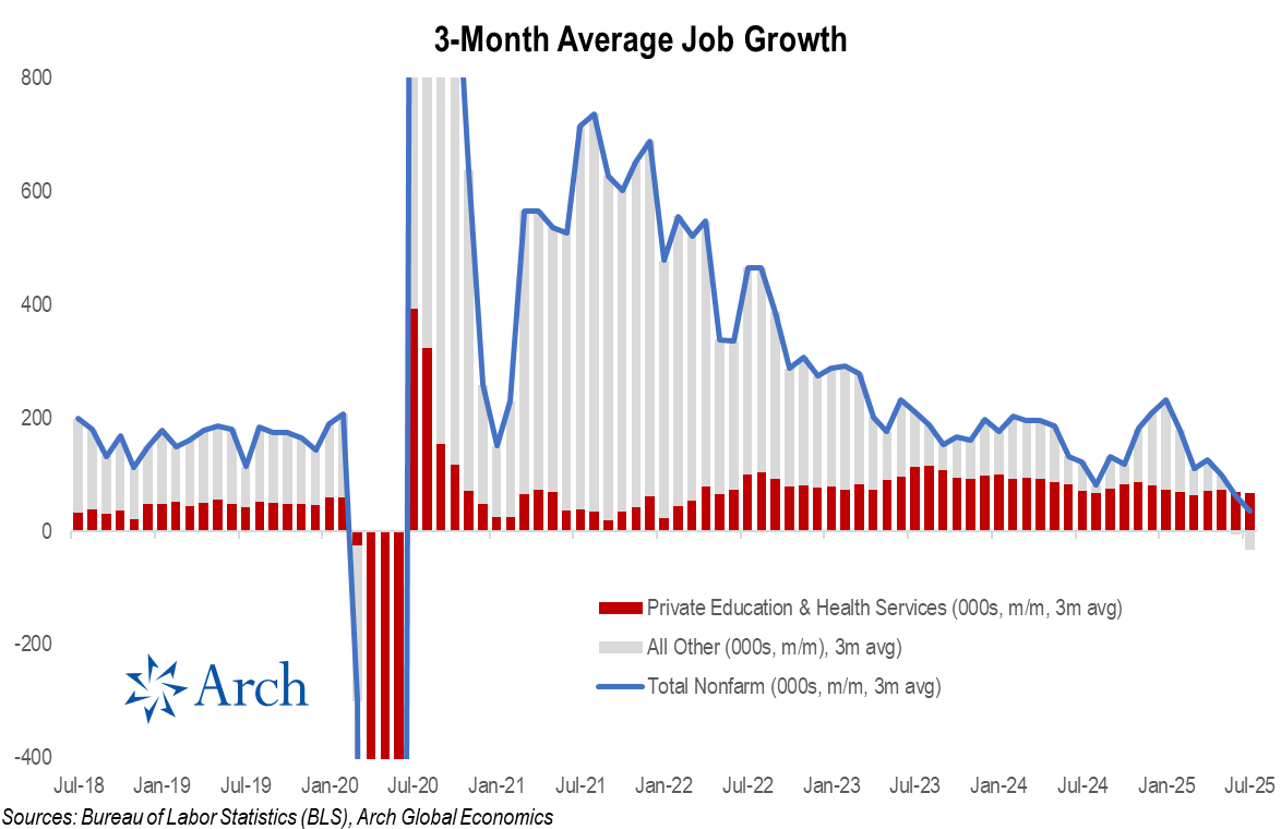
Lets look more broadly at recent 3-month trends in sector-level job growth ...
It's again clear, nothing looks very "solid" outside of Education and Health Care.
It's again clear, nothing looks very "solid" outside of Education and Health Care.
Ok, so the economy isn't really adding many jobs at this point, but at least wage growth is still solid, right?
Well, that's generally true for private service industries, where wage growth has been roughly in-line with the pre-COVID avg over the past 6 months...
But wage growth has dropped precipitously for goods producing sectors, which has been in contraction since early '23 as I noted in the diffusion chart above.
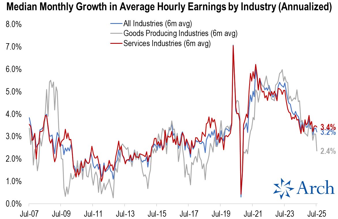
With the diffusion index for the broader private sector having flipped into contraction territory, it's not likely that service sector wage growth will remain resilient for much longer.
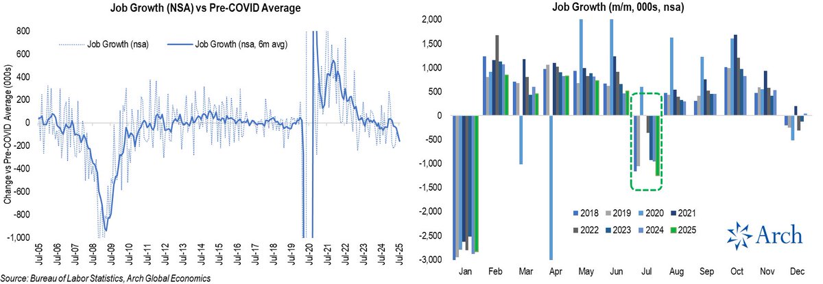
I heard an argument that seasonal adjustments were to blame for the job growth slowdown, so let's look at the non-seasonally adjusted data (nsa).
Looks to me like jobs declined by more than normal in July and the pace of job growth is now well below the pre-COVID norm and trending lower.
Looks to me like jobs declined by more than normal in July and the pace of job growth is now well below the pre-COVID norm and trending lower.
• • •
Missing some Tweet in this thread? You can try to
force a refresh