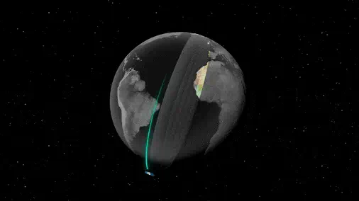
Google DeepMind just released one of the most important tools in geospatial data science.
It’s called AlphaEarth Foundations.
I want to break it down for you in intuitive terms:
It’s called AlphaEarth Foundations.
I want to break it down for you in intuitive terms:
We have petabytes of satellite images.
But it’s still hard to answer questions like:
• What’s in this image?
• How has it changed?
• What kind of crop or forest is this?
AlphaEarth helps answer these questions, even in places with limited data.
But it’s still hard to answer questions like:
• What’s in this image?
• How has it changed?
• What kind of crop or forest is this?
AlphaEarth helps answer these questions, even in places with limited data.
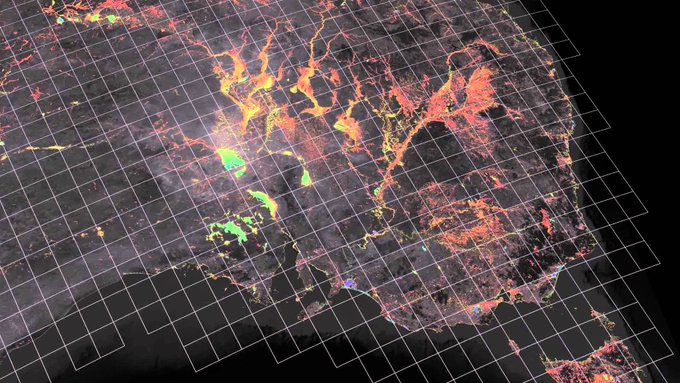
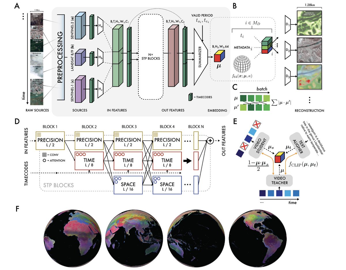
AlphaEarth is a foundation model for Earth Observation.
It turns raw satellite data into compact numerical representations, called embeddings.
It turns raw satellite data into compact numerical representations, called embeddings.
𝗦𝗼, 𝘄𝗵𝗮𝘁 𝗮𝗿𝗲 𝗲𝗺𝗯𝗲𝗱𝗱𝗶𝗻𝗴𝘀?
To understand embeddings, it probably helps to work through an example.
Imagine we have the following graph:
You can see that there are just two dimensions to this graph.
A ‘greenness’ dimension and a ‘treeness’ dimension.
To understand embeddings, it probably helps to work through an example.
Imagine we have the following graph:
You can see that there are just two dimensions to this graph.
A ‘greenness’ dimension and a ‘treeness’ dimension.

Now imagine if we take a satellite image and break it down into small grids, like the following.
Let’s focus on one specific grid - i.e. the one I’ve selected in orange below:
Let’s focus on one specific grid - i.e. the one I’ve selected in orange below:
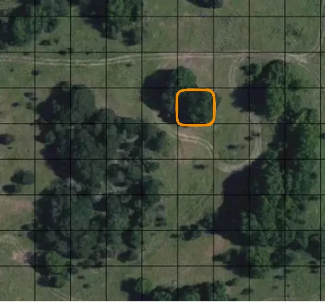
If we took this orange grid, and situated it on our graph (or ‘embedding space’), it would probably sit somewhere here (since it’s both pretty green, and pretty tree-like):
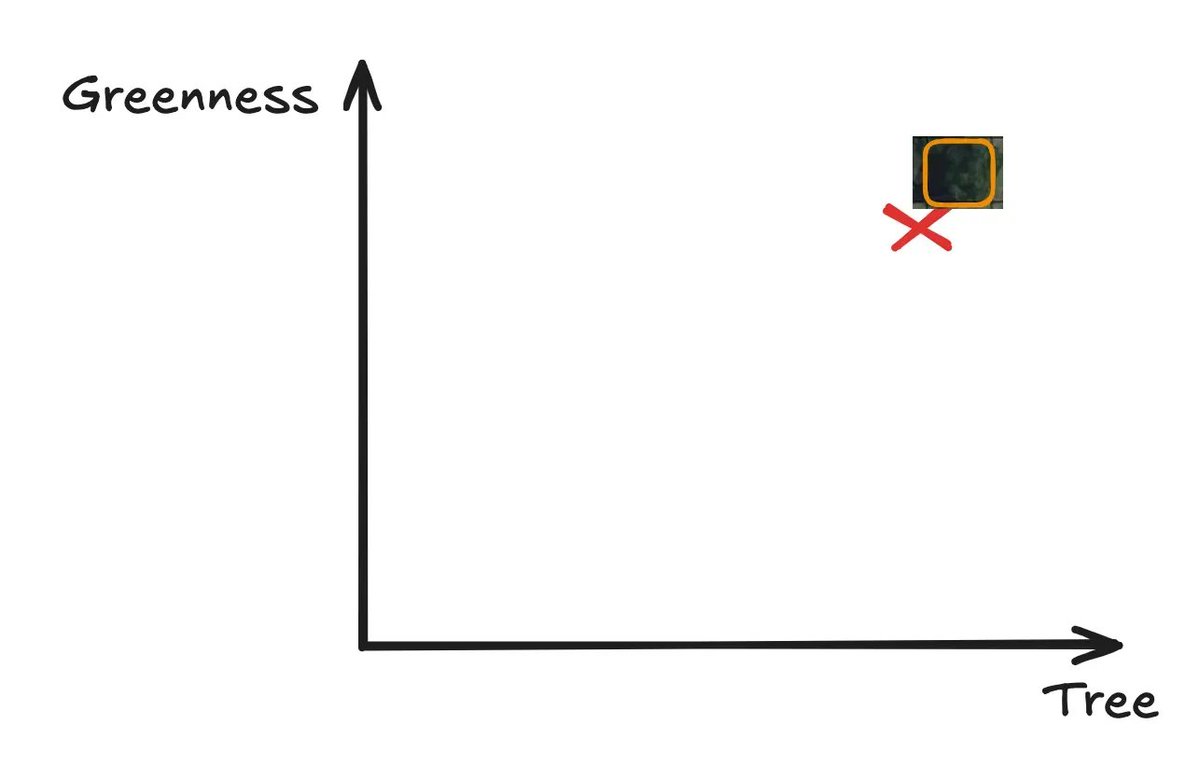
Congratulations, if you’ve followed this basic example, you’ve got the idea of what an embedding is.
Now, imagine if instead of us just having two dimensions, we have dozens.
E.g. it may cover anything from ‘blueness’ to ‘urbanness’ to ‘smokeyness’, etc.
And then, instead of us just having one grid from one satellite image, we situate every grid from billions of satellite images.
Then we'd have a LOT of embeddings.
E.g. it may cover anything from ‘blueness’ to ‘urbanness’ to ‘smokeyness’, etc.
And then, instead of us just having one grid from one satellite image, we situate every grid from billions of satellite images.
Then we'd have a LOT of embeddings.
You can think of embeddings as a way to do two things:
𝟭. 𝗖𝗼𝗺𝗽𝗿𝗲𝘀𝘀 a large amount of information from images into a small set of numbers/coordinates, and
𝟮. 𝗣𝗼𝘀𝗶𝘁𝗶𝗼𝗻 similar parts of an image close together in a multi-dimensional space, so that the model can understand relationships between them.
𝟭. 𝗖𝗼𝗺𝗽𝗿𝗲𝘀𝘀 a large amount of information from images into a small set of numbers/coordinates, and
𝟮. 𝗣𝗼𝘀𝗶𝘁𝗶𝗼𝗻 similar parts of an image close together in a multi-dimensional space, so that the model can understand relationships between them.
Here’s a visual example that helps make it more concrete.
It shows how about 1,000 words are represented using embeddings across 200 dimensions.
Here the word “Albania” ends up near other related words like “Albanian”.
The model has learned that they often appear in similar contexts.
It shows how about 1,000 words are represented using embeddings across 200 dimensions.
Here the word “Albania” ends up near other related words like “Albanian”.
The model has learned that they often appear in similar contexts.

Once you’ve got good embeddings, you can:
• Detect change over time
• Find places with similar landscapes
• Classify land cover using less training data
• Fill gaps where no data exists
This saves time, resources, and improves accuracy.
• Detect change over time
• Find places with similar landscapes
• Classify land cover using less training data
• Fill gaps where no data exists
This saves time, resources, and improves accuracy.
What makes AlphaEarth stand out?
• It uses 𝗱𝗶𝘃𝗲𝗿𝘀𝗲 𝗱𝗮𝘁𝗮- satellites, field measurements, and climate records
• It works 𝗮𝗰𝗿𝗼𝘀𝘀 𝘁𝗶𝗺𝗲: not just static images
• It’s 𝗵𝗶𝗴𝗵-𝗿𝗲𝘀𝗼𝗹𝘂𝘁𝗶𝗼𝗻: 10m²
• It 𝗴𝗲𝗻𝗲𝗿𝗮𝗹𝗶𝘀𝗲𝘀 well, even with limited labels
• It’s 𝗰𝗼𝗺𝗽𝗮𝗰𝘁: just 64 bytes per pixel
• It uses 𝗱𝗶𝘃𝗲𝗿𝘀𝗲 𝗱𝗮𝘁𝗮- satellites, field measurements, and climate records
• It works 𝗮𝗰𝗿𝗼𝘀𝘀 𝘁𝗶𝗺𝗲: not just static images
• It’s 𝗵𝗶𝗴𝗵-𝗿𝗲𝘀𝗼𝗹𝘂𝘁𝗶𝗼𝗻: 10m²
• It 𝗴𝗲𝗻𝗲𝗿𝗮𝗹𝗶𝘀𝗲𝘀 well, even with limited labels
• It’s 𝗰𝗼𝗺𝗽𝗮𝗰𝘁: just 64 bytes per pixel
There are four key innovations:
𝟭. 𝗧𝗶𝗺𝗲-𝗮𝘄𝗮𝗿𝗲 𝗺𝗼𝗱𝗲𝗹𝗹𝗶𝗻𝗴: learns from sparse or irregular data
𝟮. 𝗦𝗽𝗮𝗰𝗲-𝗧𝗶𝗺𝗲 𝗣𝗿𝗲𝗰𝗶𝘀𝗶𝗼𝗻 𝗲𝗻𝗰𝗼𝗱𝗶𝗻𝗴: uses attention layers and convolutions
𝟯. 𝗧𝗲𝘅𝘁 𝗮𝗹𝗶𝗴𝗻𝗺𝗲𝗻𝘁: links image data with descriptions like “soybean field”
𝟰. 𝗨𝗻𝗶𝗳𝗼𝗿𝗺 𝗲𝗺𝗯𝗲𝗱𝗱𝗶𝗻𝗴 𝘀𝘁𝗿𝘂𝗰𝘁𝘂𝗿𝗲: avoids redundant outputs
𝟭. 𝗧𝗶𝗺𝗲-𝗮𝘄𝗮𝗿𝗲 𝗺𝗼𝗱𝗲𝗹𝗹𝗶𝗻𝗴: learns from sparse or irregular data
𝟮. 𝗦𝗽𝗮𝗰𝗲-𝗧𝗶𝗺𝗲 𝗣𝗿𝗲𝗰𝗶𝘀𝗶𝗼𝗻 𝗲𝗻𝗰𝗼𝗱𝗶𝗻𝗴: uses attention layers and convolutions
𝟯. 𝗧𝗲𝘅𝘁 𝗮𝗹𝗶𝗴𝗻𝗺𝗲𝗻𝘁: links image data with descriptions like “soybean field”
𝟰. 𝗨𝗻𝗶𝗳𝗼𝗿𝗺 𝗲𝗺𝗯𝗲𝗱𝗱𝗶𝗻𝗴 𝘀𝘁𝗿𝘂𝗰𝘁𝘂𝗿𝗲: avoids redundant outputs
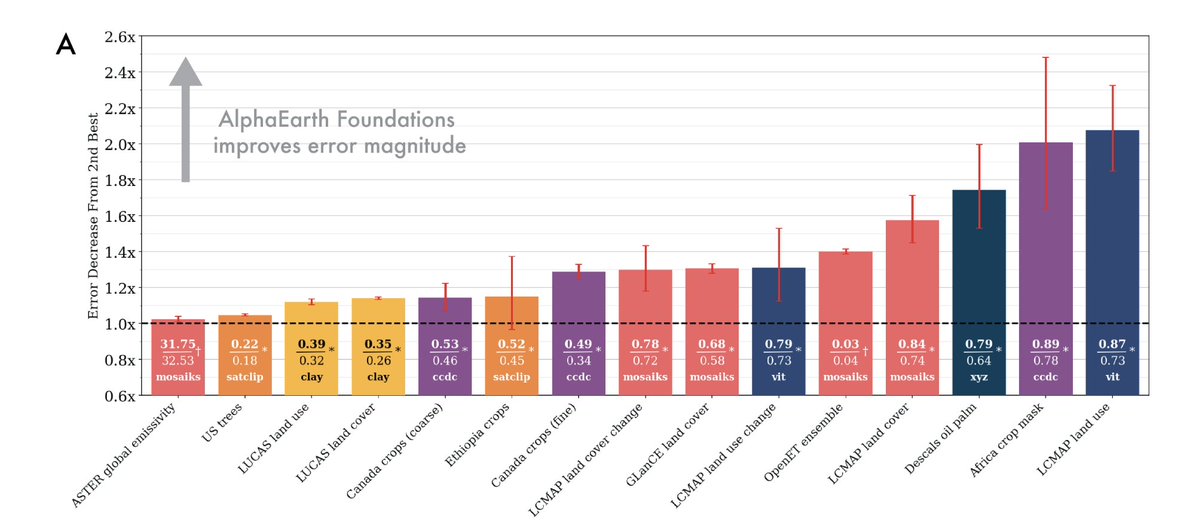
𝗛𝗼𝘄 𝘄𝗲𝗹𝗹 𝗱𝗼𝗲𝘀 𝗶𝘁 𝗽𝗲𝗿𝗳𝗼𝗿𝗺?
Across 15 tasks, AlphaEarth outperformed other models.
It did best in:
• Crop type mapping
• Tree species classification
• Evapotranspiration estimation
• Land use change detection
Across 15 tasks, AlphaEarth outperformed other models.
It did best in:
• Crop type mapping
• Tree species classification
• Evapotranspiration estimation
• Land use change detection
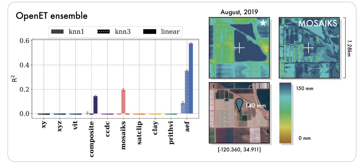
Interestingly, AEF seems to be able to estimate biophysical variables that are continuous rather than categorical.
AEF is the only model that meaningfully predicted evapotranspiration, a key variable for farming, water planning, and climate work.
AEF is the only model that meaningfully predicted evapotranspiration, a key variable for farming, water planning, and climate work.
You can access AlphaEarth embeddings for free in Google Earth Engine.
No need to host the model or download anything.
Just plug it into your existing GEE workflows.
No need to host the model or download anything.
Just plug it into your existing GEE workflows.

Here’s what you can do with it:
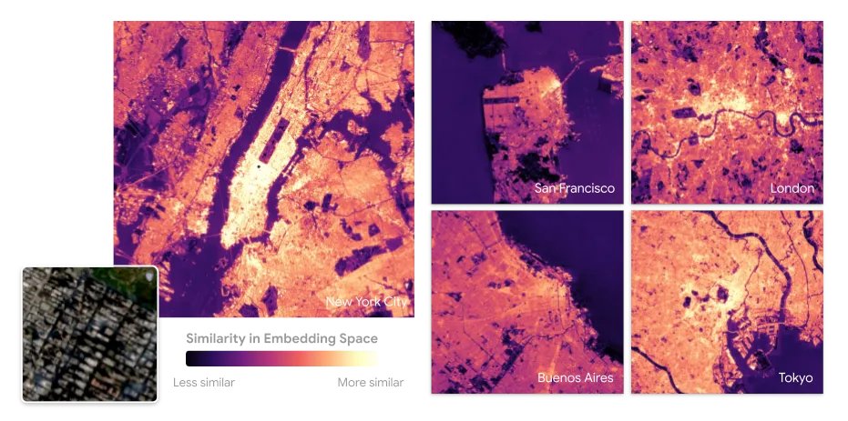
1. Similarity search
Pick any point on Earth, and find all locations with similar environmental conditions.
2. Change detection
Compare embeddings over time to track changes like wildfires or urban growth.
1. Similarity search
Pick any point on Earth, and find all locations with similar environmental conditions.
2. Change detection
Compare embeddings over time to track changes like wildfires or urban growth.
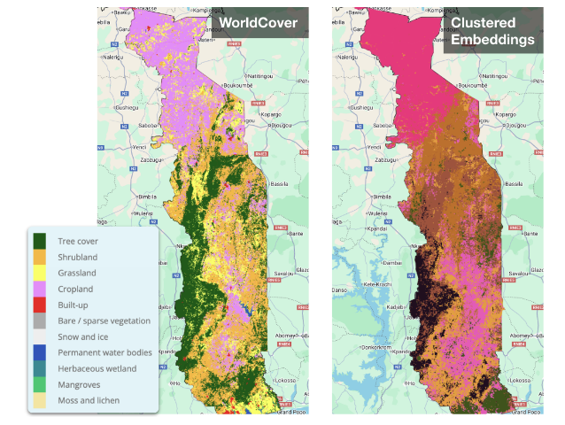
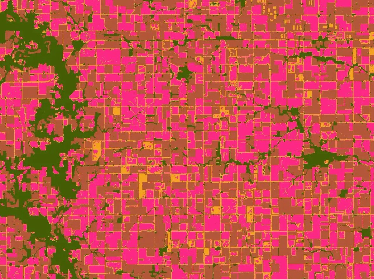
3. Clustering
Group areas with similar features, with no labels required.
This is great for identifying forest types, soil regions, or urban patterns.
4. Low-shot classification
Train accurate maps with far fewer labelled points.
Group areas with similar features, with no labels required.
This is great for identifying forest types, soil regions, or urban patterns.
4. Low-shot classification
Train accurate maps with far fewer labelled points.
Google is also offering grants (up to $5,000) to test new use-cases for these embeddings.
You can apply here: docs.google.com/forms/d/e/1FAI…
You can apply here: docs.google.com/forms/d/e/1FAI…
The takeaway:
AlphaEarth Foundations is a big drop in the geospatial space.
It’s fast, accurate, easy to use, and available now.
Expect even more models like this in future.
AlphaEarth Foundations is a big drop in the geospatial space.
It’s fast, accurate, easy to use, and available now.
Expect even more models like this in future.
If you liked this, you might enjoy this post on foundation models:
And give us a follow @yohaniddawela for more breakdowns on geospatial topics.
And give us a follow @yohaniddawela for more breakdowns on geospatial topics.
https://x.com/yohaniddawela/status/1944717574576488466
Interested in getting a short overview of the latest geospatial papers and datasets each week?
Subscribe to the Spatial Edge newsletter: yohan.so
Subscribe to the Spatial Edge newsletter: yohan.so
• • •
Missing some Tweet in this thread? You can try to
force a refresh