
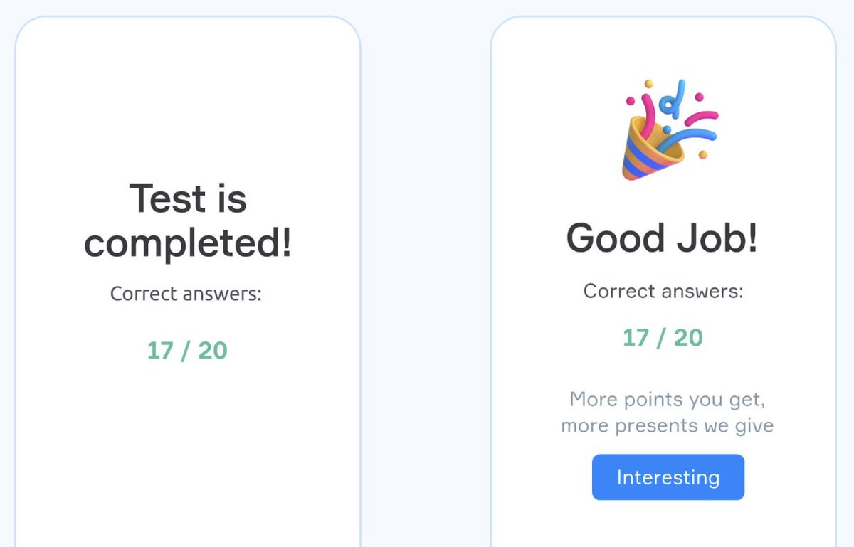
Look at these 2 UIs.
One of them will 100% outperform the other for one reason:
Peak-End Rule.
Here's how this psychological principle works & how to use it in your products:
One of them will 100% outperform the other for one reason:
Peak-End Rule.
Here's how this psychological principle works & how to use it in your products:

As the name suggests, this rule states that your users don't remember everything about your app.
They only remember two things:
1. The most intense moment (peak)
2. How it Ends
That's it. The rest is forgotten by their brain.
(Credits: @UXChrisNguyen)
They only remember two things:
1. The most intense moment (peak)
2. How it Ends
That's it. The rest is forgotten by their brain.
(Credits: @UXChrisNguyen)
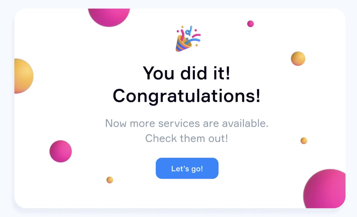
What this essentially means is that you can literally have 20 mediocre screens...
But if you nail the peak & end?
Users will still love your product. (not saying you intentionally make it mediocre lol)
Let me show you who's doing this right (and who's f*cking it up):
But if you nail the peak & end?
Users will still love your product. (not saying you intentionally make it mediocre lol)
Let me show you who's doing this right (and who's f*cking it up):

Apps crushing the Peak-End Rule:
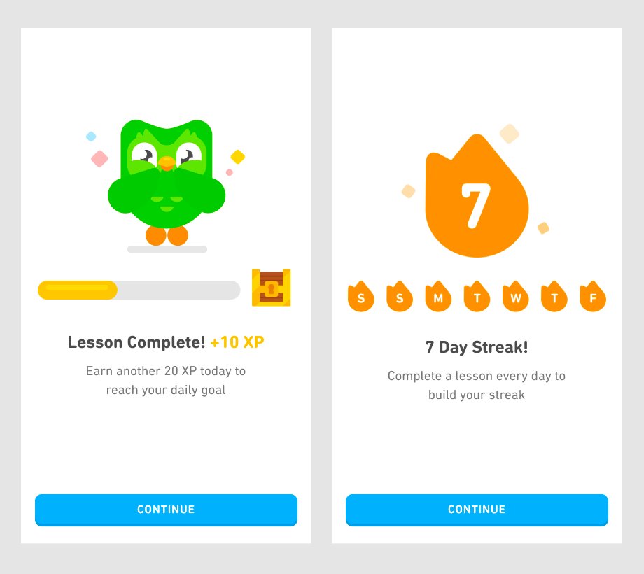
1. @DUOLINGO
Peak: Those addictive animations when you get answers right
End: Cheerful celebration + clear progress
Your brain literally gets a dopamine hit.
No wonder people are addicted...
1. @DUOLINGO
Peak: Those addictive animations when you get answers right
End: Cheerful celebration + clear progress
Your brain literally gets a dopamine hit.
No wonder people are addicted...
2. @UBER
They turned waiting (negative peak) into tracking your driver in real-time.
Then, when your ride arrives...
You're hit with a notification.
Interesting way to transform anxiety into anticipation.
They turned waiting (negative peak) into tracking your driver in real-time.
Then, when your ride arrives...
You're hit with a notification.
Interesting way to transform anxiety into anticipation.
Now here's who's screwing it up:
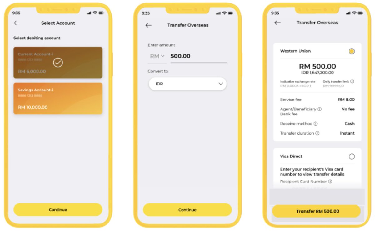
1. BANKING APPS
Complex steps → frustrating peak
"Success" screen → boring end
You just moved $10k, and all you get is... "Transaction complete"?
Bro, jazz it up a little.
1. BANKING APPS
Complex steps → frustrating peak
"Success" screen → boring end
You just moved $10k, and all you get is... "Transaction complete"?
Bro, jazz it up a little.
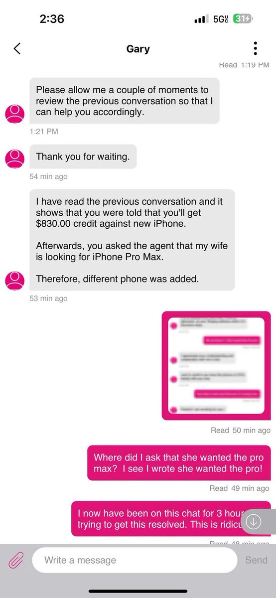
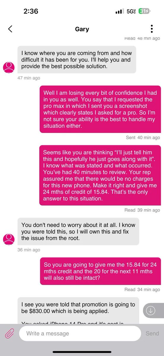
2. CUSTOMER SUPPORT CHATS
Long wait = negative peak
"Case closed" = abrupt end
Doesn't matter if they solved your problem.
You end up remembering the pain instead of the solution.
Long wait = negative peak
"Case closed" = abrupt end
Doesn't matter if they solved your problem.
You end up remembering the pain instead of the solution.
3. TICKETING SITES
Surprise fees at checkout = rage peak
Basic confirmation = forgettable end
They had you excited for a moment.
Then killed it with a $30 "convenience fee."
Now you hate them forever.
Surprise fees at checkout = rage peak
Basic confirmation = forgettable end
They had you excited for a moment.
Then killed it with a $30 "convenience fee."
Now you hate them forever.

So how do you use this? Very simple:
Map your user journey.
Find the most emotional moments.
Make them memorable (for good reasons).
Map your user journey.
Find the most emotional moments.
Make them memorable (for good reasons).
Then look at your endings:
• Success states
• Confirmations
• Final screens
And turn them into celebrations.
• Success states
• Confirmations
• Final screens
And turn them into celebrations.
The best part is that this rule is not limited to just apps.
It applies in different facets of business as well:
Sales calls: Nail the demo (peak) and follow-up (end).
Client work: Smooth kickoff, amazing delivery.
Presentations: Strong opening, killer close.
It applies in different facets of business as well:
Sales calls: Nail the demo (peak) and follow-up (end).
Client work: Smooth kickoff, amazing delivery.
Presentations: Strong opening, killer close.
TL; DR:
People forget the middle.
They remember how you made them feel.
So stop obsessing over perfecting every pixel.
And start obsessing over your peaks and endings.
Because that's all your users will remember anyway.
People forget the middle.
They remember how you made them feel.
So stop obsessing over perfecting every pixel.
And start obsessing over your peaks and endings.
Because that's all your users will remember anyway.

Founders:
We've helped 60+ startups ship beautiful products that actually convert.
So if you’re looking for a metrics-driven, world-class UX/UI for your app/product with no fluff...
Book a call and let’s see how we can help:
cal.com/denisjeliazkov…
We've helped 60+ startups ship beautiful products that actually convert.
So if you’re looking for a metrics-driven, world-class UX/UI for your app/product with no fluff...
Book a call and let’s see how we can help:
cal.com/denisjeliazkov…
Liked this thread?
Give your bro @DenisJeliazkov a follow for more cool design processes & breakdowns.
And like/repost to help a fellow designer:
Give your bro @DenisJeliazkov a follow for more cool design processes & breakdowns.
And like/repost to help a fellow designer:
https://twitter.com/711232574245498880/status/1954195990250168748
• • •
Missing some Tweet in this thread? You can try to
force a refresh


