🚨 BREAKING: IBM launches a free Python library that converts ANY document to data
Introducing Docling. Here's what you need to know: 🧵
Introducing Docling. Here's what you need to know: 🧵

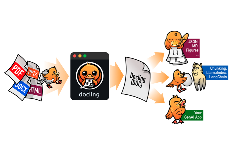
1. What is Docling?
Docling is a Python library that simplifies document processing, parsing diverse formats — including advanced PDF understanding — and providing seamless integrations with the gen AI ecosystem.
Docling is a Python library that simplifies document processing, parsing diverse formats — including advanced PDF understanding — and providing seamless integrations with the gen AI ecosystem.
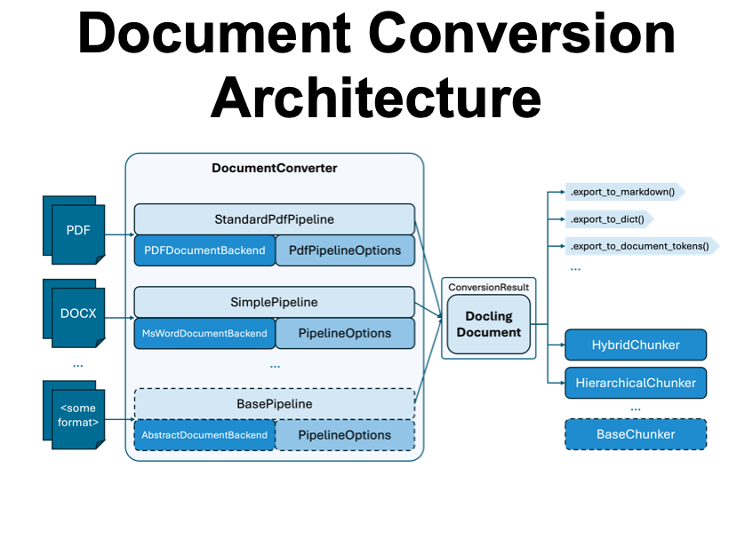
2. Document Conversion Architecture
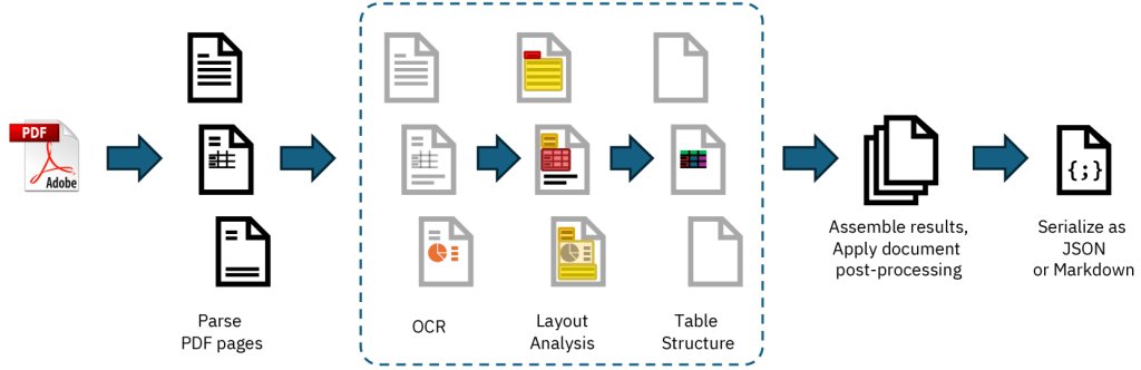
For each document format, the document converter knows which format-specific backend to employ for parsing the document and which pipeline to use for orchestrating the execution, along with any relevant options.
For each document format, the document converter knows which format-specific backend to employ for parsing the document and which pipeline to use for orchestrating the execution, along with any relevant options.
3. PDF Conversion to Markdown
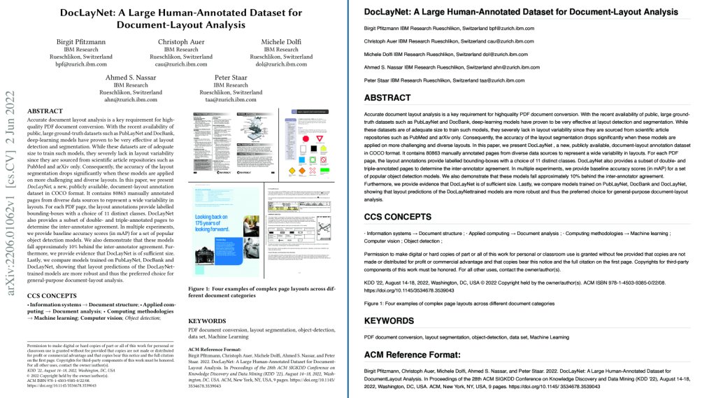
Here is an example of the DocLayNet paper from arXiv, converted into Markdown format by Docling.
Here is an example of the DocLayNet paper from arXiv, converted into Markdown format by Docling.
4. Core Technology:
Docling includes:
- PDF Backends for parsing
- Layout Analysis Model
- Vision-Based Table Formatter
- OCR for Text
Docling includes:
- PDF Backends for parsing
- Layout Analysis Model
- Vision-Based Table Formatter
- OCR for Text
5. Every data analyst, data scientist, and data engineer needs to learn Generative AI
99% of them are overlooking AI. This is a massive opportunity for you.
I'd like to help.
99% of them are overlooking AI. This is a massive opportunity for you.
I'd like to help.
On Wednesday, August 20th, I'm sharing one of my best AI/ML Projects for FREE:
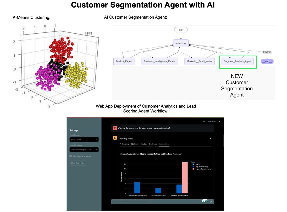
How I built an AI Customer Segmentation Agent with Python:
Register here (1,821 registered): learn.business-science.io/ai-register
How I built an AI Customer Segmentation Agent with Python:
Register here (1,821 registered): learn.business-science.io/ai-register
That's a wrap! Over the next 24 days, I'm sharing the 24 concepts that helped me become an AI data scientist.
If you enjoyed this thread:
1. Follow me @mdancho84 for more of these
2. RT the tweet below to share this thread with your audience
If you enjoyed this thread:
1. Follow me @mdancho84 for more of these
2. RT the tweet below to share this thread with your audience
https://twitter.com/815555071517872128/status/1955652415585202306
• • •
Missing some Tweet in this thread? You can try to
force a refresh