The 10 types of clustering that all data scientists need to know.
Let's dive in:
Let's dive in:
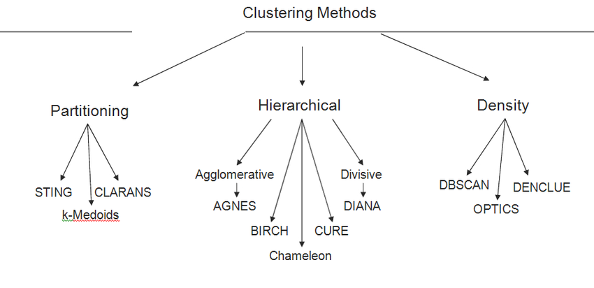
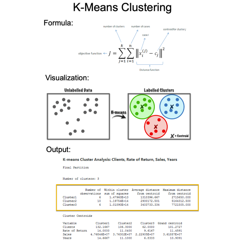
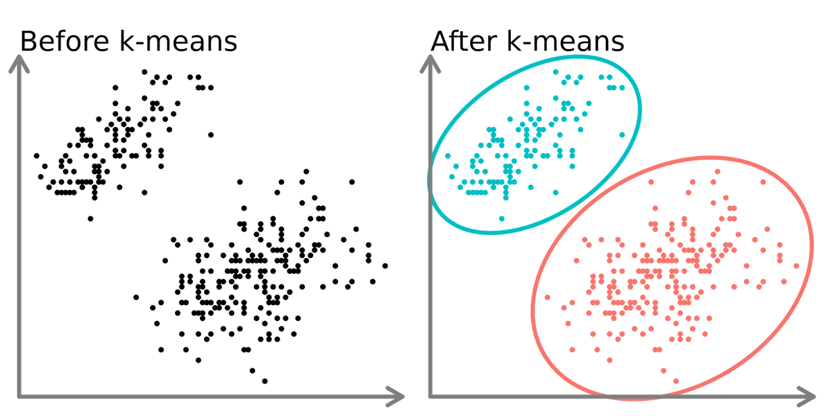
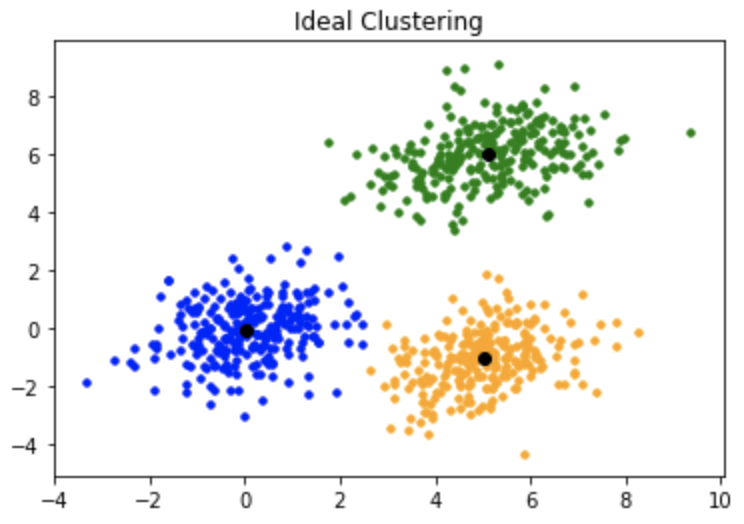
1. K-Means Clustering:
This is a centroid-based algorithm, where the goal is to minimize the sum of distances between points and their respective cluster centroid.
This is a centroid-based algorithm, where the goal is to minimize the sum of distances between points and their respective cluster centroid.
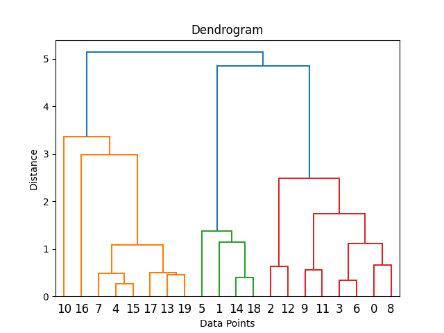
2. Hierarchical Clustering:
This method creates a tree of clusters. It is subdivided into Agglomerative (bottom-up approach) and Divisive (top-down approach).
This method creates a tree of clusters. It is subdivided into Agglomerative (bottom-up approach) and Divisive (top-down approach).
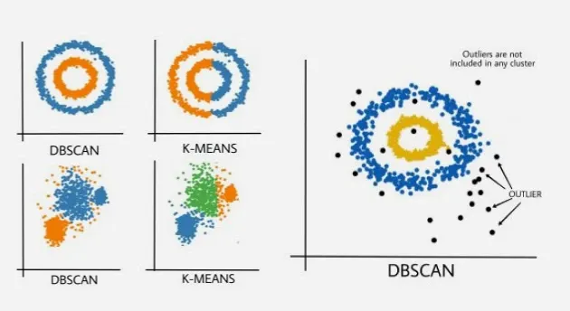
3. DBSCAN (Density-Based Spatial Clustering of Applications with Noise):
This algorithm defines clusters as areas of high density separated by areas of low density.
This algorithm defines clusters as areas of high density separated by areas of low density.
4. Mean Shift Clustering:
It is a centroid-based algorithm, which updates candidates for centroids to be the mean of points within a given region.
It is a centroid-based algorithm, which updates candidates for centroids to be the mean of points within a given region.
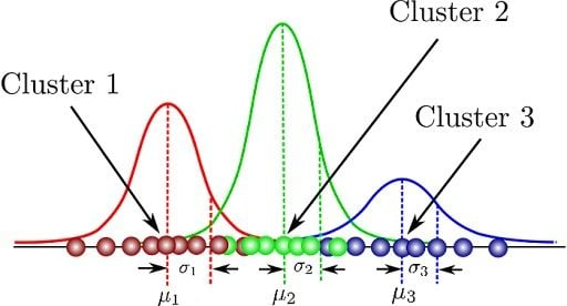
5. Gaussian Mixture Models (GMM):
This method uses a probabilistic model to represent the presence of subpopulations within an overall population without requiring to assign each data point to a cluster.
This method uses a probabilistic model to represent the presence of subpopulations within an overall population without requiring to assign each data point to a cluster.
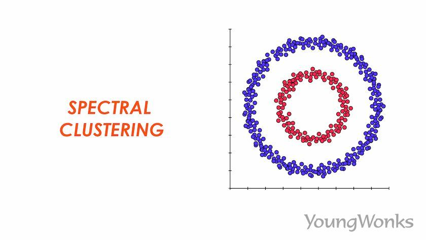
6. Spectral Clustering:
It uses the eigenvalues of a similarity matrix to reduce dimensionality before applying a clustering algorithm, typically K-means.
It uses the eigenvalues of a similarity matrix to reduce dimensionality before applying a clustering algorithm, typically K-means.
7. OPTICS (Ordering Points To Identify the Clustering Structure):
Similar to DBSCAN, but creates a reachability plot to determine clustering structure.
Similar to DBSCAN, but creates a reachability plot to determine clustering structure.
8. Affinity Propagation:
It sends messages between pairs of samples until a set of exemplars and corresponding clusters gradually emerges.
It sends messages between pairs of samples until a set of exemplars and corresponding clusters gradually emerges.
9. BIRCH (Balanced Iterative Reducing and Clustering using Hierarchies):
Designed for large datasets, it incrementally and dynamically clusters incoming multi-dimensional metric data points.
Designed for large datasets, it incrementally and dynamically clusters incoming multi-dimensional metric data points.
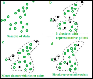
10. CURE (Clustering Using Representatives):
It identifies clusters by shrinking each cluster to a certain number of representative points rather than the centroid.
It identifies clusters by shrinking each cluster to a certain number of representative points rather than the centroid.
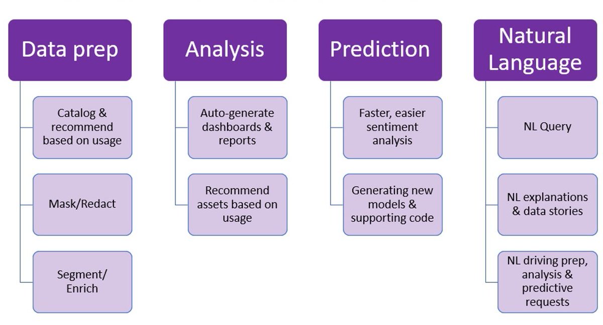
EVERY DATA SCIENTIST NEEDS TO LEARN AI IN 2025.
99% of data scientists are overlooking AI.
I want to help.
99% of data scientists are overlooking AI.
I want to help.
On Wednesday, August 21st, I'm sharing one of my best AI Projects:
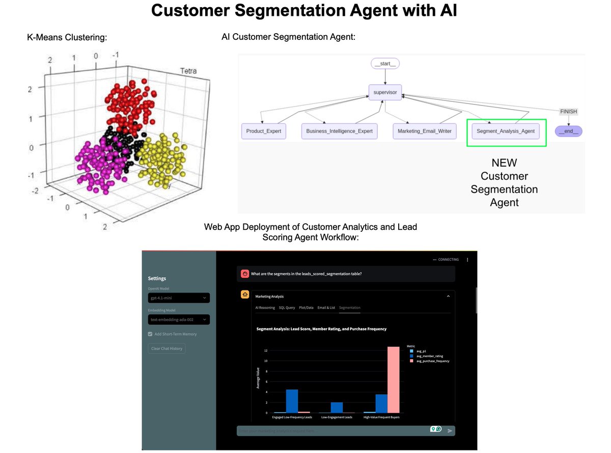
How I built an AI Customer Segmentation Agent with Python:
Register here (500 seats): learn.business-science.io/ai-register
How I built an AI Customer Segmentation Agent with Python:
Register here (500 seats): learn.business-science.io/ai-register
That's a wrap! Over the next 24 days, I'm sharing the 24 concepts that helped me become an AI data scientist.
If you enjoyed this thread:
1. Follow me @mdancho84 for more of these
2. RT the tweet below to share this thread with your audience
If you enjoyed this thread:
1. Follow me @mdancho84 for more of these
2. RT the tweet below to share this thread with your audience
https://twitter.com/815555071517872128/status/1955955151241392629
• • •
Missing some Tweet in this thread? You can try to
force a refresh