Changing your map’s resolution can change your conclusions.
It’s called the Support Effect.
And it distorts everything from poverty estimates to climate models.
Here’s how it works:
It’s called the Support Effect.
And it distorts everything from poverty estimates to climate models.
Here’s how it works:

In spatial analysis, “support” refers to the unit of measurement in space.
It could be:
• a point (e.g., GPS location)
• an area (e.g., census tract)
• a pixel (e.g., satellite image cell)
The support determines how and where a variable is measured.
It could be:
• a point (e.g., GPS location)
• an area (e.g., census tract)
• a pixel (e.g., satellite image cell)
The support determines how and where a variable is measured.
Here’s the issue:
If you change the size or shape of the support, the results change.
This is the Change of Support Problem (COSP).
It means that statistics like the mean, variance, or correlation can shift.
If you change the size or shape of the support, the results change.
This is the Change of Support Problem (COSP).
It means that statistics like the mean, variance, or correlation can shift.

This is closely related to another concept: the Modifiable Areal Unit Problem (MAUP).
MAUP occurs when results depend on how you divide space.
But COSP is the more general idea:
It’s about any change in spatial resolution, not just areal units.
MAUP occurs when results depend on how you divide space.
But COSP is the more general idea:
It’s about any change in spatial resolution, not just areal units.
Let’s make this concrete.
Say you’re measuring air pollution:
• At the point level, you have sensors scattered across a city.
• At the neighbourhood level, you average these into districts.
• At the city level, you average across the whole urban area.
Each step changes the support, and potentially your conclusions.
Say you’re measuring air pollution:
• At the point level, you have sensors scattered across a city.
• At the neighbourhood level, you average these into districts.
• At the city level, you average across the whole urban area.
Each step changes the support, and potentially your conclusions.
Why does this matter?
Because spatial variation gets smoothed out when you aggregate.
• Local extremes disappear
• Variance shrinks
• Correlations between variables can strengthen or weaken
• Regression coefficients can change.
Because spatial variation gets smoothed out when you aggregate.
• Local extremes disappear
• Variance shrinks
• Correlations between variables can strengthen or weaken
• Regression coefficients can change.
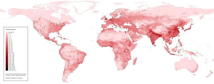
The Support Effect can distort everything from poverty mapping to climate modelling.
For example:
If you train a machine learning model on coarse-resolution satellite data, but apply it to high-res urban pixels, you’ll likely get biased predictions.
For example:
If you train a machine learning model on coarse-resolution satellite data, but apply it to high-res urban pixels, you’ll likely get biased predictions.
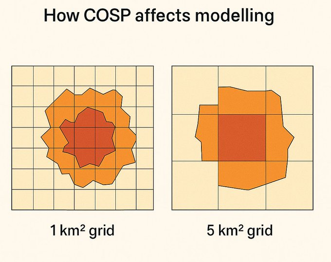
Here’s how COSP affects modelling:
Let’s say you build a model using 1 km² satellite data to predict income.
You later upscale it to 5 km².
The model might overstate relationships because the averaging reduces local noise and exaggerates trends.
Let’s say you build a model using 1 km² satellite data to predict income.
You later upscale it to 5 km².
The model might overstate relationships because the averaging reduces local noise and exaggerates trends.
There are ways to account for the support effect.
Some common methods include:
• Area-to-point kriging – interpolates point-level values from areal data
• Downscaling models – use covariates to estimate fine-scale patterns from coarse data
• Hierarchical models – explicitly model data at multiple supports
Some common methods include:
• Area-to-point kriging – interpolates point-level values from areal data
• Downscaling models – use covariates to estimate fine-scale patterns from coarse data
• Hierarchical models – explicitly model data at multiple supports
The big takeaway?
When working with spatial data, the support is never neutral.
Always ask:
• What spatial unit was this data measured at?
• Am I comparing variables on the same support?
• Will aggregation change the patterns I see?
When working with spatial data, the support is never neutral.
Always ask:
• What spatial unit was this data measured at?
• Am I comparing variables on the same support?
• Will aggregation change the patterns I see?
tl;dr:
• The Support Effect means your results can change with resolution
• It affects all forms of spatial points, polygons, rasters
• Ignoring it can lead to misinterpretation of patterns and biased models
• Always align your units, or adjust for them
• The Support Effect means your results can change with resolution
• It affects all forms of spatial points, polygons, rasters
• Ignoring it can lead to misinterpretation of patterns and biased models
• Always align your units, or adjust for them
225 Following
18.7K Followers
Yohan
@yohaniddawela
Sharing insights from the intersection of geospatial data science and economics | PhD in Economic Geography from
@lsenews
. Views are my own.
225 Following
18.7K Followers
Post
See new posts
Conversation
Yohan
@yohaniddawela
·
Jun 23
Let’s make this concrete.
Say you’re measuring air pollution:
• At the point level, you have sensors scattered across a city.
• At the neighbourhood level, you average these into districts.
• At the city level, you average across the whole urban area.
Each step changes the
Show more
Save
Yohan
@yohaniddawela
·
Jun 23
Why does this matter?
Because spatial variation gets smoothed out when you aggregate.
• Local extremes disappear
• Variance shrinks
• Correlations between variables can strengthen or weaken
• Regression coefficients can change.
Save
Yohan
@yohaniddawela
·
Jun 23
The Support Effect can distort everything from poverty mapping to climate modelling.
For example:
If you train a machine learning model on coarse-resolution satellite data, but apply it to high-res urban pixels, you’ll likely get biased predictions.
Save
Yohan
@yohaniddawela
·
Jun 23
Here’s how COSP affects modelling:
Let’s say you build a model using 1 km² satellite data to predict income.
You later upscale it to 5 km².
The model might overstate relationships because the averaging reduces local noise and exaggerates trends.
There are ways to account for the support effect.
Some common methods include:
• Area-to-point kriging – interpolates point-level values from areal data
• Downscaling models – use covariates to estimate fine-scale patterns from coarse data
• Hierarchical models – explicitly model data at multiple supports
18.7K Followers
Yohan
@yohaniddawela
Sharing insights from the intersection of geospatial data science and economics | PhD in Economic Geography from
@lsenews
. Views are my own.
225 Following
18.7K Followers
Post
See new posts
Conversation
Yohan
@yohaniddawela
·
Jun 23
Let’s make this concrete.
Say you’re measuring air pollution:
• At the point level, you have sensors scattered across a city.
• At the neighbourhood level, you average these into districts.
• At the city level, you average across the whole urban area.
Each step changes the
Show more
Save
Yohan
@yohaniddawela
·
Jun 23
Why does this matter?
Because spatial variation gets smoothed out when you aggregate.
• Local extremes disappear
• Variance shrinks
• Correlations between variables can strengthen or weaken
• Regression coefficients can change.
Save
Yohan
@yohaniddawela
·
Jun 23
The Support Effect can distort everything from poverty mapping to climate modelling.
For example:
If you train a machine learning model on coarse-resolution satellite data, but apply it to high-res urban pixels, you’ll likely get biased predictions.
Save
Yohan
@yohaniddawela
·
Jun 23
Here’s how COSP affects modelling:
Let’s say you build a model using 1 km² satellite data to predict income.
You later upscale it to 5 km².
The model might overstate relationships because the averaging reduces local noise and exaggerates trends.
There are ways to account for the support effect.
Some common methods include:
• Area-to-point kriging – interpolates point-level values from areal data
• Downscaling models – use covariates to estimate fine-scale patterns from coarse data
• Hierarchical models – explicitly model data at multiple supports
The big takeaway?
When working with spatial data, the support is never neutral.
Always ask:
• What spatial unit was this data measured at?
• Am I comparing variables on the same support?
• Will aggregation change the patterns I see?
tl;dr:
• The Support Effect means your results can change with resolution
• It affects all forms of spatial points, polygons, rasters
• Ignoring it can lead to misinterpretation of patterns and biased models
• Always align your units, or adjust for them
@LSEnews If you liked this, you might enjoy this post on the Modifiable Areal Unit Problem:
and give us a follow @yohaniddawela for more breakdowns on geospatial topics.
and give us a follow @yohaniddawela for more breakdowns on geospatial topics.
https://x.com/yohaniddawela/status/1743239060401856533
@LSEnews Interested in getting a short overview of the latest geospatial papers and datasets each week?
Subscribe to the Spatial Edge newsletter: yohan.so
Subscribe to the Spatial Edge newsletter: yohan.so

• • •
Missing some Tweet in this thread? You can try to
force a refresh