After I posted this thread, I was given all the raw data.
So, here are the zero-sum moral circles, where the categories are explicitly non-overlapping and giving moral units to a higher category does not include a lower-level category.
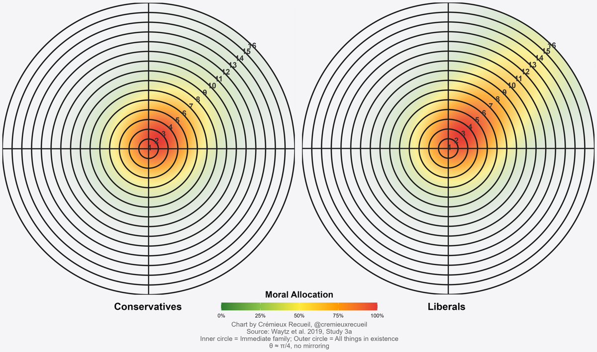
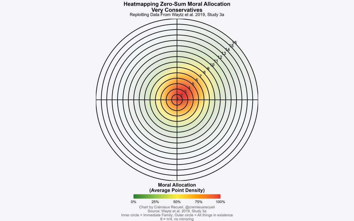
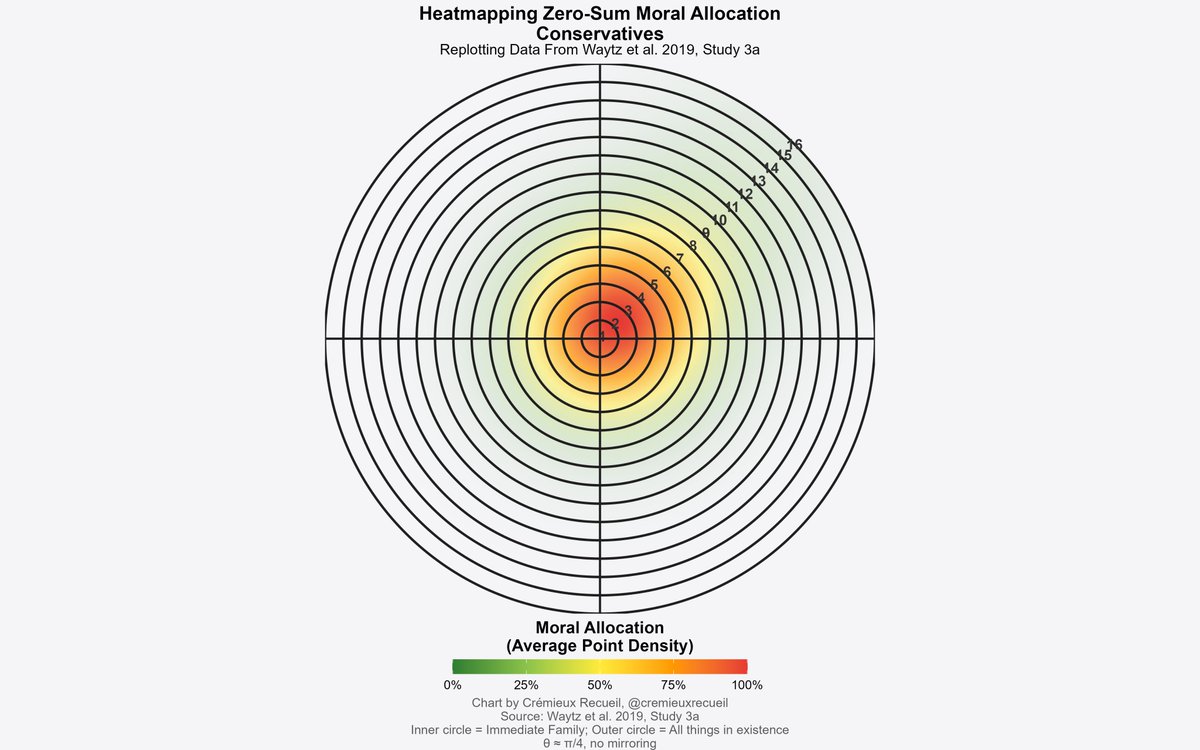
First, conservatives: very family-centric!
So, here are the zero-sum moral circles, where the categories are explicitly non-overlapping and giving moral units to a higher category does not include a lower-level category.
First, conservatives: very family-centric!
https://twitter.com/cremieuxrecueil/status/1962314265152332130
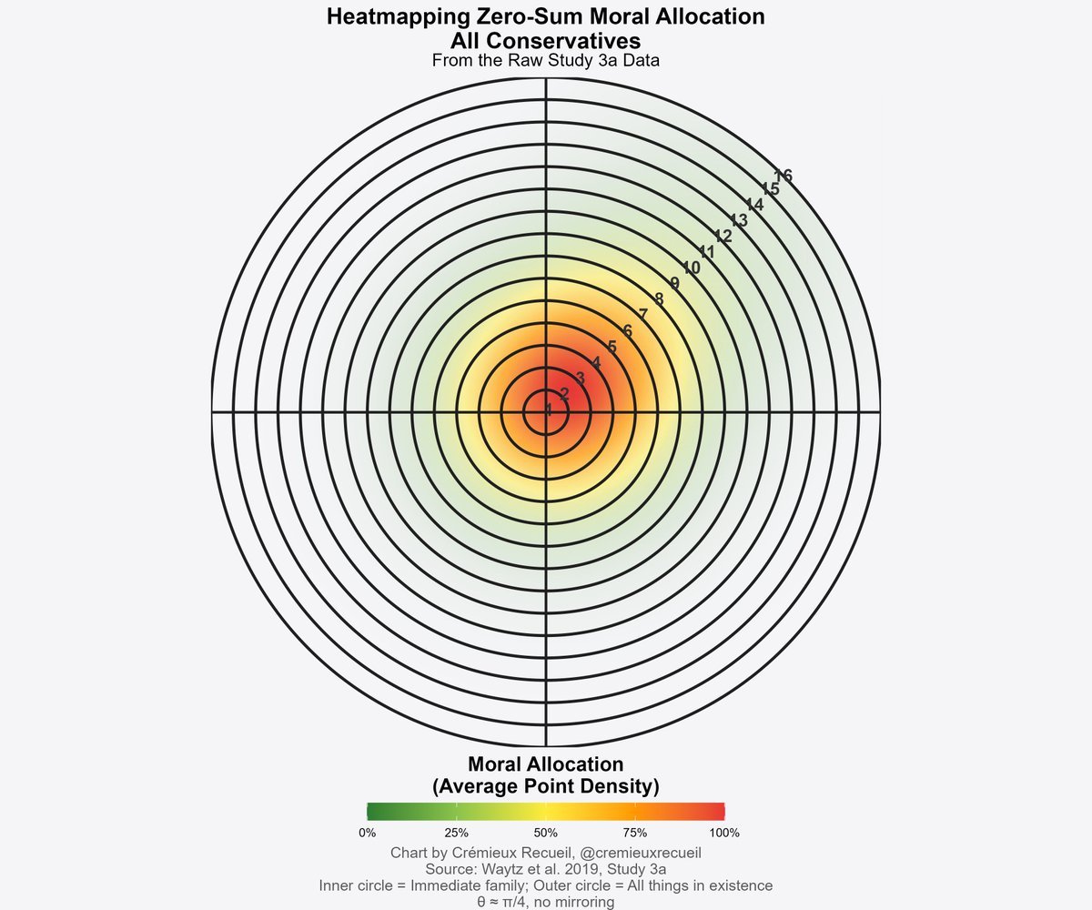
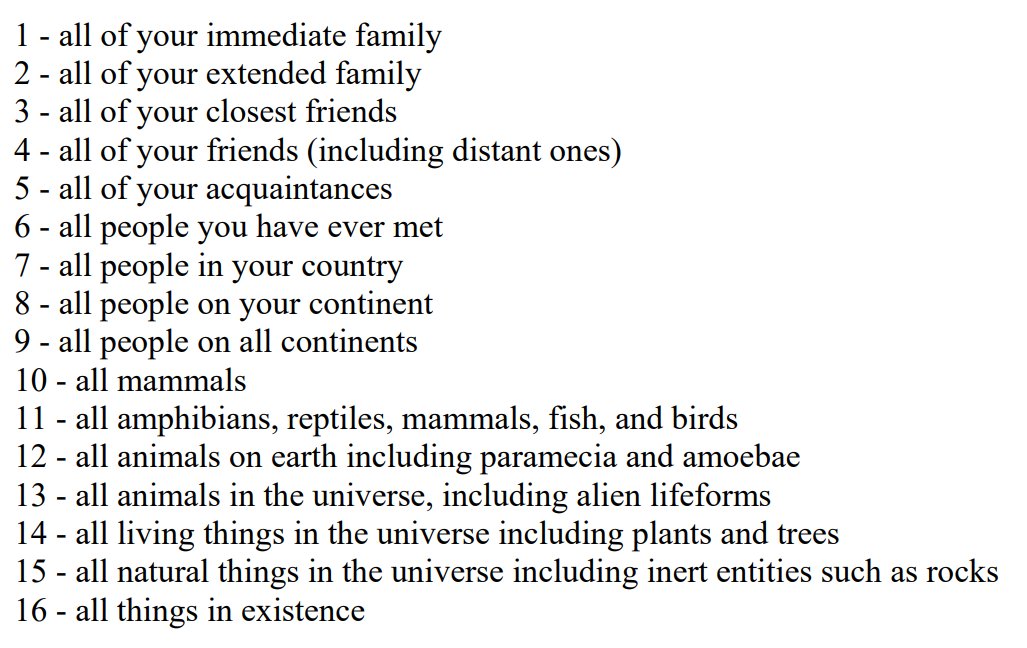
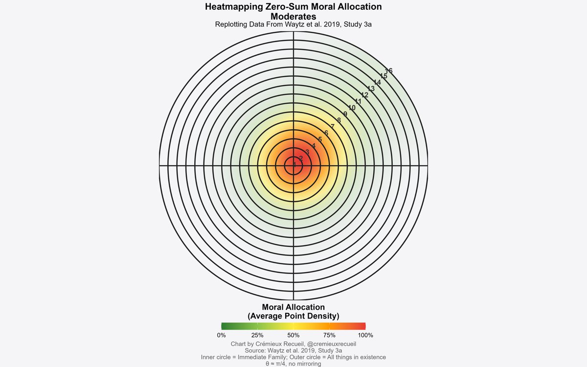
In case you're unfamiliar, these are the levels.
Participants were instructed that the moral units to allocate were like currency they can spend on others and allocate to different moral circles, and that a higher-level circle does **not** mean allocating to a lower one.
Participants were instructed that the moral units to allocate were like currency they can spend on others and allocate to different moral circles, and that a higher-level circle does **not** mean allocating to a lower one.
If you pick "16" in this exercise, then you take a moral unit away from levels 1-15.
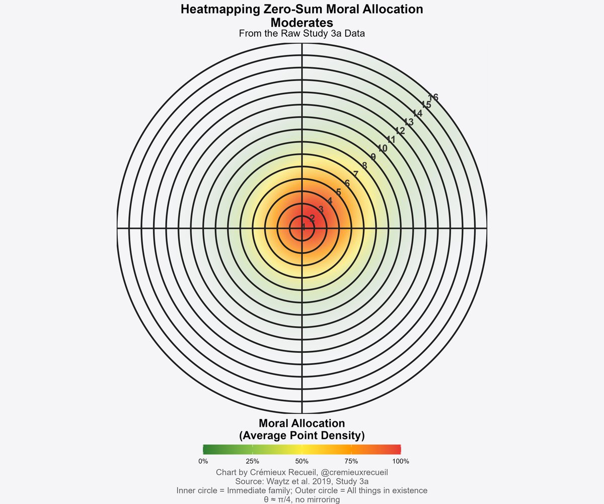
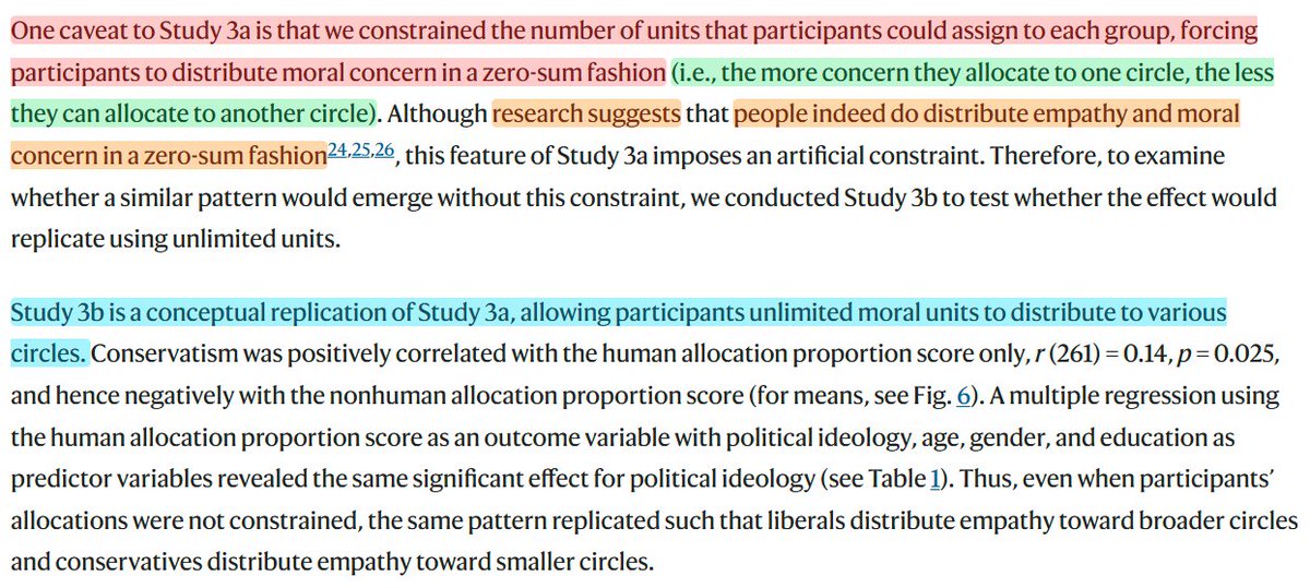
Here's how this worked out for moderates. Curious result: they're a little more family-focused than conservatives!
Here's how this worked out for moderates. Curious result: they're a little more family-focused than conservatives!
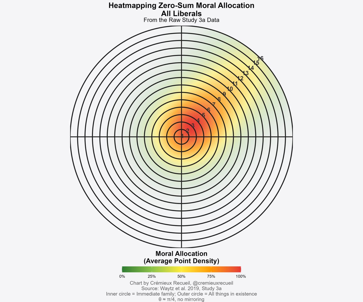
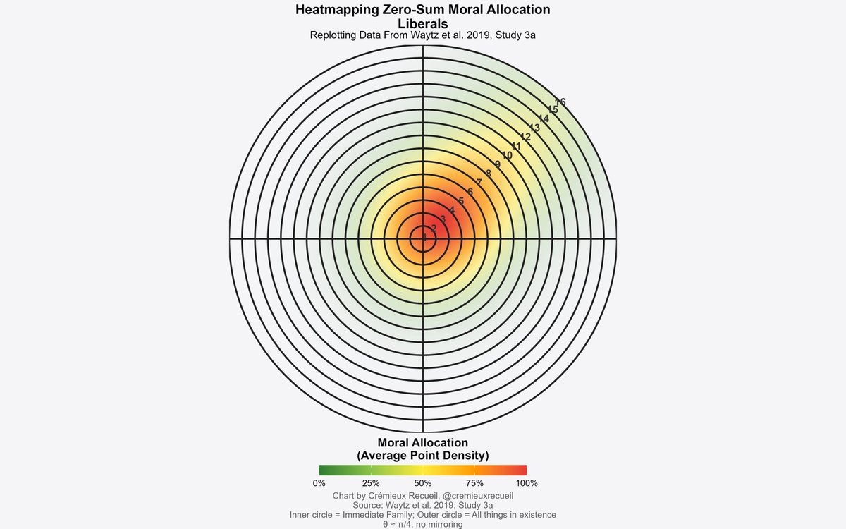
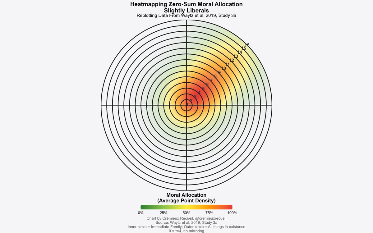
And finally, here's how this worked out for liberals.
Plenty of them allocated their scarce moral units to far-out categories, even though this meant taking a moral unit away from categories like immediate family members.
Plenty of them allocated their scarce moral units to far-out categories, even though this meant taking a moral unit away from categories like immediate family members.
I also received the data from the version of this study where participants could invest in different exclusive categories as much as they wanted.
In the real world, moral allocation is scarce. The authors cited other studies to that effect, but wanted to test infinite units.
In the real world, moral allocation is scarce. The authors cited other studies to that effect, but wanted to test infinite units.
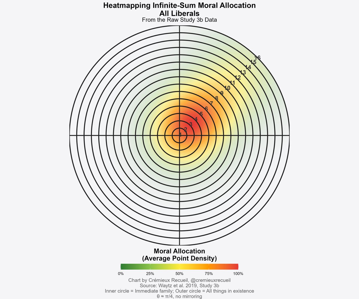
First up for infinite units are the conservatives.
They spread out quite a bit. Seems they do care about later levels, but they still put far more moral focus on the inner levels, the family and people they really know.
They spread out quite a bit. Seems they do care about later levels, but they still put far more moral focus on the inner levels, the family and people they really know.

Moderates spread out even more with infinite units.
They didn't spread out as much as liberals with scarce moral units, but they spread out considerably nonetheless.
They didn't spread out as much as liberals with scarce moral units, but they spread out considerably nonetheless.
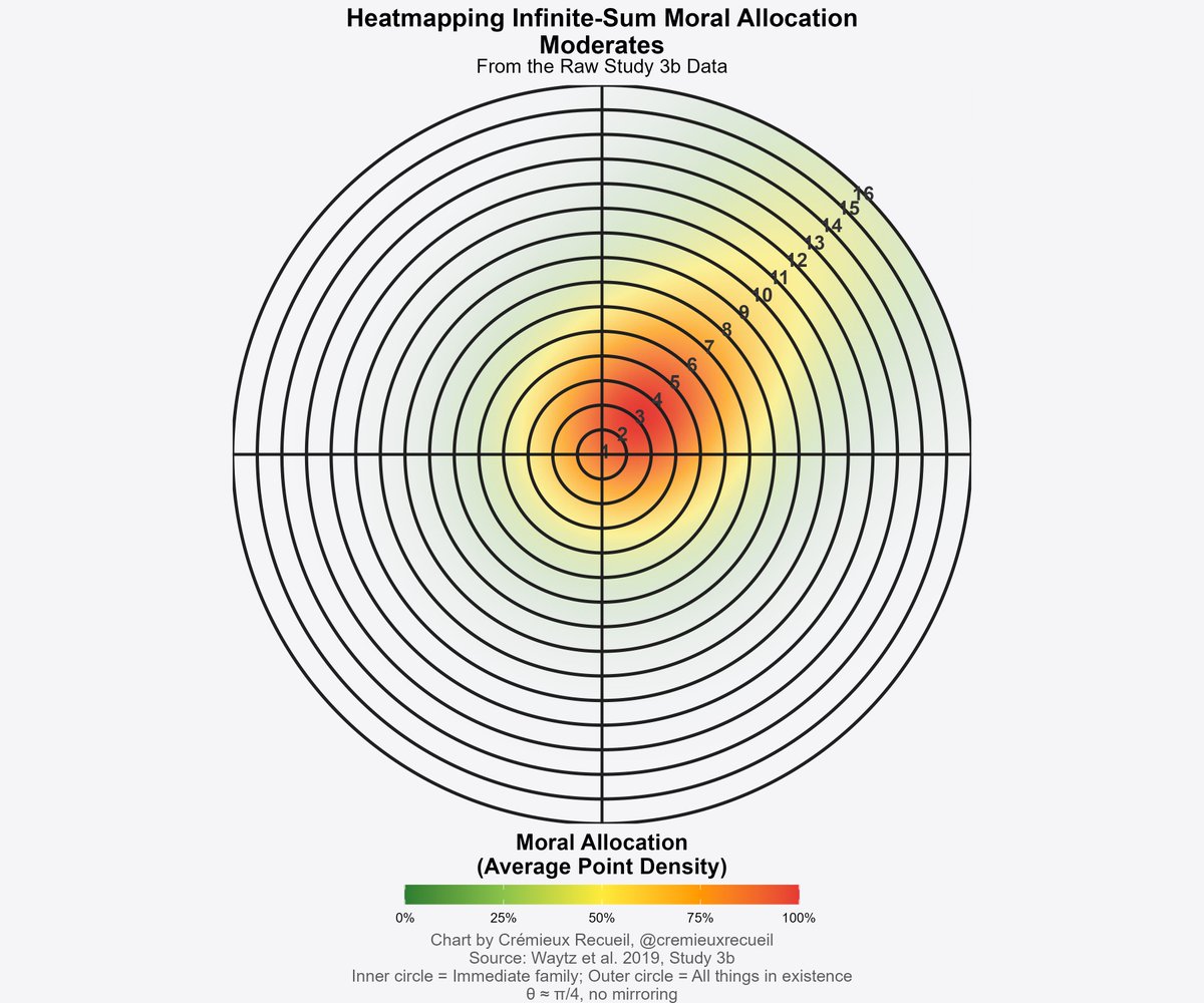
Finally, liberals.
Having infinite moral units actually saw them come back closer.
They were more extreme than conservatives and a bit more than moderates, too.
Having infinite moral units actually saw them come back closer.
They were more extreme than conservatives and a bit more than moderates, too.
In the zero-sum setting, the heat map meme directionally held up.
In the infinite-sum setting, it directionally held up as well, but was far weaker.
The first study's setting is more realistic, but the second one had a larger sample.
In the infinite-sum setting, it directionally held up as well, but was far weaker.
The first study's setting is more realistic, but the second one had a larger sample.
Here's something else I just learned. It's VERY curious.
The authors don't know how to replicate the original heat map! They actually received the image from Qualtrics, and it seems Qualtrics... doesn't know how they did it either.
It can be replicated, but with weird smoothing
The authors don't know how to replicate the original heat map! They actually received the image from Qualtrics, and it seems Qualtrics... doesn't know how they did it either.
It can be replicated, but with weird smoothing
Anyway, there's your heat map meme.
The people who said it wasn't real didn't actually check by replotting the data in the heatmap format.
The people who said it wasn't real didn't actually check by replotting the data in the heatmap format.
Now, hopefully people will moderate to the position
- The heat map meme was supported
- The magnitude is less than it first appeared
- Replication is warranted
-- Constructive qualitative extensions to this study are needed to understand what people really think about this task
- The heat map meme was supported
- The magnitude is less than it first appeared
- Replication is warranted
-- Constructive qualitative extensions to this study are needed to understand what people really think about this task
This is the craziest one, by the way: large portions valuing rocks over family.
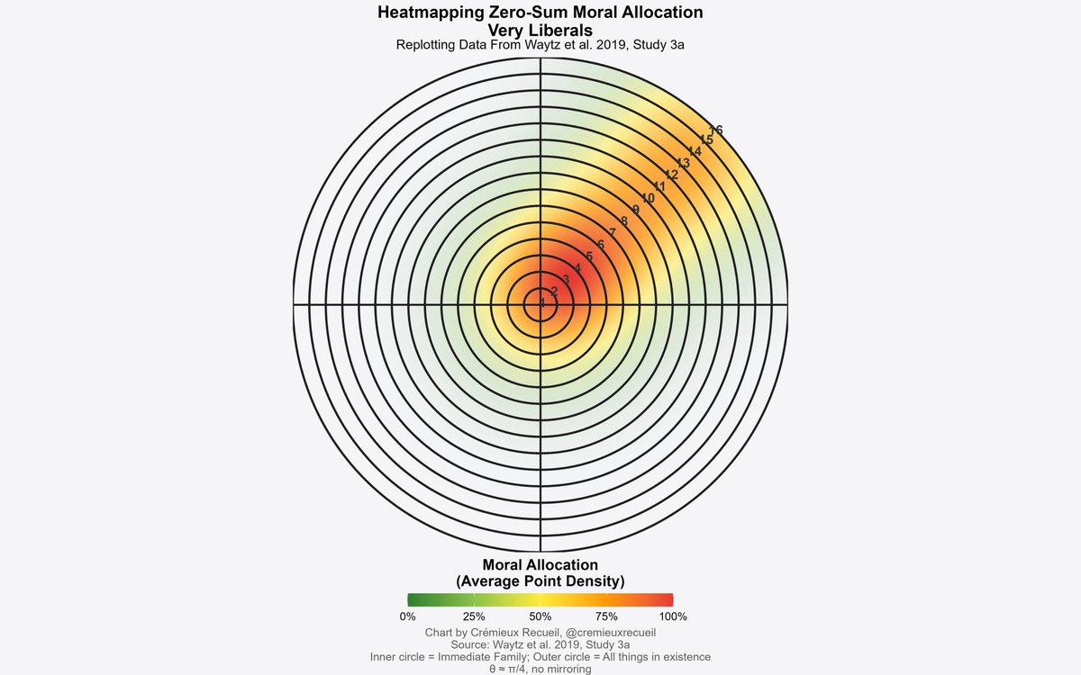
The #2 and #3 for weirdest were Slightly Liberal and Liberal, in that order.
My new position is that we should probably retract this study for using psychometrically invalid instruments.
https://x.com/cremieuxrecueil/status/1962610255520567609
• • •
Missing some Tweet in this thread? You can try to
force a refresh