Turns out there are some pretty big issues with DHS data.
A new study finds massive subnational differences in data quality across 35 African countries.
Here's the breakdown:
A new study finds massive subnational differences in data quality across 35 African countries.
Here's the breakdown:

A new study in Nature Communications, analyses geocoded DHS data at a 5km resolution.
It highlights serious concerns for health and development policymaking:
It highlights serious concerns for health and development policymaking:
The researchers focus on three types of data errors:
• Incomplete age (missing birth month or year)
• Age heaping (ages ending in 0 or 5)
• Flagged HAZ (missing or implausible child height data)
These are widely used indicators of data quality.
• Incomplete age (missing birth month or year)
• Age heaping (ages ending in 0 or 5)
• Flagged HAZ (missing or implausible child height data)
These are widely used indicators of data quality.
Using geostatistical models, they mapped these indicators at high spatial resolution.
They then aggregated the results to district and national levels, weighted by population.
They then aggregated the results to district and national levels, weighted by population.
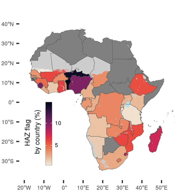
Findings show extreme within-country variation.
For example:
• Nigeria’s age heaping ranged from 25% to over 60% across districts
• In Chad, missing age data varied from 8% to over 90% between regions
For example:
• Nigeria’s age heaping ranged from 25% to over 60% across districts
• In Chad, missing age data varied from 8% to over 90% between regions
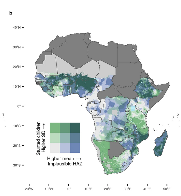
A major discovery: data quality deteriorates the further you get from settlements.
In rural and remote areas, missing data, imprecise measurements, and other errors become much more common.
In rural and remote areas, missing data, imprecise measurements, and other errors become much more common.
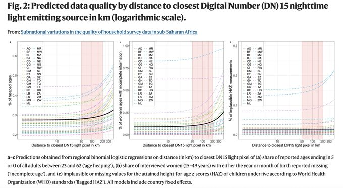
This remoteness penalty was found across all three indicators, and across nearly all countries.
It was particularly strong in West Africa, and slightly weaker in Central and Southern Africa.
It was particularly strong in West Africa, and slightly weaker in Central and Southern Africa.
Another key finding: poor data quality is only weakly correlated with standard sampling uncertainty.
This means two separate problems can overlap in different places:
• Small sample sizes
• Systematic measurement errors
Both threaten the reliability of local data.
This means two separate problems can overlap in different places:
• Small sample sizes
• Systematic measurement errors
Both threaten the reliability of local data.
For instance, parts of Madagascar and Niger showed both high sampling uncertainty and high systematic errors.
In contrast, some districts in Angola and Senegal had very high data quality.
In contrast, some districts in Angola and Senegal had very high data quality.

Poor quality data can ultimately mislead policymakers, misallocate resources, and fail to capture the true needs of remote populations.
Without knowing where these problems are, interventions may miss their targets.
Without knowing where these problems are, interventions may miss their targets.
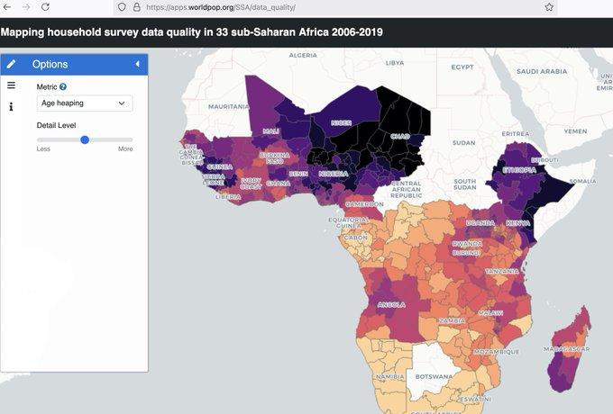
The researchers provide an online visualization tool to explore data quality across Africa.
This will help data users assess risks and adjust their analyses accordingly.
Link: apps.worldpop.org/SSA/data_quali…
This will help data users assess risks and adjust their analyses accordingly.
Link: apps.worldpop.org/SSA/data_quali…
The takeaway:
even “gold standard” household surveys like DHS aren't uniformly reliable.
even “gold standard” household surveys like DHS aren't uniformly reliable.
If you're interested in subnational development data, check this post out:
And give us a follow @yohaniddawela for more breakdowns on geospatial topics.
And give us a follow @yohaniddawela for more breakdowns on geospatial topics.
https://x.com/yohaniddawela/status/1912114287247564951
• • •
Missing some Tweet in this thread? You can try to
force a refresh