
Want to improve your emails?
Good news: you don’t need a full redesign or fancy new template.
Sometimes, a quick test (like button copy, subject lines, or send times) is all it takes.
But testing only works when you know what to test and how to read the results.
Here are 9 practical ways to optimize your campaigns👇
Good news: you don’t need a full redesign or fancy new template.
Sometimes, a quick test (like button copy, subject lines, or send times) is all it takes.
But testing only works when you know what to test and how to read the results.
Here are 9 practical ways to optimize your campaigns👇
But first… let’s lay down some ground rules:
-Always start with a clear hypothesis.
-Only test one variable at a time. Seriously. Don’t muddy the waters.
-Limit your variations (2–4 max) to keep results accurate.
-Make sure your audience sample is big enough to matter.
-Never edit a live test – let it finish first.
-And finally, ask your audience for feedback directly.
Alright, let’s get into the good stuff.
1. Test your subject lines
Your subject line is the first impression (and often the only shot you get).
It also sets the tone for your email. A small change, like adding urgency or using a playful hook, can give your open rate a pretty noticeable lift.
Here’s what to test:
-Short vs. long subject lines (try under 50 characters vs. 60–70)
-Preview text tweaks
-Words that create urgency, scarcity, or curiosity
Emojis (they’re not for everyone, but they can pop in the inbox)
For example, you could try something like:
-A: “Final hours: 20% off everything”
-B: “Your cart misses you 🛒”
Then watch what gets more opens. Rinse and repeat.

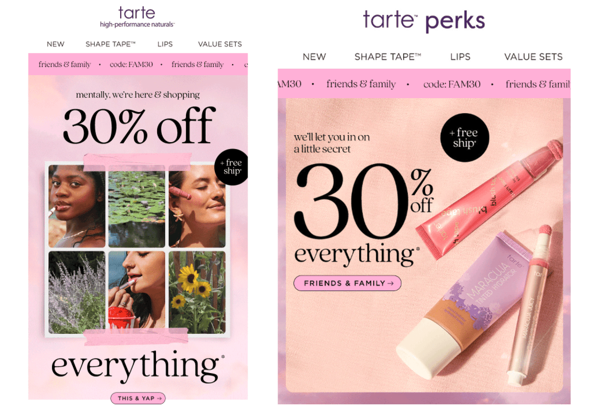
2. Play around with your incentives
Discounts are awesome, but they aren’t your only option.
People respond differently depending on how the offer feels. For example, some customers might not find a $10 discount as exciting as a free gift – even if the value’s the same!
Testing various offers helps you find out what clicks with your audience.
Here’s what to test:
-Percentage (%) off vs. dollar amount ($) off
-Free shipping vs. discount
-Small gift with purchase
-Contest or giveaway entry
-Bonus content (like a PDF guide or recipe)
For example, you could try:
-A: “Get 15% off your first order”
-B: “Get a free gift with your first order 🎁”
Then track which one brings in more conversions or new signups.
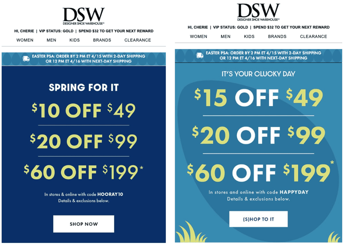
3. Make seasonal campaigns work for you
People are primed to shop during the holidays. Your job? Make it easy, fun, and relevant.
Seasonal emails are great for riding the holiday wave. They also help create context and urgency, which encourages buyers to act now.
Here’s what to test:
Holiday-themed copy and puns
Seasonal imagery that still fits your brand aesthetic
Offers tied to the season (cozy bundles in fall, “beat the heat” promos in summer)
For example, if you’re promoting outerwear during a winter sale, you could test the following subject lines:
A: “Winter coats, now 25% off ❄️”
B: “Cold? Your new favorite coat is waiting”
Track which one drives more opens and clicks – and test it again when you shift into spring or summer content.
4. Experiment with your CTA buttons
Your call-to-action (CTA) tells the reader what to do next. The clearer and more attractive it is, the more likely they are to take action.
Here’s what to test:
-Wording
-Button color
-Button vs. text link
-Number of CTAs in the email
-CTA placement
For instance, if you’re promoting a new product launch, you could test:
-A: “Shop Now” (actionable)
-B: “Treat Yourself” (emotional)
Monitor which gets more clicks. Don’t forget to test placement too!
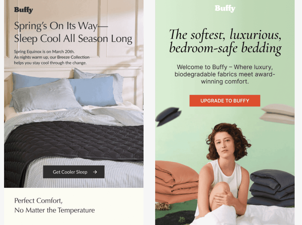
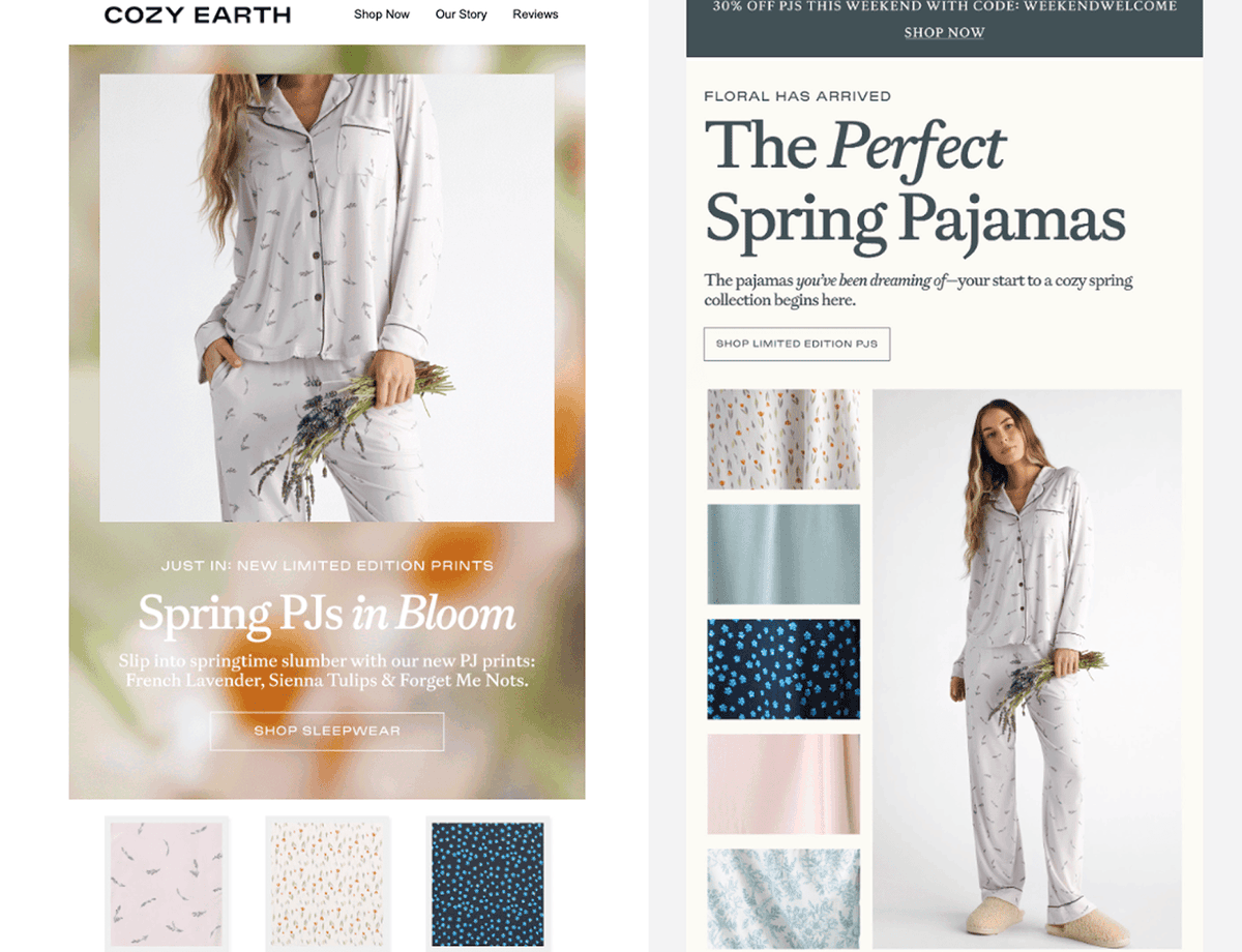
5. Try different layouts and email designs
Design influences how people read (and whether they convert).
Some readers want quick visuals. Others want storytelling. Your layout affects how easy it is to follow and take the desired action.
Here’s what to test:
-Two-column vs. single-column layouts
-More text vs. more images
-Order of content blocks
-Clean product grids vs. lifestyle imagery
-Font styles and button shapes
If you’re sending a product-focused email, you could test these layout styles:
-A: A clean product grid with 4 items, prices and short descriptions
-B: A single hero product with a lifestyle photo and a story-driven intro
Track whether showing multiple options or highlighting one product gets more clicks.
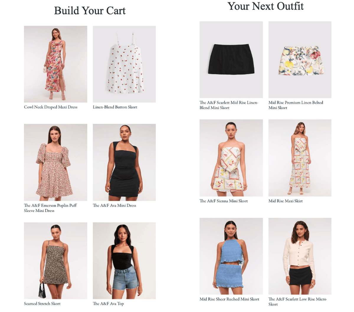
6. Add product feeds and recommendations
“Here’s something you might like” goes a long way when it’s actually something they might like.
Add smart feeds and recs in your emails that pull products from real customer data (e.g. purchase behavior, browsing history, favorites etc.).
Here’s what to test:
-Dynamic product blocks vs. static ones
-Personalized feeds vs. bestsellers
-Abandoned cart reminders vs. “You might also like”
For example, test two versions of a follow-up email after someone browses your site:
-A: “Recommended just for you” (personalized list of items they viewed)
-B: “Top picks from other shoppers like you” (curated list based on available data)
Compare engagement and click-through on the recommended products.
7. Scale personalization with AI-powered testing
Traditional A/B testing tells you what works for most people. But what if the second-best version actually works better for a specific group?
Some AI email marketing tools let you work smarter. Instead of sending the same “winner” email to everyone, let AI detect who preferred which version – and send them that.
It’s 1:1 personalization at scale. No more leaving potential clicks behind.
8. Find the best send times for your audience
A student, a new parent, and a 9-to-5 office worker are not opening emails at the same moment. Timing matters, and a great email sent at the wrong time is still a miss.
Here’s what to test:
-Early morning vs. afternoon vs. evening
-Weekday vs. weekend
-Seasonal changes in behavior
-Time zones or local delivery
If you’re running a weekend sale on summer sandals, try:
-A: Wednesday at 7 p.m. (post-work scroll time)
-B: Friday at 8 a.m. (weekend planning mode)
You're looking for the sweet spot between intent and action. Track opens, clicks, and conversions to see which timing wins.
9. Make compliance user-friendly and test how it’s presented
Compliance might not sound fun, but it builds trust and keeps you out of legal trouble. At the most basic level, it means including a visible unsubscribe link.
When people feel in control of their inboxes, they’re less likely to bounce for good (and respect your brand).
Here’s what to test:
Placement and tone of unsubscribe links
Friendly opt-out messages
Options for managing preferences vs. only unsubscribe
If unsubscribes are higher than you’d like, test how you present the opt-out:
A: A simple “Unsubscribe” link in the footer
B: A softer alternative like “Too many emails? Update your preferences”
Sometimes, just offering options can lower your unsubscribe rates.
So here’s the recap:
✅ Don’t guess—test (and only one thing at a time).
✅ Keep your audience segments in mind, not just your content.
✅ Focus on real behavior, not just vanity metrics.
✅ Always give your subscribers a reason to stay (and a clear path out if they choose to leave).
The more intentional you are with testing, the better your emails will perform. And the best part? Your audience will tell you exactly what they want – if you’re paying attention.
Now go send smarter!
If you enjoyed this breakdown, please like, share, comment, and retweet!
@ecomchasedimond and I send a daily newsletter focused retention marketing, specifically in email and sms marketing for ecommerce
We have 12 more found here: ecomemailmarketer.com
@ecomchasedimond and I send a daily newsletter focused retention marketing, specifically in email and sms marketing for ecommerce
We have 12 more found here: ecomemailmarketer.com
• • •
Missing some Tweet in this thread? You can try to
force a refresh


