Marketer of 17+ years. Former retailer/merchant & SaaS Founder. Co-Host @Senditpod @TheAsomPod. Newsletter: @eComemailmktr Event: @commerceround Learn more 👇
Jan 9 • 13 tweets • 5 min read
I know we just got done with the holidays...
But for some their holidays are coming up on Feb 14th!
Today, we break down Goldbelly’s V day email
With bold visuals, fun wordplay and a nostalgic music theme, it's packed with strong CTA's and design
Let's break it down👇
Let's start with the header block
🔍 TL;DR: The header is strong and eye-catching. Larger, bolder text, a higher CTA, and a more personal hook could make it even better.
Here's what we liked and areas of improvement👇
Jan 8 • 12 tweets • 2 min read
Here's a quiet reason most retention programs stall after the first purchase:
Brands can't see behavior fast enough to react to it
Because their systems weren't built to respond in real time
Let me explain 👇
A customer does one of these things today:
Browses a product 3 times
Clicks an email but doesn't buy
Buys once, skips the next campaign
Comes back via SMS instead of email
Most brands won't act on that until tomorrow
Next campaign
Or never
By then, the moment is gone
Jan 6 • 11 tweets • 4 min read
Browse abandonment emails are one of the top 5 email flow
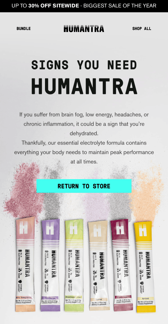
Today we break down Humantra, who takes a smart approach with theirs
Instead of reminding someone what they left behind, it focuses on why they may have stalled in the first place
This email fixes that by guiding the decision rather than forcing it
Let's break it down👇
Starting at the top, this is where Humantra pulls the shopper back in and reframes the conversation.
-The headline leads with a problem, not a product. “Signs You Need Humantra” immediately makes the email feel personal and relevant.
-Calling out symptoms like brain fog and low energy connects hydration to performance, not just thirst.
-The product lineup does a lot of work here. Showing all the stick packs together reinforces variety and makes the brand feel established.
-The supporting copy stays simple and easy to digest, which is exactly what you want for a browse abandonment touchpoint.
Jan 2 • 8 tweets • 4 min read
You’ve probably heard this before: your best marketers are your customers
But most brands still treat UGC (user-generated content) like an optional cherry on top
Reality: it proves your product works and keeps customers talking about you long after checkout
Here are 5 ways to collect and use UGC for growth in email👇
1. Build a UGC Machine
Relying on organic customer posts alone is risky – some months you’ll get a flood, others a trickle. The key is building systems that capture content consistently.
Here are some ideas to try:
-Trigger post-purchase review requests with photo/video uploads.
-Add a simple “Share your unboxing” CTA with a branded hashtag.
-Run seasonal or themed UGC campaigns (e.g., “Holiday Looks with [Brand]”).
-Offer small incentives like discount codes, loyalty points, or features on your site/email to encourage submissions.
Think of it as a content flywheel: every purchase should feed fresh UGC back into your marketing.
Dec 22, 2025 • 9 tweets • 5 min read
As we look into 2026, consumer expectations are rising fast.
Shoppers expect email to feel personal, relevant, and helpful.
They want brands that treat them like individuals, not one-size-fits-all subscribers.
And with inboxes more crowded than ever, anything generic gets ignored instantly.
Here are six ways to get more results from your eCommerce emails in 2026 👇
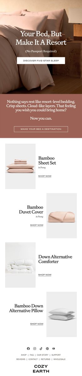
1. Use smarter upsells and cross-sells powered by AI
Upsells and cross-sells are still some of the highest converting emails you can send, but in 2026 the bar is higher. Shoppers expect recommendations that feel thoughtful, not random.
Most ESPs now use AI to analyze purchase behavior, browsing patterns, and customer preferences to recommend products that feel hand-picked.
How to level up these emails:
-Use AI recommendations. Let your ESP choose complementary products based on real behavior, not guesswork.
-Layer on strong “why” messaging. Tell customers how the add-on improves their experience.
-Avoid generic pairings. If someone buys premium cookware, they should not see the cheapest spatula in your store. Match quality with quality.
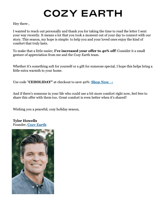
Cozy Earth’s product-focused layout is a great example of a clean, premium upsell experience that highlights complementary items without overwhelming the shopper.
Dec 19, 2025 • 10 tweets • 3 min read
Keep it simple stupid.
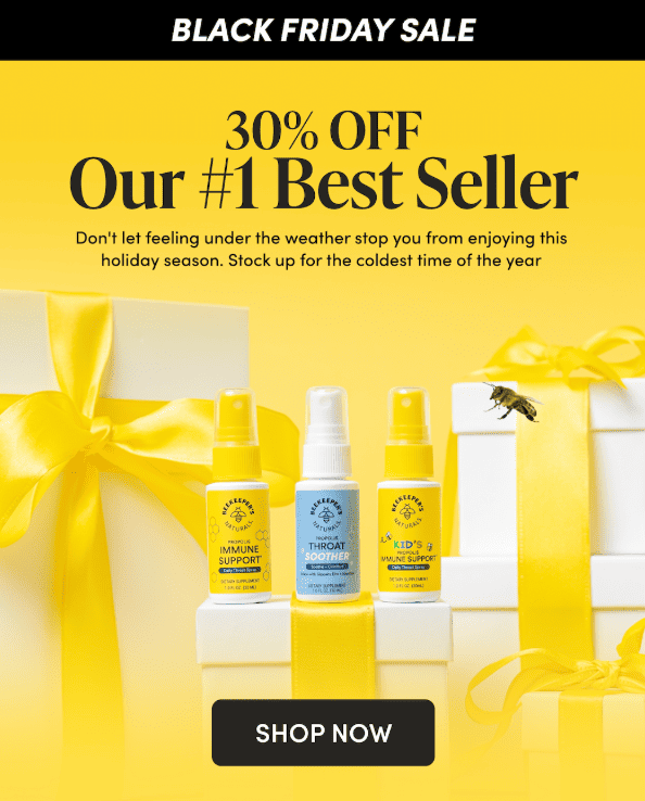
Beekeeper’s Naturals is a prime example of how to run a Black Friday sale without overcomplicating it.
A bold offer, bright visuals, and clear product education make this email easy to skim and even easier to act on.
Let's breakdown their BFCM email👇
Let's start with the header block
-Strong promotional clarity. “30 percent Off Our Number 1 Best Seller” immediately communicates value and filters the reader’s attention.
-Above the fold content is almost perfect. The product lineup, headline, and supporting copy appear early which is exactly what you want for mobile.
-Holiday energy done right. The ribbon visuals and warm palette feel festive without distracting from the offer.
-Purpose driven subcopy. The line about staying healthy during the season ties directly to the product’s use case and increases relevance.
Dec 18, 2025 • 14 tweets • 4 min read
Retention is not about flashy tactics.
It is about showing your customers that you care in small, meaningful ways that compound over time.
Today, we break down 5 ways to leverage retention without busting your budget👇
1. Embrace Manual Personalization and Human Touches
Automation is great, but nothing beats the feeling of a message that clearly came from another human being.
Manual personalization is one of the most underrated retention tactics. And because so few brands actually do it, it stands out even more in 2026.
Dec 17, 2025 • 9 tweets • 4 min read
Q5 is here!
Q5 runs from December 26 through around January 3 or 4
It’s when customers are done gifting for others and ready to shop for themselves
They’re sitting on store credits, gift cards, and cash they just got for the holidays
Here's how to attack via email and sms👇
Start by building your Q5 game plan
1. Adjust your messaging.
Q5 isn’t BFCM 2.0. Your tone should feel calm, personal, and rewarding; more “you’ve earned it” than “don’t miss out.”
Focus on refresh, self-care, and getting ready for the new year.
Think: reset energy, soft motivations, and giving shoppers permission to treat themselves after a hectic season.
Dec 16, 2025 • 9 tweets • 4 min read
You’ve probably heard this before: “Send the right message to the right person at the right time”
Well, segmentation is how you actually do that
You don’t need to build 25 dynamic flows or hire a data analyst
You just need to stop treating your entire list like one person
Here are 5 simple segments every eCommerce brand should start with👇
Segmentation is when you split your list into smaller groups: based on things like behavior, location, or engagement
Instead of blasting everyone the same message, you’re giving each group something they actually want to open, read, and click
Most email service providers like @omnisend let you create segments
The trick is knowing which segments to build first
Dec 15, 2025 • 13 tweets • 4 min read
Marketing automation isn’t just efficient; it’s essential
There's 6 that matter most for the highest performing brands in 2025.
From re-engaging abandoned carts to celebrating milestones, the right automations build relationships that drive repeat purchases and boost lifetime values
Let's break down the 6 (with examples)👇
1. Abandoned Cart Emails
Still the MVP of ecommerce automation. Abandoned cart emails remind shoppers what they left behind (and why they wanted it in the first place).
They recover lost revenue, but more importantly, they re-engage intent.
-How to make yours stand out:
-Send the first reminder within 3–4 hours of abandonment.
-Add a second follow-up within 24 hours with social proof or urgency.
-Include product images, dynamic recommendations, and a clear CTA
Dec 12, 2025 • 10 tweets • 4 min read
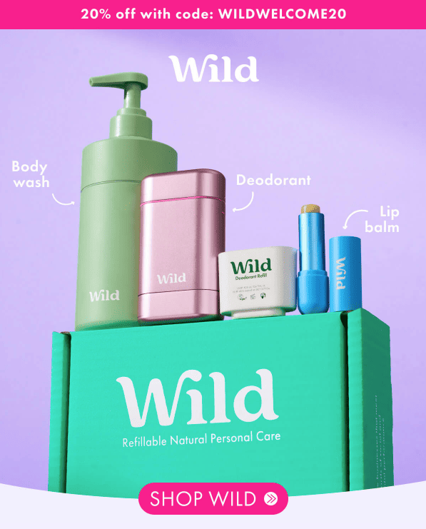
The welcome email is the most important email your customer will receive.
Today, we take a look at Wild’s welcome email which does a great job of showing new subscribers who they are from the first scroll.
The visuals are bright, the layout is clean, and the hero image immediately introduces their core refillable products.
Let's break it down 👇
Let's start with the header block
Here's what we liked and what we’d do differently👇
✔ Strong hero image. Showing deodorant, body wash, and lip balm right away sets expectations and tells subscribers exactly what Wild is about.
✔ Clear incentive. “20% off with code WILDWELCOME20” is front and center and easy to understand.
✔ Immediate brand identity. The color palette and typography feel consistent with Wild’s bubbly, sustainable voice.
✔ Early expectation setting. The line explaining what subscribers can expect in future emails is a nice touch and builds trust quickly.
Dec 11, 2025 • 17 tweets • 5 min read
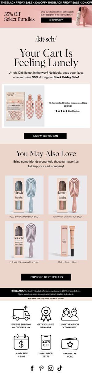
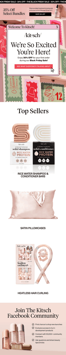
Kitsch turned a standard abandoned cart journey into a festive, relationship-building experience that trades pushiness for personalization.
The holiday touches, education-focused middle emails, and interactive survey give shoppers room to explore while still guiding them toward checkout.
Let's break down their 6 email flow👇
Kitsch’s Holiday-Ready Abandoned Cart Flow
1. Welcome To Kitsch!
Focus: Greeting new subscribers and driving first purchase
✔ Festive design immediately signals a seasonal moment and creates urgency
✔ Strong intro incentive of 30 percent off drives early conversions
✔ Clear CTA hierarchy keeps the focus on exploring best sellers
Dec 10, 2025 • 11 tweets • 6 min read
Remember your customers don’t stop shopping after Black Friday
They don’t stop opening emails
They don’t stop needing great products
So why would you stop showing up?
Here's 7 ways to apply those BFCM learnings to your marketing👇
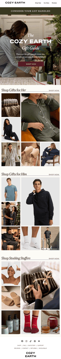
1. Send Gift Guides All Year
Gifting isn’t just for the holidays.
People have birthdays, anniversaries, graduations, housewarmings, baby showers… life keeps happening. So keep those gift guides coming.
Try curating seasonal round-ups, like:
-“Spring Birthday Picks”
-“Housewarming Gifts They’ll Actually Use”
-“Unique Gifts for the Graduate”
Break it down further by adding “For Her” or “Under $50” to target specific buyers and make it easier for people to shop.
SAYSO nails this with their Valentine’s Day gift guide:
Dec 9, 2025 • 8 tweets • 3 min read
Cart abandonment stings
And in 2025, it’s more common than ever
With rising ad costs and shifting consumer behavior, every uncompleted checkout hits harder
But the good news? Most of those “lost” carts aren’t gone forever
Here are the most common culprits in 2025 and what you can do about each 👇
1. Surprise Costs at Checkout
Even in an era of one-click convenience, unexpected fees still ruin the moment. Studies show that nearly half of shoppers abandon carts because taxes, shipping, or handling fees catch them off guard.
Fix it:
-Be upfront about all costs on product pages.
-Offer a shipping estimator early in the flow.
-Highlight free shipping thresholds clearly (“Free shipping on orders over $75”).
Transparency earns trust (and trust converts).
Dec 8, 2025 • 17 tweets • 4 min read
Just cause it's a big sale, doesn't mean you should forget about brand.
Every touchpoint (Black Friday or no) needs to always reinforce he company's brand.
This is done through education and experience.
Let's break down Tropicfeel's Black Friday 6 email series👇
Black Friday kicks off tomorrow
Focus: Driving early excitement and waitlist sign-ups
Why It Works:
✅ Minimalist layout directs all focus to the single CTA (“Join Now”)
✅ “Private Sale” language creates exclusivity and curiosity
✅ Strong hierarchy with bold headline and early access incentive
Dec 5, 2025 • 10 tweets • 3 min read
Simple sells.
And today, I am breaking down Act+Acre's recent sale that keeps things clean; literally and visually.
With a minimal layout, strong visuals, and just enough proof points, this campaign makes its best-selling serum the undeniable hero.
Let’s take a closer look👇
Let's start with the header block
Here's what we liked and what we’d do differently👇
✔ The 30% off bar immediately communicates urgency and value. It’s direct, simple, and visible even on mobile.
✔ “Our Best-Selling Product Ever” is an easy, high-impact headline. It builds authority and curiosity in one line.
✔ Product stats add instant credibility. “Sold out 5x,” “2x award winner,” and “3,000+ five-star reviews” serve as quick, scannable proof points.
✔ Consistent CTA placement with “Shop Stem Cell Serum” keeps the focus exactly where it should be: on the hero product.
Dec 4, 2025 • 10 tweets • 4 min read
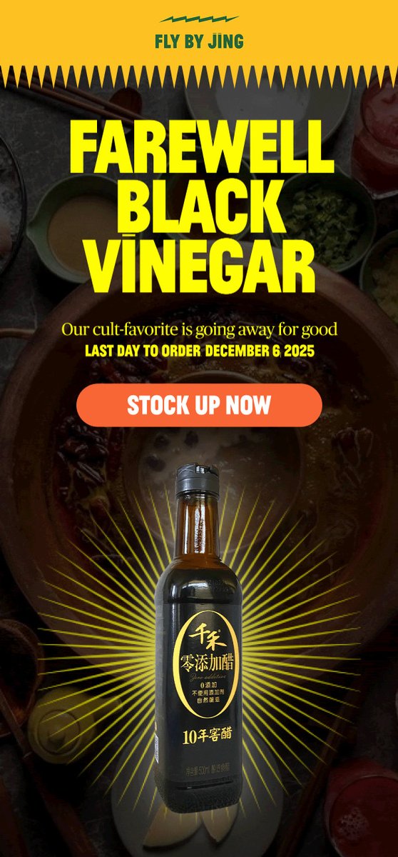
Some goodbyes hit harder than others
Today, we break down a sunset email, of a last chance to grab a product before it gets off the shelf by Fly by Jing.
Their sunset of the Black Vinegar is a sharp, urgency-first send that gets straight to the point.
Let's break down what makes this kind of “last call” email work 👇
Let's start with the header block
Here's what we liked and what we’d do differently👇
✔ The headline does its job. “Farewell Black Vinegar” is simple and direct, instantly communicating the message.
✔ The date stamp matters. Calling out the last day to order gives customers a real deadline to act on.
✔ Strong visual focus. The hero bottle is front and center, and the yellow on dark green color palette feels very on brand.
Dec 3, 2025 • 10 tweets • 4 min read
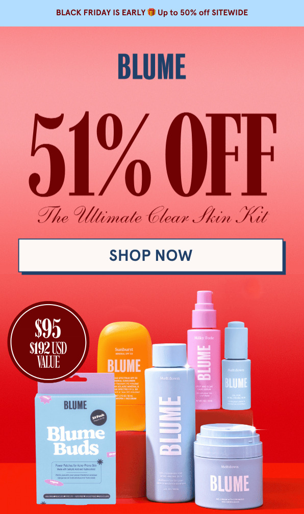
Blume went loud for Black Friday and it works.
A giant 51% off headline, bold color, and a transformation photo that does all the talking.
But a few mixed messages in the offer stack hold it back.
Here’s what they nailed and what could hit even harder for their Black Friday announcement 👇
Let's start with the header block
Here's what we liked and what we’d do differently👇
What We Love
✔ Big, unmissable offer. The “51% OFF” headline commands attention and immediately communicates the deal.
✔ On-brand color palette. The pink-red gradient captures Blume’s feminine, confident energy and stands out in a crowded inbox.
✔ Clean hero layout. The “Shop Now” button sits front and center, giving readers an obvious next step.
✔ Clear value statement. The inclusion of “$95 | $192 USD value” sets expectations and builds perceived savings right away.
Nov 24, 2025 • 17 tweets • 7 min read
It's Black Friday, Cyber Monday holiday week...
And if you're still looking for final email and sms marketing ideas for your brand, I've got 13 ideas for you below👇
(p.s. send more email this week, your customers are expecting it)
1. The Segmented Gift Guide
Why it works: Shoppers are overwhelmed. A segmented guide simplifies decisions and increases purchase intent by showing products that actually fit their needs.
How to implement:
-Build guides around customer goals or interests instead of demographics.
-Use purchase data or quiz inputs to personalize each send.
-Make every product block feel curated, not copy-pasted.
Strategic tip: Lead with language like “Made for…” or “Perfect if you…” to anchor readers emotionally before they browse.
Nov 19, 2025 • 10 tweets • 4 min read
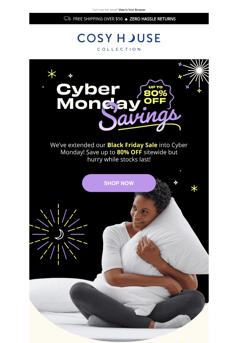
The best way to learn what works best for this Black Friday, Cyber Monday is to dissect what worked last year and improve upon it.
Today, we review Cosy House Collection’s Cyber Monday email has all the right ingredients for a high-performing holiday send: big savings, clear product showcases, and bold visuals
But while the deals shine, the copy and structure could use a little tightening to match the brand’s luxury positioning
Let’s break it down👇
Let's start with the header block
Here's what we liked and what we’d do differently👇
What We Love
✔ Clear sale message. “Cyber Monday Savings” instantly communicates the promotion, and extending the Black Friday sale adds a sense of urgency and convenience.
✔ Eye-catching visuals. The spark-themed graphics keep it festive without feeling overwhelming.
✔ Hero product focus. Featuring someone cozied up in bed sets the tone and reinforces the comfort-driven brand message.
Nov 18, 2025 • 12 tweets • 5 min read
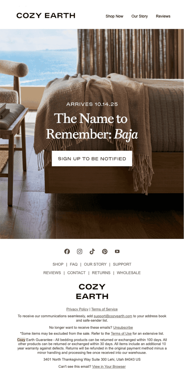
Cozy Earth’s new Baja Collection launch wasn’t loud, it was intentional.
Across six emails, the luxury bedding brand delivered a masterclass in restraint, pairing slow-build storytelling with timeless visuals and founder-led messaging to turn a simple product drop into a full brand moment.
This series proves that not every launch needs urgency to convert. Sometimes, confidence sells better than hype.
Here’s how Cozy Earth turned a bedding collection into a lifestyle statement👇
1. Something New for the Bed. 10.14.25
Focus: Early teaser for the upcoming launch
Why This Works:
✅ Elegant restraint. The hero visual is calm, minimal, and on-brand for Cozy Earth’s “elevated comfort” aesthetic
✅ Specific launch date builds anticipation and signals confidence
✅ “Sign up to be notified” CTA captures high-intent subscribers without over-selling
What Needs Work:
❌ Could include a subtle hint about what makes the product new or different to intrigue readers
❌ No incentive or reason to click beyond curiosity; a line like “first to access limited stock” could have improved signups