
I know I don't often post except for Thursday's map updates, but there's something I need to discuss with you about the national PCR positivity rate.
That's the rate shown here.
🧵👇
That's the rate shown here.
🧵👇

At the height of the October wave last year, every single area in England bar one was reporting test results regularly.
The map had no shaded areas.
The map had no shaded areas.

Things have changed greatly since then.
In late January, a number of trusts decided to cut their testing dramatically.
In February, some trusts stopped reporting results completely.
In late January, a number of trusts decided to cut their testing dramatically.
In February, some trusts stopped reporting results completely.
We now have 18.5% of areas not reporting.
Some (6 or 7) are trying to avoid reporting at all, but do so occasionally.
Others (the majority) do normally report, but have not reported for a couple of days.
Some (6 or 7) are trying to avoid reporting at all, but do so occasionally.
Others (the majority) do normally report, but have not reported for a couple of days.
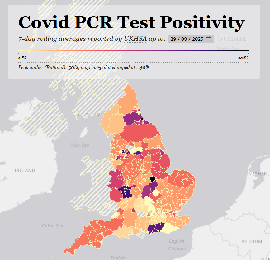
What this means is that the national positivity figure - the one UKHSA use on the dashboard, the one journalists refer to, currently at 9.25% - is wrong.
It is skewed downwards.
It is skewed downwards.
That figure is the average of the 123 areas reporting actual results and the 28 areas reporting 0%.
To work out what the real positivity rate is across England, we'd need to know what those 28 missing areas' results are.
To work out what the real positivity rate is across England, we'd need to know what those 28 missing areas' results are.
(A digression:
UKHSA says positivity is 9.25%, but when I calculate the average from the raw data, it's 9.62%.
I don't know why there's a difference. It's their data.)
UKHSA says positivity is 9.25%, but when I calculate the average from the raw data, it's 9.62%.
I don't know why there's a difference. It's their data.)
Anyway. There's no easy way to deal with the missing data.
But we can be certain that the areas reporting 0% are not actually experiencing 0%.
Especially at the moment, when areas reporting 0% are surrounded by areas reporting very high positivity.
But we can be certain that the areas reporting 0% are not actually experiencing 0%.
Especially at the moment, when areas reporting 0% are surrounded by areas reporting very high positivity.
So I'm proposing two methodologies for giving us a more truthful national positivity stat.
The first gives all areas reporting 0% the existing national average instead, i.e. 9.62%, and then recalculates the national average.
The first gives all areas reporting 0% the existing national average instead, i.e. 9.62%, and then recalculates the national average.
The second uses the last known good local data - often only a day or two behind - for each area that's stopped reporting recently, and 9.62% for all the others.
This method is likely more accurate, but also more subjective.
This method is likely more accurate, but also more subjective.
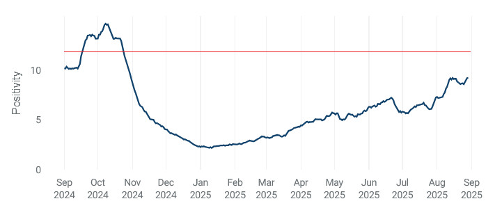
Here's the result.
The first, conservative method gives 11.4%.
The second, more accurate but more subjective method gives 11.8%.
The red line in the graph shows where the latter would be.
The first, conservative method gives 11.4%.
The second, more accurate but more subjective method gives 11.8%.
The red line in the graph shows where the latter would be.
If we want to compare this wave to last autumn's we have to account for the areas that were reporting then, but whose data is missing now.
Unfortunately the areas that are missing vary from week to week.
Unfortunately the areas that are missing vary from week to week.
So, I am minded to add an 'adjusted' national positivity stat to the map each week.
At the moment, I think it would have to use the first, conservative methodology.
At the moment, I think it would have to use the first, conservative methodology.
But as always, I want the map to remain a public health tool for the use of ordinary people.
I want them to know what's happening where they live right now.
I want it to inform their actions in a way that's useful to them.
I want them to know what's happening where they live right now.
I want it to inform their actions in a way that's useful to them.
You need to know if it's raining where you are today, not how much it rained last month on average across England.
What I don't want is for the map to head in the direction of historical documentation, showing past developments at a national scale that isn't of any practical use to anyone except academics.
(I say this as an academic.)
(I say this as an academic.)
Too many of the reports and charts and substacks have settled into a comfortable academic distance both temporally and spatially.
They're data archaeology, not public health info.
I don't want the map to fall into that trap.
They're data archaeology, not public health info.
I don't want the map to fall into that trap.
But that's my personal view.
I'd like to know what other people think.
Do you want an adjusted national stat adding to the map? Is it useful? Would you change the method used?
/ends
I'd like to know what other people think.
Do you want an adjusted national stat adding to the map? Is it useful? Would you change the method used?
/ends
• • •
Missing some Tweet in this thread? You can try to
force a refresh


