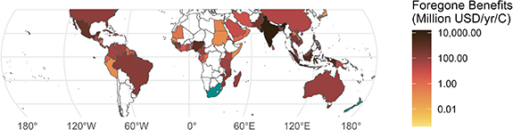
Asia will bear 65% of global mangrove losses by 2100, whilst OECD countries face just 3%.
A new study reveals the massive inequality in climate impacts on coastal ecosystems.
Here's what you need to know:
A new study reveals the massive inequality in climate impacts on coastal ecosystems.
Here's what you need to know:
A new study in Environmental Research: Climate presents the first global analysis of how warming seas threaten mangrove restoration efforts:
The researchers analysed mangrove cover data across 1,533 locations worldwide from 1996 to 2020.
They examined how climate variables and economic development influence mangrove area.
Their approach uses panel data analysis to isolate the causal effects of temperature and GDP.
They examined how climate variables and economic development influence mangrove area.
Their approach uses panel data analysis to isolate the causal effects of temperature and GDP.

They found two opposing forces at play:
1. Rising local GDP supports mangrove growth (likely through conservation efforts)
2. Warming sea surface temperatures damage mangroves above a certain threshold
However, the issue is these forces nearly cancel each other out.
1. Rising local GDP supports mangrove growth (likely through conservation efforts)
2. Warming sea surface temperatures damage mangroves above a certain threshold
However, the issue is these forces nearly cancel each other out.
Eeconomic growth alone could have achieved the global goal of restoring 50% of historical mangrove cover by 2100.
But warming ocean temperatures completely stall this progress.
But warming ocean temperatures completely stall this progress.
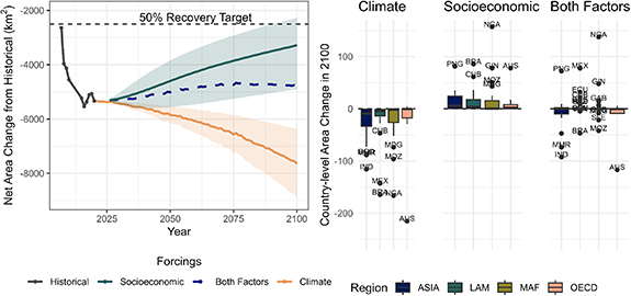
The study reveals a non-linear relationship with temperature.
Mangroves in cooler areas initially benefit from warming, but once temperatures exceed a threshold, damage occurs.
The researchers identified sea surface temperature during the hottest month as the main factor.
Mangroves in cooler areas initially benefit from warming, but once temperatures exceed a threshold, damage occurs.
The researchers identified sea surface temperature during the hottest month as the main factor.
By 2100, under a high emissions scenario (SSP5-RCP7.0), mangrove areas could be 150,000 hectares smaller than without climate change.
Countries like India, Myanmar, Brazil, Mozambique, and Australia face the largest reductions.
Countries like India, Myanmar, Brazil, Mozambique, and Australia face the largest reductions.
The economic losses are pretty nuts.
The researchers estimate annual welfare losses from reduced mangrove services could reach 28 billion USD by 2100.
This includes losses from:
• Cultural services
• Provisioning services (food, materials)
• Regulating services (storm protection, carbon storage)
The researchers estimate annual welfare losses from reduced mangrove services could reach 28 billion USD by 2100.
This includes losses from:
• Cultural services
• Provisioning services (food, materials)
• Regulating services (storm protection, carbon storage)
The impacts are deeply unequal.
• Asia bears 65% of the losses (18.6 billion USD annually),
• Middle East and Africa bears 19% (5.4 billion USD),
• Latin America and the Caribbean bears 13% (3.6 billion USD), and
• OECD countries bear just 3% (0.8 billion USD).
• Asia bears 65% of the losses (18.6 billion USD annually),
• Middle East and Africa bears 19% (5.4 billion USD),
• Latin America and the Caribbean bears 13% (3.6 billion USD), and
• OECD countries bear just 3% (0.8 billion USD).
The study also found a surprising pattern with economic development.
Lower-income regions initially deplete mangroves more, but as income rises, conservation eventually improves.
This creates a turning point where wealth becomes beneficial rather than destructive.
Lower-income regions initially deplete mangroves more, but as income rises, conservation eventually improves.
This creates a turning point where wealth becomes beneficial rather than destructive.
The authors reckon their estimates are likely conservative.
Many societal benefits of mangroves haven't been fully captured due to limited primary studies, especially regarding non-use values.
The actual impact could be significantly greater.
Many societal benefits of mangroves haven't been fully captured due to limited primary studies, especially regarding non-use values.
The actual impact could be significantly greater.
tl;dr:
Even with economic growth favouring mangrove restoration, ocean warming threatens to cancel out these gains entirely.
This means much greater conservation efforts will be needed to achieve substantial mangrove restoration by century's end.
Even with economic growth favouring mangrove restoration, ocean warming threatens to cancel out these gains entirely.
This means much greater conservation efforts will be needed to achieve substantial mangrove restoration by century's end.
• • •
Missing some Tweet in this thread? You can try to
force a refresh