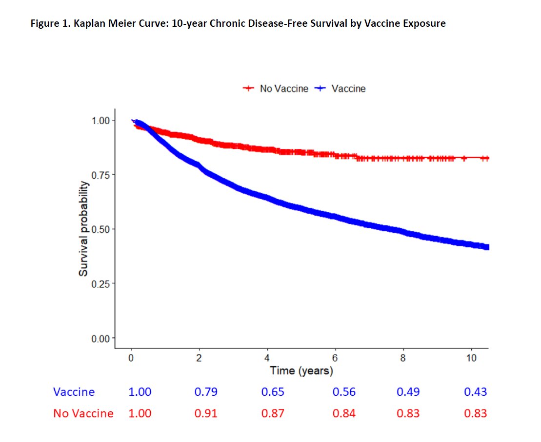
I'm going to explain why this chart is so important and why @jsm2334 is being disingenuous by ignoring it - whilst making points that undermine the "real world vaccine data" industry.
It's a Kaplan-Meier curve and it obliterates Jeffrey's argument.
THREAD response🧵below
It's a Kaplan-Meier curve and it obliterates Jeffrey's argument.
THREAD response🧵below
https://twitter.com/stkirsch/status/1978146753812595153

Just to go over it... the lines show what proportion of subjects (children) ended up without chronic disease up to 10 years after being studied.
It's called a survival analysis because it's used for cancer survival.
If the red line was a cancer drug it would be a blockbuster
It's called a survival analysis because it's used for cancer survival.
If the red line was a cancer drug it would be a blockbuster

It shows that by the end of the 10 year follow-up, of those that they could still follow up (who stayed in the study) 57% (100-43%) of vaccinated kids had chronic disease (e.g. asthma) and 17% (100-83%) of unvaccinated kids did.
A huge difference not explainable by chance.
A huge difference not explainable by chance.

Jeffrey Morris ignored this chart because he didn't want to accept that this is EXACTLY the type of analysis that pharma companies provide for cancer drugs and vaccines.
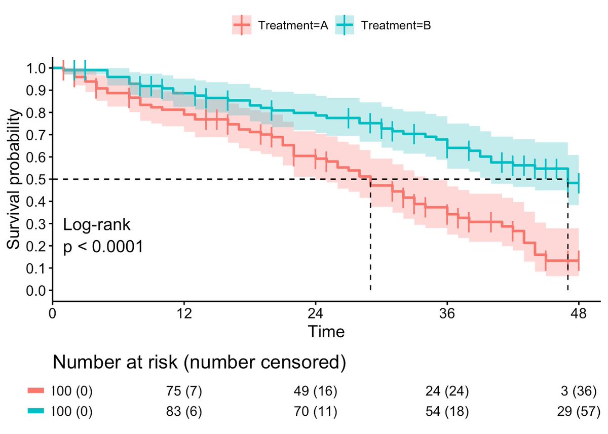
Here's a bunch of examples.
The numbers of subjects remaining are usually posted underneath.
Here's a bunch of examples.
The numbers of subjects remaining are usually posted underneath.
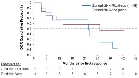
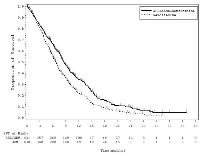
Here's a good one. @DrPatSoonShiong's "wonder drug" Abraxane.
Not only does it have a miniscule benefit in this chart but just check out the numbers remaining after 24 months.
Single figures. At 2 years.
Not only does it have a miniscule benefit in this chart but just check out the numbers remaining after 24 months.
Single figures. At 2 years.
Yet "low numbers" is exactly what Jeffrey Morris is complaining about for the follow-up in the Zervos study posted by @AaronSiriSG
But Jeffrey Morris is dead wrong here...
But Jeffrey Morris is dead wrong here...
https://x.com/jsm2334/status/1966282074278469786
How many people were included in the unvaccinated arm in this study at 2 years, or even 5 years?
Let's see.
We can estimate this in exactly the same way that Jeffrey Morris did.
In fact I totally agree with this chart.
Let's see.
We can estimate this in exactly the same way that Jeffrey Morris did.
In fact I totally agree with this chart.
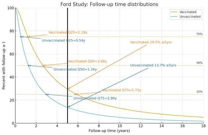
That chart is based on the median and IQR points published in the study, and to make the curves you have to fit an exponential model to represent the numbers dropping out of the study.
We get this..
Big numbers in the vaccinated but still over 200 unvaccinated at year 5
We get this..
Big numbers in the vaccinated but still over 200 unvaccinated at year 5
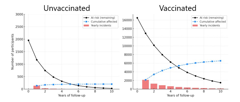
And this is what that looks like visually with estimated numbers of incidents per year:
You can even get ChatGPT to draw these graphs for you if you know what to ask for:
(note the different scales)
You can even get ChatGPT to draw these graphs for you if you know what to ask for:
(note the different scales)
What you can't do - if you let ChatGPT do all your thinking for you - is split your tweets to stay in length, which is presumably why Jeffrey Morris's thread started with an AI-like monologue.
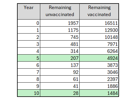
Here are the estimated figures reverse engineered from the Zervos study
@seckennedy
Here are the estimated figures reverse engineered from the Zervos study
@seckennedy
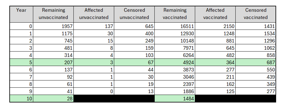
And the table gives you an idea of the numbers in each year that were lost to follow-up (censored) and how many were affected (got chronic disease).
There is no "sudden jump" at year 5+ when the kids went to school. That was a junk excuse.
Also note that the numbers underneath are the proportion unaffected instead of the more standard "subjected remaining at risk". But it's not a crime because we can estimate the figures from those provided.
There is no "sudden jump" at year 5+ when the kids went to school. That was a junk excuse.
Also note that the numbers underneath are the proportion unaffected instead of the more standard "subjected remaining at risk". But it's not a crime because we can estimate the figures from those provided.
And with our figures you can check against each year as a sanity check to see if they fit the findings of a significant difference between the groups
e.g. year 5 (OR=0.18, p<0.001) - they do.
The low p-value tells you there are enough numbers.
Which...
e.g. year 5 (OR=0.18, p<0.001) - they do.
The low p-value tells you there are enough numbers.
Which...
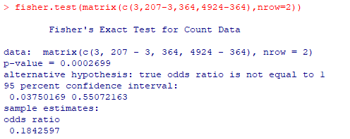
Is exactly what @AaronSiriSG claimed and Jeffrey Morris attempted to refute.
But dug himself a hole writing an article for the pharma-funded @ConversationUS that failed to mention the K-M plot once (destroying any claim to neutrality).
How convenient.
theconversation.com/why-a-study-cl…
But dug himself a hole writing an article for the pharma-funded @ConversationUS that failed to mention the K-M plot once (destroying any claim to neutrality).
How convenient.
theconversation.com/why-a-study-cl…
And just to top this off...
by highlighting the "small numbers in a survival analysis" problem Jeffrey Morris has literally shone a spotlight on the whole field of oncology drug trials.
Better get some bigger trials, pharma.
Jeff says your 6-patient studies are junk.
by highlighting the "small numbers in a survival analysis" problem Jeffrey Morris has literally shone a spotlight on the whole field of oncology drug trials.
Better get some bigger trials, pharma.
Jeff says your 6-patient studies are junk.
@MaryanneDemasi @stkirsch @DravenS17 @TonyNikolic10 @RetsefL @joshg99 @Kevin_McKernan @canceledmouse @franklin_reeder @naomirwolf @AGHuff @RefugeOfSinner5 @ClareCraigPath @craigkellyAFEE
@threader_app unroll please.
@threader_app unroll please.
@MaryanneDemasi @stkirsch @DravenS17 @TonyNikolic10 @RetsefL @joshg99 @Kevin_McKernan @canceledmouse @franklin_reeder @naomirwolf @AGHuff @RefugeOfSinner5 @ClareCraigPath @craigkellyAFEE @threader_app NB: The Conversation's funders in case you didn't know
archive.md/Tx9MC
archive.md/Tx9MC
@MaryanneDemasi @stkirsch @DravenS17 @TonyNikolic10 @RetsefL @joshg99 @Kevin_McKernan @canceledmouse @franklin_reeder @naomirwolf @AGHuff @RefugeOfSinner5 @ClareCraigPath @craigkellyAFEE @threader_app Addendum: For those who can't see the study link in the original posts
hsgac.senate.gov/wp-content/upl…
hsgac.senate.gov/wp-content/upl…
• • •
Missing some Tweet in this thread? You can try to
force a refresh