If you're selling online, your copy is doing the talking...
And depending on how you write it, it's either pulling people in… or pushing them away
So what does good email and SMS copy look like?
And how do you write it in a way that makes people trust your brand and hit purchase?
Here are 5 copywriting styles that actually work👇
And depending on how you write it, it's either pulling people in… or pushing them away
So what does good email and SMS copy look like?
And how do you write it in a way that makes people trust your brand and hit purchase?
Here are 5 copywriting styles that actually work👇
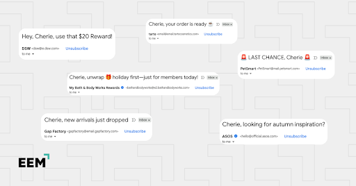
1. Create urgency and scarcity
People are inherently motivated by deadlines and limits.
It’s human psychology: when something feels scarce, we value it more.
When you weave urgency into your copy, it forces a decision. Shoppers can’t just think “I’ll buy later.” They either act now or risk missing out.
People are inherently motivated by deadlines and limits.
It’s human psychology: when something feels scarce, we value it more.
When you weave urgency into your copy, it forces a decision. Shoppers can’t just think “I’ll buy later.” They either act now or risk missing out.
👉 How to put this into action:
-Add countdown timers in promo emails: “Sale ends in 02:47:36.”
-Use SMS for same-day urgency: “24 hours left to grab 20% off your cart.”
-Send “almost gone” restock alerts: “Only a few left in your size. Act fast!”
-Remind before expiration: “Your reward points vanish in 48 hours. Don’t lose them!”
So how do you make sure your urgency doesn’t come across as spam?
Easy: just be honest.
Nothing kills trust faster than fake countdowns or false “sold out” claims. If your copy says a sale ends in 24 hours, make sure it really does.

2. Back it up with social proof
Buying online is risky for customers.
They can’t touch, smell, or try the product first. Social proof fills that gap by saying, “Don’t worry, others tried this and loved it.”
Buying online is risky for customers.
They can’t touch, smell, or try the product first. Social proof fills that gap by saying, “Don’t worry, others tried this and loved it.”
👉 How to put this into action:
-Include customer reviews as quotes in your emails.
-Use before/after images with customer stories.
-Highlight product ratings: “⭐️⭐️⭐️⭐️⭐️ Rated 4.9 by 2,300 happy customers.”
Why does it work? Because people trust people more than they trust brands. Reading about their experiences makes your product feel safer.
Pro tip: With AI-generated reviews everywhere, shoppers are harder to win over. So keep your testimonials specific, and with real names or photos.

3. Engage with storytelling and narrative copy
Unlike facts, stories paint a picture and connect emotionally with buyers. Customers don’t just see your product, they see themselves using it
That’s why stories are harder to forget than feature dumps
Unlike facts, stories paint a picture and connect emotionally with buyers. Customers don’t just see your product, they see themselves using it
That’s why stories are harder to forget than feature dumps
👉 How to put this into action:
-Share quick customer journeys: “Mark ran his first marathon in our shoes (after swearing he wasn’t a runner)”
-Build campaigns around product origin stories (great for welcome series)
-Use narrative-style subject lines: “From garage idea to bestseller: our journey"
-Send texts that continue a story over a sequence (Day 1: problem, Day 2: solution, Day 3: success)
Give your story a simple structure: beginning (the problem), middle (the journey), and end (the resolution)
And always tie it back to how your product made the difference.

4. Focus on problem-solving and benefits
At the end of the day, customers care less about your product than what it does for them
Let’s say you sell a desk chair. Listing the features alone sounds dry:
“Adjustable height, lumbar support, breathable mesh.”
At the end of the day, customers care less about your product than what it does for them
Let’s say you sell a desk chair. Listing the features alone sounds dry:
“Adjustable height, lumbar support, breathable mesh.”
👉 Now flip it into a problem-solution:
“Back pain from long workdays? Our chair supports your posture so you can work eight hours without the aches.”
See how that works?
Focusing on the benefits gives meaning to your product’s features. Plus, when people recognize themselves in the problem, they see your solution as the way out.
Pro tip: Use customer-centered language (“you” and “your”) so readers feel you’re speaking directly to them.

5. Write with personality
Nobody wants to be talked down to by a brand. Conversational copy makes customers feel like they’re chatting with a friendly human, not reading a corporate manual
Nobody wants to be talked down to by a brand. Conversational copy makes customers feel like they’re chatting with a friendly human, not reading a corporate manual
👉 How to put this into action:
-Instead of writing, “We offer free returns within 30 days,” you could say “Changed your mind? No stress. We’ll take it back, no questions asked”
-Add playful PS lines: “P.S. Yes, free returns really mean FREE”
-Keep SMS short and witty: “We can’t keep secrets…your 20% off ends tonight 😉”
Why does it work? Because personality builds loyalty
Customers don’t just buy products, they buy into brands they like. And people naturally like brands that sound approachable, funny, or caring.
Pro tip: Define your voice. Are you playful? Bold? Gentle? Stick to it everywhere so your emails, product pages, and ads all feel like they’re coming from the same personality.

Bonus: Test it, don’t guess it
Before you settle on a copy style, give it a test run. What sounds great in your head might land differently in someone’s inbox or text thread.
Start by picking one style that fits your campaign goal – maybe urgency for a flash sale or storytelling in a welcome email – and try it out on different segments.
Keep an eye on how it performs and tweak from there. A few things to track:
-Open rates (did your subject line style grab attention?)
-Click-throughs (did your copy spark interest?)
-Conversions (did it actually lead to sales?)
Let the data guide your decisions, and over time, your copy will just keep getting better.
Wrapping it up
Great copy doesn’t shout. It connects, reassures, and nudges in the right direction.
When you mix these five styles intentionally, your emails and texts stop feeling like marketing and start feeling like conversations.
Here’s a quick recap to keep in your back pocket:
✅ Create urgency that feels real (not spammy) to drive faster decisions
✅ Use social proof that’s specific, human, and impossible to fake
✅ Tell stories that help customers picture themselves using your product
✅ Highlight benefits, not just features, by solving real problems
✅ Inject personality so your brand sounds like someone they’d want to hear from
When your copy feels right, conversions tend to follow
If you enjoyed this breakdown, please like, share, comment, and retweet!
@ecomchasedimond and I send a daily newsletter focused retention marketing, specifically in email and sms marketing for ecommerce
Get more at: ecomemailmarketer.com
@ecomchasedimond and I send a daily newsletter focused retention marketing, specifically in email and sms marketing for ecommerce
Get more at: ecomemailmarketer.com
• • •
Missing some Tweet in this thread? You can try to
force a refresh