Boring_Business Profile picture
Dec 7 20 tweets 6 min read Read on X
Something not talked about enough is how the year 1971 broke the US economy forever

Here are 20 fascinating charts to show you what I mean

1. Productivity has skyrocketed while salaries have not moved at nearly the same pace. Image
2. Wealth inequality has significantly worsened.

Income gains across the economy is now mostly consolidated amongst the top 5% Image
3. Wages as a portion of the economy has steadily declined since then Image
4. Wealth has become overly concentrated to the top 1% Image
5. Progress has stalled massively for under-represented communities Image
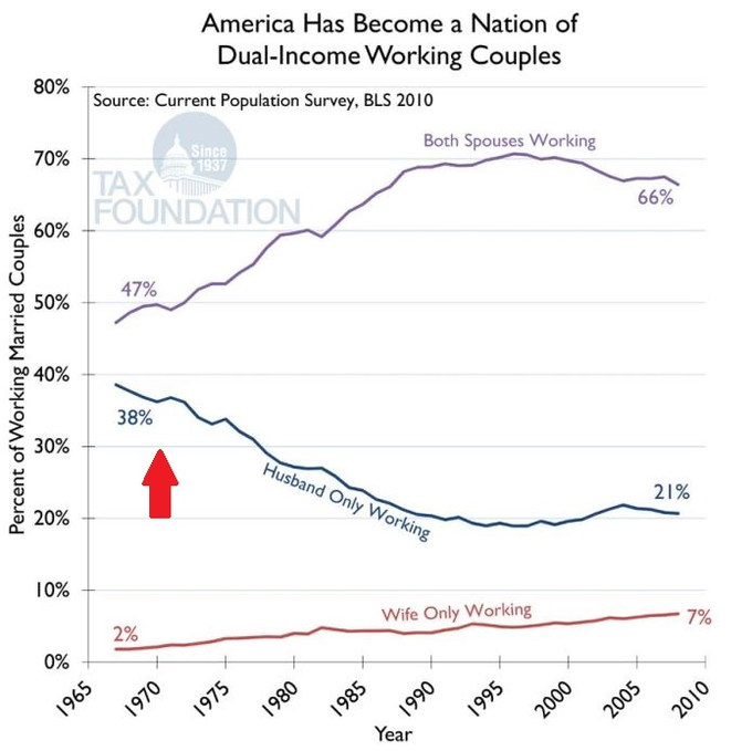
6. Dual income families have been on the rise Image
7. Inflation has skyrocketed, as displayed by the price of 1 can of Campbell's soup Image
8. Cumulative inflation has gone through the roof.

Not to mention, this chart doesn't even take into account all the money printing since 2020 Image
9. Home prices have gone up more than ever before, despite stagnant incomes Image
10. Millennials and Gen Z have had to put a pause on most of their life plans in order to afford a home Image
11. Adjusting prices for inflation only really became common after 1971 Image
12. More currencies have collapsed in modern age today than ever before in history Image
13. Every currency around the world has de-valued vs gold.

Faster than every before. Image
14. Government debt has gone through the roof.

Governments now borrow more than ever before to finance their country Image
15. The U.S. mostly stopped operating at a surplus after 1971 Image
16. P/E (price to equity) ratios have moved up Image
17. Hours of work required to buy the S&P has similarly moved up, making income inequality even worse Image
18. Family savings rate in the U.S. have collapsed ever since Image
19. Trade has become off-balance Image
20. The economy has become the deciding factor for our presidential elections Image

• • •

Missing some Tweet in this thread? You can try to force a refresh
 

Keep Current with Boring_Business

Boring_Business Profile picture

Stay in touch and get notified when new unrolls are available from this author!

Read all threads

This Thread may be Removed Anytime!

PDF

Twitter may remove this content at anytime! Save it as PDF for later use!

Try unrolling a thread yourself!

how to unroll video
  1. Follow @ThreadReaderApp to mention us!

  2. From a Twitter thread mention us with a keyword "unroll"
@threadreaderapp unroll

Practice here first or read more on our help page!

More from @BoringBiz_

Sep 15
Apollo just released a 57 page deck on the state of the U.S. economy

Some charts that caught my eye

🧵

1/ Trade policy uncertainty has been improving Image
2/ Overall economic policy uncertainty is improving Image
3/ Consumer confidence remains on the decline Image
Read 25 tweets
Sep 13
A collection of my private equity-focused primers and slides

🧵

1/ Leveraged Buyout Primer Image
2/ Leveraged Buyout Modeling: Sources & Uses Image
3/ Key Negotiating Terms in a Leveraged Buyout Image
Read 10 tweets
Aug 17
Apollo just released some fascinating charts on macroeconomic conditions and state of markets

A few that caught my eye

🧵

1/ Timeline of trade reset slowdown and impact on economic activity Image
2/ Shipping container departures from China to US Image
3/ Tariff rates for China and US Image
Read 20 tweets
Aug 1
Apollo just released some incredible data on how stablecoins are impacting demand for US treasuries and outlook for the sector

Few charts that caught my eye

🧵

1/ Stablecoin transaction volume has surpassed both Visa and Mastercard Image
2/ Stablecoin combined market cap now sits at ~$250B Image
3/ USDC and USDT make up ~85% of the market cap Image
Read 13 tweets
Jul 12
Apollo just released a 28 page deck on the outlook for the US dollar

Some charts that caught my eye

🧵

1/ Hedging costs have increased for foreign investors Image
2/ Hedged yields are negative for foreigners Image
3/ Dollar and yields first began divulging because of the trade war Image
Read 13 tweets
Jul 11
Apollo just released a 42 page deck on the state of student loans

Some fascinating charts

🧵

1/ Total number of people with federally managed student loans have now hit 45 million Image
2/ Student loan delinquencies have jumped over 1000bps since February Image
3/ Delinquencies are up across every single age group compared to 2020 Image
Read 21 tweets

Did Thread Reader help you today?

Support us! We are indie developers!


This site is made by just two indie developers on a laptop doing marketing, support and development! Read more about the story.

Become a Premium Member ($3/month or $30/year) and get exclusive features!

Become Premium

Don't want to be a Premium member but still want to support us?

Make a small donation by buying us coffee ($5) or help with server cost ($10)

Donate via Paypal

Or Donate anonymously using crypto!

Ethereum

0xfe58350B80634f60Fa6Dc149a72b4DFbc17D341E copy

Bitcoin

3ATGMxNzCUFzxpMCHL5sWSt4DVtS8UqXpi copy

Thank you for your support!

Follow Us!

:(