Jeff Gilchrist Profile picture
Apr 28 10 tweets 3 min read Read on X
*** Ontario Variant Update | Apr 28 ***

There was some competition for variant dominance during the month of March but the NB.1.8.1.* "Nimbus" family currently holds first place with 49.5% while the XFG.* "Stratus" family sits at 38.1% of sequenced genomes from COVID tests. 🧵1/ This multi-line chart tracks the lineage frequency of various COVID-19 variant families in Ontario over time, based on sequenced genome samples. The graph illustrates the changing prevalence of specific variant families, showing how different lineages compete and evolve as the dominant strains within the province.
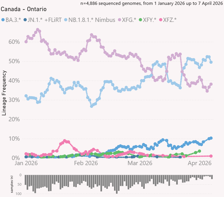
The BA.3.2 "Cicada" family has been slowing climbing and now above 10%. 2/
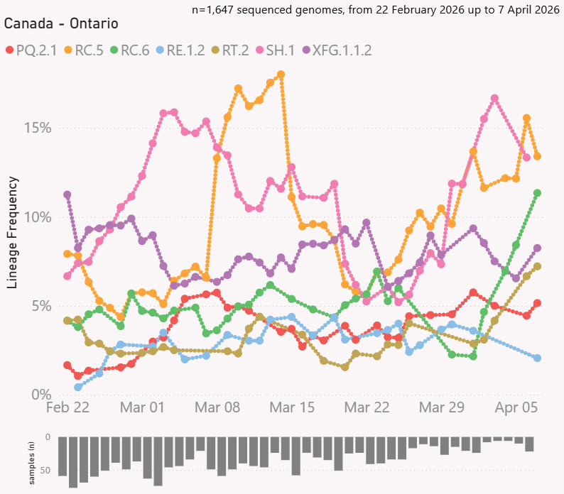
Looking at specific variants, RC.5 Nimbus currently holds first place at 13.4%, SH.1 Nimbus is a close second at 13.3%, RC.6 Nimbus is making a comeback at 11.3%, XFG.1.1.2 Stratus is at 8.2%, RT.2 Cicada at 7.2%, PQ.2.1 Nimbus at 5.2%, and RE.1.2 Cicada at 2.1%. 3/ This multi-line chart tracks the lineage frequency of emerging COVID-19 subvariants in Ontario over time, based on genomic sequencing data. The graph visualizes the shifting percentage of total cases represented by each specific lineage, highlighting the growth and competition of various viral strains.
As time goes, keeping track of the virus evolution is getting more complex. You can learn more about how variant naming works and mutations from this document ( ). 4/docs.google.com/document/d/1q0…
The SanKey diagram shows you variant lineages and you can follow back where that variant came from. 5/ This Sankey diagram illustrates the evolutionary lineage and flow of COVID-19 variants in Ontario over time, based on sequenced genome data. The visualization maps the progression and branching of specific subvariants, showing how different viral strains emerge from parent lineages to populate the current genomic landscape.
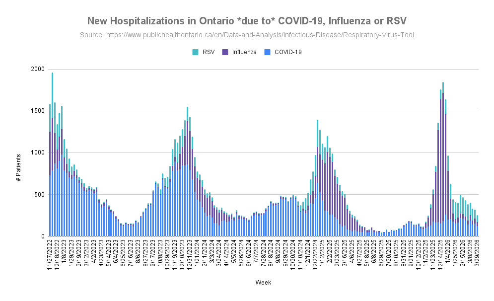
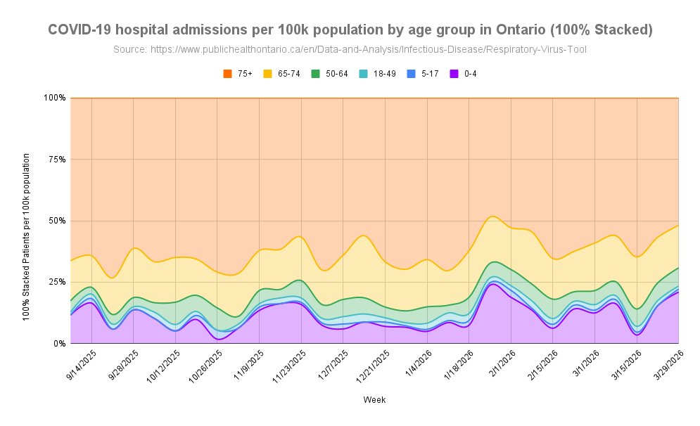
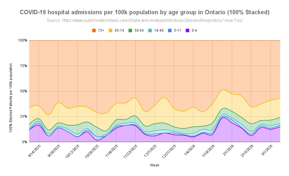
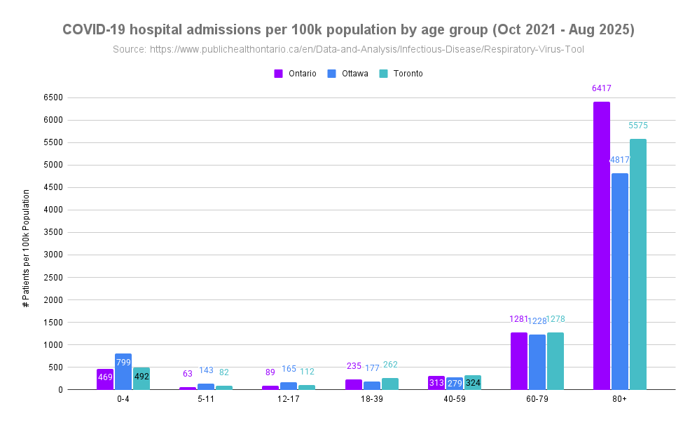
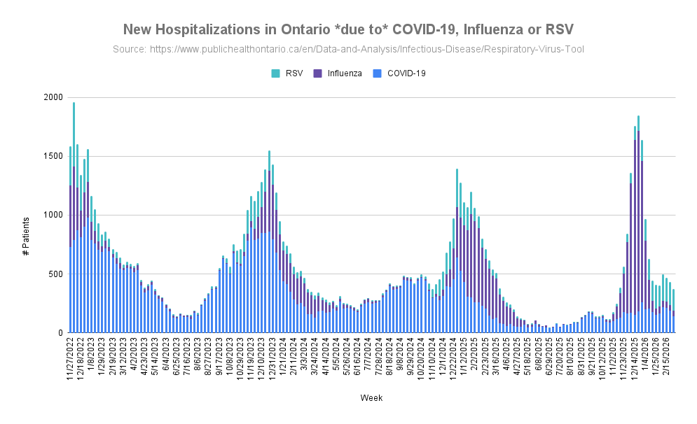
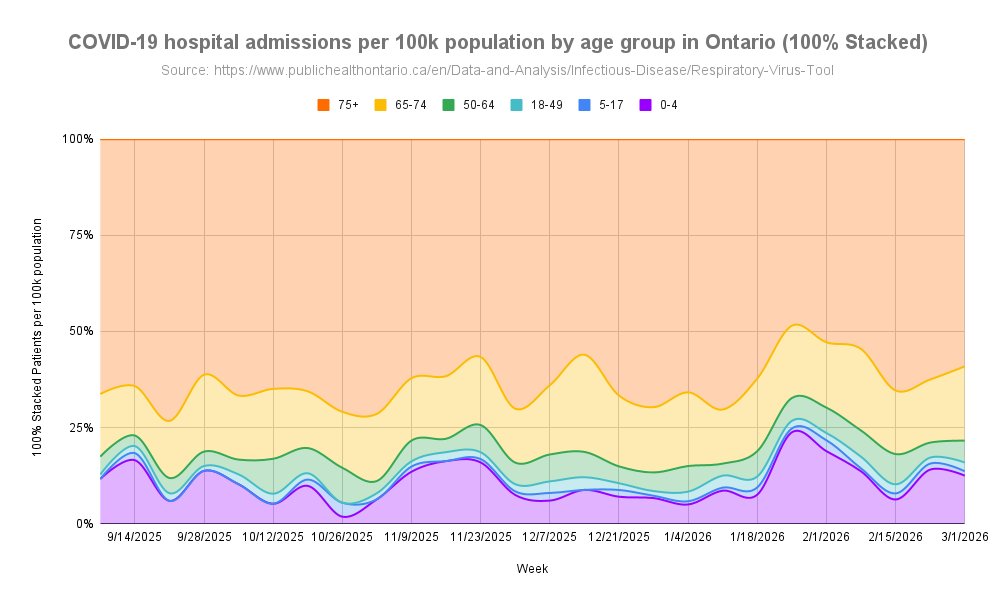
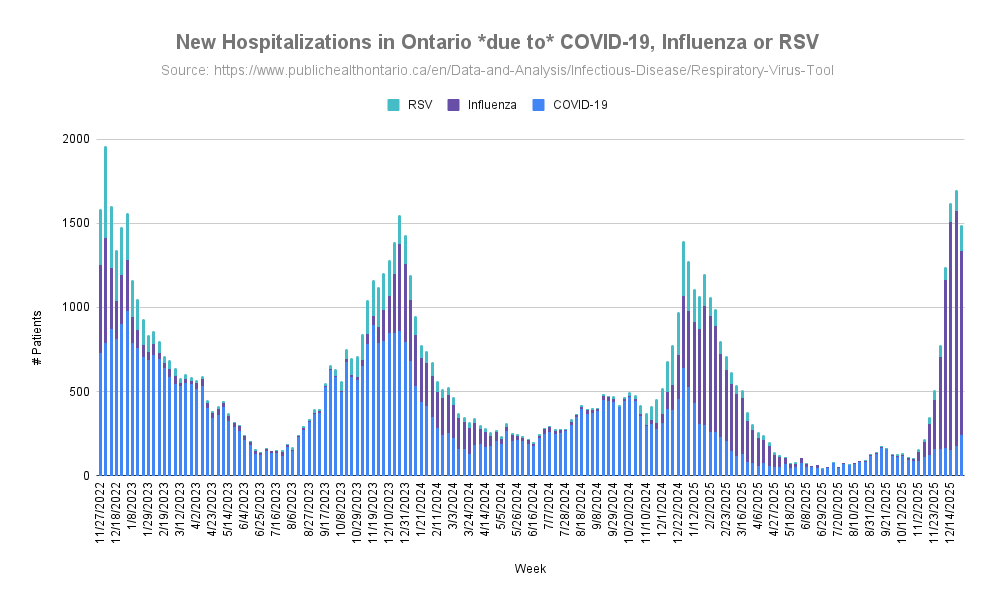
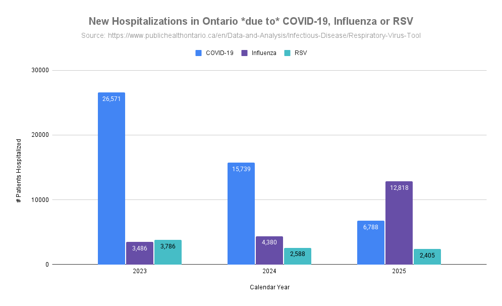
You can find weekly Ontario stats including variants at ( ). 6/covid.gilchrist.ca/Ontario.html
The visualization tool for variants was created by ( @Mike_Honey_ ) and the source of this data can be found at ( ). 7/app.powerbi.com/view?r=eyJrIjo…
To learn how to create a Sankey diagram of variants circulating in your area, please read this guide ( ). 8/
To learn how to see what variants are circulating in your area, please read this guide ( ). 9/
@threadreaderapp please unroll

• • •

Missing some Tweet in this thread? You can try to force a refresh
 

Keep Current with Jeff Gilchrist

Jeff Gilchrist Profile picture

Stay in touch and get notified when new unrolls are available from this author!

Read all threads

This Thread may be Removed Anytime!

PDF

Twitter may remove this content at anytime! Save it as PDF for later use!

Try unrolling a thread yourself!

how to unroll video
  1. Follow @ThreadReaderApp to mention us!

  2. From a Twitter thread mention us with a keyword "unroll"
@threadreaderapp unroll

Practice here first or read more on our help page!

More from @jeffgilchrist

Apr 13
*** Ontario Virus & Variant Update | Apr 13 ***

Hospitalizations due to COVID have gone down from 153 to 123 in the last update. Influenza hospitalizations decreased from 59 to 47 and RSV decreased from 110 to 85. 🧵1/

#Ontario #Virus #Variant #COVID #RSV #Influenza #Hospital Graph of New hospitalizations in Ontario due to COVID, Influenza or RSV.
Looking at age groups, those age 75+ had the highest rates of hospitalization due to COVID but decreased since last update. Second place is age 0-4 and their levels are currently increasing while age 65-74 has the third highest rate and also decreased since last update. 2/ Graph of New hospitalization rate in Ontario due to COVID by age group (100% Stacked).
The youngest age group 0-4 currently have a hospitalization rate due to COVID that are 17x higher than age 5-17, 17x higher than age 18-49, and 2.8x higher than adults 50-64. 3/
Read 25 tweets
Mar 22
*** Ontario COVID Hospitalization Rates by Age ***

Data is now available for hospital admissions due to COVID by age group going back to Oct 2021. This provides interesting insights into how much children have been impacted with serious infections compared to adults. 🧵1/ Graph of New hospitalization rate in Ontario due to COVID by age group (100% Stacked).
Chart of COVID hospital admissions per 100k population by age group from Oct. 2021 to Aug. 2025 in Ontario, Ottawa, and Toronto.
We have heard from many sources throughout the pandemic that COVID isn't serious in children or they are not impacted as much as adults with some people still claiming this today. 2/
What about today, with lower circulation happening more recently and not the huge waves seen in the past, is anyone even being hospitalized for COVID anymore? The most recent update (week of March 8, 2026) there were 188 people hospitalized in Ontario due to COVID. 3/
Read 20 tweets
Mar 14
*** Ontario Virus & Variant Update | Mar 14 ***

Hospitalizations due to COVID have gone down from 190 to 138 in the last update. Influenza hospitalizations remained stable around 49 and RSV decreased slightly from 194 to 184. 🧵1/

#Ontario #Virus #Variant #COVID #RSV #Influenza Graph of New hospitalizations in Ontario due to COVID, Influenza or RSV.
Looking at age groups, those age 75+ had the highest rates of hospitalization due to COVID but decreased since last update. Second place is age 65-74 and their levels are currently decreasing while age 0-4 has the third highest rate and also decreased since last update. 2/ Graph of New hospitalization rate in Ontario due to COVID by age group (100% Stacked).
The youngest age group 0-4 currently have a hospitalization rate due to COVID that are 11x higher than age 5-17, 5.5x higher than age 18-49, and 2x higher than adults 50-64. 3/
Read 16 tweets
Jan 11
*** Ontario Virus & Variant Update | Jan 11 ***

Hospitalizations due to COVID increased from 176 to 241 in the last update. Influenza hospitalizations have start dropping from the peak of 1,400 to 1,095 with RSV increasing from 121 to 156. 🧵1/ Graph of New hospitalizations in Ontario due to COVID, Influenza or RSV.
Looking back over the past few years, new hospitalizations for RSV have remained pretty stable the last two years around 2,500 and a decrease from 2023, while COVID has been significantly dropping each year, 26,571 in 2023 to 15,739 in 2024 to 6,788 in 2025. 2/ Graph of New hospitalizations in Ontario due to COVID, Influenza or RSV, grouped by calendar year.
Influenza has been doing the opposite, increasing significantly each year from 3,486, to 4,380 in 2024, to 12,818 in 2025. 3/
Read 13 tweets
Oct 25, 2025
How does various mask fit compare to filter the air and protect you or others?

Most masks, even baggy blue procedure masks use filtering material that can filter 95%+ of particles that pass through it, but the key is "pass through it". 🧵1/ Bar chart titled “Equivalent Exposure Time to Unmasked Person.” The chart compares how long different masks/respirators extend the equivalent exposure time relative to being unmasked. The x-axis shows unmasked infection times of 1, 5, and 10 minutes. The y-axis shows equivalent masked exposure time, ranging up to 5000 minutes. Seven mask types are represented by colored bars: - Procedure mask (loose fit, FF=2) - Ear loop mask (tight fit, FF=6) - Vertical bifold headband mask (FF=30) - N95 headband masks with fit factors of 100, 200, and 500 Key pattern: higher fit factor masks dramatically ...
Protection mostly depends on how well that mask fits your specific face and one that does not fit well, much of the air you breathe will go around the filter material and filter 0% of those particles. 2/
There has been a chart going around recently that talks about "Time it takes to transmit an infectious dose of COVID-19" which is misleading if you don't understand all of the details of how that table was made and what each component means. 3/
Read 25 tweets
Oct 19, 2025
** Ontario Variant Update (to Oct. 3, 2025) **

The XFG.* "Stratus" family is accounting for 83% while the next closest variant family NB.1.8.1.* "Nimbus" is 12.8% of sequenced genomes from COVID tests. 🧵1/ Line graph showing COVID-19 variant family frequencies in Ontario, Canada, from June to October 2025, based on 3,722 sequenced genomes.
Looking at specific variants, XFG.3 has dropped considerably and its descendent XFG.3.15 now takes first place at 6.2%, followed by XFG.3 at 5.2% and XFG.2 at 4.5%. 2/ Line graph showing specific COVID-19 variant frequencies in Ontario, Canada, from June to October 2025, based on 3,722 sequenced genomes.
It looks like PY.1.1.1 was trying to make a run for the top in mid-September but has decreased significantly. PY.1.1.1 is a descendant of LF.7 while the XFG variant is a recombination of LF.7 and LP.8.1.2 so they would share some mutations in common. 3/
Read 10 tweets

Did Thread Reader help you today?

Support us! We are indie developers!


This site is made by just two indie developers on a laptop doing marketing, support and development! Read more about the story.

Become a Premium Member ($3/month or $30/year) and get exclusive features!

Become Premium

Don't want to be a Premium member but still want to support us?

Make a small donation by buying us coffee ($5) or help with server cost ($10)

Donate via Paypal

Or Donate anonymously using crypto!

Ethereum

0xfe58350B80634f60Fa6Dc149a72b4DFbc17D341E copy

Bitcoin

3ATGMxNzCUFzxpMCHL5sWSt4DVtS8UqXpi copy

Thank you for your support!

Follow Us!

:(