Jeff Gilchrist Profile picture
May 30 26 tweets 5 min read Read on X
Filtering the air may help prevent your own infection from becoming more severe

If everyone in a household becomes infected with the same virus, does it help to isolate from each other and can you be a danger to yourself? Read on to find out...🧵1/

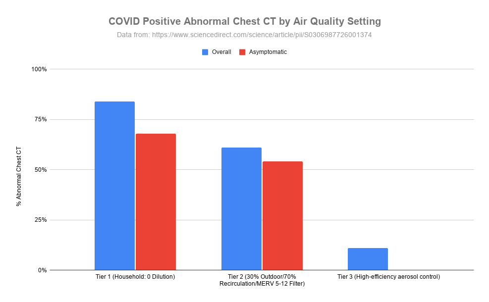
#AirQuality #IAQ #Ventilation This grouped bar chart, titled "COVID Positive Abnormal Chest CT by Air Quality Setting", displays the percentage of abnormal chest CT scans among COVID-positive patients across three different tiers of air quality control. The graph compares overall and asymptomatic cases, illustrating a clear downward trend in the percentage of abnormal scans as air filtration and ventilation efficiency improve from household levels to high-efficiency aerosol control.
An interesting hypothesis-generating study was published recently that asked if an infected person's condition can become even worse by re-inhaling their own virus particles ( ). 2/sciencedirect.com/science/articl…
Is a transition from a milder upper respiratory tract infection (runny nose, sore throat) to a more severe lower respiratory tract infection like pneumonia is significantly driven by the physical mechanism of inhaling virus containing aerosols deep into the lungs? 3/
While a person may first become infected by breathing in virus aerosols generated by another infected person, the newly the infected individual exhales high concentrations of aerosols during peak viral shedding. 4/
If they are located in a poorly ventilated space, the aerosols accumulate and the person re-inhales their own virus, driving them deep into their own uninfected lung tissues. 5/
Instead of seeing tissue become infected in a cellular "crawling" pattern from a point where the infection spreads, COVID chest CT scans show rapid scattered patches of lung damage across distant isolated areas. 6/
Inhaled aerosols would act more like the wind scattering dandelion seeds across a large area simultaneously and better explain these CT scan results. 7/
The researchers looked at chest CT scans from people that tested positive for COVID in three different tiers of ventilation quality. 8/
The first (Tier 1) were households and community areas with stagnant air, zero dilution and high accumulation. They found that 84% of the infected people who had chest CT scans overall and 68% of asymptomatic infections had abnormal CT scan results. 9/
In Tier 2 which had 30% fresh air, 70% re-circulated air and typical building filtration (MERV 5-12) the chest CT abnormality rate dropped to 61% overall and 54% for asymptomatic infections. 10/ This grouped bar chart, titled "COVID Positive Abnormal Chest CT by Air Quality Setting", displays the percentage of abnormal chest CT scans among COVID-positive patients across three different tiers of air quality control. The graph compares overall and asymptomatic cases, illustrating a clear downward trend in the percentage of abnormal scans as air filtration and ventilation efficiency improve from household levels to high-efficiency aerosol control.
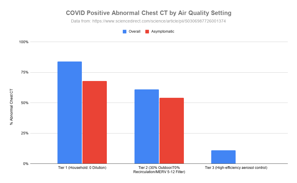
Finally, in Tier 3 where people were placed in individual negative-pressure rooms with rapid continuous air evacuation, only 11% of infected participants had chest CT abnormalities and those that did were tiny and very short lived. 11/
All participants in this high air quality group had very high viral loads in their throats and noses, but did not progress into lung damage. 12/
It is important to note that this study does not prove the hypothesis of an aerosol bridge linking upper respiratory infection to lung damage. Multiple convergent evidence is pointing more and more that this hypothesis is possible. 13/
In addition to human evidence, another study has shown with controlled COVID exposure in primates that inoculation via the intranasal route resulted in limited involvement in the lower respiratory tract... 14/
...whereas exposure to aerosols resulted in infection throughout the respiratory tract ( ). 15/academic.oup.com/jid/article/23…
If their hypothesis is true, improving air filtration and air quality not only protects others from catching your sickness but also helps protect you from your own sickness. 16/
Even without high end negative-pressure isolation rooms, it is possible to put an air filter close to our heads when sick to try and filter as much of what we are releasing in our own aerosols as possible to reduce the amount we are re-inhaling and others might be inhaling. 17/
Cleaning the air and improving ventilation could physically prevent mild cases from degrading into more severe illness including pneumonia. 18/
Since cleaning the air is a physical mechanism, it would be applicable to all pathogens that catch rides in aerosols including viruses and bacteria and not be impacted by pathogens mutating over time. 19/
The nice thing about this hypothesis is that even if we don't know definitively if true, cleaning the air has many benefits so worthwhile implementing whether this specific hypothesis is true or not. 20/
You can find out more about the importance of indoor air quality here ( pingthread.com/thread/1607379… ) more specifically about wildfire smoke and cooking here ( docs.google.com/document/d/1x0… ). 21/
A new webinar by Dr. Louise Hidinger, founder of Clean Indoor Air Toronto: Healthy Air at Home: What You Can Monitor, Filter, and Fix ( ) 22/
OSPE (Ontario Society of Professional Engineers) has a number of different indoor air quality reports here ( ). 23/ospe.on.ca/advocacy/gover…
UCDavid College of Engineering has a whole bunch of Indoor Air Quality videos here ( ). 24/iaq.ucdavis.edu/video-lessons/
Joey Fox has put together a collection of Indoor Air Quality educational pieces here ( ). 25/itsairborne.com/indoor-air-qua…
@threadreaderapp please unroll

• • •

Missing some Tweet in this thread? You can try to force a refresh

 

Keep Current with Jeff Gilchrist

Jeff Gilchrist Profile picture

Stay in touch and get notified when new unrolls are available from this author!

Read all threads

This Thread may be Removed Anytime!

PDF

Twitter may remove this content at anytime! Save it as PDF for later use!

Try unrolling a thread yourself!

how to unroll video
  1. Follow @ThreadReaderApp to mention us!

  2. From a Twitter thread mention us with a keyword "unroll"
@threadreaderapp unroll

Practice here first or read more on our help page!

More from @jeffgilchrist

May 24
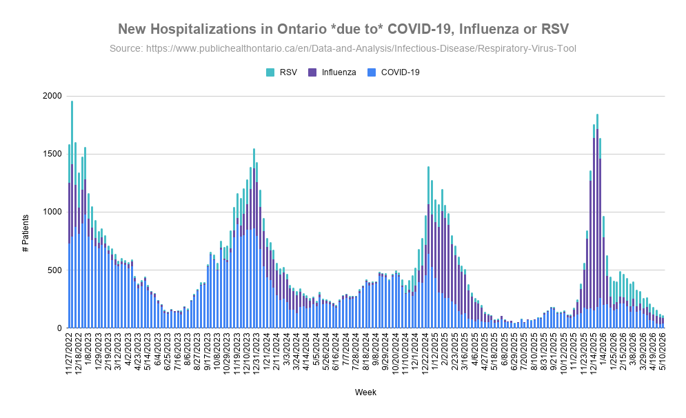
*** Ontario Virus Update | May 24 ***

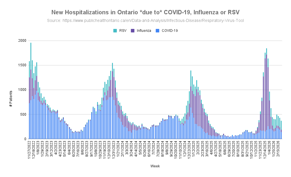
Hospitalizations due to COVID have increased from 34 to 38 in the last update. Influenza hospitalizations decreased from 57 to 51 and RSV decreased from 33 to 20. 🧵1/

#Ontario #Virus #COVID #RSV #Influenza #Hospital This stacked bar chart displays weekly new hospitalizations in Ontario specifically attributed to COVID-19, Influenza, and RSV. The data tracks the fluctuating volume of patients over time, highlighting seasonal surges and the relative contribution of each respiratory virus to the overall healthcare burden.
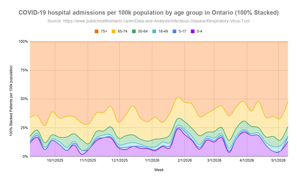
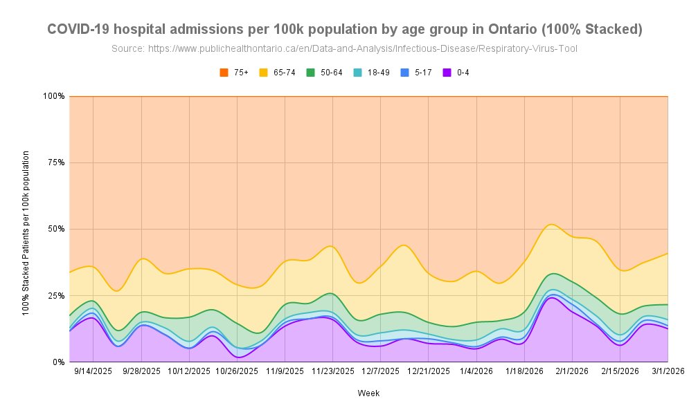
Looking at age groups, those age 75+ had the highest rates of hospitalization due to COVID but decreased since last update. Second place is age 65-74 which increased, and third place is age 0-4 which also increased. 2/ This 100% stacked area chart illustrates the weekly proportion of COVID-19 hospital admissions per 100,000 population in Ontario across different age groups. The graph visualizes how the relative distribution of hospitalizations shifts over time among demographics ranging from infants to seniors aged 75 and older.
COVID case rates were fairly stable across age groups this past update except for age 80+ which had a significant decrease but still maintain the highest rates. The 0-4 and 60-79 age groups currently have similar rates. 3/ This multi-line graph tracks the weekly rate of COVID-19 cases per 100,000 population in Ontario, categorized by various age groups from infants to seniors aged 80 and older. The data trends highlight the fluctuations in infection rates across different demographics over the year.
Read 10 tweets
May 10
*** Ontario Variant Update | May 10 ***

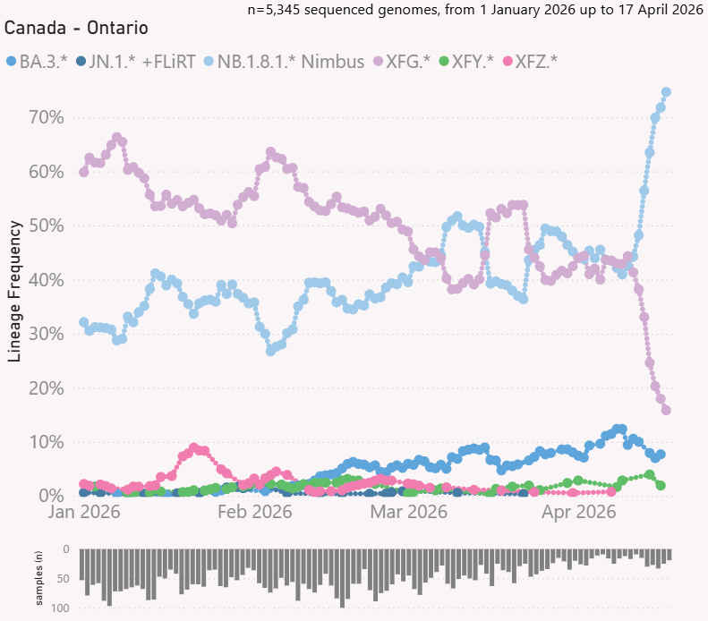
In Ontario, the NB.1.8.1.* "Nimbus" variant family shot to 74.7% of sequenced genomes from COVID tests while the XFG.* "Stratus" family dropped to 15.8% and the BA.3.2 "Cicada" family decreased below 10% again.🧵1/
#Ontario #COVID #Variant This multi-line chart tracks the lineage frequency of various COVID-19 variant families in Ontario over time, based on sequenced genome samples. The graph illustrates the changing prevalence of specific variant families, showing how different lineages compete and evolve as the dominant strains within the province.
Ontario released another month of sequencing data by age and we continue to see high ratios of Cicada in children with another 51 BA.3.2.2.* sequences out of 617 new sequences ( ). 2/publichealthontario.ca/-/media/docume…
With 126 Cicada sequences from 1,828 total, we see children still have the highest proportion which decreases after age 5-11 as age increases with significant drops from age 60+. 3/ This bar chart illustrates the percentage of the BA.3.2.* Cicada COVID-19 variant lineage among different age groups in Ontario over a designated time period. The graph visualizes the relative prevalence of the lineage across demographics, highlighting how the variant is distributed from young children to seniors aged 80 and older.
Read 11 tweets
Apr 28
*** Ontario Variant Update | Apr 28 ***

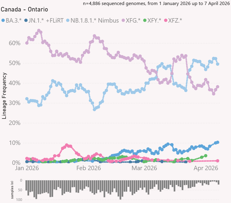
There was some competition for variant dominance during the month of March but the NB.1.8.1.* "Nimbus" family currently holds first place with 49.5% while the XFG.* "Stratus" family sits at 38.1% of sequenced genomes from COVID tests. 🧵1/ This multi-line chart tracks the lineage frequency of various COVID-19 variant families in Ontario over time, based on sequenced genome samples. The graph illustrates the changing prevalence of specific variant families, showing how different lineages compete and evolve as the dominant strains within the province.
The BA.3.2 "Cicada" family has been slowing climbing and now above 10%. 2/
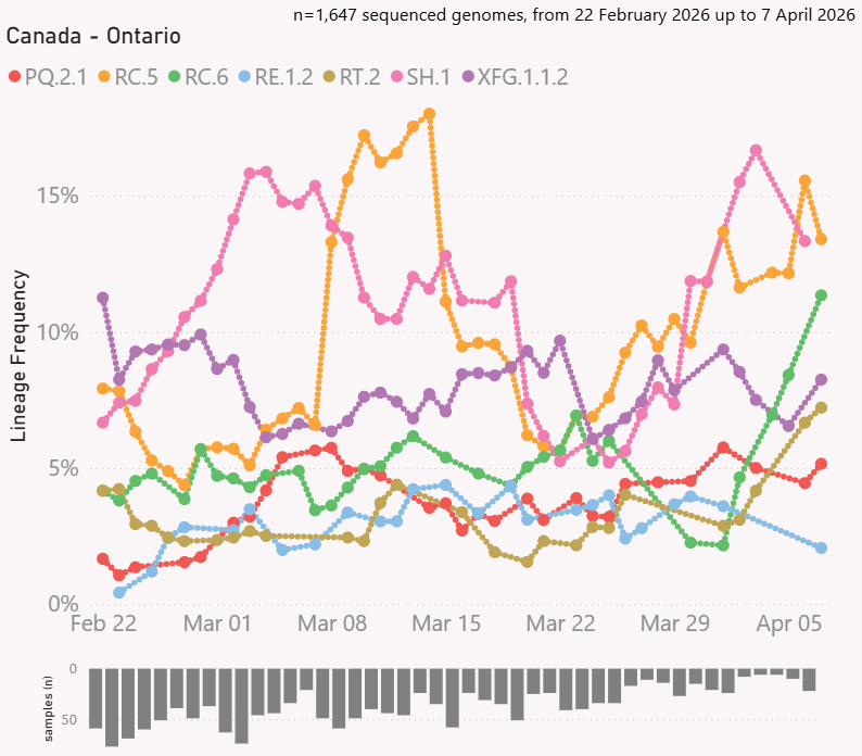
Looking at specific variants, RC.5 Nimbus currently holds first place at 13.4%, SH.1 Nimbus is a close second at 13.3%, RC.6 Nimbus is making a comeback at 11.3%, XFG.1.1.2 Stratus is at 8.2%, RT.2 Cicada at 7.2%, PQ.2.1 Nimbus at 5.2%, and RE.1.2 Cicada at 2.1%. 3/ This multi-line chart tracks the lineage frequency of emerging COVID-19 subvariants in Ontario over time, based on genomic sequencing data. The graph visualizes the shifting percentage of total cases represented by each specific lineage, highlighting the growth and competition of various viral strains.
Read 10 tweets
Apr 13
*** Ontario Virus & Variant Update | Apr 13 ***

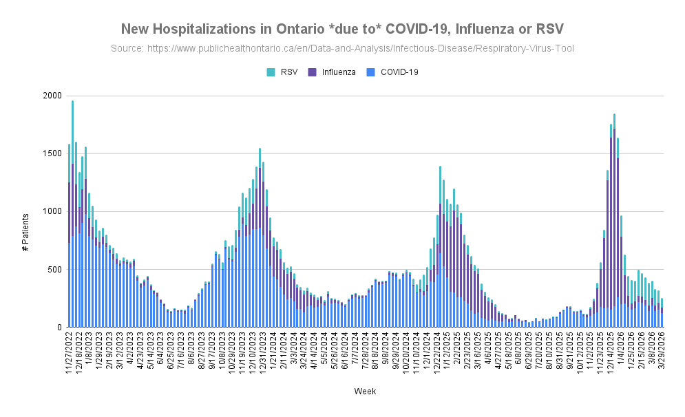
Hospitalizations due to COVID have gone down from 153 to 123 in the last update. Influenza hospitalizations decreased from 59 to 47 and RSV decreased from 110 to 85. 🧵1/

#Ontario #Virus #Variant #COVID #RSV #Influenza #Hospital Graph of New hospitalizations in Ontario due to COVID, Influenza or RSV.
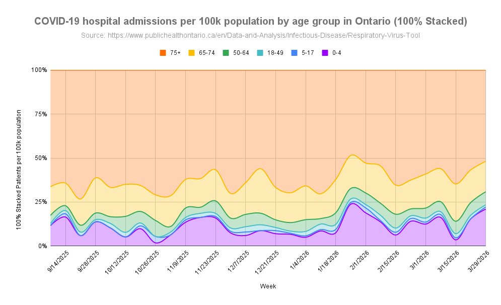
Looking at age groups, those age 75+ had the highest rates of hospitalization due to COVID but decreased since last update. Second place is age 0-4 and their levels are currently increasing while age 65-74 has the third highest rate and also decreased since last update. 2/ Graph of New hospitalization rate in Ontario due to COVID by age group (100% Stacked).
The youngest age group 0-4 currently have a hospitalization rate due to COVID that are 17x higher than age 5-17, 17x higher than age 18-49, and 2.8x higher than adults 50-64. 3/
Read 25 tweets
Mar 22
*** Ontario COVID Hospitalization Rates by Age ***

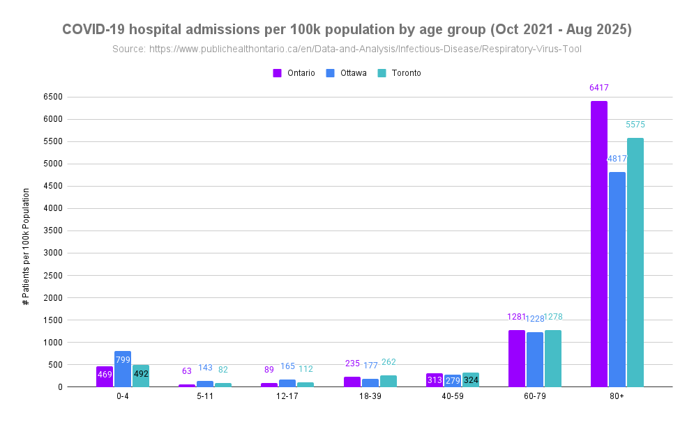
Data is now available for hospital admissions due to COVID by age group going back to Oct 2021. This provides interesting insights into how much children have been impacted with serious infections compared to adults. 🧵1/ Graph of New hospitalization rate in Ontario due to COVID by age group (100% Stacked).
Chart of COVID hospital admissions per 100k population by age group from Oct. 2021 to Aug. 2025 in Ontario, Ottawa, and Toronto.
We have heard from many sources throughout the pandemic that COVID isn't serious in children or they are not impacted as much as adults with some people still claiming this today. 2/
What about today, with lower circulation happening more recently and not the huge waves seen in the past, is anyone even being hospitalized for COVID anymore? The most recent update (week of March 8, 2026) there were 188 people hospitalized in Ontario due to COVID. 3/
Read 20 tweets
Mar 14
*** Ontario Virus & Variant Update | Mar 14 ***

Hospitalizations due to COVID have gone down from 190 to 138 in the last update. Influenza hospitalizations remained stable around 49 and RSV decreased slightly from 194 to 184. 🧵1/

#Ontario #Virus #Variant #COVID #RSV #Influenza Graph of New hospitalizations in Ontario due to COVID, Influenza or RSV.
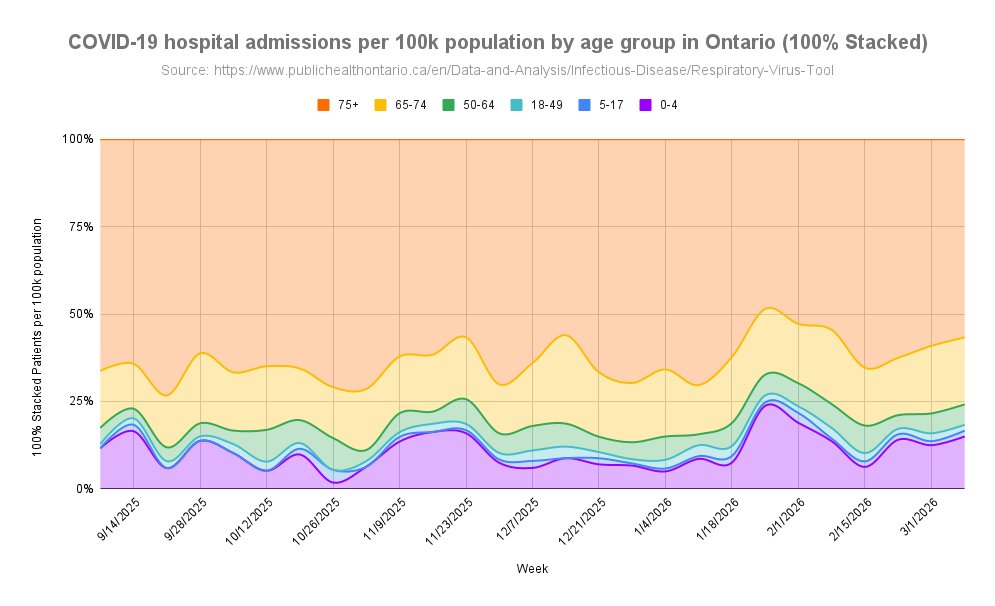
Looking at age groups, those age 75+ had the highest rates of hospitalization due to COVID but decreased since last update. Second place is age 65-74 and their levels are currently decreasing while age 0-4 has the third highest rate and also decreased since last update. 2/ Graph of New hospitalization rate in Ontario due to COVID by age group (100% Stacked).
The youngest age group 0-4 currently have a hospitalization rate due to COVID that are 11x higher than age 5-17, 5.5x higher than age 18-49, and 2x higher than adults 50-64. 3/
Read 16 tweets

Did Thread Reader help you today?

Support us! We are indie developers!


This site is made by just two indie developers on a laptop doing marketing, support and development! Read more about the story.

Become a Premium Member ($3/month or $30/year) and get exclusive features!

Become Premium

Don't want to be a Premium member but still want to support us?

Make a small donation by buying us coffee ($5) or help with server cost ($10)

Donate via Paypal

Or Donate anonymously using crypto!

Ethereum

0xfe58350B80634f60Fa6Dc149a72b4DFbc17D341E copy

Bitcoin

3ATGMxNzCUFzxpMCHL5sWSt4DVtS8UqXpi copy

Thank you for your support!

Follow Us!

:(