Thread Reader
Share this page!
×
Post
Share
Email
Enter URL or ID to Unroll
×
Unroll Thread
You can paste full URL like: https://x.com/threadreaderapp/status/1644127596119195649
or just the ID like: 1644127596119195649
How to get URL link on X (Twitter) App
On the Twitter thread, click on
or
icon on the bottom
Click again on
or
Share Via icon
Click on
Copy Link to Tweet
Paste it above and click "Unroll Thread"!
More info at
Twitter Help
A. Michael
@BIAnalystMike
Associate member @abetalk | Building @Taswithdata_ | BI and Analytics | Tweets on #dailydoseofdata.
Subscribe
Save as PDF
Aug 5, 2022
•
13 tweets
•
5 min read
If you do it right, Excel can be the most powerful tool for data visualization.
Here are 10 tips for creating aesthetically pleasing excel dashboard.
+bonus
Get datasets directly within excel.
A thread 🧵
1)
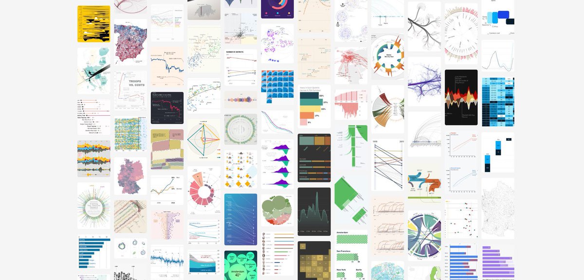
Get Inspired!!!
You have the potential to be creative, all you need is inspiration.
Use these resources to find chart types, color schemes and inspiration for your next data analysis project:
a)
dataviz-inspiration.com
b)
public.tableau.com/app/discover
c)
vizgallery.tableaupublic.com