Baizuo Greengrove Profile picture
Extended relentlessly brutal analysis at https://t.co/Kqde1RwOL4
Dec 14, 2020 6 tweets 4 min read
@MLevitt_NP2013 1/ It's also true that the base death rate for <65 in the US that this springs from is higher than in Europe by a large margin

US has a huge relative obesity rate (impt co-morbidity source; only behind Paci island countries!) and high minority pop % leading to low vitamin D also 
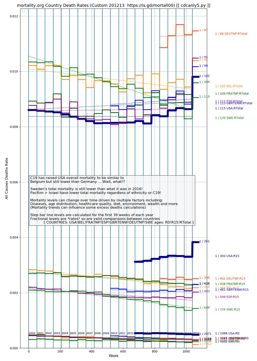
@MLevitt_NP2013 2/ If you look at the R15(-64) group a quarter of the way up you see the large 2020 increase in US

But note of the Euro's that Spain and UK have the largest bumps with the highest minority/ vit D- pop %'s also. And had been trending up

US also runs higher in <15 pop
Nov 28, 2020 11 tweets 8 min read
@AlexBerenson 1/ The 50+1 is a good point bcz 1957 and 68 pandemics had no lockdown deaths ... bcz there was no lockdown! We weren't insane back then.

But with disputed (57) or no/late (68) vaccine we DID have 400K and 280K respective pop+age adjusted deaths!

Memory-holed comparables. @AlexBerenson 2/ My latest simple lesson on pop and age adjustment are here.


But even though the JHU slides are wrong re excess, they accidentally illuminate the issue from another angle.

It turns out of course that even a 13% increase in deaths does not stand out...
Nov 27, 2020 5 tweets 5 min read
@geenlid @interpolated 1/ @geenlid is correct of course but there are two steps to this as pointed out by my tweet re 1957 and 68.

@geenlid 's chart has covered both steps but sometimes you may not have age proportion data so you need to at least do population adjustment.

@geenlid @interpolated 2/ The first step is population adjustment. This becomes clear when you look at US historical mortality records and find some years they report death counts and some years death rates!

The second step is age adjustment which can be more challenging the farther back you look...
Oct 2, 2020 7 tweets 4 min read
1/ A new "have we added another flu?" C19 endemicity "kitchen sink edition" deaths chart to chew on for the weekend.

Use your big monitor, read the green text and then zoom around and check out the patterns and nuggets.

Opening question:
Q: Why are FL and TN opening?
A: This 2/ Note that everything on the chart has been population adjusted onto the US scale so the compares with the US 2018 ILI "yellow zone" are valid.

Data decent at least to vertical blue line.

And just to make sure it's out there, here's my latest "Minority Report" table version.
Sep 9, 2020 4 tweets 3 min read
The week 36 CDC update is out today (Sep 9) and the 2020 ILI line continues on above recent past years. So still no evidence that lockdowns have affected ILI.

But next I will post an new view for my main chart that is verrrry interesting re growth in one category...
@FatEmperor First here's the new mode calculating 2018 (a "bad" flu year). Read the newly added blue text with calculations in the lower right.

It shows how US CDC all causes line "breathes" to be the "sine base" for excess deaths. Important perspective to absorb.

But...

2
@FatEmperor
Aug 17, 2020 39 tweets 14 min read
1/ MAJOR THREAD on my chart again

I have found the magnitude and (primarily) Gompertz shape of the C19 virus deaths for the US is entirely comparable/ consilient with the 1957 and 1968 flu pandemics by researching historical flu data. is.gd/mitflu
@EthicalSkeptic 
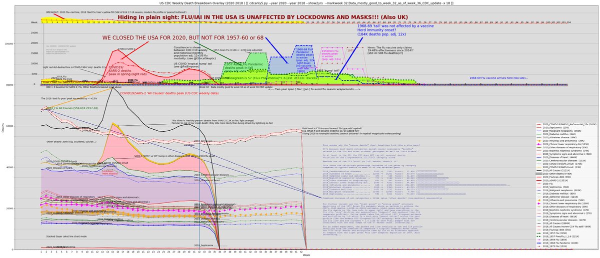
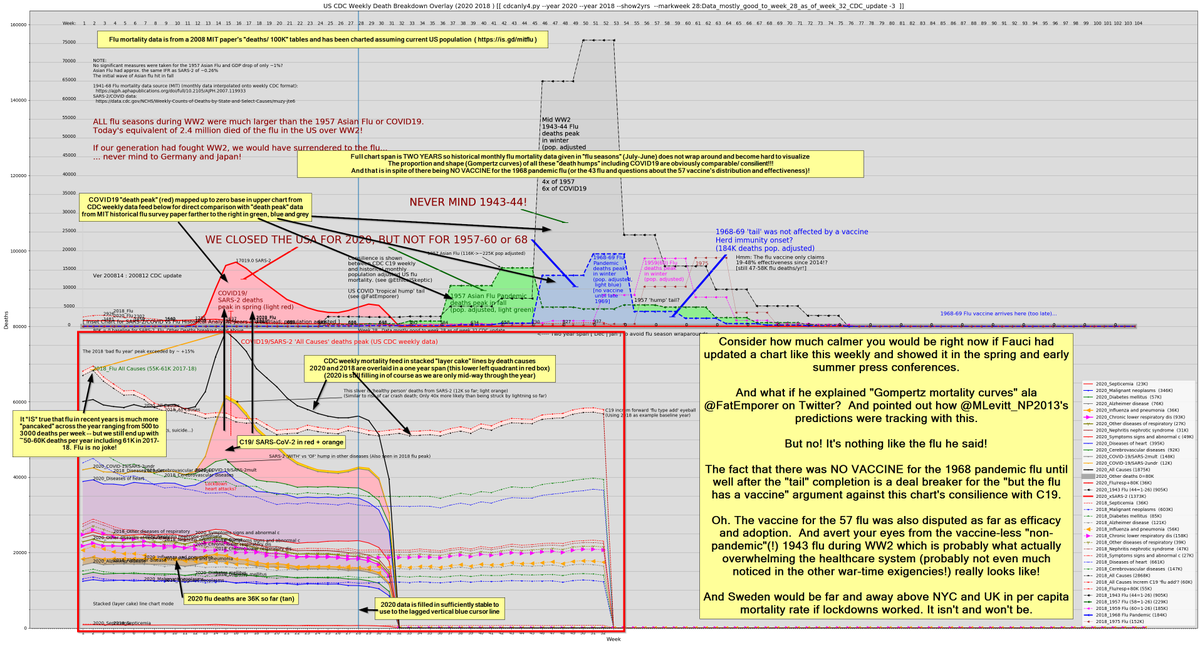
2/ While there isn't great detailed mortality data on the 1918 pandemic -- and there are some interesting questions like how many died of *recommended* aspirin overdoses! -- there is US monthly data on the more recent 1957 and 1968 pandemics.