Cameron Dawson Profile picture
Chief Investment Officer at NewEdge Wealth⚡️CFA Charterholder⚡️will never solicit in messages
Oct 7, 2023 6 tweets 2 min read
This week’s Weekly Edge looks at the Bond-like resilience of the US economy, but like any good 00, we look over our shoulder for signs of deterioration/emerging stress.
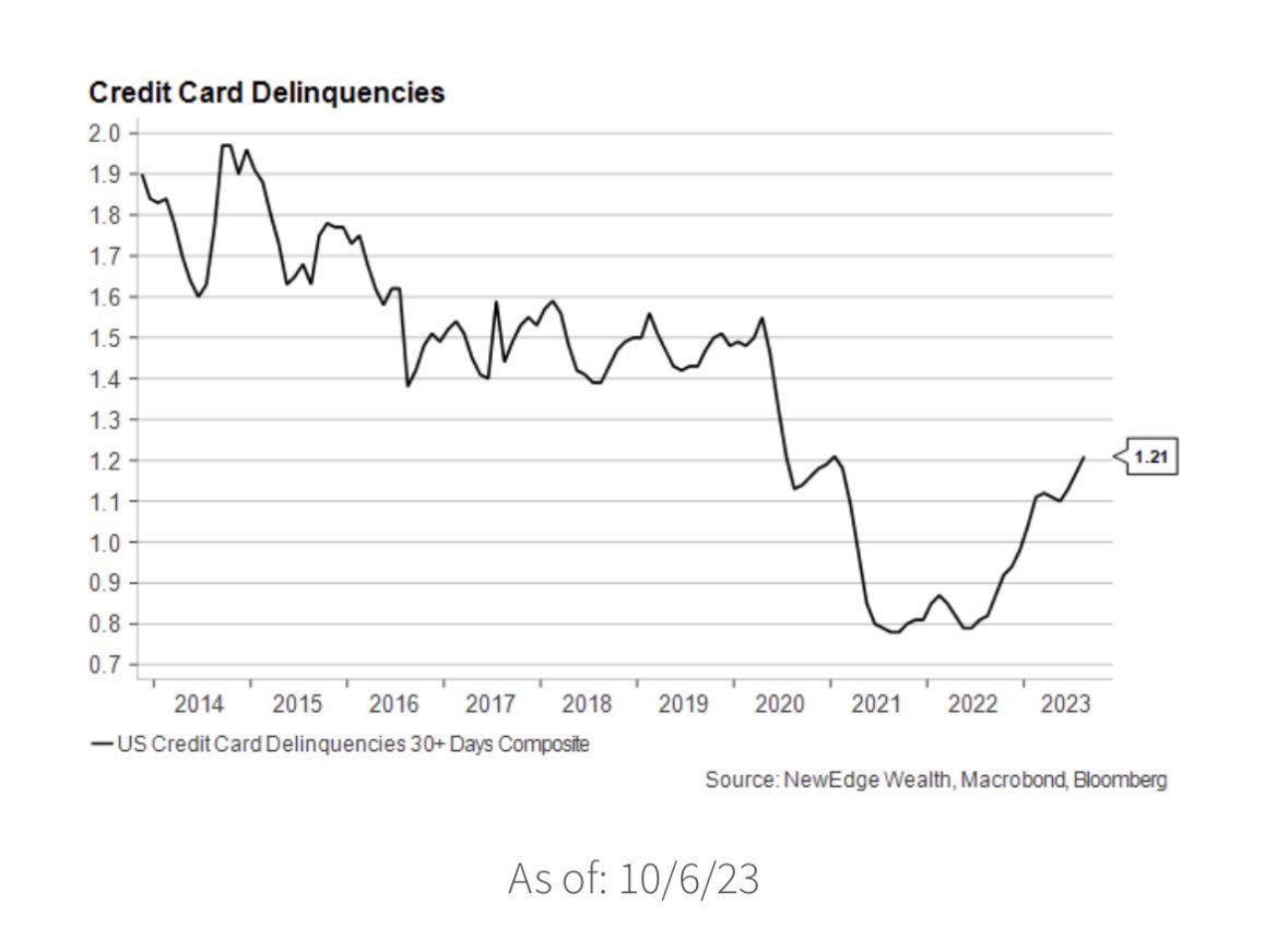
One example is rising credit card delinquencies. But this rapid rise needs context… Image Delinquency levels are rising rapidly, but have not eclipsed pre-COVID levels and are well below GFC levels. Further, CC balances as a % of income are well below pre GFC levels and even below pre-COVID levels. Image
May 6, 2023 11 tweets 4 min read
10 charts to kick off May (and 10 pts to anyone who can, without search, catch every reference... there is some niche in there 😎).

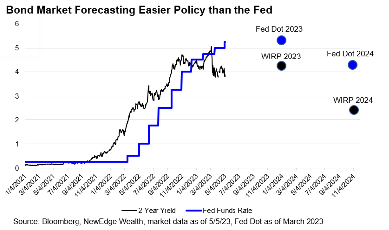
1. You Take the High Road, I Take the Low Road:
Fed Funds > 2 Yr, with bond mkt pricing in much easier policy than Fed Image 2. Everybody’s Working (for the Weekend):
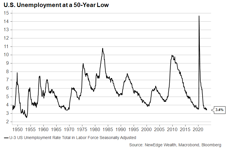
A key factor keeping the Fed in its “higher for longer” mode, despite banking issues, is the tight labor market. Friday’s Nonfarm Payrolls report dropped the unemployment rate down to 3.4%, at the 50-year low Image
Apr 1, 2023 11 tweets 4 min read
Weekly Edge Thread! 🧵
This week we go my fave early goth rock with She Sells Sanctuary 🖤🏴‍☠️

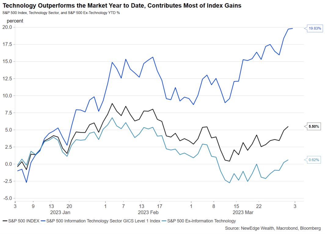
Tech has been dominant in 2023 and have driven almost all of the index gains.
Tech +19.8%
S&P +5.5%
S&P ex-tech +0.62%
What has driven this outperformance and can it continue? Tech’s strength YTD has been entirely driven by multiple expansion.
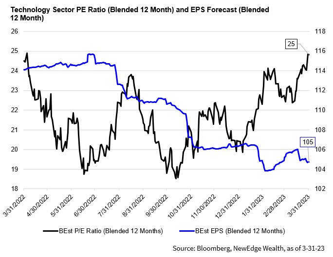
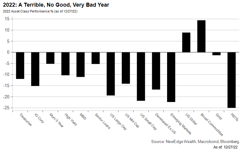
Tech forward PE is +25% YTD, while Tech’s 2023 EPS growth forecast has been cut from -2% to -8% YoY.
Dec 29, 2022 22 tweets 9 min read
22 Charts for 2022
A year in review and a mega thread!🧵plus a link to the entire piece is here (and keep an eye out for our 23 outlook soon!): newedgewealth.com/22-charts-for-…

1. A terrible, no good, very bad year:
Nearly all asset classes experienced pronounced weakness in 2022. Image 2. Appetite for Destruction:
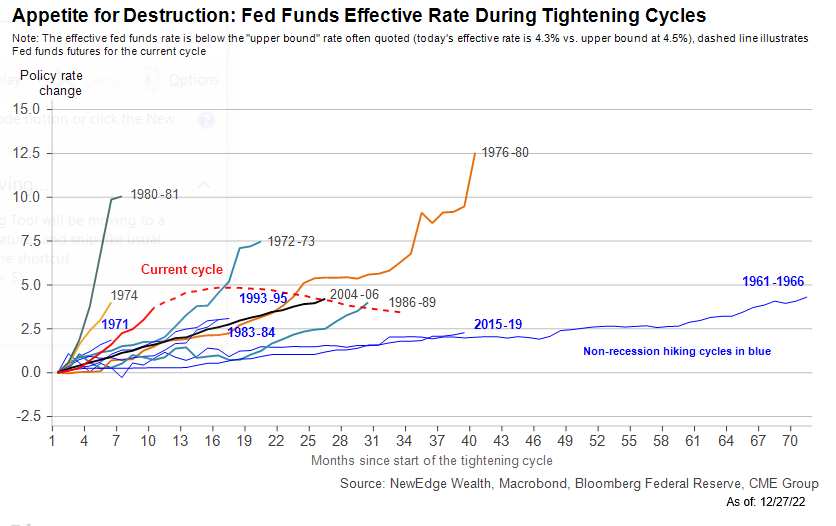
The most rapid tightening cycle by the Fed since the early 80's.
(Note this chart shows the Effective Fed Funds rate through Nov-22). Image
Aug 1, 2022 15 tweets 5 min read
Let's get REAL (a🧵)!
Since the Fed meeting last week real yields have been falling across the curve. Here we can see both 5 and 2 Year Real Yields falling back into negative territory, while 10 Year Real Yields are dancing right above 0.
This is important for multiple reasons: First, a quick reminder of how real yields are calculated:
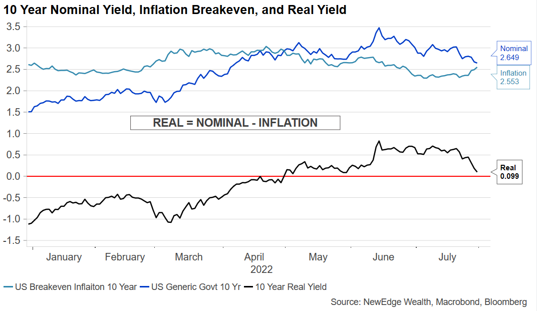
REAL = NOMINAL - INFLATION
So, in recent weeks have have seen nominal rates fall (rally in bonds on risk off?), while inflation breakevens have risen (maybe pricing in an easier Fed?), resulting in a drop in Real Yields
May 10, 2022 13 tweets 5 min read
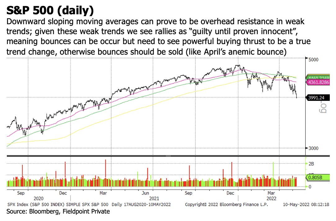
Flush check 🧵After weak trading, let's see where we stand on flush measures to see if we have seen capitulation.
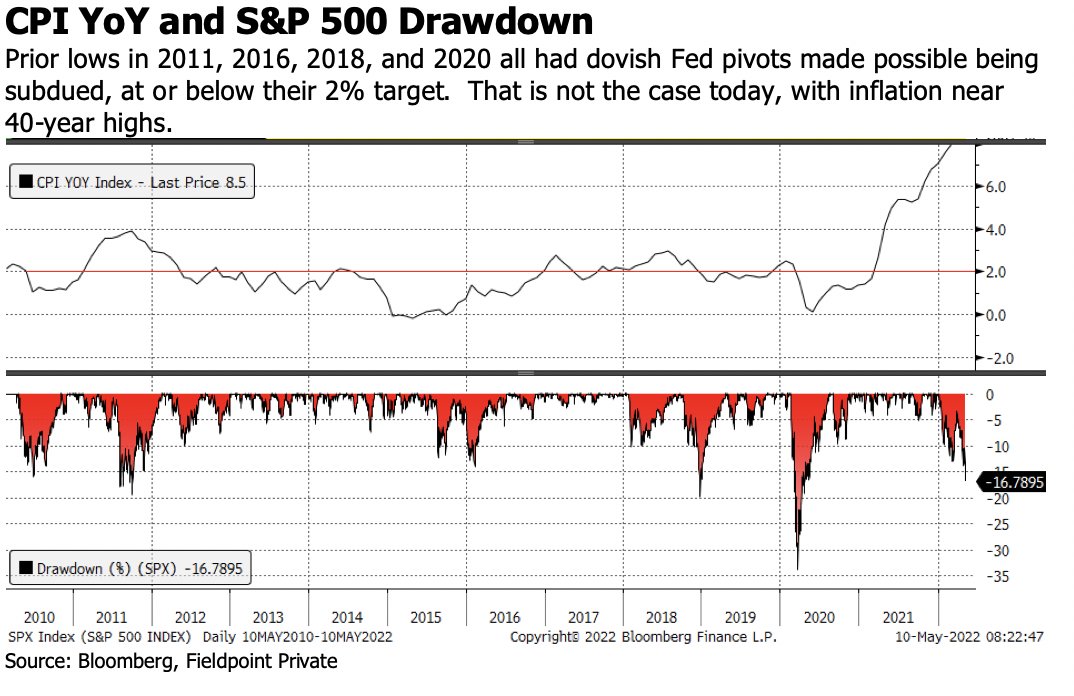
First, we have to acknowledge that trends have weakened substantially, so a bounce could be short lived and better off sold into new overhead resistance (ie 50DMA). Next, we have to acknowledge how different the Fed's/liquidity's posture is this time around. Capitulative lows in the prior cycle (11, 16, 18, 20) all were accompanied by a pivot to Fed dovishness, made possible by inflation being at or below their 2% target.
May 2, 2022 15 tweets 6 min read
I’m excited for Spaces at 5p with @rhemrajani9 @AviNMash @JLinWins @PoundingDaTable
In prep, here are a series of pre-FOMC charts.
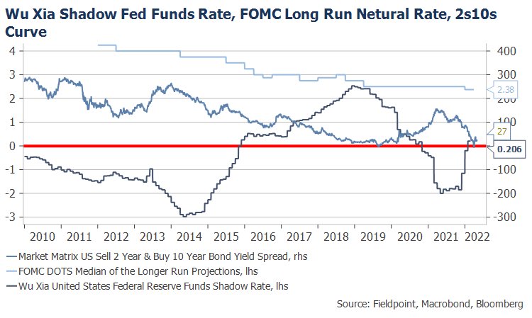
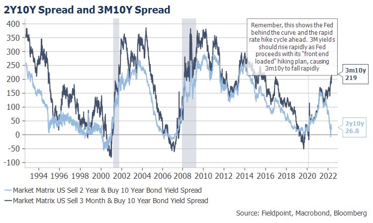
First, the Fed remains a long way from “neutral” but is signaling it wants to get there rapidly. This is why they will tolerate curve inversion The 3m10y curve should begin to fall rapidly as the Fed delivers on its front-end-loaded rate hike plan, meaning 3m yields will move rapidly higher.
Apr 26, 2022 13 tweets 5 min read
Did we "flush" today? Let's run through a few charts to see (🧵)
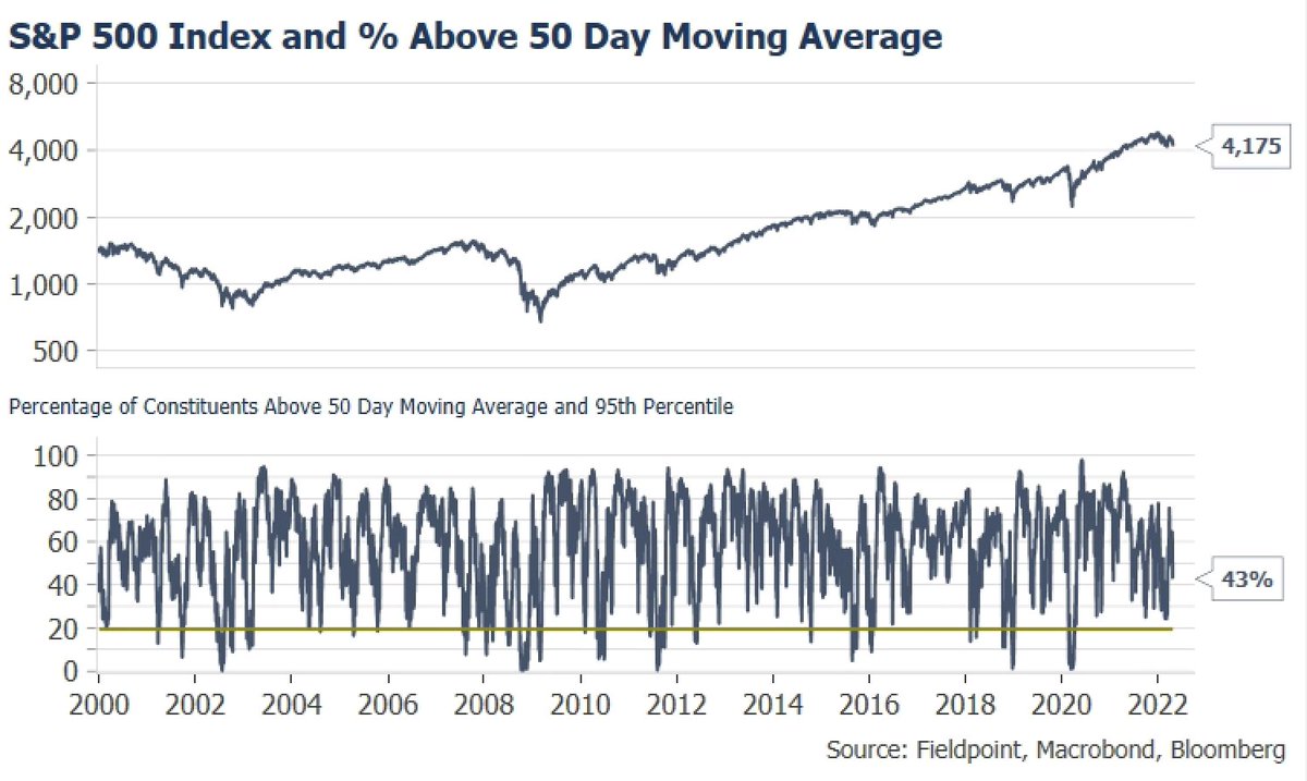
The quick answer is possibly for a short term bounce, but the true capitulate flush signals have still yet to hit to signal a major major low. SPX still has 43% of members above their shorter term 50 day moving average. This often goes sub-20% at major lows. Image
Mar 20, 2022 7 tweets 2 min read
Let's talk about yield curves (🧵)!
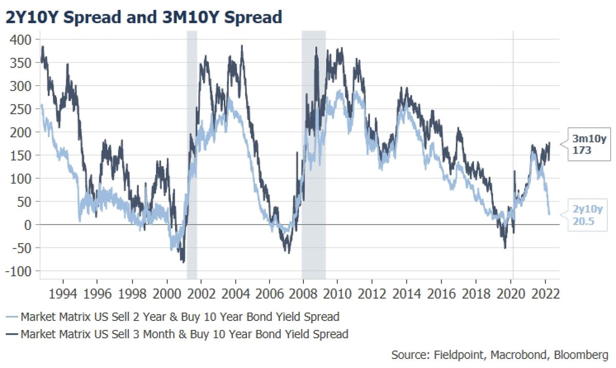
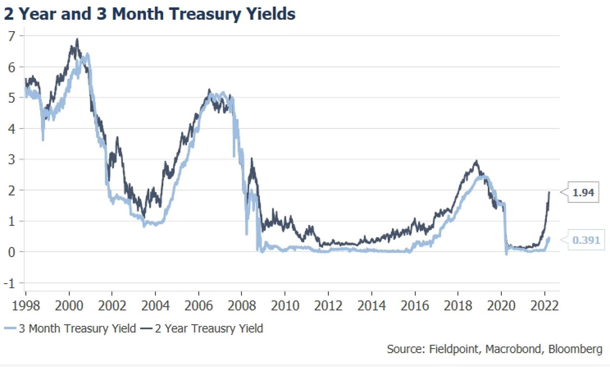
A popular push back to worries about a very flat 2Y10Y Treasury curve (the difference in yield between 10 Year and 2Y Treasuries) at just 20 bps today is that the 3M10Y curve remains steep and "safe" at 173 bps, not signaling imminent recession The 3M10Y curve remaining steep at the beginning of a tightening cycle makes sense. In an overly simplistic description, the 3M yield is reflecting just the Fed policy moves over the coming 3M (1 more hike), while the 2Y is reflecting the policy moves over the next 2Y (~8 hikes)