
Workforce Economist in Residence at Guild; Senior Fellow at the Burning Glass Institute. Labor markets, macro, and (sorry) music! Tweets represent my own views.
 2/ Focusing solely on the UR, we're tracking a little better than my 80th percentile scenario halfway through the year.
 2/ Some definitions first.
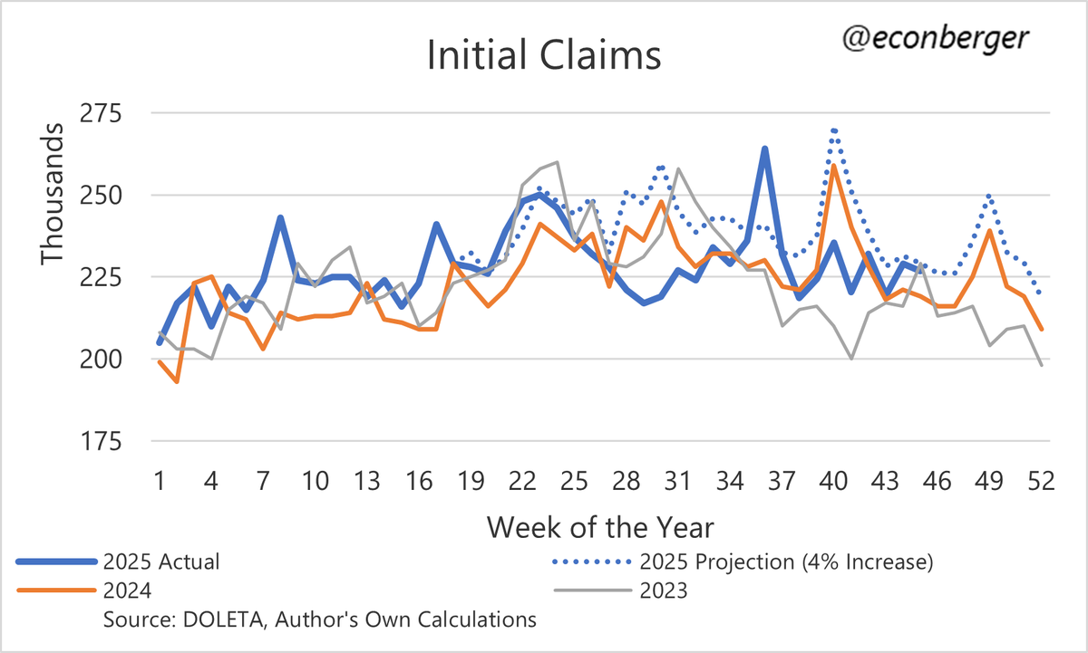 2/ Maybe something bad is around the corner but it hasn't happened yet.
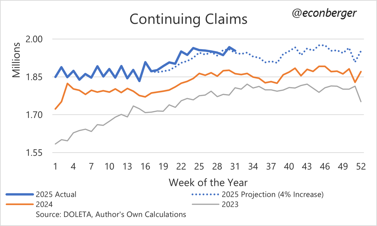
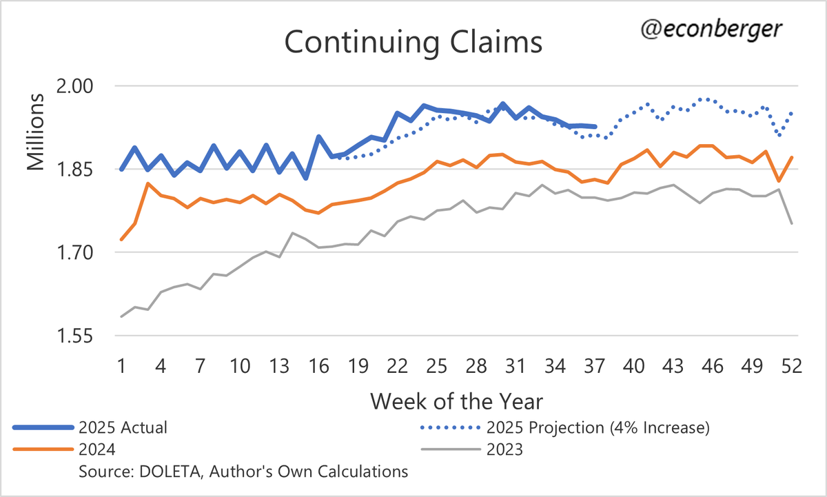 2/ There's been a mild reacceleration in the CC data recently. We'll see if it goes anywhere; the May/June mild acceleration petered out.
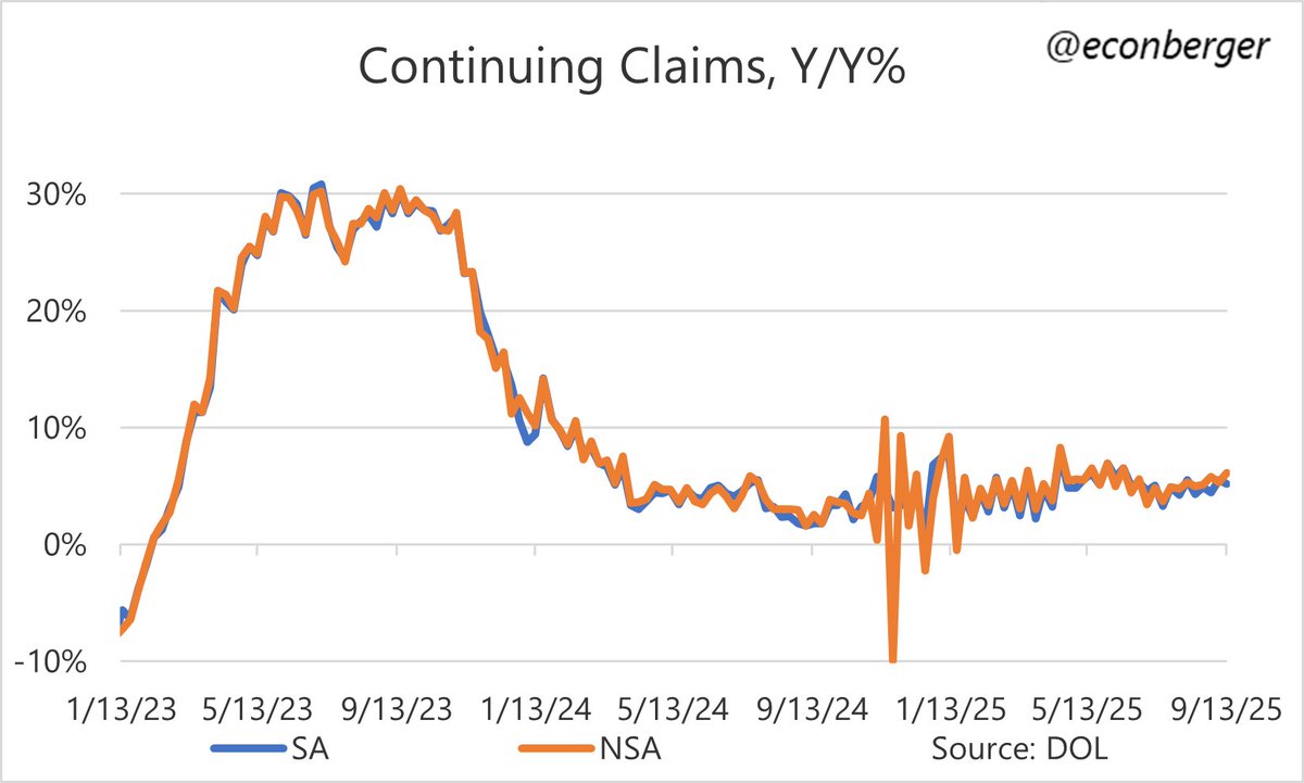
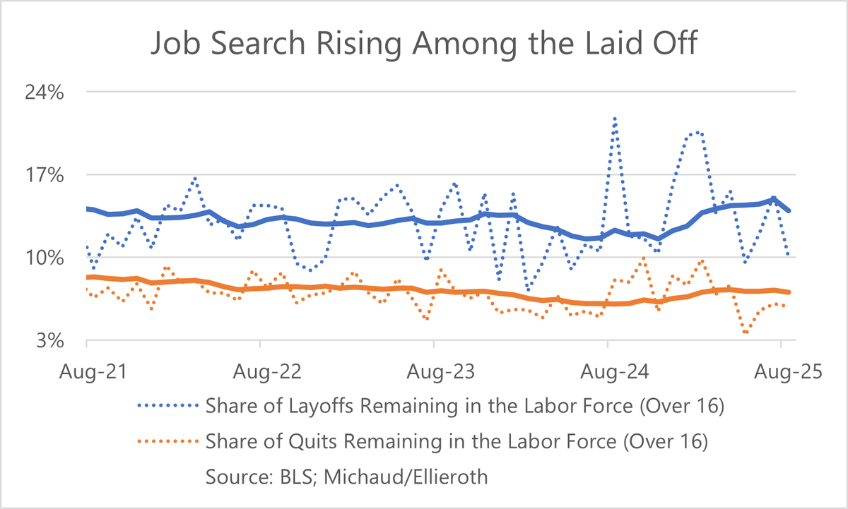
 2/ We also have, courtesy of @mander_michaud and @KathrinPhD , measures of quits & layoffs into non-employment.
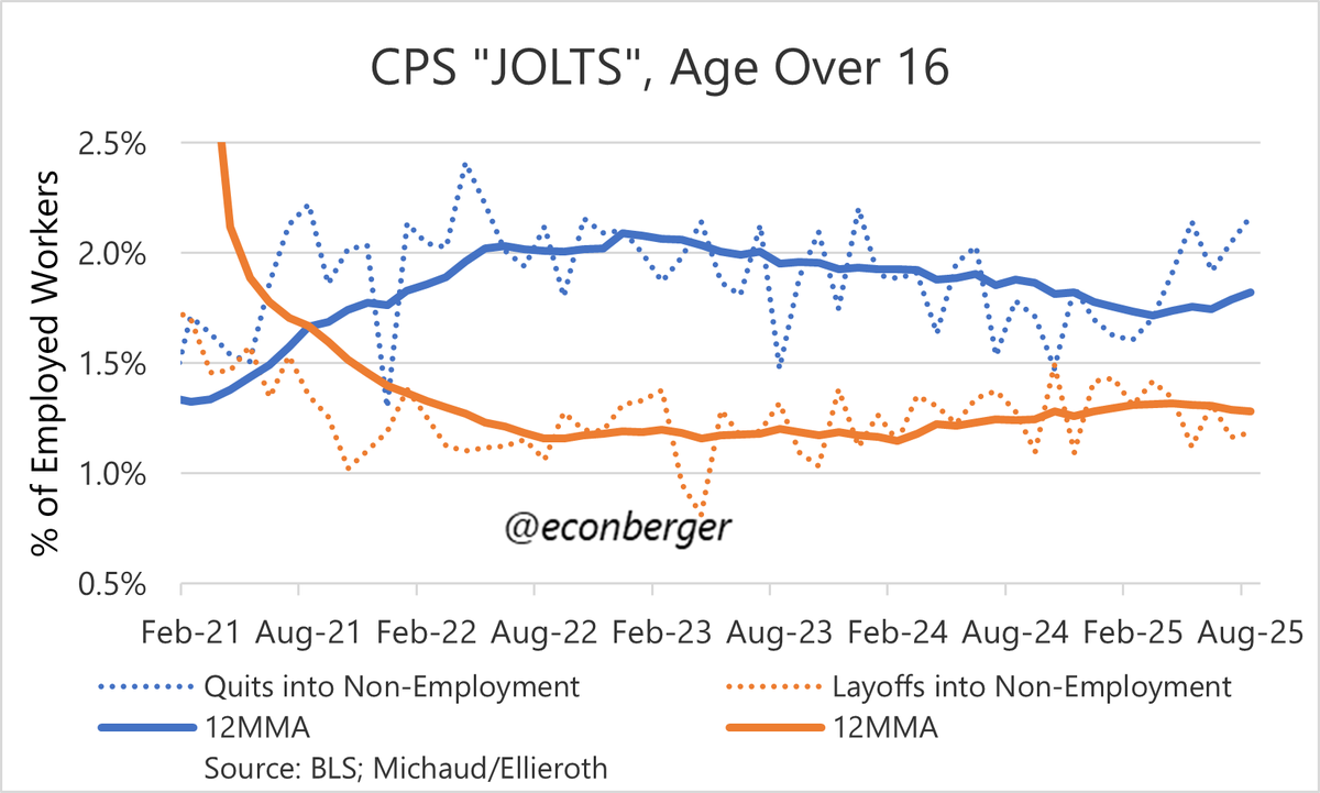
 2/ It's well above last year's level.
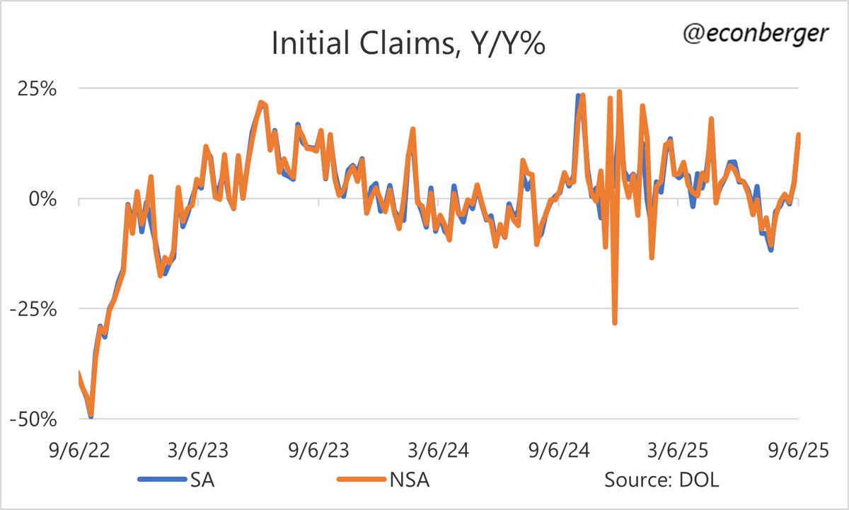
 2/ On the plus side... prime working age employment population ratio, the flagship indicator of this report rises to 80.7%. No sign of deterioration in this metric. Steady since last fall.
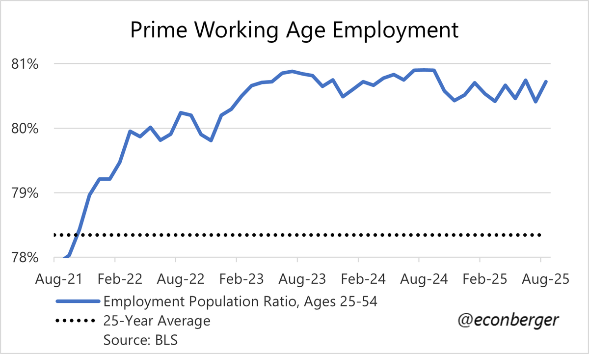
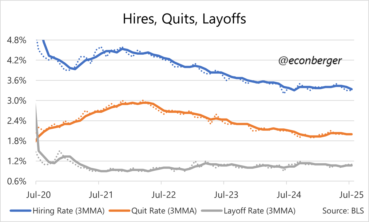 3/ The hiring rate, at 3.3%, is around where it was for much of 2011-13 (or if you like an average unemployment rate for that period, just over 8%). It's a really hard time to find a job.
 2a/ First off are recent employer actions on headcount.
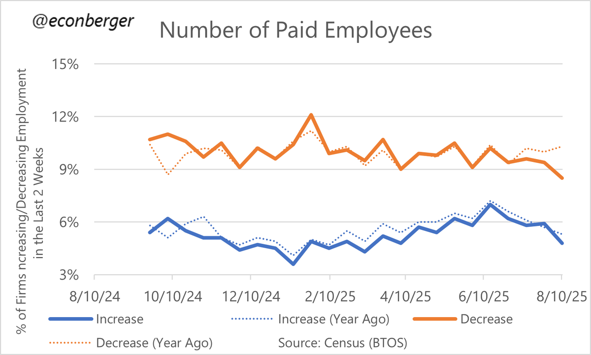
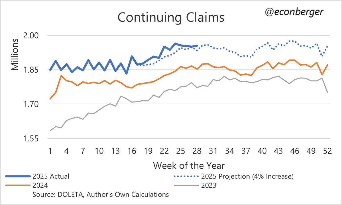
 2/ The underlying trend is mid-single-digits Y/Y growth - a tiny bit better than 2 months ago, a tiny bit worse than earlier this year.
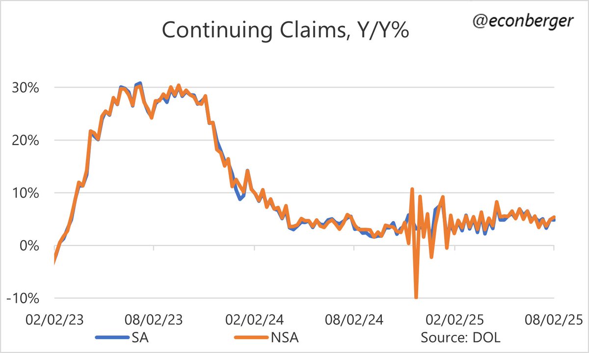
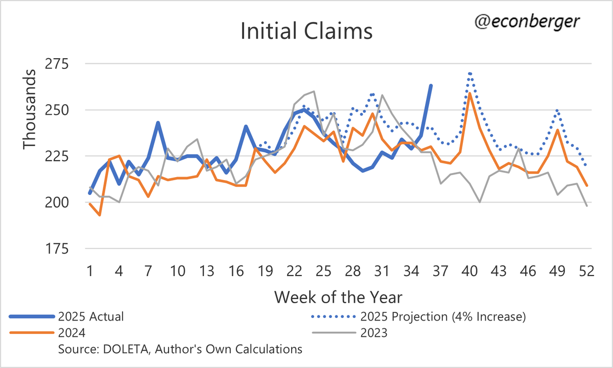
 2/ Another way of seeing this: continuing claims were up about 4% Y/Y - comparable to before the scare.
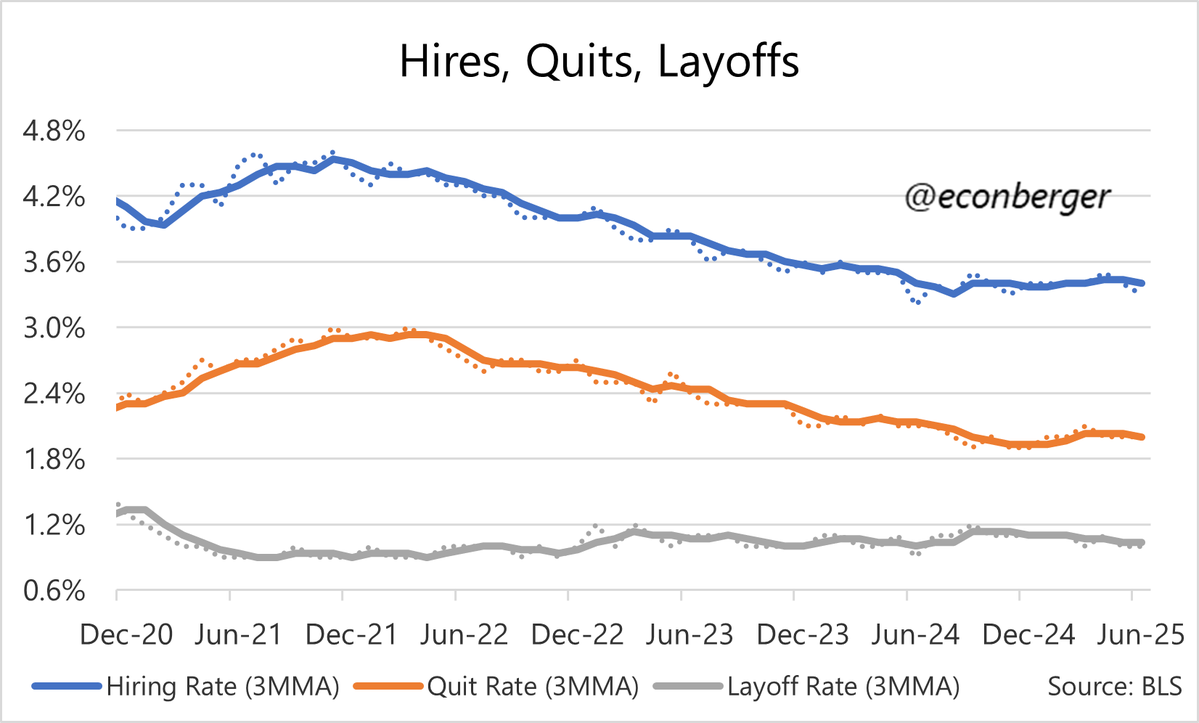 2/ As stated earlier, hiring was on the soft side. A hiring rate of 3.3% is comparable to early 2012 levels, when the unemployment rate was a little over 8%. But there's a pretty good chance it's just noise around a stable, weak hiring trend.
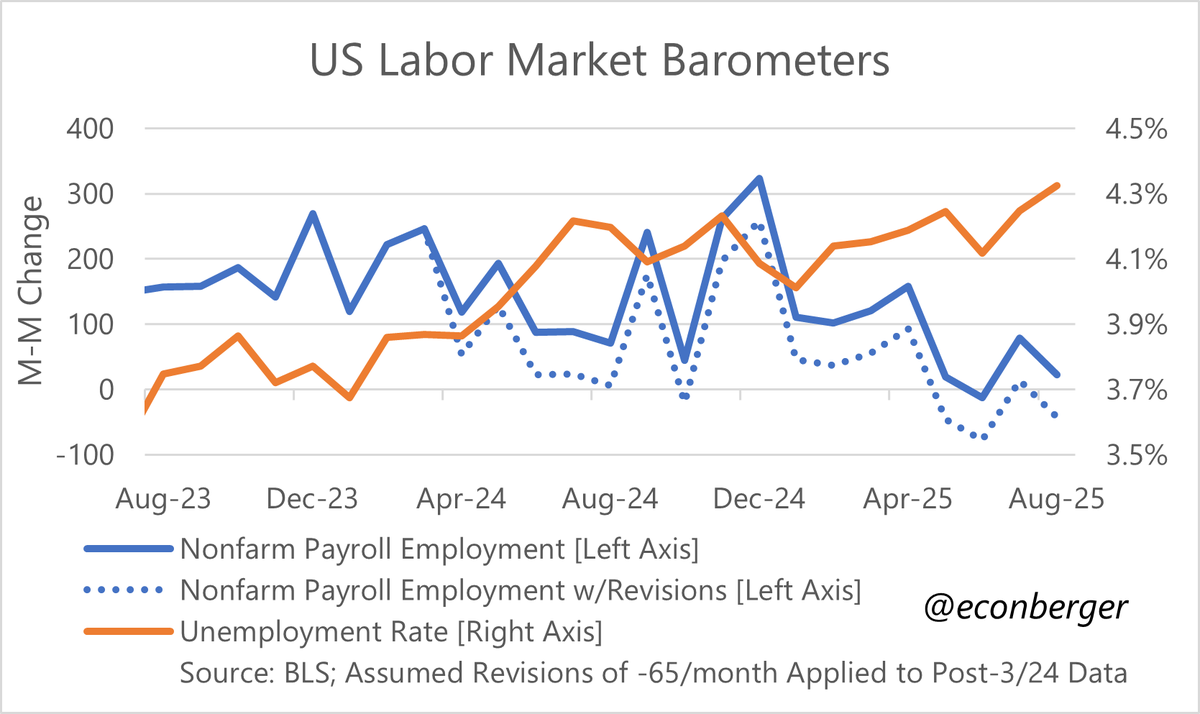
 2/ That flattish trajectory in the published series is an overly benign portrayal of what is actually happening in the underlying data, which is an ongoing slow creep upward.

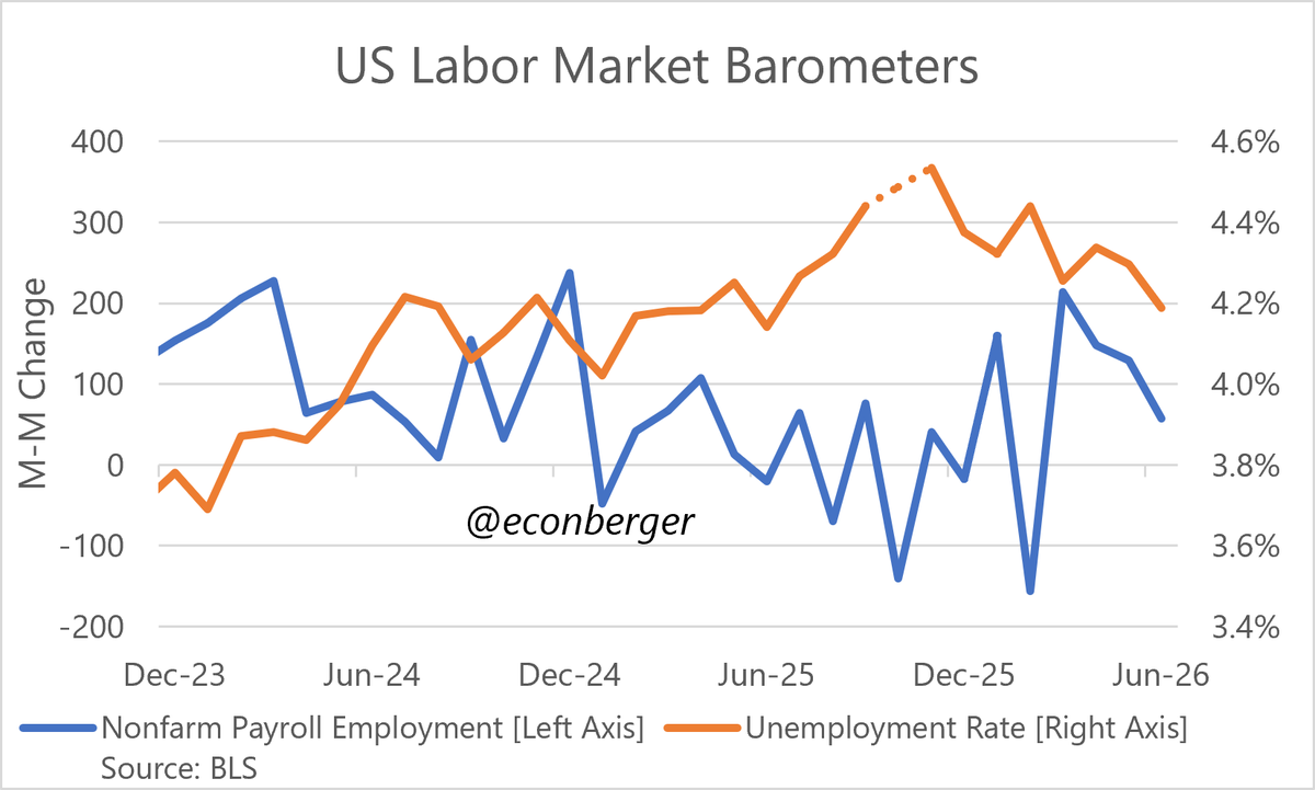
 2/ The unemployment rate is slowly creeping up, right along the track the Fed anticipated in March.
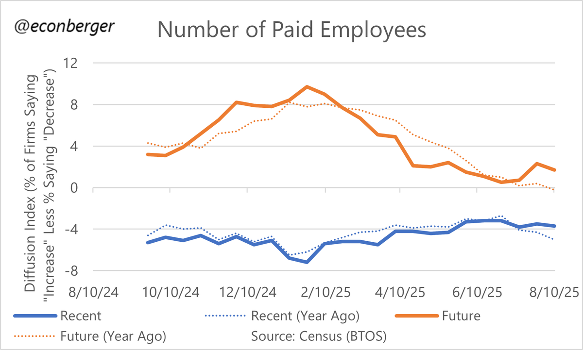
 2/ The improvement in headcount plans (relative to a year ago) is coming from fewer firms planning to cut headcount, and more firms planning to expand it.
 2/ To recap: the QCEW is the source data for the annual benchmark revision to nonfarm payroll employment.
 2/ This modest improvement in plans is due to more firms planning to increase headcount, and fewer firms planning to cut back.
 2/ The deterioration in employer headcount expectations has come from both a falling share of firms planning to expand, and a rising share of firms planning to cut employment.
 2/ Why wrong?