Harry Stevens Profile picture
Climate Lab columnist @washingtonpost Data, maps and curiosity about climate change 📩 Email me + check my work: harry.stevens@washpost.com
Jul 2 5 tweets 3 min read
How accurate is the weather forecast in your town?

@niko_tinius and I learned that @NWS just began doing gridded assessments of forecast accuracy. We got the data and mapped of how many days into the future they get within 3°F of the observed high temp.

washingtonpost.com/climate-enviro…
Image We made a tool that lets you look up the accuracy of the temperature forecast in your town.

Interestingly, forecast accuracy varies depending on whether it's hot or cold outside, so we included a comparison of warm vs. cool months.

washingtonpost.com/climate-enviro…
Jan 20, 2022 6 tweets 3 min read
🧵 At the one-year mark of Biden's presidency, hundreds of federal government positions remain unfilled.

We've updated our tracker to reflect the latest in the president's struggle to fill more than 1,200 positions that require Senate confirmation.

washingtonpost.com/politics/inter…

1/6
The Senate has simply slowed down.

Biden put forward more nominees in his 1st year than Donald Trump and about as many as George W. Bush and Barack Obama.

But it took on avg. 103 days to confirm a Biden nominee, compared with 100 days for Trump, 80 for Obama & 48 for Bush.

2/6
Nov 23, 2021 6 tweets 4 min read
As more states approve new congressional maps, competitive congressional districts are disappearing.

The result: the House could be even more partisan and polarized after next year's midterms.

New story from me, @ashlynstill and @KevinUhrm: washingtonpost.com/politics/2021/… In the 15 states that approved new congressional district maps as of Monday morning, the number of districts where the 2020 presidential margin was within five percentage points has fallen from 23 to just 10, according to our analysis. washingtonpost.com/politics/2021/…
Sep 17, 2021 6 tweets 3 min read
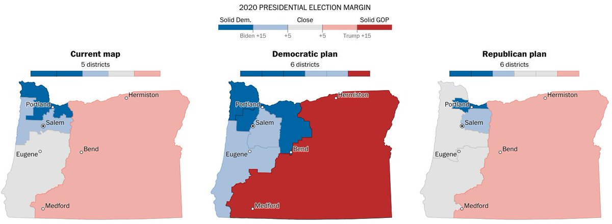
NEW story from me: It's been a month since the Census released detailed data, and states have begun to release redistricting plans. I wrote a computer program that analyzes such plans, and I took it for a test drive on early maps from OR, IN and CO. washingtonpost.com/politics/inter… In Oregon, both Democrats and Republicans released proposals, helping reveal the ways mapmakers can shift district boundaries to gain a political advantage. Surprise! The D plan would be good for Ds and the R plan would be good for Rs. washingtonpost.com/politics/inter…
Jun 21, 2021 9 tweets 3 min read
NEW from me: New Yorkers are about to do ranked-choice voting. What is that? And why do its supporters say it better represents the will of the people?

This story features interactive voting simulations that should help you grok how it all works. washingtonpost.com/politics/inter…

1/9
Imagine we have an electorate made up of 200 voters...

2/9
Feb 9, 2021 5 tweets 3 min read
NEW: The U.S.'s pace of vaccinations has sped up. We're at nearly 1.5 million a day. But if we want to get "back to normal" by the end of the summer, we have to go way faster. wapo.st/vaccination-pa…
🧵 1/5 We talked to the great @DrLeanaWen, who said positive things about Biden admin's efforts. But "100 million shots in 100 days" didn't sound so good to her. Instead? “The man on the moon is the kind of goal that we should be aiming for at this point.” wapo.st/vaccination-pa… 🧵 2/5
Aug 7, 2020 10 tweets 6 min read
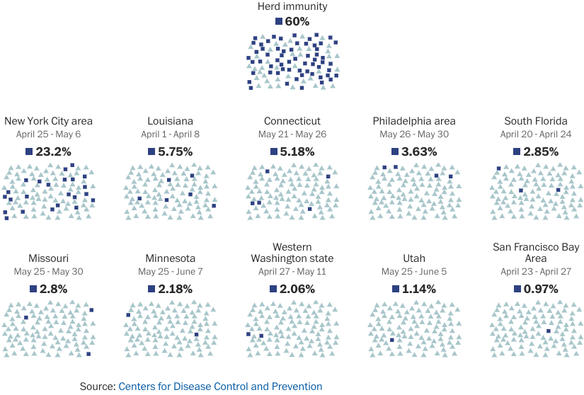
Curious about how herd immunity works? Want to know how far we are from getting there? My latest #coronavirus story in the @washingtonpost is for you.

'A vaccine, or millions of deaths: How America can build herd immunity to the coronavirus'

wapo.st/herd-immunity During an epidemic, being around a lot of people can be dangerous. But if those people are immune, instead of being a danger, they're more like a shield. This is the essence of what epidemiologists call "herd immunity."

wapo.st/herd-immunity
Mar 14, 2020 6 tweets 3 min read
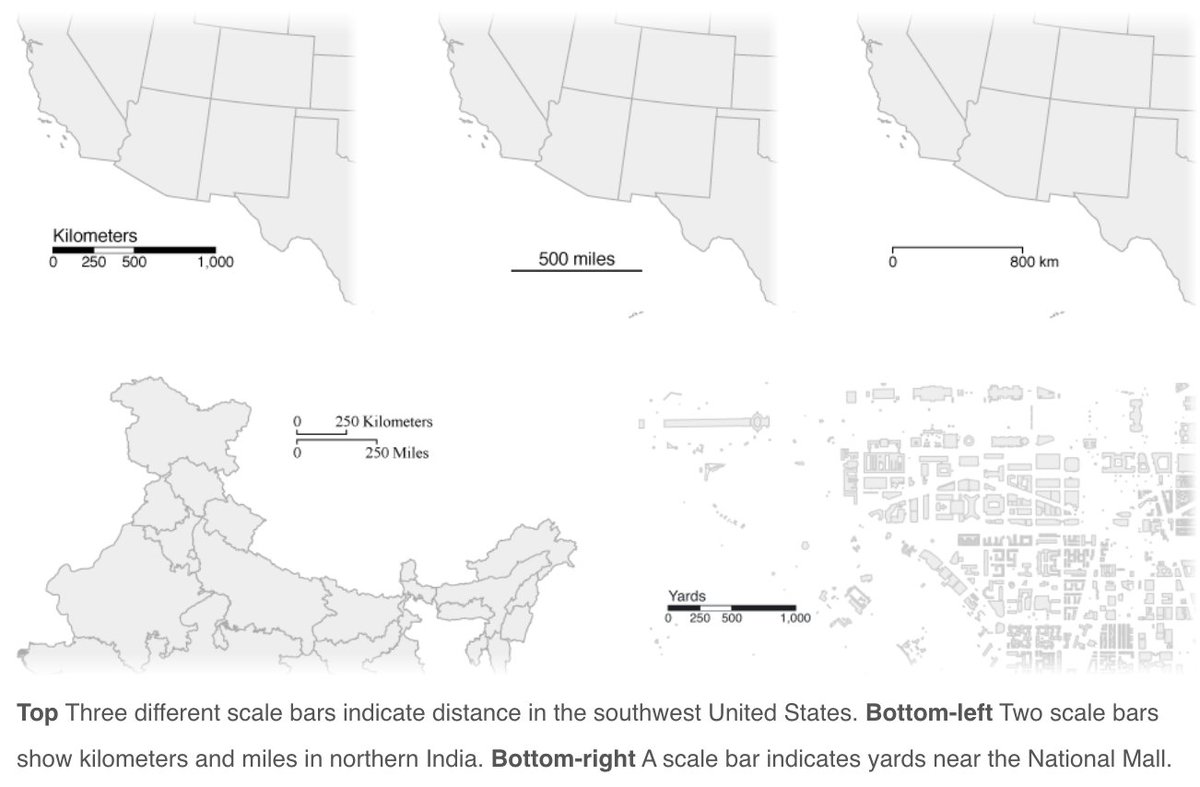
If you like bouncing balls explaining how to slow down #coronavirus, my latest story in the @washingtonpost is for you: Why outbreaks like coronavirus spread exponentially, and how to “flatten the curve” washingtonpost.com/graphics/2020/… The early trickle of new #coronavirus infections has turned into a steady current. By creating simple simulations, we can see how to slow it down. Here's what it looks like if you don't do anything to stop the spread.
Feb 10, 2020 7 tweets 5 min read
Attention web cartographers: Today I'm releasing d3-geo-scale-bar version 1! It's a JavaScript library that makes it easy to add scale bars to your #D3js maps. Here's an introduction and tutorial on @observablehq: observablehq.com/@harrystevens/… #cartography @observablehq Just give it a projection, and it'll give you a scale bar. It even plays nicely with transitions! observablehq.com/@harrystevens/…