Hoefler&Co. Profile picture
H&Co designs typefaces. Design tweets by Jonathan, support tweets by Madi. Learn about our work in Netflix's "Abstract: The Art of Design", S02 E06.
Mar 4, 2020 15 tweets 5 min read
Ahoy, Dylan — this is a really nice one! I *might* have a fix for your C — see what you think of the following. My first thought was... Is there any opportunity to give the C the same snappy asymmetry of the A and B? They both have major and minor gestures, where the C is a lot more evenly balanced.
Feb 29, 2020 23 tweets 8 min read
Ahoy, @Kron98_! Jorge, thank you for this project — it’s intriguing. Some background for anyone listening in: Jorge is designing a typeface inspired by the school in his mother’s village, as part of a project to highlight depopulation in rural Spain. -> 
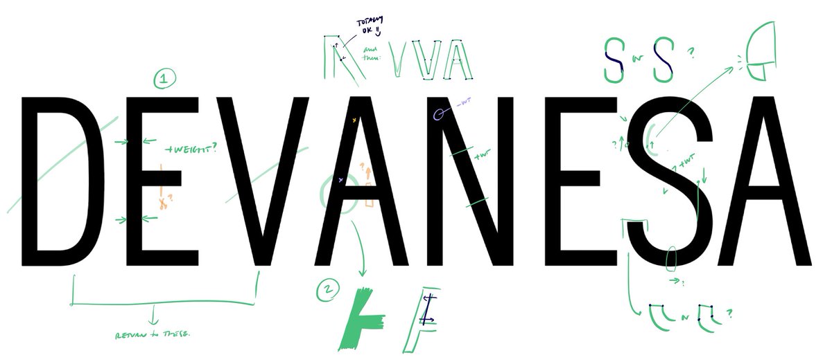
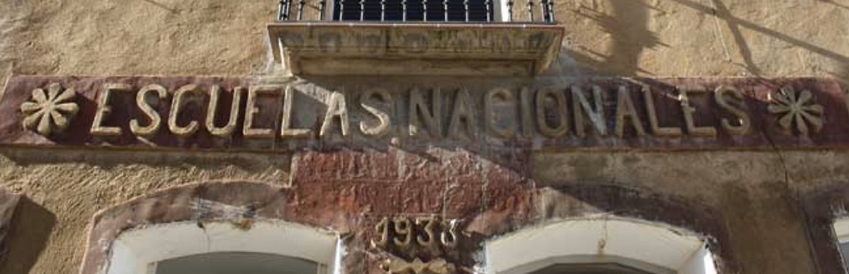
He’d written to ask about whether his initial draft was becoming too generic, and losing the charm of the original — an important and very delicate question. I’m always apprehensive of projects that revive “naive” lettering, because they run the risk of... ->
Feb 26, 2020 19 tweets 7 min read
Ahoy, @JoshApos! I really like where your typeface is going. It’s an interesting moment to look at this together, because your drawings are in great shape, but there’s a missing piece that will make your life easier. (And I have an S trick to share.) —> 
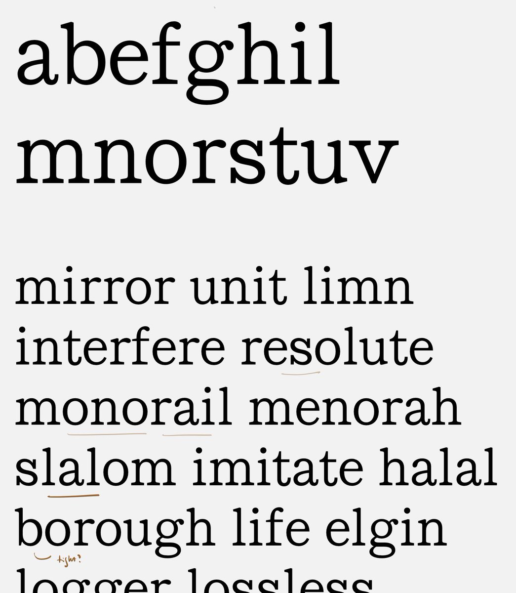
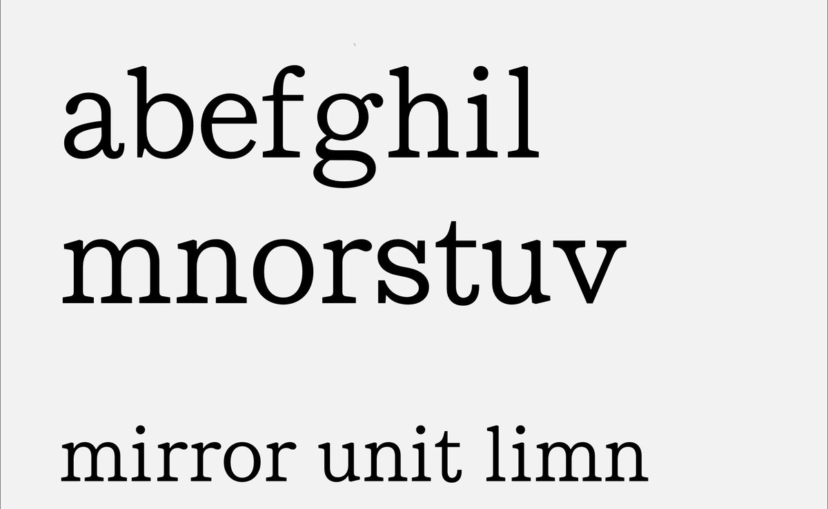
I’ve added a couple of words to your proof that might be illustrative. (Ultimately you’ll want lots more.) Take a look at the word ‘monorail’: to my eye, there’s something funny happening in the rhythm of m/o/n/o: —>
Feb 23, 2020 14 tweets 5 min read
Ahoy, Paul! Happy to offer a second set of eyes. I like where this is going: personally I’m not seeing anything wrong with the E-T join, but maybe this is what you’re seeing (& a way out)? —> Here’s a look at the comparative size of the joins between letters. Not necessarily a problem, but the E-T is the biggest: wonder if that’s what’s making it look odd to you? —>
Feb 22, 2020 8 tweets 3 min read
Ahoy, Jessica! Nice talking to you just now. Here’s a thought or two about the S & friends; feel free to use or discard. I wondered if you‘re seeing what I’m seeing... —> I wonder if turning the S clockwise is all it needs? (Also possible that you’ll want to add weight in the spine, but I’d start with rotating it, to see if it helps.) —>
Jan 5, 2019 6 tweets 2 min read
A bittersweet part of sharing Adobe Illustrator fixes on Twitter is getting emails from famous designers I haven't talked to in years, who write to share their similar frustrations, and recount the effort they've put into corresponding with @Adobe PMs who just don't care. It is tragic to see this once beautiful and elegant program, the tool I've used every day since 1987, get slowly dismantled in the interest of I don't know what. If "snap to point" no longer works reliably, what's the value of new features?