
Turning complex data into powerful visual stories! 📊 Founder of #dataviz agency @BaryonDesign. Ex-physicist. Allergic to negativity. He/him 🏳️🌈
 💩 Everything else is potential NOISE, or clutter: if you can remove an element from your visual and it doesn't harm the message, that means it might have been a distraction for your audience.
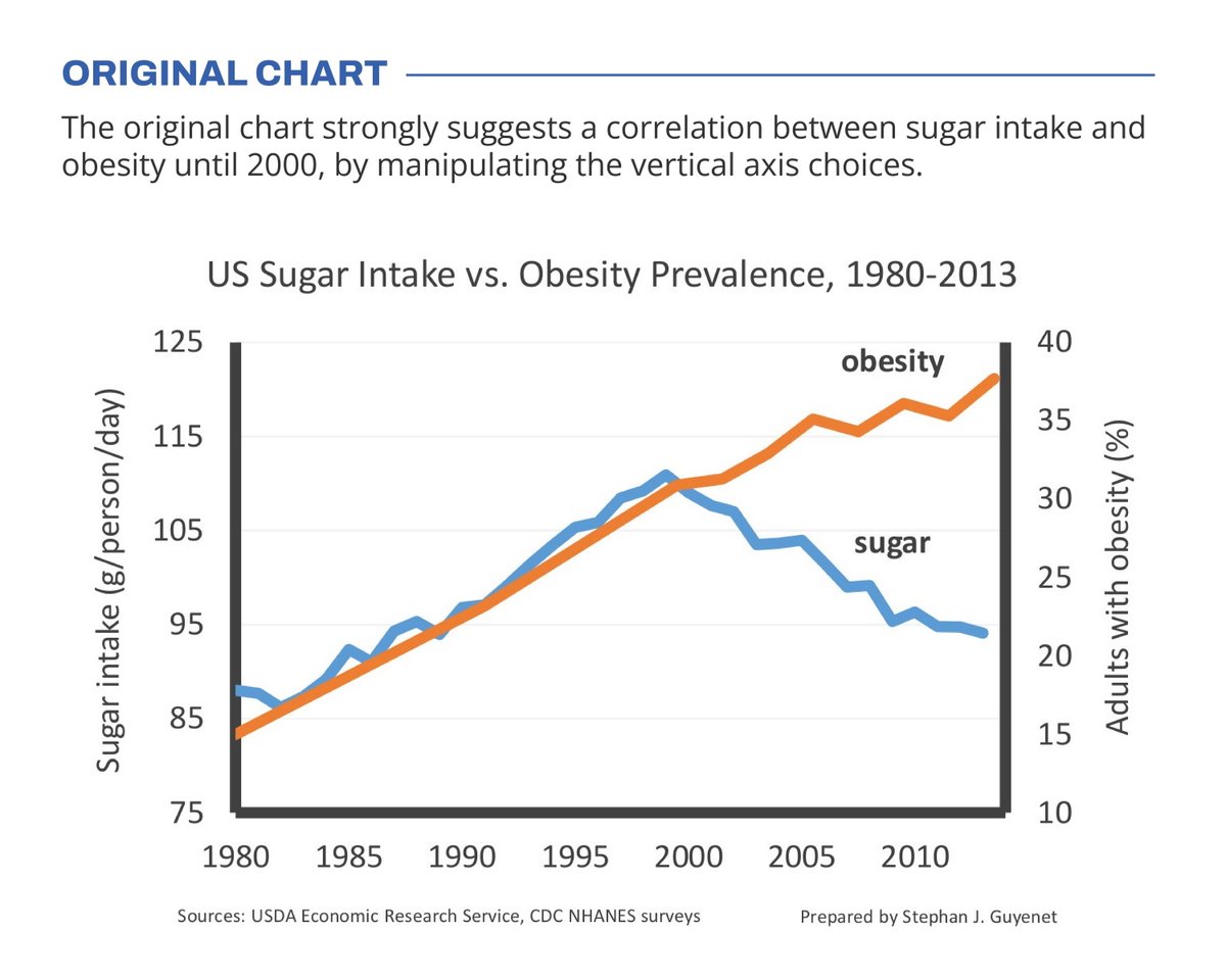 🧐 But with a closer look we can see something else is going on. Sugar intake levels are rising by 30% (from 85g to 110g), while obesity prevalence is rising by 164% (from 14% to 37% of the population). For an accurate comparison, these lines shouldn't nicely align at all!