
Stanford Prof. of Biophysics, Cambridge PhD and DSc, 2013 Chemistry Nobel Laureate (complex systems), FRS & US National Academy member, I code well for my age.
 Italy 181,000 cases/day on peak on 13-Jan.
 Big states looking good too.

 Please note that the two translation are automatic. I give independent results from Microsoft and Google. The original is in Hebrew.


 @ynetnews @adiryanko @Blitz20191 @AlexBerenson @MatanHolzer @dvir_a @boulderfish
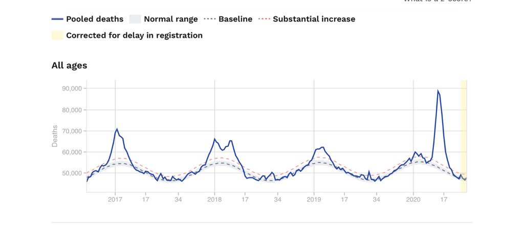
  The baseline can be calculated as an average over earlier years or even simply be the totals for a different year. Deaths can be reported anywhere but a larger population makes numbers more certain. The total death is shown here for Europe (350 million) euromomo.eu/graphs-and-maps.
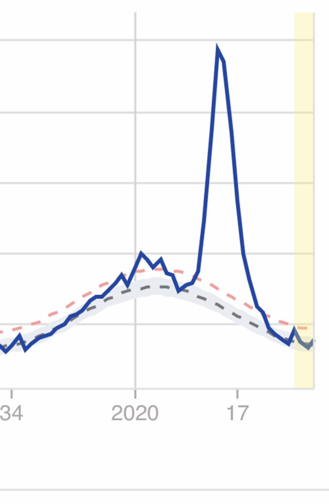


 Here is the evidence showing Google still does not full-text index this essential report. The Guardian @guardian finally gave CCDC @chinacdc age-range death numbers on 1 Apr. weekly.chinacdc.cn/en/article/id/…


 EuroMOMO euromomo.eu/graphs-and-maps Excess Deaths from 2020 Week 8 now match reported COVID Deaths @JHUSystems perfectly (better than 2%). In earlier weeks the reported deaths were lower. Not sure why? It allows me to do this in depth analysis & comparison with EuroMOMO influenza.
 The app was written in Python by Andrea Scaiewicz advised by João Rodrigues. It is research software allowing comparison of all locations with >50 deaths or >3000 cases (see examples). Response is slow as freely hosted by heroku @heroku. Tested too little, it is likely buggy.


 Continuing properly... (2) EuroMOMO euromomo.eu/graphs-and-maps now gives numbers by mouse-over. Getting values is easier than WebPlotDigitization but still tricky with my laptop and track pad. What I post here has been double checked but EuroMOMO does update. Please do check me!