
Quantitative Analytics Platform | Options & Futures
New Quant Engine
Try for Free 👇
 2/ To understand vanna, you first need to understand one thing:
 2/ Quick breakdown:
 2/ What you’re looking at:
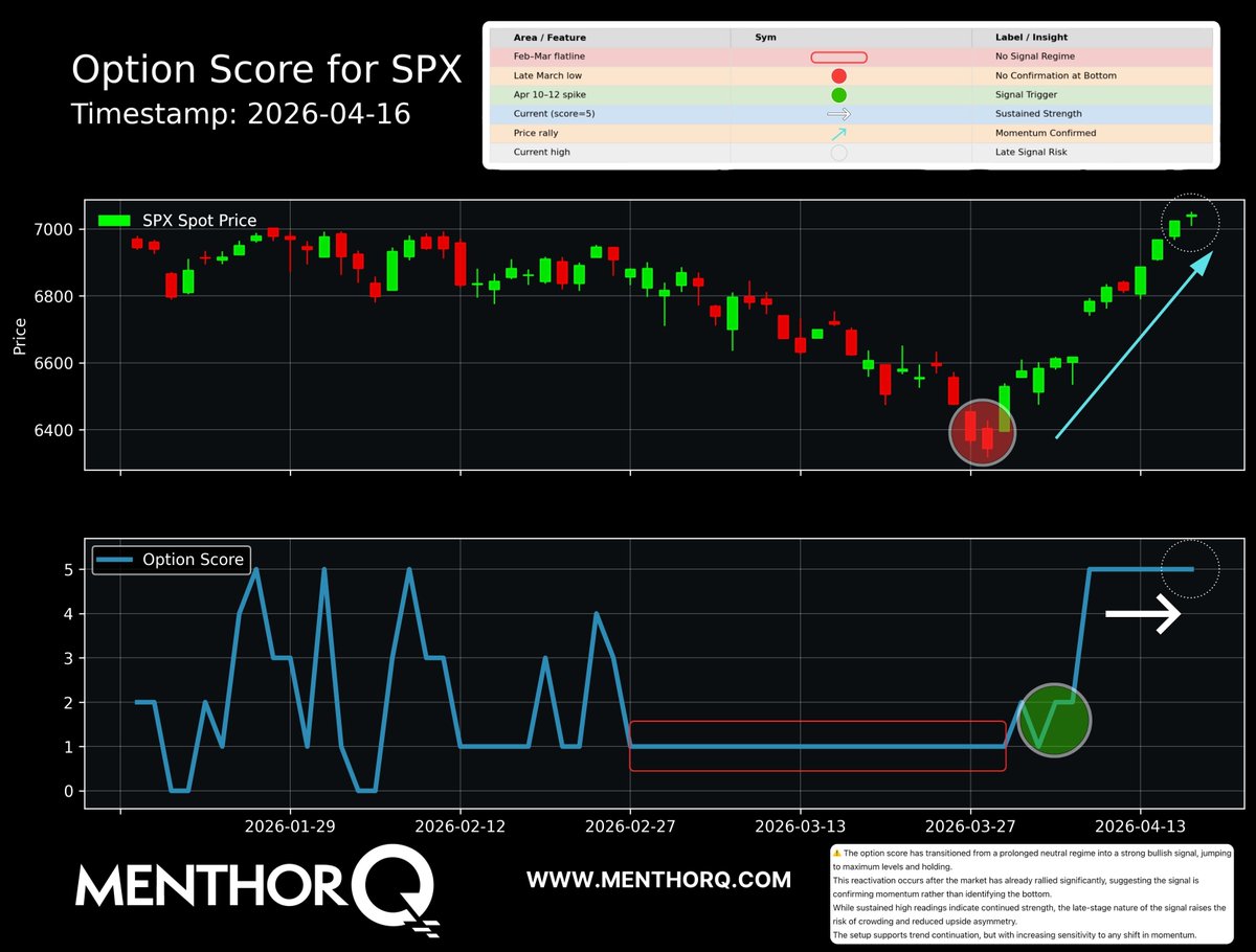 2/ Quick breakdown:
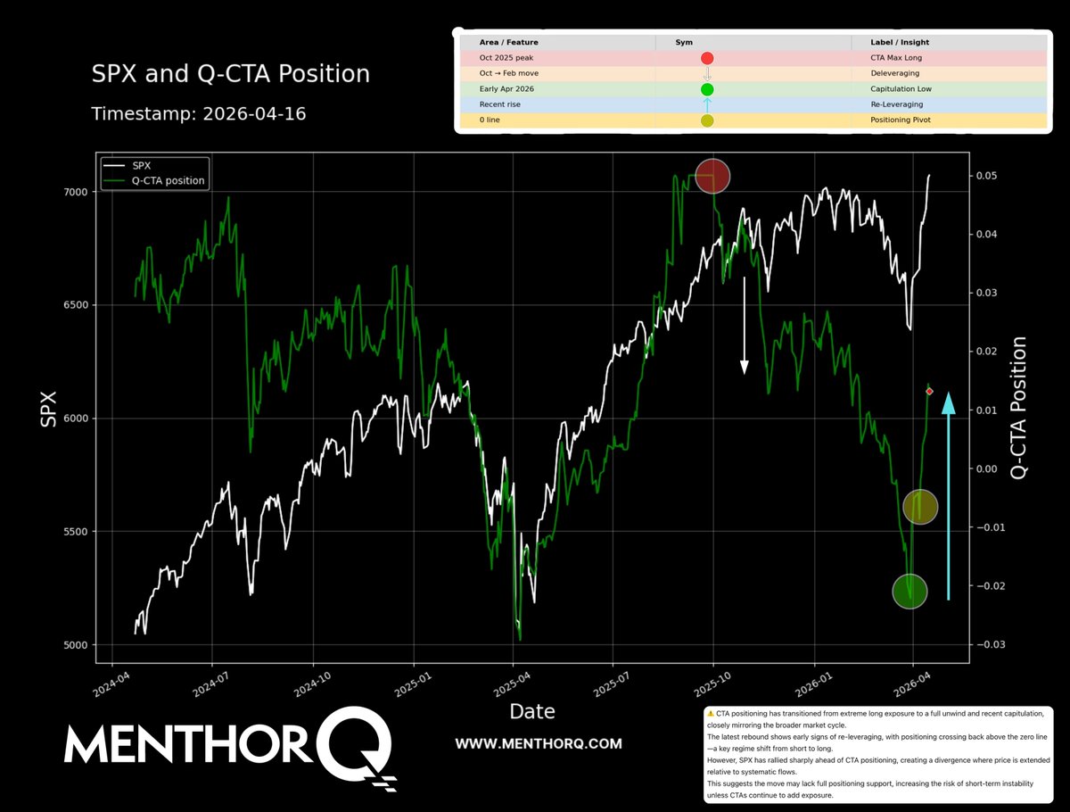 2/ Quick basics:
 2/ Quick breakdown:
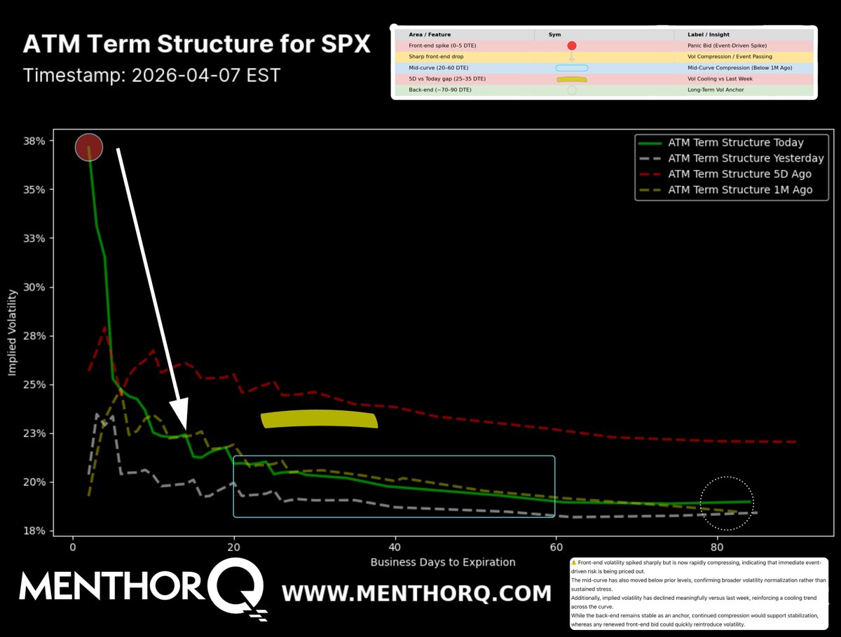 2/ This chart shows the term structure of volatility for $SPX.
 2/ The green line = CTA positioning.
 2/ This chart breaks down GEX (gamma exposure) by different expiries.
 2/ Weekly expirations are dealer long gamma.
 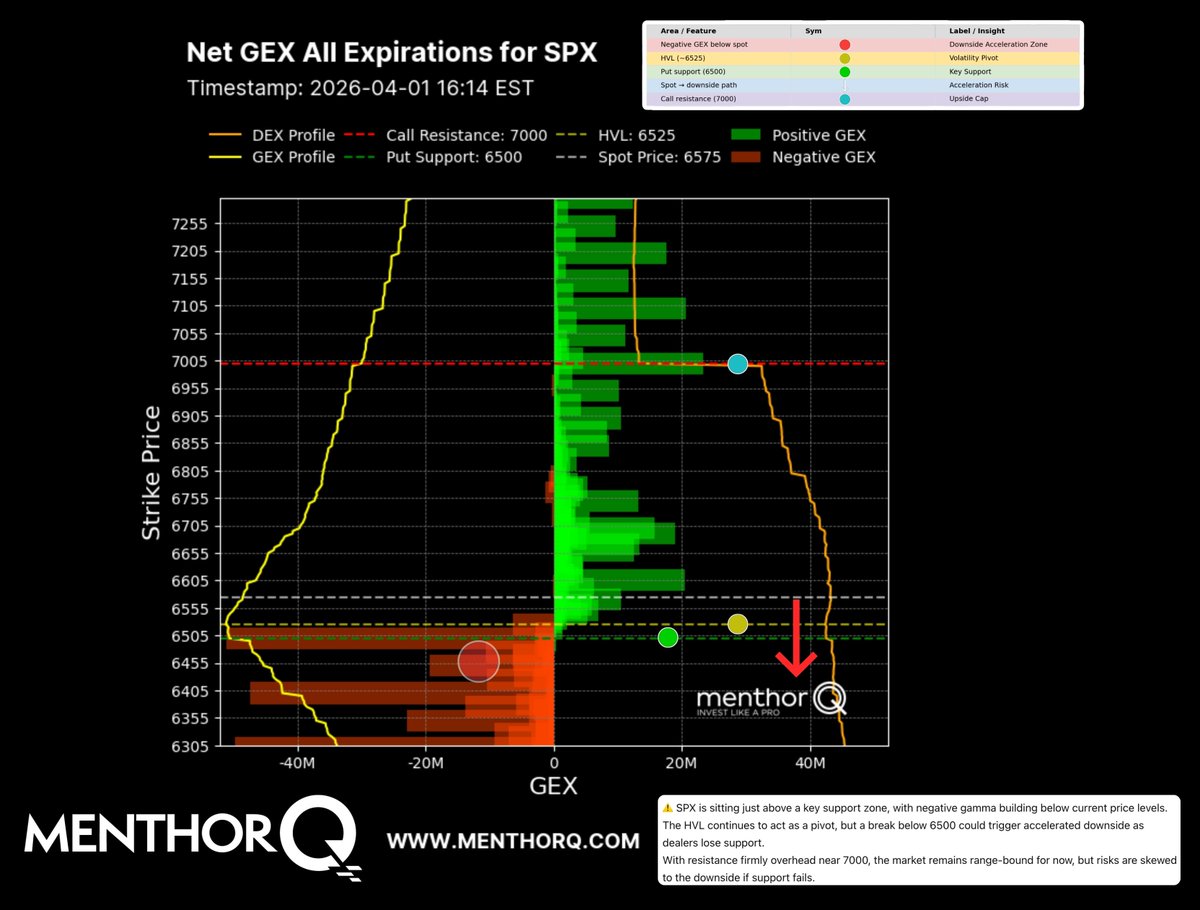 2/ First, the fundamentals. Spot is at 6,575.
 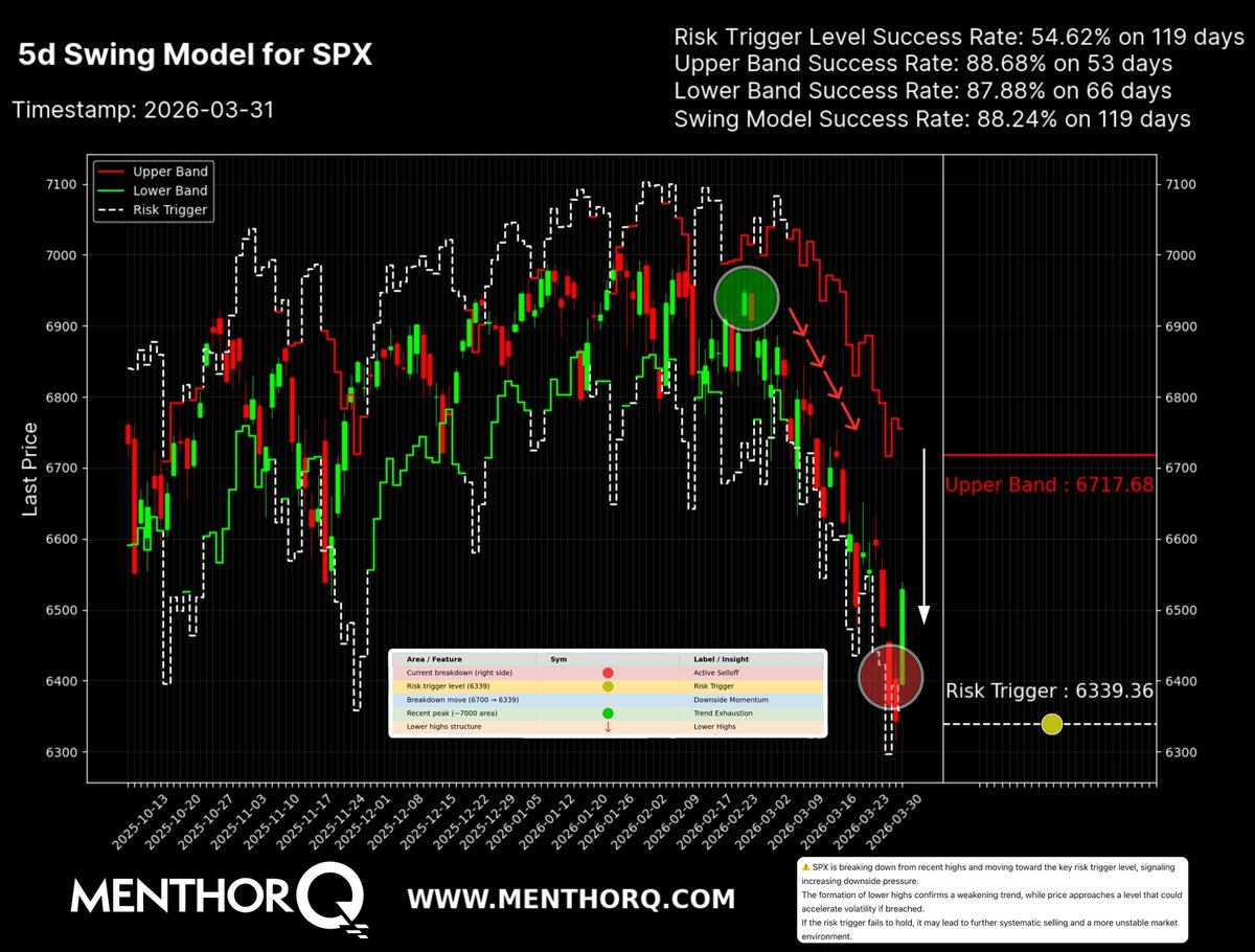 2/ The model tracks 3 key levels:
  2/ The green line = CTA positioning (systematic funds).
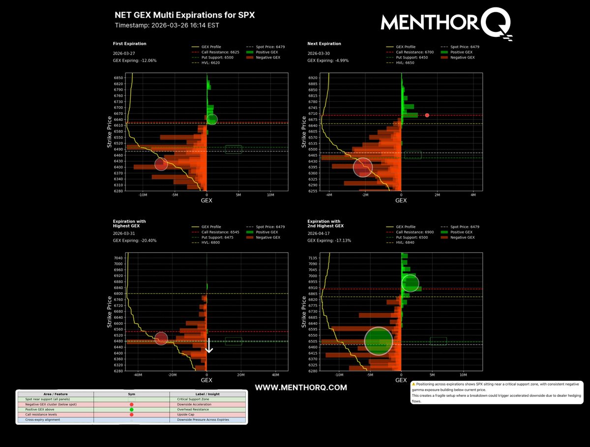 2/ Across near-term expirations, GEX is firmly negative.
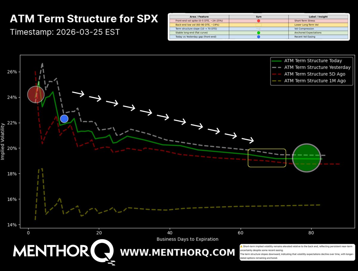 2/ The front of the curve (short-term volatility) has come down vs yesterday and last week.
 2/ The lower panel tracks how many stocks are trading above their 200-day average.
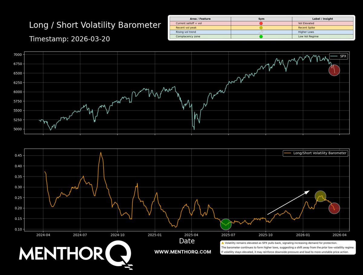 2/ The Long/Short Volatility Barometer has been trending lower over time.
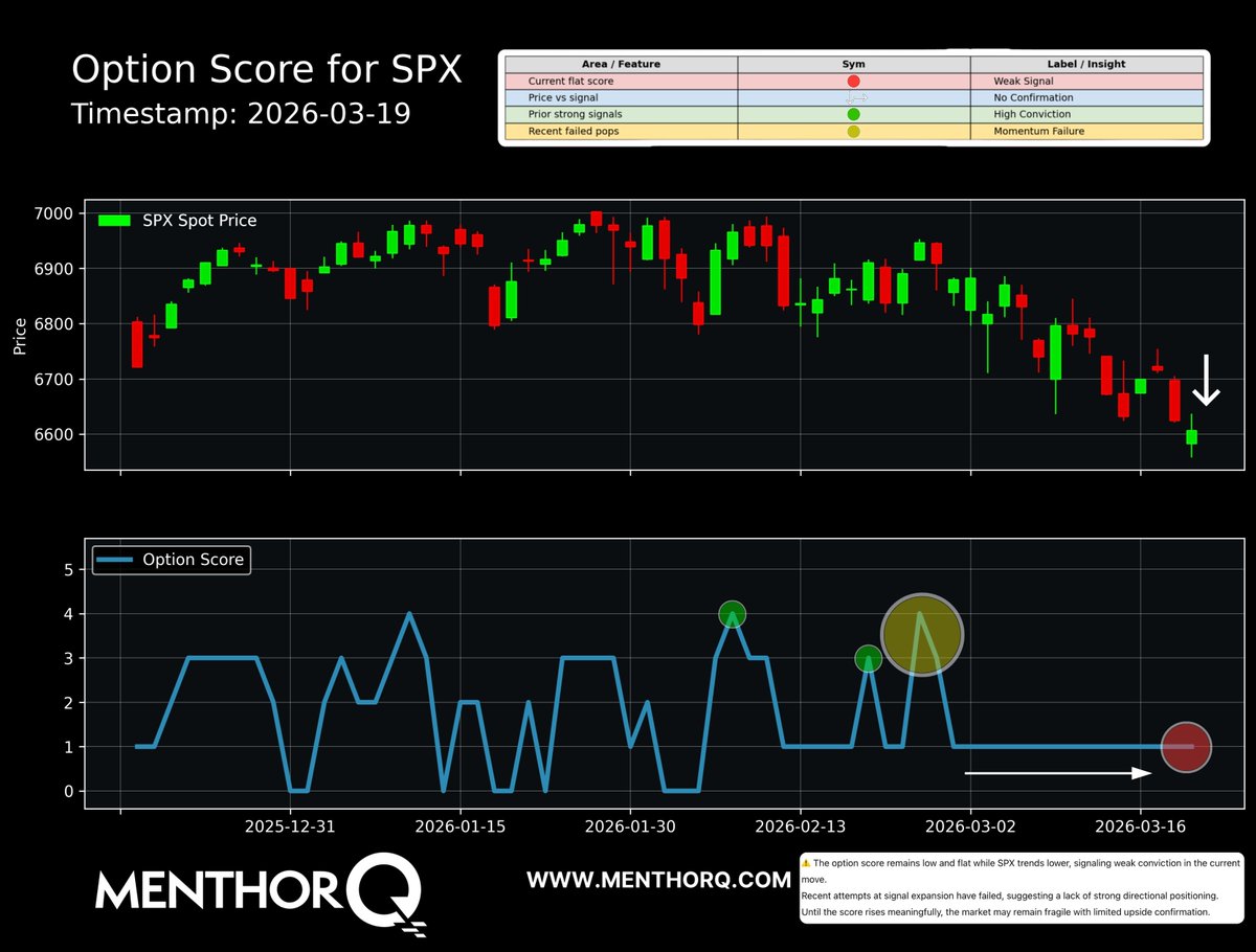 2/ The “option score” is a simplified way to track bullish vs bearish options positioning.
 2/ TSLA = consistently cheap
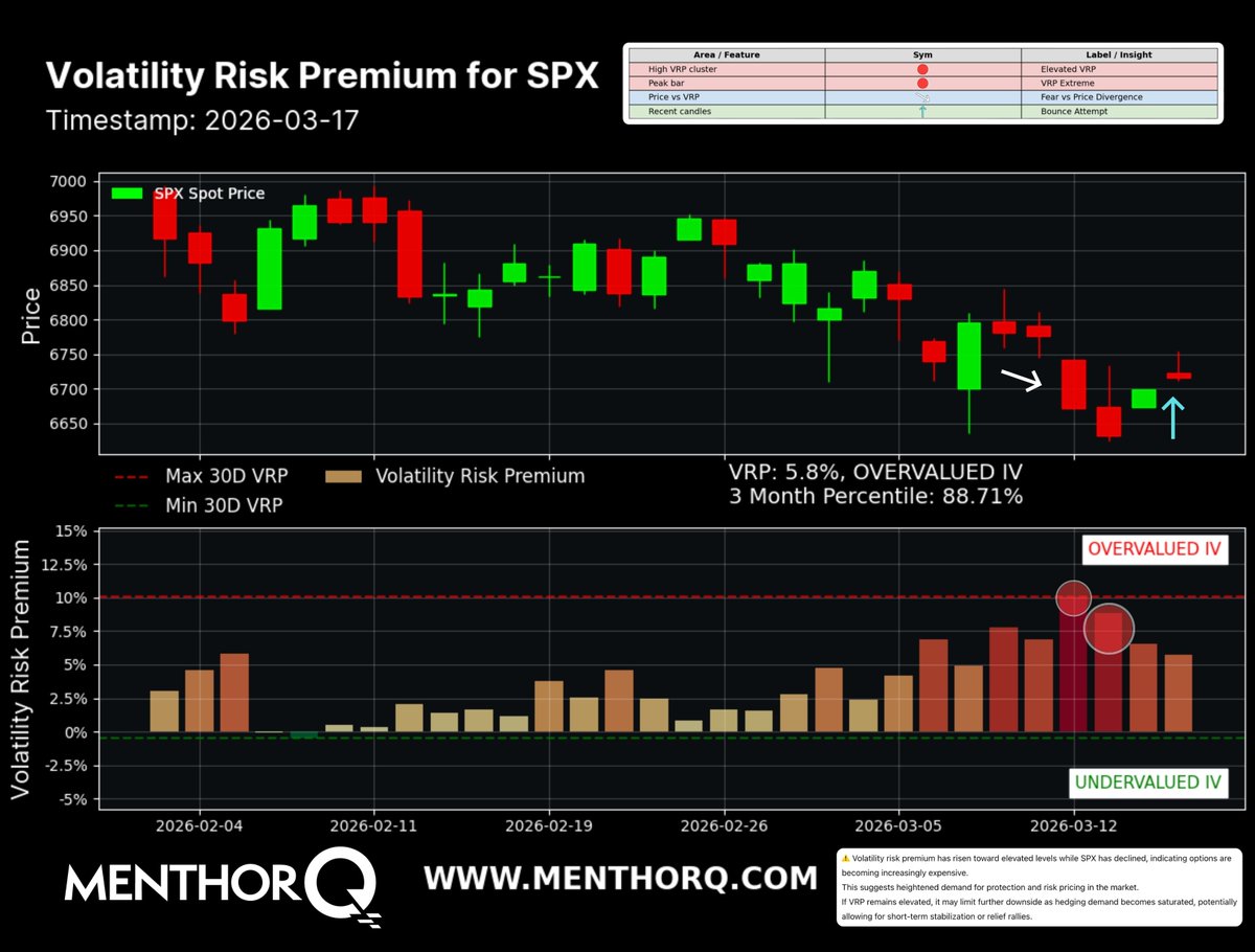 2/ This chart tracks the Volatility Risk Premium (VRP).
 2/ The bottom panel tracks how many stocks are flashing a MACD buy signal.