Stuart A Profile picture
Kim Profile picture 1 subscribed
Feb 21 7 tweets 2 min read
It looks like the Office for Health Improvement and Disparities 🏴󠁧󠁢󠁥󠁮󠁧󠁿 will no longer be releasing Excess Mortality data, so here are the heat maps for one last time…

1. Non-COVID by Age Group… Image 
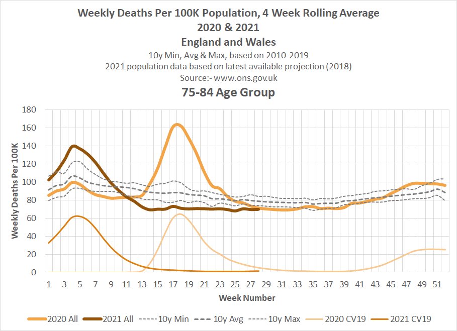
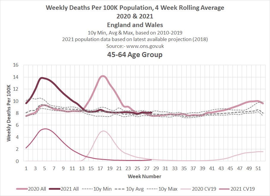
2. All Causes by Age Group.. Image
Apr 3, 2023 5 tweets 2 min read
England 🏴󠁧󠁢󠁥󠁮󠁧󠁿

Specific causes of death that have significantly increased during 2021/2022.

(Not all causes have significantly increased - these are just ones that stand out).

Part 1 - Circulatory
Aug 19, 2022 6 tweets 2 min read
England 🏴󠁧󠁢󠁥󠁮󠁧󠁿

Cumulative Excess Deaths NOT Involving CV19.

Comparing weeks 1-31 2022 v 2021 by Age Group & Sex.

0-24 big gap between males and females… 
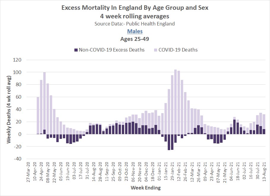
25-49. Less than expected for the first 20 weeks of 2022 but has changed direction since then…
May 16, 2022 6 tweets 3 min read
England 🏴󠁧󠁢󠁥󠁮󠁧󠁿 Excess Deaths NOT Involving CV19.

Since Mar 2020 there have been 58,443 more Deaths Involving CV19 than Excess Deaths = 58,443 fewer Non-CV19 Deaths than expected.

During the 2nd half of 2021, however, there were 6,331 more Non-CV19 deaths than expected… ImageImage 
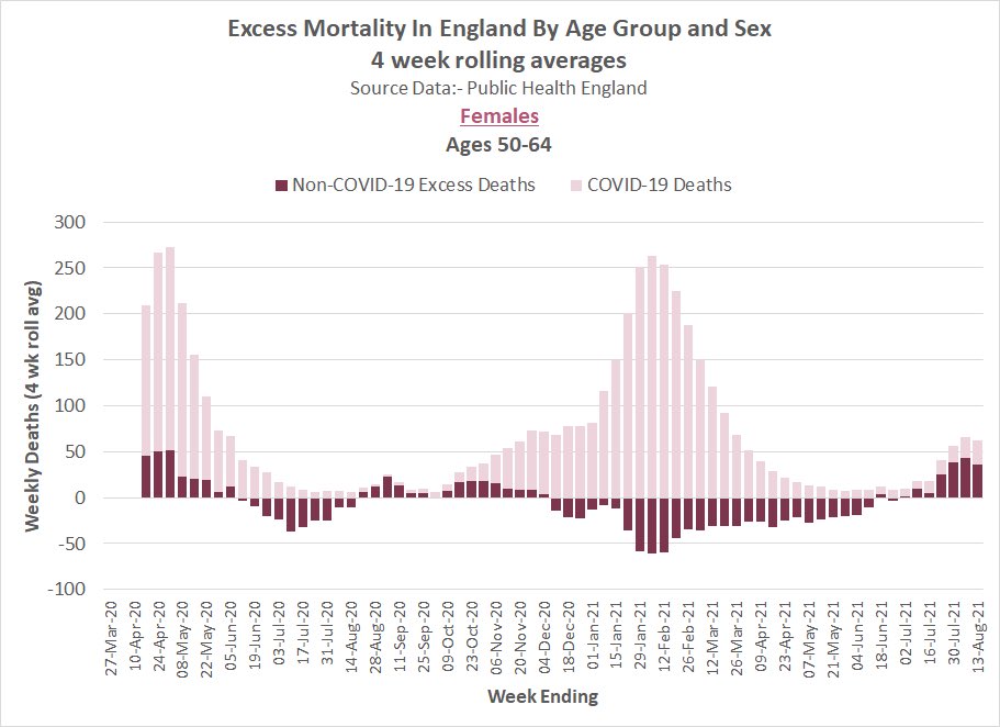
Charts show cumulative Non-CV19 excess for 2nd half of 2021…

In the 0-24 and 25-49 age groups there were significantly more excess in Males than in Females.

What caused this excess? Why is it higher in Males than Females? ImageImage
Nov 9, 2021 7 tweets 3 min read
England 🏴󠁧󠁢󠁥󠁮󠁧󠁿 & Wales 🏴󠁧󠁢󠁷󠁬󠁳󠁿

More detailed look at mortality in the 15-19 age group…

Cumulative Weeks 1 to 43 Males and Females.

Comparing 2021 with 2019 and 2020, Males diverge from week 23. 
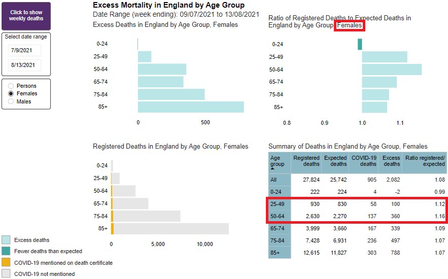
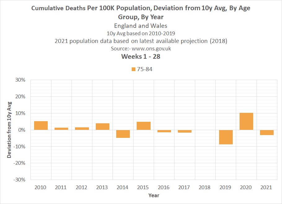
Adjusting for changes in population size…
Oct 13, 2021 4 tweets 2 min read
Scotland 🏴󠁧󠁢󠁳󠁣󠁴󠁿

Excess deaths by underlying cause based on latest data released today.

Excess Deaths NOT Due to COVID-19 are 11.6% higher than the 2015-2019 average (for the last 8 weeks) and appear to be trending upwards… 
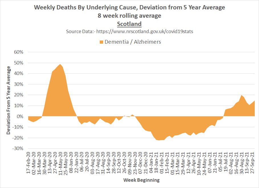
%Deviation from 2015-2019 average by underlying cause…
Aug 26, 2021 6 tweets 4 min read
🏴󠁧󠁢󠁥󠁮󠁧󠁿 latest excess mortality data from Public Health England.

On top of CV19 deaths, non CV19 excess looking high in the last 6 weeks, particularly in the 25-64s…
Aug 25, 2021 4 tweets 1 min read
England 🏴󠁧󠁢󠁥󠁮󠁧󠁿
Monthly Age-Standardised Mortality Rate January 2001 to July 2021… Heat map…
Aug 24, 2021 4 tweets 3 min read
Weekly Deaths Per 100K, All Cause and COVID-19 and All Cause year to date deviation from 10y average by age group 🏴󠁧󠁢󠁥󠁮󠁧󠁿 & 🏴󠁧󠁢󠁷󠁬󠁳󠁿.
Aug 13, 2021 6 tweets 5 min read
Plotting vaccination rates and CV19 death rates of the 20 countries which currently have the highest daily CV19 death rates according to Our World in Data…. ImageImageImageImage ImageImageImageImage
Jul 28, 2021 9 tweets 6 min read
Plotting vaccination rates of the 25 countries which currently have the highest daily CV19 death rates according to Our World in Data.

Can anyone spot a pattern?
Jul 27, 2021 4 tweets 3 min read
Weekly Deaths Per 100K, All Cause and COVID-19 and All Cause year to date deviation from 10y average by age group 🏴󠁧󠁢󠁥󠁮󠁧󠁿 & 🏴󠁧󠁢󠁷󠁬󠁳󠁿.
Feb 8, 2021 7 tweets 2 min read
A short thread exploring CV19 in the context of age-standardised mortality rate.
The first graphic compares 3 different mortality metrics:- Total Deaths, Deaths Per 100K and Age Standardised Mortality Rate (ASMR). Have added lines simulating a doubling of CV19 deaths. Note that the relative increase in the ASMR, due to CV19, is far lower than the other two metrics. This is due to a combination of three factors...
1. The ASMR calculation has a lower weighting for deaths in the 64+ age groups. The higher the age group the lower the weighting.