Charles Franklin Profile picture
Co-Dev. https://t.co/JD9ObuugSo, https://t.co/Ovy3zGCciZ, Director Marquette Law School Poll, Prof Emeritus UW-Madison. R nerd.
Aviva Gabriel Profile picture artofstark Profile picture jimrothstein Profile picture 3 subscribed
Aug 31, 2023 6 tweets 2 min read
The indictments of Donald Trump have *not* boosted him in the polls, either for favorability or for his support in the GOP primary. This claim keeps being repeated as if the data support it. It does not.

pollsandvotes.com/?p=455 Trump’s net favorability inched up 1.5-2 points following the first indictment in New York on March 30, 2023, from a median of -14.0 to -12.5, and mean of -14.2 to -12.2. This is the only period of a (slight) improvement compared to the pre-indictment period Image
Dec 1, 2022 12 tweets 4 min read
Our new national @MULawPoll is out

DeSantis gains support, now moving up to a tie with Biden among registered voters nationwide. His support has slowly but steadily increased over the year. Biden has remained stable. 15% wish for an alternative to these two. 1/n Image Trump continues to trail Biden, by 10 points in this poll. Biden lead has been increasing since March. DeSantis was a point stronger than Trump vs Biden in March & Sept, but now 10 points stronger on margin vs Biden. 2/n Image
Nov 12, 2022 8 tweets 3 min read
Wisconsin density and vote, the journey continues

Density is concentrated in the southeast, with other denser places in St. Croix-Eau Claire area, plus pockets like La Crosse

Pop change since 2010 varies & modestly correlated .28 w density

I focus on density. You do change 1/n Do note the places with pop declines though. Milwaukee is important for decline in pop, and as notes may account for decline in total vote in 2022.

But also note what a massive growth Dane County accounts for. Fox valley, St. Croix-Eau Claire too. 2/n
Nov 12, 2022 4 tweets 2 min read
More on Wisconsin turnout.

Where turnout rose from 2018 to 2022, GOP did better, Dem did worse.

Turnout change was a net benefit to Johnson & Michels.

Much attention to Milwaukee County, where turnout was down 47,090 from 2018. How much did that matter in Senate race? 1/n Image Barnes won MKE county by 40.26%, so if turnout had remained at 2018 level, and Barnes got the same share of those additional votes, he would have picked up 18,959 net votes

Statewide, he lost by 27,407

The MKE turnout would have tightened the race, but not put Barnes ahead 2/n Image
Nov 12, 2022 5 tweets 2 min read
Friday night of election week, so more data, of course.

The Wisconsin elections in 5 maps and 2 charts.

First up: Vote margins in Senate and Governor races by county.

Evers wins or comes close in a few more counties than Barnes does in Senate.

Dane is *dark* blue.

1/n 
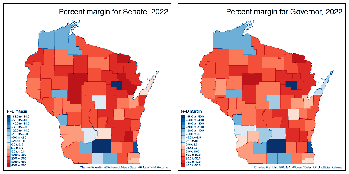
Now look at shifts since the 2016 Senate and 2018 Gov races.

The southeast and Fox valley are mostly red in the vote margin, but are moving in a Dem direction in both races. BOW and WOW. <;-)

North & West redder, but especially for Senate, less for Gov.

Geo polarization.

2/n
Oct 21, 2022 17 tweets 6 min read
Fundamentals thread

The current conventional wisdom is for the midterm to be somewhat better than average for the president's party in the House. (I set aside the Senate here.) The fundamentals doubt that, as we'll see. 1/n The "fundamentals" provide a helpful baseline, even if "non-fundamentals" such as polling, candidate quality, unique issues, may modify that baseline. So let's only look at historical relationships here. 2/n
Aug 6, 2022 5 tweets 2 min read
Everyone should have a weekend hobby, even if it also includes data.

Mine is ancient manuscripts and how they have come down to us.

In this case, Greek New Testament manuscripts. Here by type w distribution over time. 1/k Nice separation of first 3, then Minuscules of both types come at similar times

But there is a scaling
issue. Papyri are just 1.8% of surviving mss, Uncials 5.7%, Lectionaries Uncials 5.5%, Minuscules 51.3% & Lectionaries Minuscules 36.2%

But densities don't reflect that

2/k
Feb 7, 2022 9 tweets 5 min read
Recently I tweeted about shifts in aggregate party ID, following Gallup's release of shifts in their polls. I find 4 other pollsters showing the D-R margin tightening, though not as much as Gallup. Blog version: pollsandvotes.com/?p=217

But what about individual change? 1/n For tracking individual change we need panel data. Thanks to Democracy Fund and Voter Study Group we have a public panel from 2011 through 2020.

I prefer fresh cross sections for tracking aggregate shifts, but panels are THE thing for individual change.

2/n
Nov 22, 2021 13 tweets 5 min read
I've seen a cartoon going around showing the liberal-conservative ideology of the self and Dem and Rep parties. In the cartoon, the self and Rep party stay fixed while the Dem party moves far to the left. It is an effective graphic & rhetoric but how does it fit with data? 1/n The American National Election Studies ANES has measured ideology of self & both parties on a 7-point scale since 1972. The points are labelled "extremely liberal", "liberal", "slightly liberal", "moderate", "slightly conservative", "conservative" and "extremely conservative" 2/n
Oct 9, 2021 9 tweets 6 min read
Lovely map/graphic from @PostGraphics. The @danbalz story it illustrates is excellent.

Here see the blue cities that stand out against red countryside in the Green Bay-Appleton-Oshkosh area. The denser cities & villages are almost all less R than surroundings. 1/n Here is 2020 at the municipality level. This is our @MULawPoll & Lubar center mapping app by @jdjmke at lubarcenter.shinyapps.io/VotesApp/ it has statewide results 2000-2020 so you can compare over time. 2/n
Oct 8, 2021 5 tweets 3 min read
My colleague @jdjmke has a new post on districting in Wisconsin. He generates 50,000 maps and 1.65 million state senate seats. The upshot: a good many extremely Dem seats but that means the rest are quite Rep.

Geographic clustering matters a lot. 1/n

law.marquette.edu/facultyblog/20… @jdjmke A way to see the geographic clustering is this chart from @jdjmke It shows how many D and R voters live in extremely lopsided neighborhoods (that voted 75-25 or more for the D or R). In 2000 9% of Ds and 2% of Rs lived in such places. Now it is 21% of Ds and 5% of Rs. 2/n
Jul 19, 2021 5 tweets 3 min read
Earlier thread on vaccinated rate and hesitancy of UNvaxed by party here (with charts!):


Lots of "what about age..education..race.." So here is the "technical appendix" of the thread.

May 21-June 28 data.

Probability have been vaxed:

1/n Probability vaxed:
Very little time trend here (there is over longer time of course)
Rep less likely than Dem
Ind less likely than Dem
More likely with increased age & ed
No gender difference
Black less likely than white
No diff for Hispanic & other race vs white

2/n
Jul 18, 2021 5 tweets 3 min read
Vaccinated by party, and hesitancy among the UNvaccinated by party.

Little partisan difference until about April 1 in vaccinated rate. Diverges after that. Now >25 point D-R gap.

(Self-reported status, overall 68.6% vaxed 6/28)

1/n As pct vaccinated rises, the UNvaccinated are increasingly composed of those who are "not very" or "not at all likely" to get vaccinated.

All partisan groups show this hesitancy, but near 90% of unvaxed Reps unlikely vs 68% D & Ind. 2/n
Jul 16, 2021 4 tweets 2 min read
Not news but the red-blue state divide in Vax rates and new cases is really stark right now. Has been sharpening since May (when my CDC data begins).

Here new cases/week by % 12+ with at least 1st dose. Pattern same for complete doses. 1/2 Here is 1st dose Vax rate (12+) by Trump percent 2016, by day.

Relationship has been strong all along but somewhat stronger now.

2/3
Jun 30, 2021 16 tweets 6 min read
A look at how the Supreme Court Justices voted in the October 2020 term. It isn't _quite_ over but the overall picture won't change with the last few decisions.

tl;dr It is a 3-3-3 Court and there are 2-dimensions which helps explain the variety of majorities this year. 1/n Also tl;dr we had more 9-0 or 8-1 decisions this year (67%) than in 2019 (46%) and the average of 48% over the last 10 years. The Justices who agreed LEAST on decisions (Sotomayor and Thomas) nonetheless *agreed* in 61% of decisions. 2/n
Jun 27, 2021 5 tweets 4 min read
Same state, different party Senators have gotten more rare, now only 6 pair-were 25 (!) 40 years ago

@WisVoter has the story in MKE Journal Sentinel & now in USAToday. Both paywall but maybe you have one of the subscriptions 1/n

jsonline.com/story/news/pol…

usatoday.com/story/news/pol… Image @WisVoter The list of oddest odd couples is in this @WisVoter tweet. 2/n

Image
May 22, 2021 14 tweets 6 min read
Hmmmm. I wonder what this thread is about? (OK: tl;dr it is about midterm elections and what to expect in 2022) 1/n OK here are the variables. National Democratic percentage of the 2-party House vote in the midterm by the national 2 party vote in the previous presidential election. Not much of a relationship. Some votes go up (above the diagonal) and about as many go down (below diagonal) 2/n
May 20, 2021 6 tweets 2 min read
Earlier I posted a thread on the geography of uninsured in Wisc and public opinion on Medicaid expansion


Now a look at coverage rates over time by state

Early expand states had biggest gains, late adopers smaller and no-expansion least. All improved 1/n Image Wisconsin had the least uninsured among non-expansion states prior to expansion beginning in 2014, has improved, and remains lowest of the no-expansion states.

Early expansion reduced uninsured more than late expansion or no-expansion, given 2013 rate. 2/n Image
May 19, 2021 6 tweets 5 min read
Wisconsin remains divided over Medicaid expansion.

Gov. Evers call for a special session will be gaveled in and out according to GOP leadership.

Here is a look at how Wisconsin compares nationally and where folks lack coverage. 1/n

Political reaction:
Image 
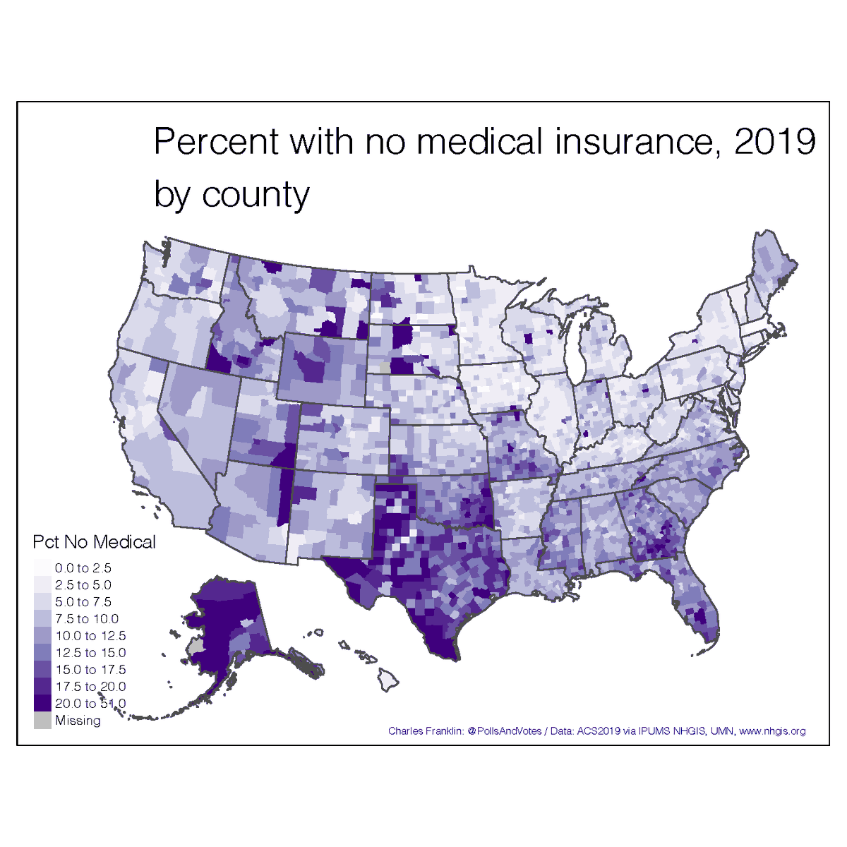
Wisc coverage compares favorably with many other states, and especially so among those that also declined to expand Medicaid

Note: MO approved a referendum to expand but legislature & gov have not funded the expansion

2/n

For details fo each state see:

kff.org/medicaid/issue… ImageImage
May 13, 2021 4 tweets 2 min read
Earlier tonight I posted state level Covid cases & deaths by 2016 vote. By popular demand, here it is by county within each state.

I hope the graphics can stand zooming which is really necessary to see the charts clearly.

Here cases/million by vote margin.

More below. 1/n And here are deaths per million.

The axes differ to make each state as legible as possible. So be careful comparing states.

A lot of things vary by county: education, race, pop density, age. SO THIS IS NOT A CAUSAL EXPLANATION nor even one controlled for multiple factors.

2/n
May 13, 2021 5 tweets 2 min read
It is hard to avoid looking at how states handled Covid without a partisan filter. If we use cases/million there is a bit of correlation, w GOP states higher than Dem. But if we look at deaths/million there's no correlation at all. 1/n One puzzle is why cases are correlated but deaths are not. I don't have an answer to that, but it is interesting.

2/n