
Fan of colourful Star Trek and sleek starships, on assignment in the Blue Sky sector


 …Or if you have a spare $50-70k you could always place a bid I suppose! Many more Star Trek items too.

 My BS senses did twinge a little, but I trusted the source and the image looked pretty authentic. Oh well. Luckily it didn't take very long to make.
 My personal favourite uniforms might be the standard ones from Beyond. And you might assume that I hate the field jacket as it features so many of the design tropes I parodied in my picture, but oddly enough I quite like it! I contain multitudes. 😅


 Those are my vector recreations of the 1991 logo. I also made this trading card packaging version. #AffinityDesigner


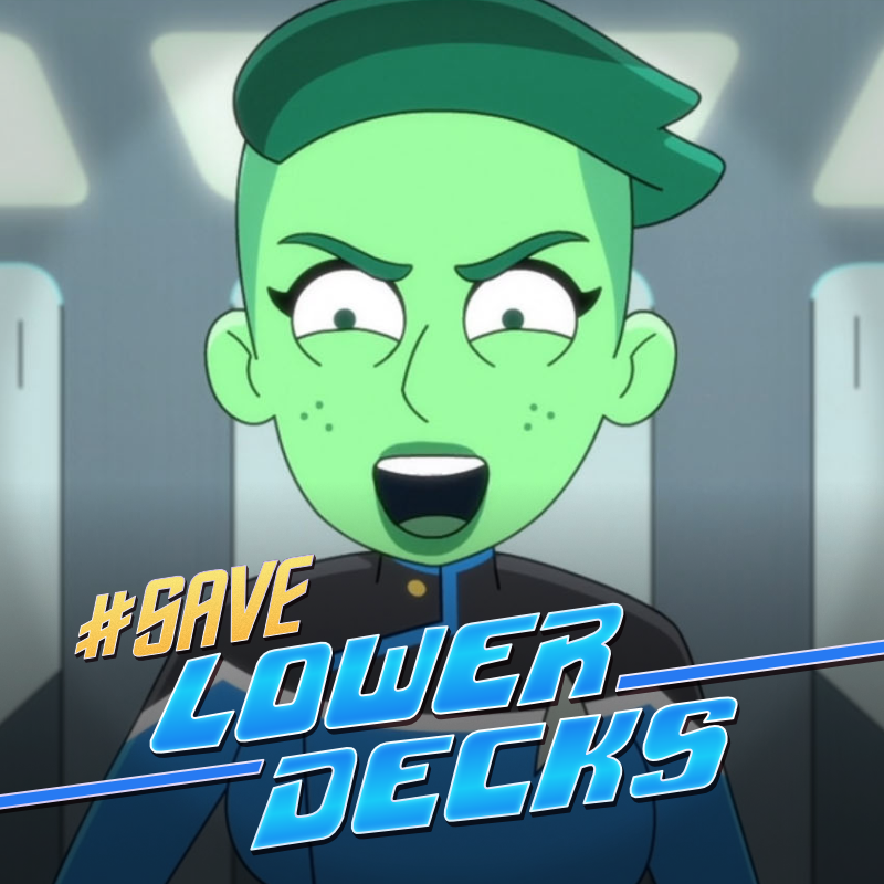
 The senior staff #SaveLowerDecks


 More images for comparison, including a typical cosplay example. The SNW version looks good, I just think a closer match could have been better still. twitter.com/i/web/status/1…
 Starting with probably my personal favourite, Atolm's Chariot-class. [Image 2 model and render by Alexander Klemm]


 One deficiency of my page is that the font I used wasn't a great match to the original Joseph drawings. Thanks to @DewlineO for pointing out this font based on the exact stencil used! It has some kerning issues but is still a huge improvement.


 …The series was going to be set 150 years after TNG, in the wake of a vicious attack that has made warp travel impossible throughout much of the galaxy. Sound familiar? Consequently the Federation has withdrawn and become more isolationist. Hmm… 🤔
