The top 60 % of Bitcoin’s dataset follows a stretched-exponential master-curve quantile regression when expressed as a ratio to the bottom 40 %, which itself is well described by a linear quantile regression.
This chart confirms the relationship: across 60 fitted quantiles, the model achieves an R2 of 0.992.
The mathematical pattern that explains the top 60% quantile distribution of Bitcoin’s price action appears just as—if not more—consistently reliable as the pattern governing the bottom 40% quantile distribution.
Both segments are equally important and can be modeled with mathematics.
Because their behaviours are interdependent, a breakdown in one pattern would likely signal a breakdown in the other as well.
So what is a Stretched Exponential Master Curve?
A stretched exponential master curve is a mathematical model used to describe processes that decay in a way that isn’t purely exponential.
In many natural systems, things don't decay at a constant rate.
Instead, they slow down over time, and the stretched exponential function captures this by including a "stretch" parameter that adjusts how the decay rate changes over time.
This kind of model is commonly used in various fields, like physics and material science, to describe the way certain systems lose energy over time.
In summary, using a stretched exponential master curve is a well-established and theoretically justified way to model complex decay processes, and it provides a robust framework for making accurate predictions.
Jan 10, 2025 • 4 tweets • 1 min read
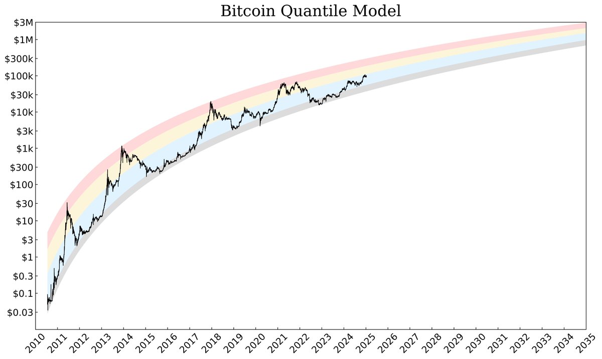
Bitcoin Quantile Model
🟥 0.95 to 0.9999
🟨 0.75 to 0.95
🟦 0.25 to 0.75
⬜️ 0.0001 to 0.25
Jan 1, 2035
$2,929,803 | 0.9999
$2,078,515 | 0.95
$1,523,171 | 0.75
$1,293,110 | 0.50
$974,078 | 0.25
$687,130 | 0.0001
2013 Top = 0.9999
2017 Top = 0.9999
2021 April Top = 0.9954
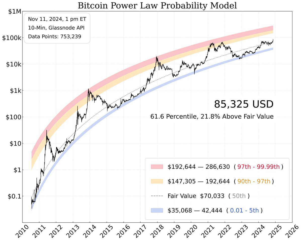
Nov 11, 2024 • 10 tweets • 4 min read
Update 1, #Bitcoin Probability Model
Bitcoin's foundation in mathematical elegance reveals a beauty that guides us toward truth.
👉 Follow for regular updates.
After 500+ lines of code, my first major #BTC model is complete and now auto-updates every 10 minutes.
P.S. I’m not a coder and have ZERO coding background.
As a full-time, unpaid Bitcoin researcher, I often get asked how people can best support my free content.
Simply bookmark, repost, and comment on my posts :)
Thanks for all your continued support!
— PlanC
Important - Please Read In Full
Before Asking Questions
Despite this chart not looking like a power-law relationship, the underlying data still follows one. The mathematical relationship or model between variables is independent of how the data is presented or plotted. Whether you use a linear, log-linear, or log-log plot, the relationship remains a power law. The choice of plot type only affects the data's visual appearance, not the actual relationship between the variables. This version is more intuitive.
The dollar values reflect the corresponding quantile as of today. Since each quantile value updates every 10 minutes, these values will gradually increase over time. However, the model can also estimate the probable distribution price range at future points, which I’ll showcase in upcoming charts.
For anyone wondering, this is quite different from the rainbow chart. The data follows a log-log relationship with quantile regressions, whereas the rainbow chart uses logarithmic regression with a log-linear relationship.
I am not 'drawing' these lines. These are quantile regressions of the log of price vs. time, based on all the data we have to date. The line is NOT technical analysis or 'drawn' manually; it is a statistically generated line, using the best statistical model we have for Bitcoin.
Understanding Quantiles:
99.9% Quantile: The price has only been above this line 0.1% of the time, or just 1 day out of every 1,000 days in the full data set. By definition, this means that such a day is a very rare event.
99% Quantile: The price has only been above this line 1% of the time, or just 1 day out of every 100 days in the full data set. By definition, this means that such a day is a rare event.
0.1% Quantile: The price has only been below this line 0.1% of the time, or just 1 day out of every 1,000 days in the full data set. By definition, this means that such a day is a very rare event.
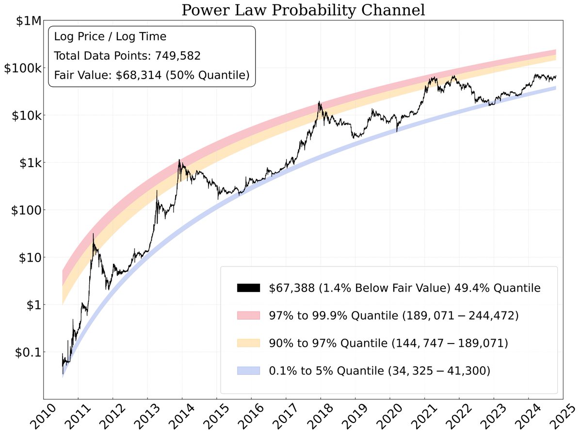
Oct 17, 2024 • 6 tweets • 2 min read
I've enhanced the layout, adding Fair Value and the percentage above/below Fair Value to the chart to provide a more comprehensive perspective of our position within the data set.
Moving forward, updates will be posted at 4 PM UTC on Tuesdays and Saturdays.
Important point:
Despite this chart not looking like a power-law relationship, the underlying data still follows one.
The mathematical relationship or model between variables is independent of how the data is presented or plotted. Whether you use a linear, log-linear, or log-log plot, the relationship remains a power law.
The choice of plot type only affects the data's visual appearance, not the actual relationship between the variables.