Retired derivatives trader | Statistics (Notre Dame) | Studied under Scholes, Miller & Fama | Focused on empirical proof
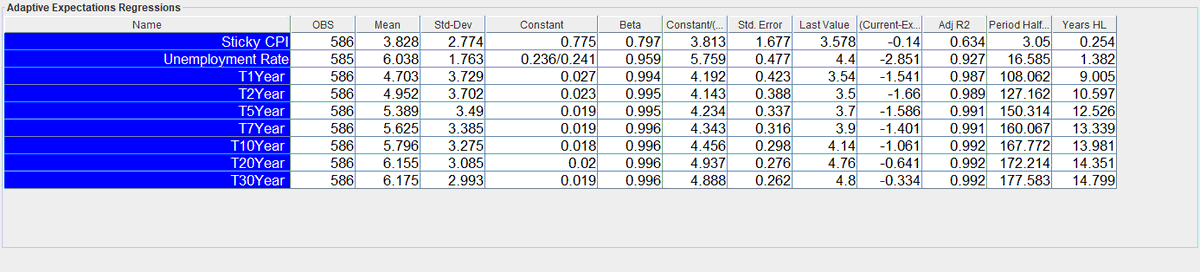
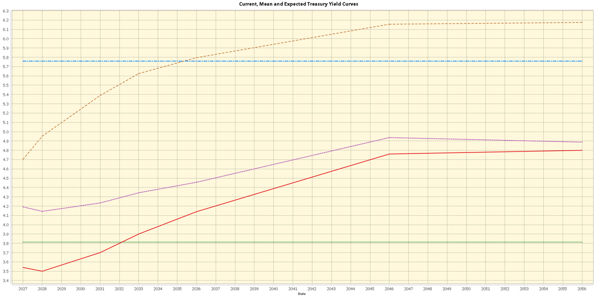 Below is a table with the regressions for each point on our adaptive yield curve. Long term rates are near the anchor and political pressure deflates short term rates. Everyone loves free money... term premium expansion is just getting started next frame.