Alexandra Freeman Profile picture
Executive Director of the Winton Centre for Risk & Evidence Communication, University of Cambridge. Creator of Octopus: https://t.co/YPVogCeNVi
May 7, 2021 9 tweets 4 min read
Here are newly updated graphics from us for the latest data from the UK's @MHRAgovuk on blood clots and the AZ vaccine.

Full info is at wintoncentre.maths.cam.ac.uk/news/latest-da…

There are important notes on the site, which I'll also thread here. 
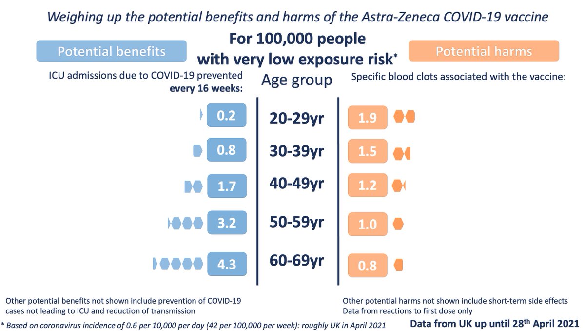
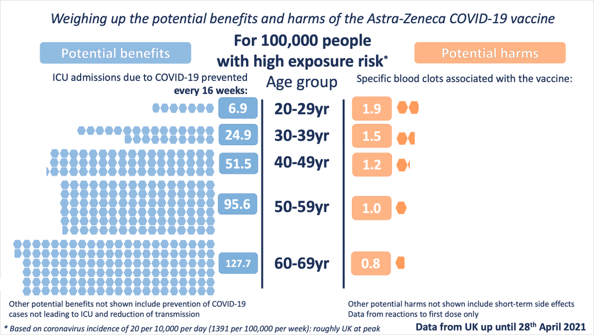
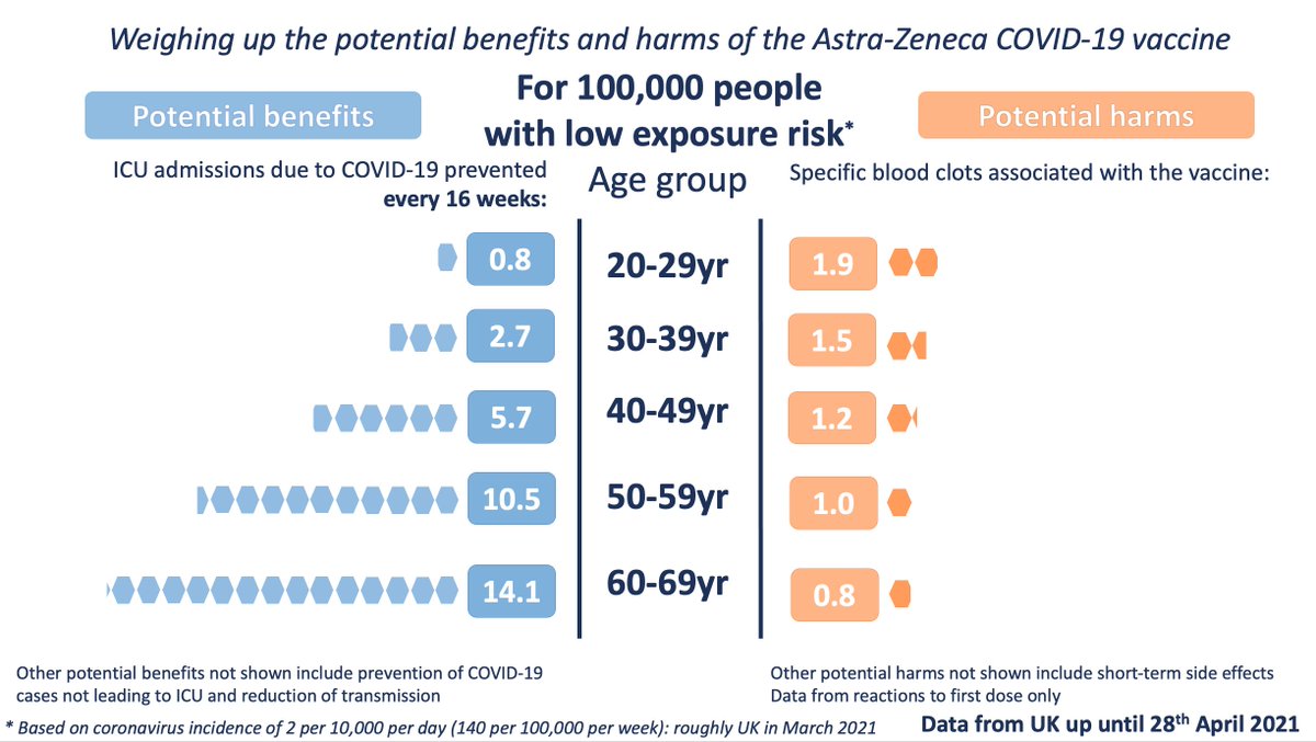
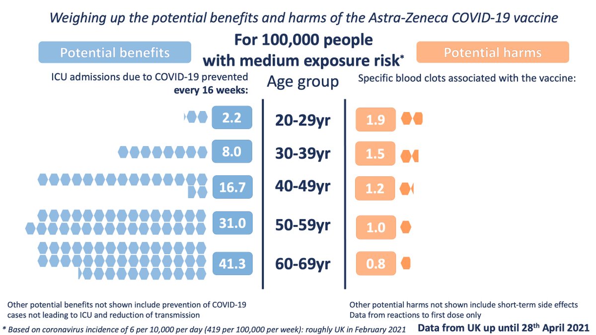
We've added a new slide for 'very low exposure' which is based on current incidence of the virus in the UK. Just remember that vaccination benefits keep adding up for every week of protection, which will be longer than the 16 weeks we illustrate. The potential harms are 'one off'
Apr 21, 2021 9 tweets 5 min read
Our work from last year on how to communicate personalised risks from COVID-19 is out:
royalsocietypublishing.org/doi/10.1098/rs…

In it we describe a series of studies by the Winton team
@d_spiegel @SciComGuy @mesotronium @CRSchneider3 @sarahdryhurst @acethecurious @lfinikarides @LuoniGiulia In summary, for those developing personal risk calculators:

1) Are you trying to change behaviour or simply inform people? It changes your communication approach.

UK opinion last summer:
Apr 7, 2021 10 tweets 6 min read
Our graphics to illustrate the potential benefits and potential harms of the AstraZeneca vaccine as announced by the MHRA this afternoon.

Benefits accrued over 16 weeks, at three different levels of exposure to the virus. 
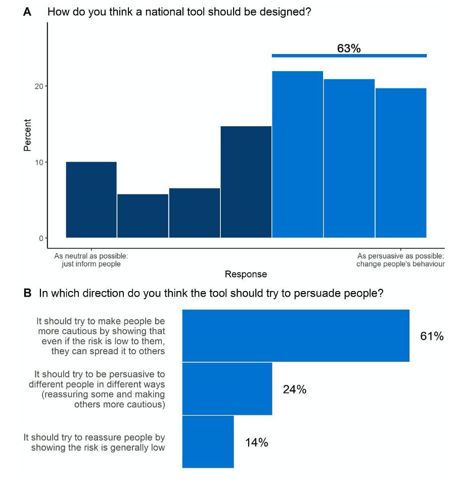
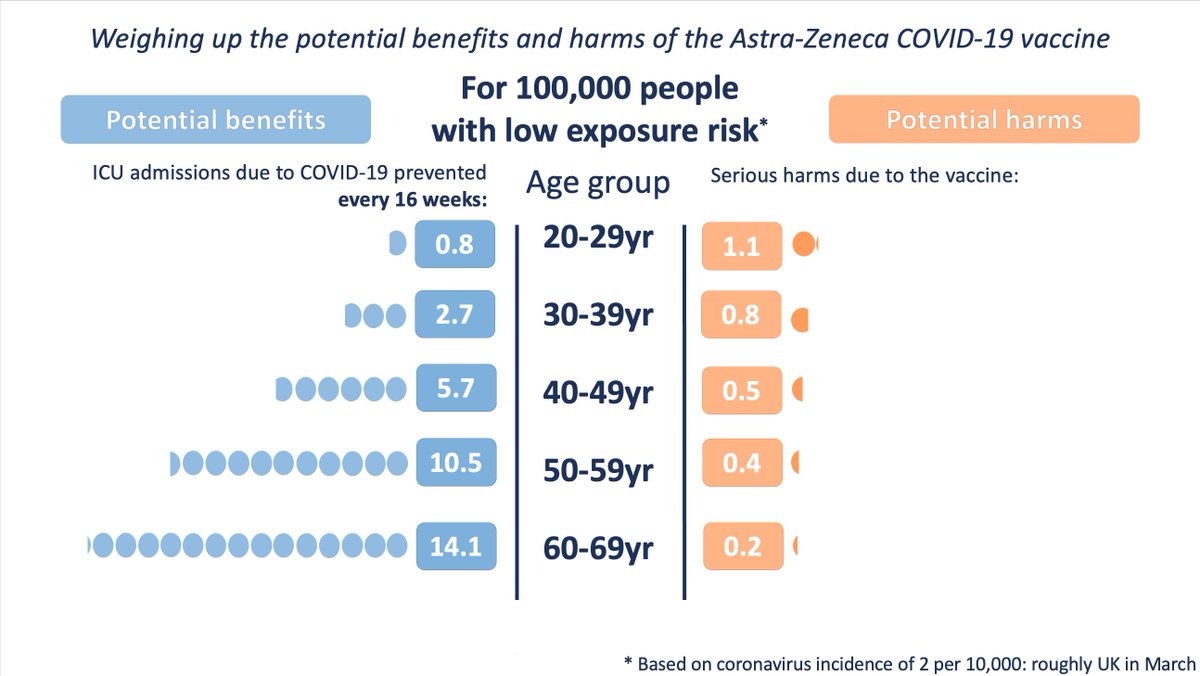
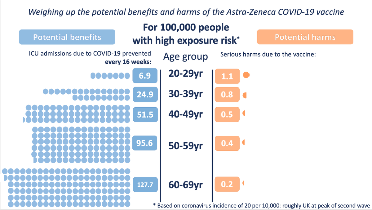
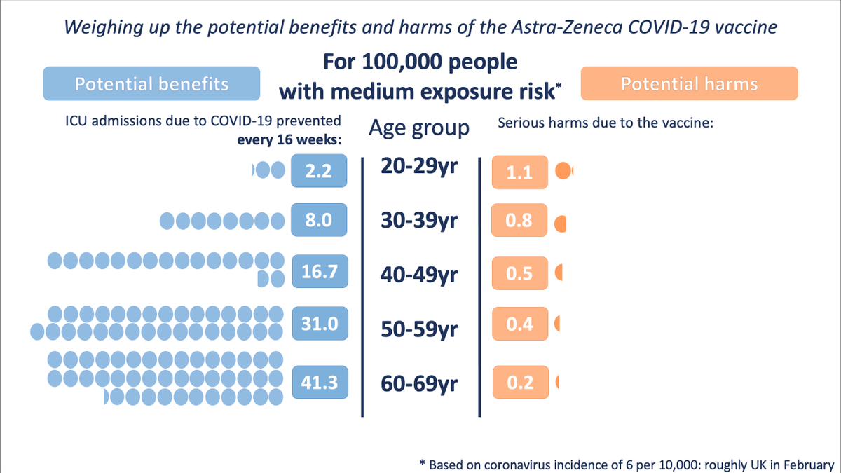
Avoidance of ICU admission was chosen as a benefit comparator because the potential harms being illustrated are equally severe.

Of course for every one of these potential ICU admissions there are many many people who might have had hospitalisation or long COVID.
Nov 18, 2020 10 tweets 3 min read
Some musings from me on risk perception/communication on BMJ blog today.

We throw numbers around when talking about health risks - they’re a way of precisely defining a concept. But it’s like communicating colour through hexademical codes or wavelengths…
bit.ly/32RzXSL Firstly, the numbers only make sense to those already very familiar with the arbitrary mapping of number to concept. A designer or physicist might instinctively bring to mind a colour when you say 6d46c4 or 350nm, but the rest of us don’t.
Nov 18, 2020 9 tweets 5 min read
We’ve got a comment in Nature today on why science needs good ‘evidence communication’ and not the typical rules of rhetoric, designed to persuade rather than inform: nature.com/articles/d4158…

@d_spiegel @Sander_vdLinden @MarteauTM Alongside the comment piece, which ironically sets out to persuade you to consider not be persuasive, are our more detailed thoughts on how to do this: media.nature.com/original/magaz…